Extract any visual specifications directly from Sketch designs using Indigo.Design's Inspect feature. (read more)![]()
↧
Inspect for Sketch prototypes in the cloud or private server
↧
Ignite UI Release Notes - June 2019: 18.2, 19.1 Service Release
With every release comes a set of release notes that reflects the state of resolved bugs and new additions from the previous release. You’ll find the notes useful to help determine the resolution of existing issues from a past release and as a means of determining where to test your applications when upgrading from one version to the next.
Release notes are available in both PDF and Excel formats. The PDF summarizes the changes to this release along with a listing of each item. The Excel sheet includes each change item and makes it easy for you to sort, filter and otherwise manipulate the data to your liking.
Download the Release Notes
Ignite UI 2018 Volume 2
- PDF (Ignite UI 2018 Volume 2, Build 18.2.20182.108)
- Excel (Ignite UI 2018 Volume 2, Build 18.2.20182.108)
Ignite UI 2019 Volume 1
- PDF (Ignite UI 2019 Volume 1, Build 19.1.20191.31)
- Excel (Ignite UI 2019 Volume 1, Build 19.1.20191.31)
↧
↧
Working with Auto-Generated Columns in the Ignite UI for Angular Grid
Ignite UI for Angular Grid is the fastest data grid available. It not only helps to run applications faster but also allows you as a developer to write applications faster. To see it in action, assume that you have a data source as shown in the code listing below:
this.products = [
    { Id: '1', Title: 'Book', ExpiryDate: new Date(), Price: 35, Rating: 3.5 },
    { Id: '2', Title: 'Pen', ExpiryDate: new Date(), Price: 25, Rating: 4.0 },
    { Id: '3', Title: 'Pencil', ExpiryDate: new Date(), Price: 20, Rating: 3.2 },
    { Id: '4', Title: 'Bat', ExpiryDate: new Date(), Price: 135, Rating: 4.0 },
    { Id: '5', Title: 'Ball', ExpiryDate: new Date(), Price: 65, Rating: 3.8 },
];
You can render the above data in igxGrid by simply defining an instance of the igxGrid in the component’s template and binding the data property to the product array. It is straightforward to add as shown in the below code listing:
<igx-grid [data]="products" [autoGenerate]="true" width="960px"> </igx-grid>
By setting only data and autoGenerate properties, you should get data rendered in igxGrid as shown below:

Since the autoGenerate property is set to true, Ignite UI will generate columns with default properties configured. However, Ignite UI for Angular Grid has a ton of features such as:
- Filtering
- Paging
- Sorting
- Column pinning
- Column hiding
- Column template
- Header template etc. and many more.
As a developer, you may want to configure these features depending on your business requirements. There are two ways to do this:
- Set the autoGenerate property to false and configure columns manually. Learn more about it here.
- If columns are generated automatically, configure the above features at run time in the component class.
We can configure essential features at run time when columns are initialized. Ignite UI for Angular igxGridComponent provides you an event onColumInit.

At the time of column initialization, the onColumnInit event is executed. Any business logic you wish to execute at this time, you should write inside this event. For example, we can write code to enable various features as shown in the below image:

You can handle the event in the component class, as shown in the code listing below:

If you want to pin a particular column in a particular location, you can do that as follows
public onColumnInit(column: IgxColumnComponent) {
    if (column.field === 'Title') {
        column.pin();
    }
}
You will find the Title column pinned to the left side as shown below:

You can hide a column at runtime while initializing by setting the hidden property value to true:
public onColumnInit(column: IgxColumnComponent) {
    if (column.field === 'Id') {
        column.hidden = true;
    }
}
You can also make a column editable by setting the editable property to true:
 public onColumnInit(column: IgxColumnComponent) {
    if (column.field === 'ExpiryDate') {
        column.editable = true;
    }
}
When igxGrid renders, ExpiryDate column should be editable as shown in below image. You might also notice that in editing mode, Ignite UI gives you the option to edit the date type column in igxCalandar

As you can see, it’s very easy to configure various fetaures in auto generated columns. Besides configuring features, you can also format column data to a specfied output. In Angular, pipes do that. So for auto generated columns, you apply pipes using the formatter function.
Let us say that you want to,
- Display ExpiryDate in specific date format
- Display Title in upper case
For that, you can use the formatter function in onColumnInit event as shown in the below image. Here we are using toLocaleDateString to convert date output to local date format and toUpperCase to display output in uppercase.

After applying above formatter, you will find data in Title column is formatted in uppercase and data of ExpiryDate column is formatted in the local date string format.

You can use formatter for complex business logic as well. You can pass multiple statements as logic using the formatter arrow function. For example, for Price column, if price data is less than 50, you need to add a text ‘Discounted’ next to the price data. You can very quickly do that, as shown in the image below:

You will get Ignite UI for Angular Grid rendered with applied formatter as shown in the image below:

As discussed earlier, not only format the column data but also you can utilize other features also. Very smoothly, you can perform various other operations such as
- Setting a summary
- Setting filters
- Setting formatters
- Setting width
- Setting header value
- Setting header template
- Setting movable property
- Setting hidden attributes etc.
We will cover the above features individually in other blog posts. However, it’s important that you understand how to configure features when Ignite UI for Angular Grid columns are being initialized, as discussed in this blog. You can download a 30-day trial of Ignite UI for Angular from here. I hope you find this post useful.
↧
Infragistics ASP.NET Release Notes - June 2019: 18.2, 19.1 Service Release
With every release comes a set of release notes that reflects the state of resolved bugs and new additions from the previous release. You’ll find the notes useful to help determine the resolution of existing issues from a past release and as a means of determining where to test your applications when upgrading from one version to the next.
Release notes are available in both PDF and Excel formats. The PDF summarizes the changes to this release along with a listing of each item. The Excel sheet includes each change item and makes it easy for you to sort, filter and otherwise manipulate the data to your liking.
Download the Release Notes
ASP.NET 2018 Volume 2
- PDF (ASP.NET 2018 Volume 2, Build 18.2.20182.105)
- Excel (ASP.NET 2018 Volume 2, Build 18.2.20182.105)
ASP.NET 2019 Volume 1
- PDF (ASP.NET 2019 Volume 1, Build 19.1.20191.177)
- Excel (ASP.NET 2019 Volume 1, Build 19.1.20191.177)
↧
Infragistics Windows Forms Release Notes - June 2019: 18.2, 19.1 Service Release
Release notes reflect the state of resolved bugs and new additions from the previous release. You will find these notes useful to help determine the resolution of existing issues from a past release and as a means of determining where to test your applications when upgrading from one version to the next.
Release notes are available in both PDF and Excel formats. The PDF summarizes the changes to this release along with a listing of each item. The Excel sheet includes each change item and makes it easy for you to sort, filter and otherwise manipulate the data to your liking.
In order to download release notes, use the following links:
Windows Forms 2018 Volume 2 Service Release (Build 18.2.20182.XXXX)
• PDF - Infragistics for Windows Forms 2018 Volume 2
• Excel - Infragistics for Windows Forms 2018 Volume 2
Windows Forms 2019 Volume 1 Service Release (Build 19.1.20191.XXXX)
• PDF - Infragistics for Windows Forms 2019 Volume 1
• Excel - Infragistics for Windows Forms 2019 Volume 1

↧
↧
Infragistics WPF Release Notes - June 2019: 18.2, 19.1 Service Release
Release notes reflect the state of resolved bugs and new additions from the previous release. You will find these notes useful to help determine the resolution of existing issues from a past release and as a means of determining where to test your applications when upgrading from one version to the next.
Release notes are available in both PDF and Excel formats. The PDF summarizes the changes to this release along with a listing of each item. The Excel sheet includes each change item and makes it easy for you to sort, filter and otherwise manipulate the data to your liking.
In order to download release notes, use the following links:
WPF 2018 Volume 2 Service Release (Build 18.2.20182.XXXX)
• PDF - Infragistics for WPF 2018 Volume 2
• Excel - Infragistics for WPF 2018 Volume 2
WPF 2019 Volume 1 Service Release (Build 19.1.20191.XXXX)
• PDF - Infragistics for WPF 2019 Volume 1
• Excel - Infragistics for WPF 2019 Volume 1

↧
Software Performance [Web]
Performance is one of the most important, if not the most important, vectors that should be considered when producing software products.(read more)![]()
↧
Introducing Product Team Office Hours
Let’s face it, developers don’t really like talking to sales departments or interacting with marketing. While sales and marketing are very important roles to just about every company in existence, they just don’t have that very low-level knowledge of a product that developers expect. A lot of times, developers can feel frustrated that the questions they have must go though a “middle-man” to be passed along to a more technical person, and wait for the response loop to close. This could take days or weeks in some cases.
I truly empathize with you all, and we want to improve this experience for all Infragistics developers. Starting this month, I am excited to announce the introduction of the Product Team Office Hours. We’ll be hosting an online, interactive session that anyone can attend. Are you a customer looking for more information on a recent release or what’s coming next? Are you considering Infragistics and just want to learn what we’re all about and what the most recent updates are? Everyone is invited! All of the key players on our side will be available in the meeting, including me, and the product teams responsible for delivering the products that you use every day. We will talk about what we have been working on, what we are currently working on, and what we plan on working on very soon. And then of course, anything you want to talk about. This will be a two-way conversation between you, me, and the product teams.
So how will this work? Very soon, we will be sending emails to our current customers and promoting invites via our social media accounts encouraging everyone interested in attending our Product Team Office Hours to register for the Office Hours mailing list. You will only receive Product Team Office Hours meeting invites if you have registered for the Office Hours mailing list. Don't worry, you only have to register once and then you're good to go. We just need to know who wants to participate and where to send the meeting invites. In case you're wondering, yes, you can unsubscribe at anytime. But trust me, you won't want to!

Save the Date! The first Product Team Office Hours is going to be held on July 25th at 9am PST (11am EST). So make sure you keep an eye on your email, especially the junk folder, as well as your social media accounts, because will be sending out invites in the next week or so. If you don't get the invite in your email inbox, or don't see the invite come through on social media, please send me an email at blagunas@infragistics.com or connect with me via Twitter, and I'll send you the direct link to the registration page.
So, what do you think? Do you like this idea? Let me know your feedback by following and engaging with me on Twitter at @brianLagunas. You can also subscribe to my YouTube channel to be notified of new videos, and follow me on Twitch to watch me stream live.
↧
Data Driven Teams and Organizations
See how easy it is to create data-driven teams with the Reveal business intelligence platform. Find out how Reveal's simplicity brings beautiful visualizations to analytics.(read more)![]()
↧
↧
The Pricing Secret: What Embedded Analytics Vendors Won't Tell You
Find out why many embedded analytics vendors keep their costs hidden. Reveal pricing is simple, fixed and predictable.(read more)![]()
↧
Getting to Know the Reveal Visualization Editor
If you have been using Reveal, you know how easy it is to create dashboards with any number of data sources. Reveal is built by user experience experts and made for business users. It has a familiar drag and drop experience that makes it simple to use. However, the visualization editor is packed with features that you might not even know about. Today we are going to walk you through each section of the editor and show you all the capabilities Reveal has.
Fields

All of the available fields within your data source will appear on the left panel. Each field has an indicator that informs the users what field type each field is: Date, Value, Text. The plus icon in this panel allows you to either blend data sources or calculate a field:
- Blend Data Source: This is a powerful feature that allows you to bring in fields from another source and join them based on a common field.
- Calculated Field: Allows you to define new fields built based on expression using the existing fields.
Visualization Fields
Here is where you will drag and drop, or click the + mark to see the available fields and select those you want to use for the visualization you are creating.
Visualization Workspace
Here is where you will be able to see the visualization you are creating or editing as you drag and drop fields. The visualization won't populate until you have all the necessary fields needed to create that chart type.

Data Source
The data source that you are currently working with will be displayed here. With a click you can change between the different sheets, tables or views within your source or change your connection to a new source entirely without having to leave the editor.
Visualization Picker

Switch between any of our 30+ different visualizations using the dropdown picker. As you switch between the different chart types you will notice the visualization fields section change. This is where Reveal takes ease of use to a new level! We will provide you all the necessary fields you need to fill in for a given visualization type – eliminating the need to make you think. Once all the fields needed to create a beautiful chart are there – your chart will display in the visualization workspace section.
Visualization Settings

Each visualization comes with its own settings that allow you to customize what you want to show:
- Grid: show title, alignment of your fields, font size, fixed first column
- Pivot Grid: show title, alignment of your fields, font size, grand totals
- Column, Bar, Line, Area, Step Area, Step Line, Spline, Spline Area: show title, show legend, start color, chart trendline, axis configuration, axis bounds
- Stacked Column, Stacked Bar, Stacked Area: show title, show legend, start color, percentage distribution, axis configuration, axis bounds
- Text: show title, conditional formatting bounds for indicator
- Text, Web View: show title
- Pie, Doughnut, Funnel: show title, show legend, start color, start position, slice label formatting
- Circular Gauge, Linear Gauge, Bullet Graph: show title, limits, conditional formatting bounds for indicator
- KPI vs Time, KPI vs Target: show title, time period, difference formatting, indicator color
- OHLC, Candlestick: show title, axis configuration, axis bounds
- Radial: show title, show legend, start color, chart trendline
- Sparkline: show title, alignment for fields, font size, chart type, number of months shown, how last two columns, show difference column, indicator color
Within each of these settings screen you will see the option for links. This is a powerful feature that takes drill down to a whole new level. Link a visualization to a totally new dashboard to show more detail with one click. Or link out to a URL that provides deeper insights for your users.
Interested in building your own dashboards? Download a free trial of Reveal now, or contact us to see the wonders it can do for your team’s productivity!
↧
How to Create Your First Business Intelligence Dashboard with Reveal
If you are not familiar with creating dashboards, it can be a little overwhelming trying to figure out how to connect to all the data you have in different systems and build a dashboard to bring all your data together into a full 360-degree view of your business.
Reveal is self-service, business intelligence software that enables you to visualize your significant business metrics, like marketing performance, monitoring operational trends, visualizing KPIs, and optimizing customer portfolios, in one centralized location. To show you how to achieve this quickly this blog will walk you through the following steps using a sample data Excel file provided to you inside the application:
- Connect to an Excel file
- Create visualizations
- Change the theme of a dashboard
- Save your dashboard
- Share your dashboard with your team
At the end, your dashboard will look like this:

Steps to Data Insights
When you come into Reveal for the first time you will be presented with the different samples that we built for you to explore. To begin creating your own, navigate to the Dashboards section on the left panel. Click the new button in the top right-hand corner and select dashboard.

To add your first visualization click the plus in the upper right corner. Here is where you will be able to choose your first data source to connect to your data:

Within OneDrive I navigate to the file I am looking to bring into my dashboard. Once I select my excel file Reveal will bring in the different sheets I have within that file with their names (Marketing, Sales). In addition, I can choose how often I want my data to sync to my dashboard. Here you can see I selected once an hour.

Once you select your sheet you will be brought into the widget editor. On the left hand side, you will see all the columns within that excel sheet along with an indicator for what type of field they are (Date, Value, Category). On the top bar is where you can select your visualization types.
As you begin dragging fields over to the columns field you will see your data start to populate on the right. Or, if you know the visualization you want to create you can select that first! Reveal will change the input fields to let you know exactly what you need in order to create that visual.
To show new sales over time follow these steps:
- Select line chart from the visualization list
![]()
- Drag Date over to label and New Sales over to Values
- Click the Date field you dragged over to change the date aggregation from year to month
![]()
- Click the New Sales field you dragged over and change the formatting from number to currency and fraction digits to 0
- Change the title to New Sales by Month
![]()
- Click the check mark in the upper right corner


Just like that you have your first visualization!
Adding Filters to Dashboards
Now, let's add a dashboard filter so you can view a different date range on the fly.
- Click the add filter button on the top left under your dashboard title and select date filter. *note: You can use this to filter using any field within your data source by selecting add Dashboard Filter
- Within the date filter, select a range to set your data to. Use the dropdown to select Trailing 12 Months
- Underneath that you will see the visualization you created listed. If you had created more than one prior to adding this filter that would appear here as well. To connect the visualization to your dashboard filter click connect on the visualization thumbnail. Reveal will automatically connect to the date field within your data source. *note: if you have more than one date field within the excel file and need to switch the one it connects to you can use the overflow menu to edit the connection
![]()

- Once connected click the create filter button at the bottom of the dialog window and see your data pivot to the filter.
To create another visualization, you have several options:
- Click the plus icon on the top right menu bar. Reveal will first list the data you already have within that dashboard. This enables you to create from the same source quickly. You can also add a new source to this dashboard, bringing multiple data sources into one view.
- Click the overflow menu on the visualization and select it. This will not only duplicate the fields inside the visualization but also the connection to the dashboard filter if you have one. From here you can quickly go into edit the visualization and change out some fields, change the visualization and more to create a new view.
- Click the overflow menu and select copy. You can now paste this visualization right here or navigate to another dashboard to reuse it!
Here are three more powerful visualizations inside the editor to give you ideas on how you can add more to your dashboard:
- Leads by Product
![]()
- Renewal Seats by Territory
![]()
- Seats Sold by Sales Rep
![]()


Once you have your visualizations created, you can begin to adjust the size and order of them within your dashboard. Simply click on a visualization to drag it around or to use the nodes to resize it.
*Note: Auto Layout is on by Default until your resize a visualization
Next, using the overflow menu pick a new theme for your dashboard from any of Reveal's built in options.

Once you are happy with how your dashboard looks, give it a title and click the check in the upper right corner. You will them be prompted to save it and to choose where you want to save your dashboard. By default, it selects the location where you started creating your dashboard. Along with the option to save to your personal space, (pending permission level), you can save this dashboard to your organization repository or any of the teams that you are a part of.

Just like that you have a beautiful dashboard!
Interested in building your own dashboards? Download a free trial of any of our Reveal platforms now, or contact us to see the wonders it can do for your team’s productivity!
↧
Design elaborate grid experiences with indigo.design and generate Angular apps out of them.
On Monday we have launched yet another amazing update to indigo.design including vast improvements to the UI Kit for Sketch, especially in the area of the Grid component. In the latest release available in your indigo.design cloud account, we also managed to squeeze tree and hierarchical grids with all the features that the regular, flat grid offers. In this short article I will walk you through the creation of a seemingly simple grid design with a lot of feature horsepower under the hood.

- We will start by inserting the following grid pattern from the Indigo-Patterns library file "Grid/Pinning+Row Selection+Active Cell". Yes, we have created some feature presets for you available as patterns to speed up your design process and guide you on the proper way to configure features on the grid both in terms of look and generation of code.
- Upon performing "Detach from Symbol" on the added pattern we can already discover how some of the grid features have been configured. Row selection, for example, is achieved by inserting an additional column to the left of the grid and using "Checkbox" for the "Type" of the "Body" and "Header" cells of the whole column.
![]()
- To further elaborate things, we may set the "State" to one of the "Body" cells to "On" and configure all the cells belonging to that row as "RowSelected" cells via the "Grid Feature" override.
![]()
![]()
- The "Header" cells are much more interesting, however, since through them are enabled many of the functionalities on the grid, since they are column-specific. This is the case with column pinning and since we would like to have two narrow pinned columns we will slightly rearrange columns 2,3 and 4 of the grid to achieve the following layout.
![]()
- After renaming the Status column header to Sr. No. and the Progress one to SKU, we will proceed by selecting both and setting their "Feature Right" to "Pinning", of course, that will show an override for the "State", which should be set to "Unpin"."Feature Right" and "Feature Left" overrides support identical values ("Filtering" "Pinning" "Sorting") allowing for configuration of the corresponding features on the grid and column in particular.
![]()
- We will continue by disabling the pinning on the Subject column via the "Feature Right" being set to "None" and there is one small detail to take care of - the right border. Since the right-most pinned column has a thick right border we need to set the "Right Border" override of all cells belonging to the SKU column to "Pinned Line" and for all cells belonging to the Subject column to "None".
![]()
- While scrolling down to the "Right Border" override you may have come across a set of overrides for "Editing", "Column Moving", "Column Resizing", and "Column Hiding" that are responsible for the corresponding grid functionalities. Of course, when properly set, all the overrides so far will be interpreted by our code generation engine when creating an Ignite UI for Angular grid.
![]()
- Before we go on with adding more features to the grid, let's stop for a moment and edit the rest of the headers and all the body cells to contain some actual data. I have decided to depict some typical data for an order and therefore besides Sr. No. and SKU I will add some more columns like Description, Quantity, Price, Final Cost, and Total, as well as, two columns for actions on the record: Comment and Remove.
![]()
- After filling in all the body cells with appropriate values, changing the cell "Type" to "Number" for the numeric values and configuring the "Type" of the last two columns' body cells to "Icon" we are more or less ready to go on and add some more features to the grid. Of course, to polish up things for the actions columns we may want to pick an appropriate icon glyph and color for it from the possibilities ensured by the Indigo-Styling library.
![]()
![]()
- Before wrapping up our design we will also take a look at configuring the active cell of the grid, it is usually the cell that moves the focus while we browse the grid via the keyboard. This is done very easily as the "State" override of every body cell can be set to "Cell:active" in order for the cell to receive an additional style that is applied on top of any other underlying styles the cell may have.
![]()
- Now with the data we have used it becomes quite obvious that the grid is sorted according to the Sr. No. column and let's add an indication for that by selecting the header, navigating to "Feature Left" override (we already used the right one for pinning) and setting it to "Sorting". The order of the grids tells us that for the "Sorting State" we should choose "Ascending" and we are ready to add a couple of final elements.
![]()
- Orders often have a notion of total quantity/size to estimate shipment and total value of the content to estimate insurance or invoice the recipient. We will reflect this by adding a summary row and to achieve this let's insert form "Grid/Features/Sumamries" the symbol denoted as "Comfortable". If we were to click on any of the header and body cells, we will also find the Comfortable signifier for the symbol in the right panel. The grid as well as some other components nave this notion of Display Density, which may be one of these three values: Comfortable, Cosy and Compact. In the case of a grid cell they more or less tell it how high it is and what are its internal padding such that Comfortable cells always have more air than Cosy ones, and the Compact cells are always the most dense arrangements with minimal paddings.
![]()
- After performing "Detach from Symbol" on the Comfortable summaries create a layout with the cells at hand that show a single row of summaries with "State" configured as "Summary:unavailable" for all columns except for Quantity and Total ones, where appropriate values need to be provided.
![]()


The last feature that we will add to the grid will be Export to Excel and CSV, for which we need to insert a "Toolbar" from "Grid/Features" and set the "Action 1" override to none since we don't have column hiding enabled on any of the columns. However, since we enabled pinning on a couple of columns, the rest of the actions will be left intact. Once we set the "Title" of the "Toolbar" to have relevant content for the order like the order number for example, and voilà! our grid design is complete.

Below are some useful link for you to discover...
how the attached Sketch design file is arranged
and inspect the prototype on Indigo.Design Cloud
the Angular Code on StackBlitz
Get started with Indigo.Design
Don't stop with prototypes; get it in the hands of real users with our 1-click sharing, and the ability to view prototypes on any device. Harness the power of Indigo.Design Cloud for recording user sessions and task analytics

Get Indigo.Design Professional starting at $39/mo for a complete UX prototyping solution. Want Code Generation? Get Indigo.Design Enterprise for $99/month!
↧
↧
How Reveal BI Secures Your Data
The Reveal embedded business intelligence platform is based on a cloud architecture that includes multiple authentication methods , local caching of data to minimize sending of queries to servers and databases, and much more. We'll explore these in this...(read more)![]()
↧
Ignite UI for Angular 8.1.0 Release
Almost one month has passed since we’ve released our last major version and we are already producing a new one We carefully evaluate our customer’s feature requests and work on the most wanted features not listed in the product Roadmap. And that’s not all, last month we’ve fixed over 60 bugs, added new components styling guides, a series of WPF to WEB migration topics and we’ve started to develop our Ignite UI Medium publication profile (if you are interested in “Software Performance”, check out our latest article on the subject).
Let’s see what we’ve prepared for you this release.
New Components
IgxSparkline - The Ignite UI for Angular Sparkline component is a lightweight charting control. It is intended for rendering within a small scale layout such as within a grid cell, but can also be rendered alone.

IgxZoomSlider - The ZoomSlider control provides zooming functionality to range-enabled controls. The ZoomSlider features a horizontal scroll bar, a thumbnail of the whole range, and a resizable zoom-range window. The ZoomSlder cannot work as a standalone control and it acts as an enhancement for range-based controls like the igxDataChart.
New Features
IgxBottomNav now supports an igx-tab declaration mode. Despite the fact that the primary usage of the component is to define panels with content, there may be cases in which you may need to define tab items only. You can use the new mode to apply directives on the tab item, e.g. to achieve routing navigation. You are also allowed to customize tab items with labels, icons, and even templates.
IgxTabs now supports an igx-tab-item declaration mode as well. When defining tab items you have the ability to apply directives on them. For example, you may use this functionality to achieve navigation between views using the Angular Router.
IgxGrid
Clipboard copy operations - This functionality provides a fast, easy and customizable way to copy Grid data into Excel or other external programs.

Group By behavioral change - paging now includes the group rows in the page size. When paging is applied the data is split based on flat records + group records view. If a group spans multiple pages, its group header is rendered only on the first one. Page count and page size include both item types. You may find more information about the change in the GroupBy Specification.
IgxGridFooter– Used to insert a custom footer in the grids.
IgxPaginator– Now can be used as a standalone component.
IgxColumnGroup - Re-templating the column group header is now possible using the headerTemplate @Input property or the igxHeader directive. Each column group can be templated separately. The column group expects ng-template tag decorated with the igxHeader directive. The ng-template is provided with the column group object as a context.

IgxCombo - Input [overlaySettings] allows an object of type OverlaySettings to be passed. These custom overlay settings control how the drop-down list displays.
IgxForOf now offers usage of local variables even, odd, first and last to help with the distinction of the currently iterated element.
IgxSlider has lot of visual enhancements and we’ve implemented adding of custom labels.
IgxSpreadsheet - with the new chart adapter added you can now display charts in your spreadsheet component.
IgxMap - new Heat map imagery added to the map. You can now show heat-map imagery using the ShapeFileRecords that are generated by a ShapeDataSource by loading geo-spatial data and loading shape files to a tile series.
Enough with the new components/features. What about documentation and understanding how to use everything new? We strive to deliver simple and effortless experience, and we believe that begins with listening to our customers and providing a meaningful content. This is why this release the time spent on writing documentation is more than the actual feature development. Here is why:
Styling sections in topics– we thought about “how can we give visual guidance on what the styling looks like for a control or particular feature“ and “how can we get more code snippets and API docs references”. We aim to give a real way to know what styles are related to a feature and how to implement them.
WPF to Web guidance - This guide aims to help the Desktop developers to convert their skills into Web application skills. If you are a WPF developer, this guide will help you to learn Angular by comparing the differences and similarities between the two platforms. It covers topics like application structure, components, data binding and much more.
New igxTransaction topics We are already using igxTransaction in our grid components (see grid, tree grid and hierarchical editing batch editing topics). But if you want to understand how to use igxTransaction on your own, you can follow our guidance.
More topic for CLI- We have added some more guidance for ourIgnite UI CLI tool and especially how to generate our Ignite UI Angular components using it.
If I can summarize our strive for effortless experience I would quote WP Carey School of Business - “The best companies deliver straightforward, reliable experiences that meet real needs. People want to interact with companies where doing business is personalized, easy and hassle-free.”
Follow us on Medium and stay up to date with the latest Angular related perks that we work on, give us a star on GitHub and help us to continue improving our product by addressing any concerns, questions or feature requests in the issues section. We will give our best to constantly improve our product experience to suits all your needs and build apps with ease
↧
Create Master-Detail app using Ignite UI for React components
Introduction
Have you ever wanted to create a master-detail application or learn how to visualize a large data source with subsets data items? If so, this blog post will show you how to create an application that will visualize the Global Sales Team in a list of people, locations of sales in for React IgrGeographicMap component, and sales details in React IgrLiveGrid component.
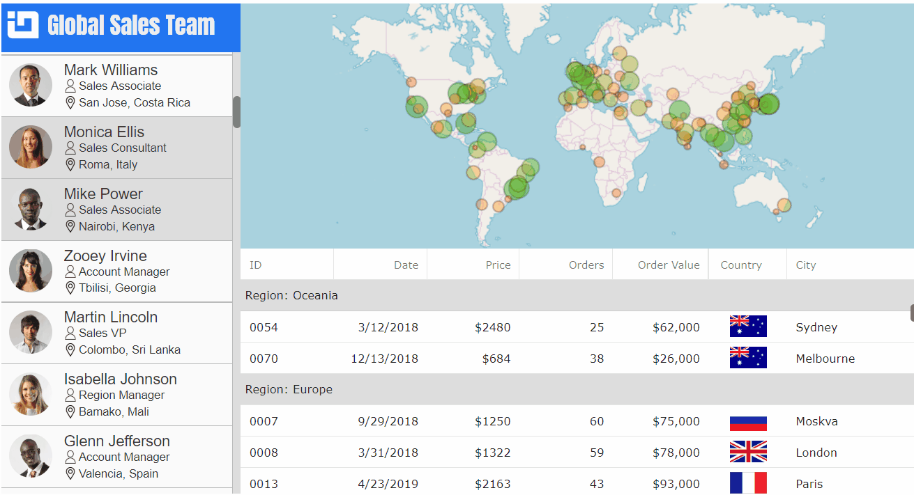
Note that the above animation does not represent actual app, where the map and grid components are updated very fast with new data for selected person in sales team.
Master-Detail view design is a great data visualization pattern for presenting large and complex data sets. As the name suggests, Master-Detail design consists of two views: master view and detail view. The master view is usually a selectable list of items such as customers, team members, products. The detail view displays data for the currently selected item in the master view.
Master-View
The master view is built using standard div, span, img, and label components.

However, first we need to generate data source for our application and create an array of items to display in the master view.
import DataUtil from"../data/DataUtil";

// declaring fields in a class:
public salesPeople: any[];
public salesData: any[];
public salesList: JSX.Element[] = [];

// generating data and items:
constructor(props: any) {
    super(props);
    this.salesPeople = DataUtil.getEmployees(100);
    this.salesList = [];
    for (let i = 0; i < this.salesPeople.length; i++) {
        const person =  this.salesPeople[i];
        this.salesList.push(this.renderItem(person, i));
    }
}
Next, we can create the master view and render each item of sales list as it is demonstrated below.
<divclassName="masterView">
    <divclassName="masterHeader">
        <imgsrc={this.getHeaderIcon()}/>
        <label>World Sales Team</label>
    </div>
    <divclassName="masterList">
        <div>{this.salesList}</div>
    </div>
</div>
Detail-View
The detail view contains of a map and a grid components that are part of Ignite Ui for React and you can try them for free.
<divclassName="detailView">
    <divclassName="map"></div>
    <divclassName="grid"></div>
</div>

The IgrGeographicMap allows you to display data that contains geographic locations from your data on geographic imagery maps.
<divclassName="detailView">
    <divclassName="map">
        <IgrGeographicMap
            ref={this.onMapRef}
            width="100%"
            height="100%"
            zoomable="true">
            <IgrGeographicProportionalSymbolSeries
            name="sales"
            radiusScale={this.sizeScale}
            fillScale={this.fillScale}
            fillMemberPath="OrderValue"
            radiusMemberPath="OrderValue"
            latitudeMemberPath="Lat"
            longitudeMemberPath="Lon"
            markerOutline="rgba(0,0,0,0.2)"
            markerType="Circle"
            tooltipTemplate={this.onSeriesTooltipCreate}  />
        </IgrGeographicMap>
    </div>
</div>

The IgrLiveGrid is a tabular React component that allows you to quickly bind and display your data with little coding or configuration. Features of the React data grid include filtering, sorting, templates, row selection, row grouping, row pinning and movable column.
<divclassName="detailView">
    <divclassName="grid">
        <IgrLiveGrid
            ref={this.onGridRef}
            height="100%"
            width="100%"
            rowHeight="35"
            headerHeight="35"
            autoGenerateColumns="false">
            <IgrTextColumnpropertyPath="ID"width="*>70"/>
            <IgrDateTimeColumnpropertyPath="OrderDate"
            headerText="Date"width="*>100"horizontalAlignment="right" />
            <IgrNumericColumnpropertyPath="OrderPrice"
            headerText="Price"width="*>90"positivePrefix="$"maxFractionDigits="0"/>
            <IgrNumericColumnpropertyPath="OrderCount"
            headerText="Orders"width="*>80"/>
            <IgrNumericColumnpropertyPath="OrderValue"
            headerText="Order Value"width="*>110"positivePrefix="$" />
            <IgrImageColumnpropertyPath="CountryFlag"
            headerText="Country"horizontalAlignment="center"width="90"/>
            <IgrTextColumnpropertyPath="City"width="*>150"/>
        </IgrLiveGrid>
    </div>
</div>
Binding Views
After creating all views, we can bind them by setting data source in a click event of the master list.
public salesData: any[];

constructor(props: any) {
    super(props);

    this.salesPeople = DataUtil.getEmployees(100);
    // defaulting to first person in the array of sales people
    this.salesData = this.salesPeople[0].Sales;
}

public onGridRef(grid: IgrLiveGrid) {
    this.grid = grid;
    this.grid.dataSource = this.salesData;
    this.grid.flush();
    this.grid.scrollToRowByIndex(0);
}

public onMapRef(map: IgrGeographicMap) {
    this.map = map;
    this.map.dataSource = this.salesData;
    this.map.zoomToGeographic({ left: -120, top: -30, width: 180, height: 90});
}

public onMasterItemClick(event: React.MouseEvent) {
    event.preventDefault();
    const newId = event.currentTarget.id;
    this.salesData = this.salesPeople[newId].Sales;

    this.map.dataSource = this.salesData;
    this.grid.dataSource = this.salesData;
    this.grid.flush();
    this.grid.scrollToRowByIndex(0);
}
Final Thoughts
The above code snippets show the most important elements of implementing a master-detail view in React application that visualizes locations of sales in React IgrGeographicMap component, and sales details in React IgrLiveGrid component.
You can download the full source code for this application from this GitHub repository. I hope you found this blog post interesting and got inspired to create your own master-detail application using the Ignite UI for React components.
Happy coding,
Martin
↧
Infragistics Launches Reveal Embedded Analytics Platform
Add beautiful data visualizations to your app with the Reveal embedded business intelligence tool.
(read more)![]()
↧
↧
Announcing Infragistics Ultimate 19.1 [Updated April 2019]
With today's launch, we are very excited to get our latest Ultimate 19.1 release into your hands. Ultimate 19.1 continues our key themes: giving you the best of breed UI controls & components for modern web development, the best Excel & Spreadsheet capabilities in the market for any platform, and continued investment in WPF & Windows Forms. This huge release has something for everyone.
I'll give you the highlights in this blog, with links at the end to more details blogs and live online demos.
The Complete Microsoft Excel Library Solution
With this release, we can safely say we offer the most complete Spreadsheet & Excel Library for all of the platforms you most care about. Angular, React, jQuery, WPF, and Windows Forms all have feature-parity in the features and functions of the Excel Library. Read, write, and create Excel documents, visualize data with charts and sparklines, apply conditional formatting, create tables with filtering and sorting, and use any of the 300+ formulas in your worksheets to expand the capability of your apps with our Microsoft Excel Library. With these capabilities, you can offer an entire Excel experience without needing Excel on the client machine!
Pixel-Perfect Excel Spreadsheet Experience
New to Angular in this release, Infragistics Spreadsheet allows an almost exact experience of Microsoft Excel – embedded in your own Angular, jQuery, WPF or Windows Forms apps. Built on top of our Excel Library with support for reading / writing Excel 97 and higher file formats (including XLXS), enjoy the UI interactions that your users have become accustomed to in Microsoft Excel. Capabilities include Conditional Formatting, Format Cells Dialog, Worksheet Filtering, Worksheet Sorting, Table Support (Editing, Copy / Paste, Tab Support, Total Row), List Data Validation, Cell Dropdown support and much, much more.
In the next few months, you'll see the same Spreadsheet control in React, so if you are a React developer looking for a robust React Spreadsheet solution, stay tuned!
Dashboards & Analytics with Charting in Excel
Visualize your app data in Excel or embed Charts in your XAML or Windows Forms spreadsheet control. With the Excel library, you can create charts in Excel based on data that exists in Worksheets, or you can create dynamic reports that include data plus data visualizations from any app—be it Angular, React, jQuery, WPF or Windows Forms. If you are just using the spreadsheet control in WPF or Windows Forms, you can create charts directly in the control with our new API. We'll be adding this capability to Angular and React soon!
Angular Grid, Spreadsheet, Charting & More
Last month we released a massive set of new features in Angular—but we aren't slowing down in 19.1. This release includes the much anticipated Spreadsheet Control, with over 25 interactive features including all of the formatting and formula capabilities from the Excel library.
Along with Angular Spreadsheet, we are shipping a massive number of new Angular charts with over 60 new Chart types and new Series types, which gives our market-leading Angular Chart 100% feature parity with the core series types that we ship in WPF, Windows Forms, React & jQuery. This release includes these Series types:
- Category Series
- Financial Series
- Polar Series
- Radial Series
- Range Series
- Scatter Area Series
- Scatter Contour
- Scatter Bubble Series
- Scatter Marker Series
- Scatter Shape Series
- Stack / Stacked 100
Along with last month's Angular release of the new Angular Hierarchical Grid in Angular, and one of the best Excel Style Filtering experiences in any grid I've ever seen, we're putting a ton of amazing native Angular capability into your hands.
React Grid Features & Geospatial Maps
React continues to get a ton investment. We've shipped 2 major releases in the last 4 months, and this release continues to impress with new React Grid features, new Charts and a new Geospatial Map control.
React Chart is now at the same feature parity level as all of our other platforms. There is over 60 new Chart types and new Series types, so it is the same story as Angular Chart—100% feature parity with the core series types that we ship in WPF, Windows Forms & jQuery.
The new React Map control has all of the benefits you've enjoyed in the WPF & jQuery map control, It provides support for all major series types, including ESRI Shape File, multiple Map Tile providers, and the High-Density Series which can handle millions of data points plotted over a geospatial map.
.NET Core 3 Support + Visual Studio 2019
With 19.1, we are shipping full support for the Preview Releases of .NET Core 3 and the RTM version of Visual Studio 2019. Arguably the biggest release of .NET since its inception, .NET Core 3 brings a huge improvement in what developers can achieve with a smaller, lighter-weight .NET Framework. Modernize your desktop applications with .NET Core 3 and gain better performance, work with the latest .NET Core CLI tools and SDK-style projects in Visual Studio, code against the latest C# 8 language features, take advantage of XAML islands, provide side-by-side deployments, and more.
As Microsoft continues to improve .NET Core 3 on their march towards GA (General Availability) / RTM in the fall, we'll continue to test and address issues with their betas and our controls to ensure your path to .NET Core 3 is seamless.
Indigo.Design Professional
This year, you can expect a lot of excitement in both major updates and major new features in Indigo.Design. On top of this release, we have releases planned for early summer, early fall and late fall—all with amazing new capabilities that are 100% based on the volumes of feedback we've received in the last several quarters since we launched Indigo.Design. For 19.1, we are shipping an update to the On-Premise version of Indigo.Design, which includes all of the Image-Based Prototyping features, as well as updates to the Sketch plugins for Cloud Sync and Publish. If you are on On-Premise customer, or interested in On-Premise Indigo.Design Professional, this release gets you all of the core cloud features for local deployment within your firewall.
Wrap Up
Ultimate 19.1 is a big release, with feature value driven by all of your feedback. Try it today or get specific details on each platform's features and to check out the samples, here is a summary of links that will get you started.
Angular Blog: What's New in Ignite UI for Angular
React Blog: What's New in Ignite UI for React
Blog: What's New in Ultimate UI for WPF
Blog: Ultimate UI for Windows Forms
Blog: What's new in Indigo.Design
As usual, we need to hear what you have to say, so please shoot me an email at jasonb@infragistics.com and let me know how we can help you to continue to deliver value to your customers with Infragistics.
Thanks and Happy Coding!
Jason
↧
Host Sketch Prototypes on Private Server with Usability Testing
Indigo.Design lets you sync Sketch prototypes and run unmoderated usability testing securely on your own private server.(read more)![]()
↧
Ignite UI for Angular 7.3.0 Release
With the 7.3.0 we release we are introducing some new and interesting features that will allow our user to expand the usability of the igxGrid. The two major things we are introducing are the Multi Row Layout and the Row Dragging feature.
Multi Row Layout
Multi-row layouts allow developers to create intricate cell arrangements within the same row by defining a template layout that is applied to header and body cells. This provides flexibility of the arrangement and makes it possible to create responsive web apps where grids would adapt and avoid horizontalcoo scrolling when the available space becomes too narrow
The igxGridComponent now supports Multi Row Layout It which can be configured with the newly added IgxColumnLayoutComponent and the columns in it. IgxColumnComponent now expose four new fields to determine the size and the location of the field into the layout:
rowStartcolStartrowEndcolEnd
![]()

Row Dragging
The Drag and Drop allows users to Row drag and pass the data of a grid record on to another surface, which has been configured to process/render this data in a particular way. This is a very useful feature in cases when we have two or more Grids and we won’t to move the row date from one grid to the other. For more details on the feature visit the WIKI pages n Github or the samples on the website (Link)

Additional Enhancements
There are also a couple of new enhancements to our already released features like igxTreeGird now support load children on demand and haschildrenkeys input properties.
The IgxListComponent now provides the ability to choose a display density from a predefined set of options: compact, cosy and comfortable (default one). It can be set by using the displayDensity input of the list.
The igxButton now provides the ability to choose a display density from a predefined set of options: compact, cosy and comfortable (default one). It can be set by using the displayDensity input of the button directive.
The Excel Style Filter dialog and its sub-dialogs now have a display density based on the displayDensityinput of their respective grid; the igxDropDown now supports virtualized items.
Check out our RoadMap and give a star to our Github repo to stay tuned.
↧