Quantcast
Channel: Infragistics Community
Viewing all 2460 articles
Browse latest View live

Developer Humor: Grandpa's Technology

$
0
0

Take a peek at this week's Developer Humor... Grandpa's Technology!

Developer Humor: Grandpa's Technology by Infragistics WinForms Controls

Embed image on your site by copying code below:

<a href="http://www.infragistics.com/community/blogs/marketing/archive/2013/09/25/developer-humor-grandpa-39-s-technology.aspx"><img src="http://www.infragistics.com/community/cfs-filesystemfile.ashx/__key/CommunityServer.Blogs.Components.WeblogFiles/marketing/4666.Grandpas_5F00_Technology_5F00_01.jpg" alt="Software Developer Comics" border="0" /></a></code></p>
<br />
<p></p>
<p><a href="http://www.infragistics.com/about-us/career-opportunities/">Software Developer</a> comics by Infragistics <a href="http://www.infragistics.com/products/windows-forms/">WinForms Controls</a> Team</p>

First open presentation about Indigo Studio v.2 in Sofia, Bulgaria - Event Recap

$
0
0

In Sofia, Bulgaria was organized a public presentation about Indigo Studio v.2. This was the first such presentation of the innovative product for UX in Central and Eastern Europe. The event was held on Wednesday, September 26th at Infragistics Bulgaria Office, 110B, Simeonovsko Shosse Bul., Sofia, Bulgaria.

I had the honor to present Indigo Studio as a lecturer.


Presentations was titled "Rapid Prototyping for Developers with Indigo Studio v.2" and presented the advantages of the product, which can benefit in particular for software developers.


Lecture presented Indigo Studio as a tool for creating storyboards, wireframes, prototyping and new features were demonstrated in version 2 like new touch gestures, screen-to-screen transitions, interactive iOS controls, export to PDF etc. .  I hope this is a good start to promote this product in the region.


Pictures from the Indigo Studio event in Sofia


You can check some awesome prototypes like this one here:

As always, you can follow us on Twitter @mihailmateev and @Infragistics and stay in touch on Facebook,Google+andLinkedIn!


Fundamentals of Python: Function and Variable Types (Week 3)

$
0
0

This week’s worth of lessons is super intuitive and really sets the tone for the rest of the class. As you’ll see, the speed of new information as well as the course structure meld together in a pretty harmonious way and let the student actually grasp concepts before moving on. While some of these are review if you’ve been following me since my last class, as always I enjoy a good subject matter comparison between languages. :)

If you need access to Week 1 or Week 2, here they are!

Lesson 1: Functions, Variables & The Call Stack

The call stack holds what are known as “stack frames” which basically represent the order in which different actions will be executed by the computer.

This is important to note when answering the question of what variable to use when there is a program with multiple instances of the same variable. The correct answer is the variable that’s in the stack frame, or as I like to call it, the active variable. Regarding assignment states and variables, if a variable does not exist in the current stack frame, Python will create the variable so it can be used. :)

HOWEVER!

When a function exists, the frame for the function is erased and control passes back to the statement containing the function call. The return of the function call is whatever was returned by the function itself.

Lesson 2: type bool

Boolean values represent the binary concept of true/false. This lesson goes over, in a pretty comprehensive way, what they are and how to use them…

Boolean Operation

Symbol

Less Than

Greater Than

Equal To

==

Greater Than or Equal To

>=

Less Than or Equal To

<=

Not Equal To

!=


Additionally, there are logical operators, which you can use to create longer, more specific selections using Boolean expressions as their operands.

Logical Operation

Symbol

Not:

not

And:

and

Or:

or


If you’re using the logical operator “and,” both booleans must evaluate to the same result in order to be true.

If you’re using the logical operator “or,” at least one of the booleans must evaluate to true in order to be true.

Additionally, when using the logical operators that are evaluating naturally, the order of precedence is simply left to right.

Lesson 3: Converting Between int, str and float

Let’s just cover this visually, because I think it actually is way more intuitive that way than through text.

Convert an into into a str:

str(3) -> ‘3’

Convert a str into an int:

int(‘3’ * 5) -> 33333

Convert a str into an int into a str:

str(int(‘3’ * 5)) -> ‘33333’

Convert a float into a str:

str(4.6) -> ‘4.6’

Convert a str into a float:

float(‘456’) -> 456.0

Convert a str into an int:

int(‘hello’) -> ValueError (AKA Juuuuuuuuuuuust kidding you can’t do that! The conversion of str to into or float only works when numbers are the only items in the string!)

Lesson 4: Import: Using Non Built-In Functions

Python has hundreds of functions that are pre-built and at the disposal of the developer; however, you have to import them to be able to use them!

In Python, the items that you import are called modules. A module is a file containing function definitions and other statements. A Python file defines a module, for example, triangle.py defines the module ‘triangle.’

In order to import a module, you would use the following statement:

import module_name

In order to access a function that is housed within a module, you would use the following statement:

module_name.function_name

Lesson 5: if Statements

if expression:
    statement

The above is the simplest form of an if statement, which is basically a way to conditionally break up your program. Here’s an example using this simile form:

if time1 == time2:
   return “same time”

If a function ends without a return statement being executed, it will automatically return None.

If your conditional if statement has multiple conditions or items you want to account for, you have several options!

Option number 1 is “elif.” Elif works the same way as “if,” but it cannot exist without an if statement before it. You can have any amount of elifs to accompany your if, including 0.

Option number 2 is “else.” Like with elif, else must come after an if, but it can also come after all of your elifs as well. Clearly, this means it has to be the last item in any sequence of an if statement, but this makes sense because else simply encompasses any cases you haven’t specifically accounted for in your ifs or elifs.

Lesson 6: No if Required!

This lesson addresses the concept of… when you might not need to use an if statement! When is that? If you are to write an if with a Boolean, of course the else will be false! It’s the only other option.

For example… you could write:

if num % 2 == 0:
  return true
else:
   return false

OR!

You could write:

return num % 2==0

These two statements represent the same process; however, the second one is cleaner, and one could even say, optimized. J

Lesson 7: Structuring if Statements

It’s super easy to nest if statements, so you can set up a conditional tree and then have sub-conditions within any level. That’s all you need to know from here! A series of if, elif, else statements can be housed WITHIN a parent if, elif, or else.

Week 3 Summary

Week 3 was super intuitive and really nailed home the idea of if statements and how to transition between different types of data. There’s not much else to say really, except let’s get excited for Week 4!

Questions/Comments?

Feel free to comment here on my blog, or find me on Twitter @DokiDara.

By Dara Monasch

Tune In to the .NET Rocks Podcast

$
0
0

Microsoft's .NET platform is an important aspect of the Windows operating system, providing key functionality for common applications that run on the OS. According to Microsoft, .NET offers developers a steady programming model for creating highly visual user experiences and secure communication-based apps.

Those looking to learn more about .NET should consider listening to the weekly .NET Rocks podcast,hosted by Carl Franklin and Richard Campbell. The shows are geared toward both seasoned developers and those without extensive development backgrounds, and the podcast can be downloaded and listened to on portable media players.

Some of the previous podcasts include shows focused on topics such as Silverlight, Windows 8, cloud computing, automation deployment, big data and TypeScript, among many others. Upcoming podcasts include Instrumenting Production with Bob Uva, the show's 900th episode, Using Azure Blob Storage for Continuous Delivery with Guy Starbuck, NodeBots, ‘RobotsConf’ with Chris Williams, and Wireframing UIs the Right Way with Russ Unger.

Channeling that Knowledge into Creativity

After listening to the podcast enough, chances are you‘re going to want to channel all that knowledge into doing something awesome. Developers interested in creating .NET applications should consider solutions such as Infragistics' .NET Controls Suite, all of which is available for a free 30 day trial. These options allow users to create apps for any .NET platform, as well as hybrid-based HTML5 apps. With these tools, devs can produce highly visual apps that include grids and charts to support their businesses.

These solutions also support the latest Windows operating system, which has become quite touch-based. Today, more employees are using smartphones and tablets to access work-related content anywhere, regardless of physical location, through the Internet. .NET controls allow developers to create touch-based apps for the Windows platform without having extensive programming backgrounds or investing in complex tools.

For more details on the .NET platform and other trends throughout the programming world, tune in to the .NET Rocks podcast. 

iOS - Objective-C - Filtering a NSArray using NSPredicate

$
0
0
In this post, i'll walk you through how to filter an NSArray using NSPredicates. The first thing you'll need to decide is if you're filtering a number or a string. For strings, you can use any of the following filters: (NOTE: must be all caps) BEGINSWITH ENDSWITH LIKE MATCHES CONTAINS For numbers, you can use: != > >= < == Now that you know what kind of data you're going to filter on, we can build our predicate. Lets first assume we're filtering an array of strings: NSArray...(read more)

Book App – Persisting with NSCoding and Introducing IGGridView (Xamarin.iOS-Monotouch)

$
0
0

So for V0.2 we made some changes on how the application works before new development.  For the delegates the code was changed to use events to report out various results.   These can be seen in SimpleCaptureMetadataOutputObjectsDelegate and CoverUrlConnectionDelegate.   Aside from that, the project was restructured slightly but that is just a cosmetic change.

Onto the new development.


Persistence of DataModel

The first version of the app was just a scanner with a web look up and that was fine, but to make the application more useful we want to persist the information we get back.   So the main storage data object (Book.cs) has been modified to implement the NSCoding methods.  This was done in a manner consistent with an earlier post on NSCoding .

[Export("initWithCoder:")]
public Book (NSCoder coder)
{
   NSString isbn = (NSString)coder.DecodeObject (@"isbn");
   if (isbn != null)
   {
       this.ISBN = isbn.ToString ();
   } 
}

public override void EncodeTo (NSCoder coder)
{
   if (this.ISBN != null)
   {
      coder.Encode( new NSString (this.ISBN), @"isbn");
   }   
}

The code will ultimately be run on iOS so if we want to use strings in Xamarin.iOS, we need to wrap the string primitive in an NSString object for the persistence round trip.

With this interface / prototype implemented, we can use NSKeyedArchiver and NSKeyedUnarchiver to persist our underlying collection to the device.


Introduction of IGGridView 

Now that we can build data, we need a way to show it. So the project also adds the IGGridView, which is located in the IG.dll. (Download Trial Installer) We add the IGGridView and add columns to show the text and the image of the data object.

isbnColumn.HeaderText = "ISBN";
isbnColumn.Width = IGColumnWidth.CreateNumericColumnWidth(200);
_helper.ColumnDefinitions.Add (isbnColumn);

IGGridViewImageColumnDefinition imageColumn = new IGGridViewImageColumnDefinition ("CoverImage",IGGridViewImageColumnDefinitionPropertyType.IGGridViewImageColumnDefinitionPropertyTypeImage);
imageColumn.Width = IGColumnWidth.CreateNumericColumnWidth(200);
_helper.ColumnDefinitions.Add (imageColumn);

When a book is scanned the image and data is saved on the device. The IGGridView comes into view, it will load the data from the device. Hmm..it works but the data is a little thin. We could also work on the UI a bit to make the book display better. I also think it would be nice if all my devices shared the data, so I could scan with any iOS device and see the results on another.

So I think the next iteration would try to include:

1) A better UI. The one I have now is utilitarian, fine for debugging but can be nicer.

2) Sharing data between devices via cloud storage

3) Maybe I can find more data to make the data more substantial.

So please download the in process project.(Xamarin.iOS / C#)

Articles in this series

1) Using the iOS7 BarCode Scanner - Book App (Xamarin.iOS-Monotouch)

2) Book App – Persisting with NSCoding and Introducing IGGridView (Xamarin.iOS-Monotouch)

By Darrell Kress

How to build XAML Doughnut Chart

$
0
0

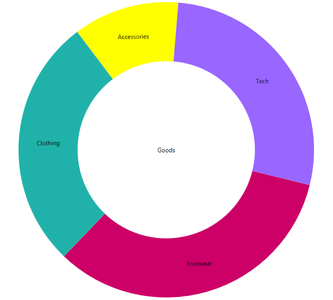
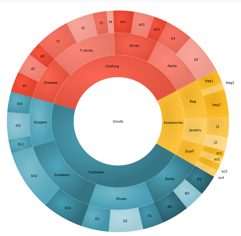
The Infragistics packages for WPF and Silverlight contain a lot of diverse charts for data visualization. The control that we are going to look at is The Doughnut Chart. This chart supports one or more rings surrounding a blank center. It can be customized by controlling the slices labels and colors or by configuring the inner radius. In this blog you can learn how to add this control to your application and how to create a custom hierarchical chart by using multiple rings.

XAML Doughnut Chart with custom brushes

Adding the Doughnut Chart

Generally, when you create your WPF project the first thing you need to do is to add the references. There is an easy way to do that:

  1. Go to the toolbox. There you will see the NetAdvantage WPF and Shared XAML controls.
  2. Drag and drop the “XamDoughnutChart”.

When you do those steps you will see that Visual Studio automatically adds the required Infragistics references.


When you dragged “XamDoughnutChart”, you actually created the needed tag to host our chart. The next step is to include the following code:

  1. <ig:XamDoughnutChart x:Name="slice">
  2.     <ig:XamDoughnutChart.Series>
  3.         <ig:RingSeries
  4.             LabelMemberPath="Label"
  5.             ValueMemberPath="productionShare"
  6.             LabelsPosition="BestFit"
  7.             ItemsSource="{Binding Mode=OneWay, Source={StaticResource source}}">
  8.         </ig:RingSeries>
  9.     </ig:XamDoughnutChart.Series>
  10. </ig:XamDoughnutChart>

The data source for the items is generated in the cs file of the page as follows:

  1. publicclassCategory
  2. {
  3.      publicstring Label { get; set; }
  4.      publicdouble productionShare { get; set; }
  5. }
  6.  
  7. publicclassHierarchalDataCollection : List<Category>
  8. {
  9.      public HierarchalDataCollection()
  10.      {
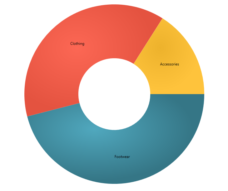
  11.          this.Add(newCategory { Label = "Footwear", productionShare = 46 });
  12.          this.Add(newCategory { Label = "Clothing", productionShare = 38 });
  13.          this.Add(newCategory { Label = "Accessories", productionShare = 16 });
  14.      }
  15. }


Basic XAML doughnut chart


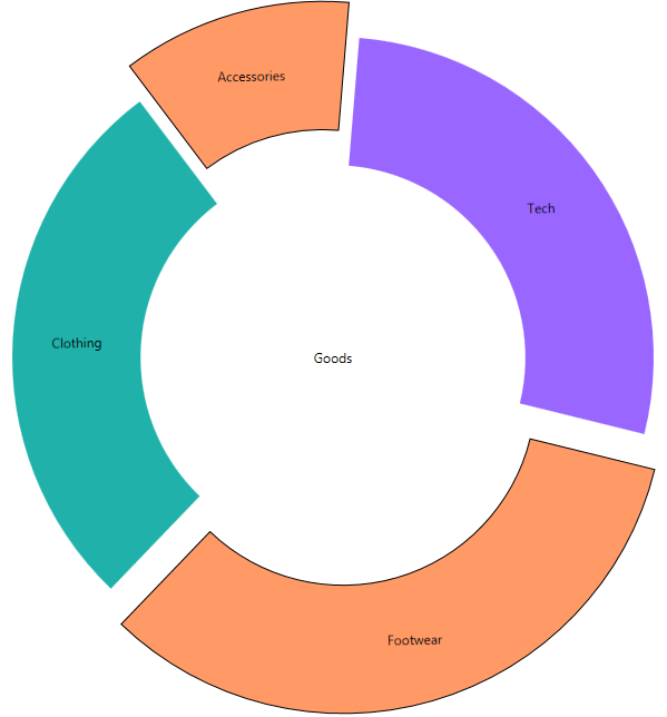
Basically those are the steps to create a Doughnut Chart. Of course it has many options like legend, brush, slice Select and Slice Explode, which will make your chart even more attractive. More about the options you can find in the documentation. I will just give you a hint how to add a particular option. For example if you want to be able to select a slice and thus make it explode and change its style add the AllowSliceExplosion and AllowSliceSelection options and set their values to true. Then create a slice click event like that:

XAML:

  1. AllowSliceExplosion="True"
  2. AllowSliceSelection="True"
  3. SliceClick="slice_SliceClick"

C#:

  1. privatevoid slice_SliceClick(object sender, Infragistics.Controls.Charts.SliceClickEventArgs e)
  2. {
  3.     e.IsSelected = !e.IsSelected;
  4.     e.IsExploded = !e.IsExploded;
  5. }


Exploded XAML doughnut chart


Custom hierarchical  chart

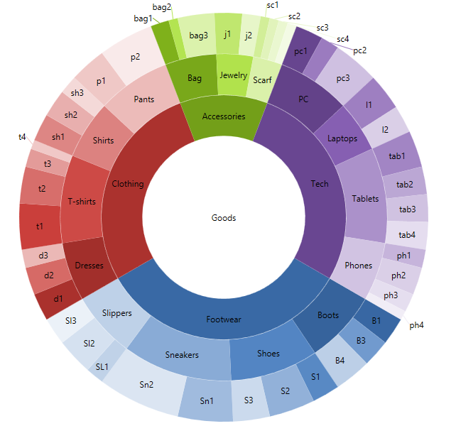
When you need to visualize hierarchical data, you can use the multiple ring visualization of the chart. We are going to create three rings doughnut chart, which will display the main categories broken down into subcategories.  For that purpose we are going to create three series and define our data source like this:

XAML :

  1. <ig:XamDoughnutChart.Series>
  2.     <ig:RingSeries
  3.                                         StartAngle="30"
  4.         LabelMemberPath="Label"
  5.         ValueMemberPath="productionShare"
  6.         LabelsPosition="BestFit"
  7.         ItemsSource="{Binding Mode=OneWay, Source={StaticResource source}}"
  8.                             Loaded="RingSeries_Loaded">
  9.     </ig:RingSeries>
  10.     <ig:RingSeries
  11.                                         StartAngle="30"
  12.         LabelMemberPath="Label"
  13.         ValueMemberPath="productionShare"
  14.         LabelsPosition="BestFit"
  15.         Loaded="RingSeries_Loaded"
  16.                             OthersCategoryThreshold="0" >
  17.     </ig:RingSeries>
  18.     <ig:RingSeries
  19.                                         StartAngle="30"
  20.         LabelMemberPath="Label"
  21.         ValueMemberPath="productionShare"
  22.         LabelsPosition="BestFit"
  23.         OthersCategoryThreshold="0">
  24.     </ig:RingSeries>
  25. </ig:XamDoughnutChart.Series>

C# :

  1. publicclassHierarchalDataCollection : List<Category>
  2.     {
  3.         public HierarchalDataCollection()
  4.         {
  5.             
  6.             this.Add(newCategory { Label = "Footwear"});
  7.             this.Add(newCategory { Label = "Clothing"});
  8.             this.Add(newCategory { Label = "Accessories"});
  9.             this.Add(newCategory { Label = "Tech" });
  10.  
  11.             
  12.             this[0].Children.Add(newCategory { Label = "Boots" });
  13.             this[0].Children.Add(newCategory { Label = "Shoes" });
  14.             this[0].Children.Add(newCategory { Label = "Sneakers" });
  15.             this[0].Children.Add(newCategory { Label = "Slippers" });
  16.  
  17.             this[1].Children.Add(newCategory { Label = "Dresses" });
  18.             this[1].Children.Add(newCategory { Label = "T-shirts" });
  19.             this[1].Children.Add(newCategory { Label = "Shirts" });
  20.             this[1].Children.Add(newCategory { Label = "Pants" });
  21.  
  22.             this[2].Children.Add(newCategory { Label = "Bag" });
  23.             this[2].Children.Add(newCategory { Label = "Jewelry" });
  24.             this[2].Children.Add(newCategory { Label = "Scarf" });
  25.  
  26.             this[3].Children.Add(newCategory { Label = "PC"});
  27.             this[3].Children.Add(newCategory { Label = "Laptops"});
  28.             this[3].Children.Add(newCategory { Label = "Tablets"});
  29.             this[3].Children.Add(newCategory { Label = "Phones"});
  30.  
  31.             
  32.             this[0].Children[0].Children.Add(newCategory { Label = "B1", productionShare = 3 });
  33.             this[0].Children[0].Children.Add(newCategory { Label = "B3", productionShare = 3 });
  34.             this[0].Children[0].Children.Add(newCategory { Label = "B4", productionShare = 4 });
  35.  
  36.             this[0].Children[1].Children.Add(newCategory { Label = "S1", productionShare = 3 });
  37.             this[0].Children[1].Children.Add(newCategory { Label = "S2", productionShare = 5 });
  38.             this[0].Children[1].Children.Add(newCategory { Label = "S3", productionShare = 4 });
  39.  
  40.             this[0].Children[2].Children.Add(newCategory { Label = "Sn1", productionShare = 6 });
  41.             this[0].Children[2].Children.Add(newCategory { Label = "Sn2", productionShare = 9 });
  42.  
  43.             this[0].Children[3].Children.Add(newCategory { Label = "SL1", productionShare = 2 });
  44.             this[0].Children[3].Children.Add(newCategory { Label = "Sl2", productionShare = 4 });
  45.             this[0].Children[3].Children.Add(newCategory { Label = "Sl3", productionShare = 3 });
  46.  
  47.            
  48.             this[1].Children[0].Children.Add(newCategory { Label = "d1", productionShare = 3 });
  49.             this[1].Children[0].Children.Add(newCategory { Label = "d2", productionShare = 3 });
  50.             this[1].Children[0].Children.Add(newCategory { Label = "d3", productionShare = 2 });
  51.  
  52.             this[1].Children[1].Children.Add(newCategory { Label = "t1", productionShare = 5 });
  53.             this[1].Children[1].Children.Add(newCategory { Label = "t2", productionShare = 4 });
  54.             this[1].Children[1].Children.Add(newCategory { Label = "t3", productionShare = 2 });
  55.             this[1].Children[1].Children.Add(newCategory { Label = "t4", productionShare = 1 });
  56.  
  57.             this[1].Children[2].Children.Add(newCategory { Label = "sh1", productionShare = 3 });
  58.             this[1].Children[2].Children.Add(newCategory { Label = "sh2", productionShare = 3 });
  59.             this[1].Children[2].Children.Add(newCategory { Label = "sh3", productionShare = 2 });
  60.  
  61.             this[1].Children[3].Children.Add(newCategory { Label = "p1", productionShare = 4 });
  62.             this[1].Children[3].Children.Add(newCategory { Label = "p2", productionShare = 6 });
  63.  
  64.             
  65.             this[2].Children[0].Children.Add(newCategory { Label = "bag1", productionShare = 2 });
  66.             this[2].Children[0].Children.Add(newCategory { Label = "bag2", productionShare = 1 });
  67.             this[2].Children[0].Children.Add(newCategory { Label = "bag3", productionShare = 4 });
  68.  
  69.             this[2].Children[1].Children.Add(newCategory { Label = "j1", productionShare = 3 });
  70.             this[2].Children[1].Children.Add(newCategory { Label = "j2", productionShare = 2 });
  71.  
  72.             this[2].Children[2].Children.Add(newCategory { Label = "sc1", productionShare = 1 });
  73.             this[2].Children[2].Children.Add(newCategory { Label = "sc2", productionShare = 1 });
  74.             this[2].Children[2].Children.Add(newCategory { Label = "sc3", productionShare = 1 });
  75.             this[2].Children[2].Children.Add(newCategory { Label = "sc4", productionShare = 1 });
  76.  
  77.             
  78.             this[3].Children[0].Children.Add(newCategory { Label = "pc1", productionShare = 3 });
  79.             this[3].Children[0].Children.Add(newCategory { Label = "pc2", productionShare = 2 });
  80.             this[3].Children[0].Children.Add(newCategory { Label = "pc3", productionShare = 5 });
  81.  
  82.             this[3].Children[1].Children.Add(newCategory { Label = "l1", productionShare = 4 });
  83.             this[3].Children[1].Children.Add(newCategory { Label = "l2", productionShare = 3 });
  84.  
  85.             this[3].Children[2].Children.Add(newCategory { Label = "tab1", productionShare = 4 });
  86.             this[3].Children[2].Children.Add(newCategory { Label = "tab2", productionShare = 3 });
  87.             this[3].Children[2].Children.Add(newCategory { Label = "tab3", productionShare = 3 });
  88.             this[3].Children[2].Children.Add(newCategory { Label = "tab4", productionShare = 3 });
  89.  
  90.             this[3].Children[3].Children.Add(newCategory { Label = "ph1", productionShare = 2 });
  91.             this[3].Children[3].Children.Add(newCategory { Label = "ph2", productionShare = 3 });
  92.             this[3].Children[3].Children.Add(newCategory { Label = "ph3", productionShare = 2 });
  93.             this[3].Children[3].Children.Add(newCategory { Label = "ph4", productionShare = 1 });
  94.         }
  95.     }


Now we have all of the data that we want to visualize. As we are making it look hierarchical it would be nice if the different slices for every category have similar color. What we are going to do is take the basic brush from the innermost ring and lighten it with every step. In the following code you can see that first we figure out how many children does the ring have and then we create a collection of brushes that will be a perfect match for the children.

  1. privatevoid RingSeries_Loaded(object sender, RoutedEventArgs e)
  2. {
  3.     var ringSeries = (sender asRingSeries);
  4.     var count = ringSeries.Ring.ArcItems[0].SliceItems.Count();
  5.     var brushes = ringSeries.Brushes;
  6.     BrushCollection brushesMatch = newBrushCollection();
  7.  
  8.     for (var i = 0; i < count; i++)
  9.     {
  10.         var childrenCount = (ringSeries.ItemsSource asList<Category>)[i].Children.Count();
  11.         var child = (ringSeries.ItemsSource asList<Category>)[i].Children;
  12.  
  13.         var brush = brushes[i];
  14.  
  15.         for (var j = 0; j < childrenCount; j++)
  16.         {
  17.             double step = 1 / (double)childrenCount;
  18.             Random rand = newRandom();
  19.                 double val = (1 + j) * step - .3;
  20.  
  21.                 brushesMatch.Add(brush.GetLightened(val));
  22.         }
  23.     }
  24.  
  25.     ringSeries.Chart.Series[ringSeries.Ring.Index + 1].Brushes = brushesMatch;
  26. }


Custom Hierarchial Doughnut Chart

Depending on the data you are going to display, you can change the way the children are colored, for instance you can brush them in random  tint. No matter  what kind of brush you use- Solid, Radial or Linear Gradient the GetLightend extension method will handle it.

  1. privatevoid RingSeries_Loaded(object sender, RoutedEventArgs e)
  2. {
  3.     var ringSeries = (sender asRingSeries);
  4.     var count = ringSeries.Ring.ArcItems[0].SliceItems.Count();
  5.     var brushes = ringSeries.Brushes;
  6.     BrushCollection brushesMatch = newBrushCollection();
  7.  
  8.     for (var i = 0; i < count; i++)
  9.     {
  10.         var childrenCount = (ringSeries.ItemsSource asList<Category>)[i].Children.Count();
  11.         var child = (ringSeries.ItemsSource asList<Category>)[i].Children;
  12.  
  13.         var brush = brushes[i];
  14.  
  15.         for (var j = 0; j < childrenCount; j++)
  16.         {
  17.             Random rand = newRandom();
  18.  
  19.             if (j % 2 == 0)
  20.             {
  21.                 double val = Math.Round((rand.NextDouble() / 4), 2);
  22.                 brushesMatch.Add(brush.GetLightened(-val));
  23.             }
  24.             else
  25.             {
  26.                 double val = Math.Round((rand.NextDouble() / 3), 2) + 0.2;
  27.                 brushesMatch.Add(brush.GetLightened(val));
  28.             }
  29.         }
  30.     }
  31.  
  32.     ringSeries.Chart.Series[ringSeries.Ring.Index + 1].Brushes = brushesMatch;
  33. }


Random lighten hierarchical doughnut chart


If you want to learn more about the doughnut chart you can check out the product’s page or read my blog:”The Ignite UI Doughnut Chart and its features”.


A WPF sample and Silverlight sample.

You can follow us on Twitter @Infragistics and stay in touch on Facebook, Google+ and LinkedIn!

Windows Azure Website issue with Portable class library

$
0
0

I was developing a website that had common logic held in a portable class library. However when I used Git deployment, the compilation on the Azure servers would fail with:
The reference assemblies for framework ".NETPortable,Version=v4.5,Profile=Profile78" were not found.

After much debugging it seems the issue is that the Azure build servers don’t have all the PCL profiles. As a shot term fix, you can go into your PCL properties, and remove support for Windows Phone 8. I changed my project to only support Windows 4.5 & Windows store, and this resolved the issue.

By David Burela


How to make an image gallery with Ignite UI Tile Manager–release 13.2

$
0
0

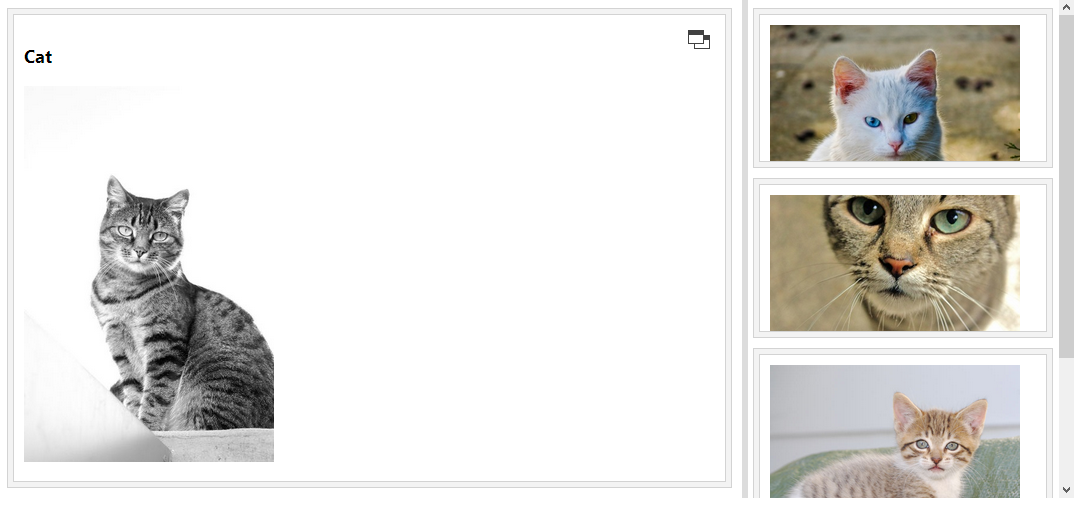
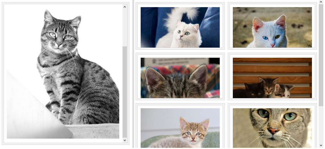
If you have read my previous blog about Infragistics’ Tile Manager control, you know that this layout control provides a user-friendly interface and allows you to rearrange your images the way you want. In this blog we are going to see what are the changes in the new release. In the last release this control was CTP, but now it is already RTM and it is fully functional. Basically this layout control displays data into tiles and every tile can represent different content depending on its state – minimized or maximized. The minimized state looks like this:

Tile Manager minimized style

When you select a particular picture it enlarge and the panel separates in two parts –a  left panel which displays the tile you have selected and a right panel which contains the other pictures. The right panel has a scrollbar which allows you to scroll the minimized tiles. Using the splitter bar between those panels you can resize both sides of the layout.

When it comes to  the code there are few basic steps you need to follow:

1. Create a div tag element to host your layout.

  1. <divid="dashboard"></div>

2. Add the control:

  1. $(function () {
  2.     $('#dashboard').igTileManager({
  3.         rightPanelTilesWidth: 300,
  4.         rightPanelTilesHeight: 160,                
  5.         marginLeft: 10,
  6.         marginTop: 10,
  7.         dataSource: dataSource,                
  8.         minimizedState:'<img src="${path}" />',
  9.         maximizedState:'<h3>${name}</h3><img src="${path}" />'
  10.     });
  11. });

3. The implementation of the data source and the file upload control stay the same as in the previous sample .The only change is the event handler function.

  1. function UpHand(evt,ui) {       
  2.     $.ajax({
  3.         type: "POST",
  4.         url: "@Url.Action("Image", "Home")",
  5.         data: {image: ui.filePath}
  6.     }).done(function (data) {
  7.         console.log(data);
  8.         dataSource.push(data);
  9.         $("#dashboard").igTileManager("option","dataSource",dataSource);
  10.     }
  11.     )};

That’s it! Now you have a beautiful layout for your app.  You can use the different options that the control offers, like animation duration to make your tiles change faster or use the column width and height to specify the height and width of each column in the container. If you need more information about how to add this control to your application read my previous blog or check out the documentation.


Tile Manager

Sample.


You can follow us on Twitter @Infragistics and stay in touch on Facebook, Google+ and LinkedIn!

SQLSaturday #199 Bulgaria Event Recap and Follow-up

$
0
0

After the first successful SQLSaturday # 152 in 2012  Infragistics was host and sponsor the conference in SQLSaturday #199   for the second time.

SQLSaturday #199 Bulgaria was held on 26 of October, 2013  at Infragistics Bulgaria office: 110 B, Simeonovsko Shosse Bul., Office Floors II and III


Sofia has a history of over 2,000 years


Infragistics Bulgaria Office

IG_5F00_Office_5F00_011_5F00_134F0E06[1]IG_5F00_Office_5F00_031_5F00_45D26B78[1]


What is SQL Saturday:

Infragistics as a company that develops solutions for data visualization and business solutions has many common points in with areas covered from the  conference: BI, Reporting, SQL Server related solutions

Our plan was to have:

  • More than 200 attendees
  • Up to 30 sessions in 5 Tracks
  • More than 15 speakers


Registration:


Keynote:


Volunteers from Infragistics


Sessions:


Sponsors:


Lunch:


SQLSaturday Raffle:


The actual statistics looks much better than SQLSaturday Bulgaria Team Expected


Our statistics:

  • 350 registrations.
  • 210 real attendees from 11 countries (USA, UK, Portugal, Poland, Holland, Belgium, Turkey, Ukraine, Russia, Bulgaria and Serbia).
  • 20 speakers from 10 different countries (USA, UK, Portugal, Poland, Holland, Belgium, Turkey, Ukraine, Russia and Bulgaria).
  • 30 sessions in 5 tracks


You can see more pictures from the conference here:

Feedbak in Twitter about SQLSaturday #199 Bulgaria


Some Twitter statistics  about SQLSaturday #Bulgaria 2013

Infragistics participation in the event:

The conference schedule is available here:

Now SQLSaturday Bulgaria Team is looking for appropriate dates for SQLSaturday Bulgaria 2014.

More information about SQLSaturday Bulgaria is available  on the website of the conference http://www.sqlsaturday.com/199SQL Saturday Bulgaria Facebook page and you can follow #sqlsat199 on Twitter.

Follow news from Infragistics for more information about new Infragistics events.

As always, you can follow us on Twitter @mihailmateev and @Infragistics and stay in touch on Facebook, Google+ andLinkedIn!


Warm Regards,
SQLSaturday Bulgaria Team


  Saturday

How to express your data using Ignite UI’s jQuery Linear Gauge control.

$
0
0

When it comes to Data Visualization, there is an abundance of controls in the Ignite UI package, which can help you provide the best user interface. Depending on the type of information you wish to display you can choose which chart to use. In the new release of Ignite UI there are few new controls and the one we are going to focus on in the current blog is the Linear Gauge. It supports a great amount of options and features , by the use of which you can customize this chart and adapt it to your data.

basic linear gauge


Basic Configuration

If you consider adding this control to a HTML page then you will need an element on which to instantiate the control.

HTML:

  1. <divid="linearGauge"></div>

After that include the following JS  code:

JS:

  1. $("#linearGauge").igLinearGauge({
  2.     width: "500px",
  3.     height: "80px",
  4.     minimumValue: "0",
  5.     maximumValue: "50",
  6.     value: "20"
  7. });


Example image:

linear gauge

If you are making a MVC project first add the Infragistics references and then use the following lines:

MVC:

  1. @(Html.Infragistics().LinearGauge()
  2.         .Width("100%")
  3.         .Height("80px")
  4.         .MinimumValue(0)
  5.         .MaximumValue(40)
  6.         .Value(22)
  7.         .Render()
  8. )

Those are the basic steps to configure the control. Of course you can add some options to the configured chart to make it correspond to your ideas. We are going to cover few of the options that Linear Gauge supports, but the entire list of features you can find in the API documentation.

Features

As we said the igLinearGauge control is an Ignite UI control which displays data in a form of linear gauge. It consists of visual elements like scale, needle, ranges and labels. All of those elements can be customized.

Scale

The scale is composed of tick marks and labels. The size and the positions of the tick marks are relative to the Graph area(a frame of reference for positioning the visual elements of the scale). There are quite a few options related to the scale. For example you can decide whether you want your scale to be inverted or not by setting the isScaleInverted option to ‘true’ or ‘false’. You can manipulate the position of the scale using the scaleStartExtend and scaleEndExtend , having in mind that both- start position and the end position of the scale are relative to the left edge of the graph area. To specify the value range you need to use the maximumValue and minimumValue options and assign them the values you wish. You can set a background color with the backingBrush option.

JS:

  1. minimumValue: "0",
  2. maximumValue: "50",
  3. scaleEndExtent: ".7",
  4. scaleStartExtent: ".2",
  5. isScaleInverted: "true",
  6. backingBrush: "#99CCFF"

MVC:

  1. .MinimumValue(0)
  2. .MaximumValue(50)         
  3. .BackingBrush("#99CCFF")
  4. .IsScaleInverted(true)
  5. .ScaleEndExtent(.7)
  6. .ScaleStartExtent(.2)

Example image:

inverted linear gauge


Ticks by themselves can be customized in few different ways. You can change the main ticks brush using the tickBrush option or you can change the mini ticks brush by the minorTickBrush option. You can also change the thickness of the main brushes by assinging them the desired value using the tickStrokeThickness option and respectively the mini brushes using minorTickStrokeThickness. The number of mini ticks that are displayed can be changed with minorTickCount.

JS:

  1. tickStrokeThickness: 4,
  2. minorTickBrush: "blue",
  3. tickBrush: "yellow",
  4. minorTickCount: 5

MVC:

  1. .TickStrokeThickness(4)
  2. .TickBrush("yellow")
  3. .MinorTickBrush("blue")
  4. .MinorTickCount(5)

Example image:

linear gauge with custom ticks


Needle

To configure the needle actually means to set its shape, size and position. The position is set by the value option and the size can be changed by needleStrokeThickness option. The shape can be: “needle”, “triangle”,”rectangle”, “trapezoid” and the option that is used is needleShape. If you want a specific shape you can set this option to “custom” and then by using the following options you can create your own needle.

JS:

  1. value: "20",
  2. needleShape: "custom",
  3. needleInnerExtent: 0.3,
  4. needleOuterExtent: 0.7,
  5. needleOuterPointExtent: 0.9,
  6. needleInnerPointExtent: 0.3,
  7. needleInnerPointWidth: 0,
  8. needleOuterPointWidth: 0.3,
  9. needleInnerBaseWidth: 0,
  10. needleOuterBaseWidth: 0.07,
  11. needleBrush:"lightpink"

MVC:

  1. .NeedleShape(LinearGraphNeedleShape.Custom)
  2. .NeedleBrush("lightpink")
  3. .NeedleInnerExtent(0.3)
  4. .NeedleOuterExtent(0.7)
  5. .NeedleOuterPointExtent(0.9)
  6. .NeedleInnerPointExtent(0.3)
  7. .NeedleInnerPointWidth(0)
  8. .NeedleOuterPointWidth(0.3)
  9. .NeedleInnerBaseWidth(0)
  10. .NeedleOuterBaseWidth(.07)

Example image:

custom needle


Ranges

The igLinearGauge control supports multiple relative ranges. Each range can be configured individually by specifying its starting and ending value , brush and border thickness.

JS:

  1.   ranges: [
  2. {
  3.     name: 'first',
  4.     startValue: -275,
  5.     endValue: -192.5,
  6.     outerStartExtent: .7,
  7.     outerEndExtent: .55
  8. },
  9. {
  10.     name: 'second',
  11.     startValue: -192.5,
  12.     endValue: -82.5,
  13.     outerStartExtent: .55,
  14.     outerEndExtent: .35
  15. },
  16. {
  17.     name: 'third',
  18.     startValue: - 82.5,
  19.     endValue: 0,
  20.     outerStartExtent: .35,
  21.     outerEndExtent: .25
  22. }
  23.   ]

Example picture:

temperature

You can achieve the sloping effect for scale by changing the outer extent options. The Linear Gauge can be either horizontal or vertical. This change can be made by orientation option:

JS:

  1. orientation: "vertical"

Example image:

vertical linear gauge


Labels

Changing the label color can be done by fontBrush option. If you want your label to be more than numbers you can use the following event and change the it.

  1. formatLabel: function (evt, ui) {
  2.     ui.label += 'Kilos';
  3. }


custom labels

The position of the labels can be modified with labelExtent . This option gets or sets the position on which to put the label as a value from 0 to 1, measured form the bottom of the scale.

custom scale


Tooltips are always useful and you can have tooltips when you hover the needle or when you hover a particular area of the chart. If you want to enable the tooltips – first set the showTooltip option to true and then use the needleToolTipTemplate or the rangeToolTipTemplate like this:

JS:

  1. <!--Needle ToolTip-->
  2. <scriptid="needleToolTip"type="text/x-jquery-tmpl">
  3.     <divclass='ui-lineargauge-needle-tooltip'>
  4.         <span>The needle is on : ${label}</span>
  5.     </div>
  6. </script>
  7.  
  8. <!--Range ToolTip-->
  9. <scriptid="rangeToolTip"type="text/x-jquery-tmpl">
  10.     <span>Range: ${item.startValue} to ${item.endValue}</span>
  11. </script>

  1. showToolTip: true,
  2. needleToolTipTemplate: "needleToolTip",
  3. rangeTooltipTemplate: "rangeToolTip",

Example image:


Conclusion

The igLinearGauge control gives you the ability to create attractive data presentations and it provides a simple and concise view of a primary value compared against a scale. This jQuery UI widget visualize data in the form of a linear gauge. Like a classic thermometer, these gauges can read out one or more values over a straight line measurement scale that you can orient vertically or horizontally.

Sample.

Coming soon a sample showing the dynamic use of this control.


You can follow us on Twitter @Infragistics and stay in touch on Facebook, Google+ and LinkedIn!

Designing for Any Device

$
0
0

What follows is a primer for the professional who has been tasked with creating a web site or application that may be accessed via multiple devices (aka responsive design). Whether you are a product manager, user experience professional, designer or developer, follow these guidelines and your users will thank you.

Regardless of the platform(s), you must:

  1. Understand the technical requirements
  2. Understand the business requirements
  3. Understand the user requirements

Note that user requirements are morethan a list of new features and functionality! User requirements must include an understanding of how users work and what they are trying to accomplish through their interaction with the artifact you are creating. These include a user’s goals, their known/stated requirements as well as their latent requirements (i.e., requirements that users don’t realize they have). User requirements also include any device-specific constraints (physical or technological) that impact a user’s ability to interact with your artifact.

Informational or Marketing Web Sites

If a responsive design is your goal and the artifact is a straightforward informational or marketing web site, it is sufficient to focus primarilyon 1 and 2 above. Here is why:

  • Informational and marketing web site designs are well understood and have become commoditized. Care to guess the percentage of web sites today that were created using WordPress? The site w3techs.com puts the number at 20.4% of all existing web sites. It remains the task of the UX or design professional to determine the information architecture (a well understood process) but the “problem” of overall site layout, usability and design for simple sites has been largely solved.
  • The goal of such sites is to make all content available under all device constraints (though the device-specific prioritization of such content remains an important task that is routinely ignored).
  • Most importantly, device-specific design and layout decisions are made programmatically in order to support the goal of “one design to fit them all”.

Complex Transactional Web Sites or Business Applications

If a responsive design is your goal and the artifact is a complex, transactional web site or business application, following #3 above becomes critical. In this case, there are multiple sets of task- and device-specific requirements that need to be implemented. Here is why:

  • A user’s expectations, goals and tasks will vary as they move between physical environments.
  • A user’s expectations, goals and tasks will vary as they move between physical devices.
  • It is almost certainly nota requirement of the user to have all content available under all device constraints. Device-specific prioritization of content is critical.
  • Specific designs are required to match specific user requirements on specific devices.

In other words, tasks and processes that may be well-supported in an office environment may be completely inappropriate if translated verbatim to a non-office environment, regardless of device. This isn’t simply a matter of knowing what content to hide or expose. Depending on situational requirements, certain tasks may be done differently, incompletely or not at all. Key to creating an application that alwayssupports users is understanding how and when a user’s requirements change.

Responsive design is a misnomer. It is a development technique. There are no such shortcuts to good design.


Kevin Richardsonhas been working in the area of user experience for over 20 years. With an advanced degree in Cognitive Psychology, he has experience across business verticals in the fields of research, evaluation, design and management of innovative, user-centered solutions.

Kevin’s experience includes web sites, portals and dashboards, enterprise software and custom business applications for medical, pharmaceutical, communications, entertainment, energy, transportation and government users.

On the weekends, you can find Kevin on his motorcycle, riding for Infragistics Racingat a number of different racetracks on the East coast.

IG Racing

Ember.js Basics - What is Ember?

$
0
0

According to the creators of the framework, Ember.js is “a framework for creating ambitious web applications”. What exactly do they mean? Also, with the many (, many, many) JavaScript frameworks that we have to choose from these days, why might I choose Ember? In this post, I’ll introduce Ember.js and some of the core concepts that backed its development. In future posts, I’ll dig in and show you how to build applications with the framework. For now, let’s look at what the framework is made of.

Guiding principles

Before looking at the details of any framework, it helps to understand the core concepts that drove the feature decisions in the first place. Perhaps the biggest factor in the creation of Ember was the belief that what makes the web so unique is the ability to bookmark and share URLs. The team felt that many JavaScript frameworks treated the URL as an afterthought (mostly by treating the concept of a router as an optional add-on). The Ember team also wanted to create an MVC framework that was closer in line with the desktop MVC framework mentality rather than taking a server-side MVC approach (like ASP.NET MVC or Ruby on Rails). So, Ember combines the productivity of a native UI framework while supporting shareable URLs. The following key concepts are what make up the framework from a high-level overview standpoint.

Core concepts

Naming conventions

Ember was written with convention over configuration in mind. This means that much of the framework relies on things being named consistently and in the manner that the framework expects. The naming conventions are summarized nicely here.

Templates

Templates are what describe the user interface in Ember.js. Ember templates are written using the Handlebars templating language which allows for expressions to be added to standard HTML markup within double curly braces: {{}}. Each template is backed by a model and supports databinding such that the template will auto-update when the model changes. The following features are supported in Ember’s Handlebars templates:

  • Plain HTML
  • Expressions - Allow model values to be substituted into the HTML. For instance, {{price}} would substitue the value of the price property on the model into the template where specified
  • Outlets - An outlet (specified by {{outlet}}) is a placeholder for another template. As the user moves around the application, different templates can be loaded into the outlet by the router.
  • Components - Custom HTML elements (technically, custom Handlebars helpers) that help clean up repetitive templates by enabling the creation of reusable controls

Example template:

Name: {{input type="text" value=name placeholder="Enter your name"}}

My name is {{name}} and I want to learn Ember!

Router

The router in Ember is what powers the shareable URLs that are so important to web applications. The router translates the URL of a request into a series of templates. For instance, when I visit /coffee within the application, Ember’s router will translate this to the CoffeeRoute which will set up the appropriate template backed by the appropriate model for that request. As the templates or models being shown to the user change, Ember’s router will automatically keep the URL in the browser up to date. This means that the user can share the URL at any point in the application lifecycle. Whenever someone clicks on this shared URL, they will see the same thing that the original user saw.

Example router:

App.Router.map(function() {
  this.resource('about');
  this.resource('coffees', function() {
    this.resource('coffee', {path: ':coffee_id'});
  });
});

App.CoffeesRoute = Ember.Route.extend({
  model: function () {
    return App.Coffee.find();
  }
});

Models

A model object is used to store persistent state within an Ember application. These model objects are what back the templates and provide data to be displayed within the HTML. Many applications will load these models through a REST API using Ember Data which will store the data in a server database, but Ember doesn’t limit you to just this choice. There are many adapters for Ember Data that allow you to choose the backend that works best for your project. You can even roll your own syncing using the Basic Adapter

Example model:

var attr = DS.attr;

App.Coffee = DS.Model.extend({
  name: attr('string'),
  price: attr('number'),
  ounces: attr('number'),
  description: attr('string'),
  roaster: attr('string'),
  acidity: attr('string'),
  body: attr('number')
});

Controllers

The controller is technically where the templates get their data from. Though optional, a controller will be created by Ember if not directly declared for a route. The controller “decorates” the model object. Properties specified on the controller can be accessed by a template as if they were declared on the model. Methods can be created within the controller that can be called using Handlebars helpers in the template. This enables things like button actions. In general, properties that do not need to be synced to the backend server but are necessary for template logic should be created in the controller. Ember supports the creation of ObjectControllers, which manages a single model object, and ArrayControllers which manage a list of model objects.

Example controller:

Todos.TodoController = Ember.ObjectController.extend({
  isCompleted: function(key, value){
    var model = this.get('model');

    if (value === undefined) {
      // property being used as a getter
      return model.get('isCompleted');
    } else {
      // property being used as a setter
      model.set('isCompleted', value);
      model.save();
      return value;
    }
  }.property('model.isCompleted')
});

Components

Components allow for the creation of reusable controls. The interface for the component is defined using Handlebars templates. The component also has a JavaScript class that is used to store state and handle user interaction. Components are placed into a template using a Handlebars helper with a name based off of the name of the component.

Example component:

App.GravatarImageComponent = Ember.Component.extend({
  size: 200,
  email: '',

  gravatarUrl: function() {
    var email = this.get('email'),
        size = this.get('size');

    return 'http://www.gravatar.com/avatar/' + hex_md5(email) + '?s=' + size;
  }.property('email', 'size')
});

Summary

Ember.js is a relatively young but growing framework. Though in the past it suffered from a lack of documentation and a difficult learning curve, that situation has improved dramatically. The Ember guides are very well-written and will help you get started with the framework in no time. I will also be posting more on how to develop with this framework over the coming weeks.

Contact

If you want to comment or reach out to me, the best place to do that is on Twitter @brentschooley. I can also be reached via email at bschooley@infragistics.com.

Creating a jQuery Music Player using the Ignite UI Linear Gauge.

$
0
0

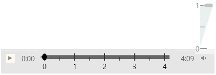
The Linear gauge widget can be very handy if you want to create a custom music player. In this blog you can see how to use this control to build the volume slider and the player slider while making a Music player like the one described in O'Reilly’s jQuery Cook Book. The example picture demonstrates the final result.

Step one

First of all, we need some HTML tags to host our player elements. We are going to use the HTML5 audio tag to hold our song.

  1. <audiosrc="/Music/song.mp3"></audio>

Then we are going to set the basics for the player. We will need a play and pause button, a volume button and of course the controls for progress and volume. You can use some CSS to style those elements

  1. <divclass="musicPlayer">
  2.     <divclass="buttons">
  3.         <aclass="playpause"href="#">
  4.             <spanclass="ui-icon ui-icon-play"></span>
  5.             <spanclass="ui-icon ui-icon-pause"></span>
  6.             </a>
  7.     </div>
  8.     <spanclass="currenttime"></span>
  9.     <divid="linearGauge"></div>
  10.     <spanclass="duration"></span>
  11.     <divclass="volume-container">
  12.         <divclass="volume">
  13.             <ahref="#">
  14.                 <spanclass="vol ui-icon ui-icon-volume-on"></span>
  15.             </a>
  16.         </div>
  17.     </div>
  18.     <divid="linearGauge1"></div>
  19. </div>

Step two

Now that we have the construction of our music player let’s make it functional. First you will need the following code to enable the play and the pause buttons.

  1. $('.buttons .playpause').click(function () {
  2.     var player = $(this).parents('.musicPlayer');
  3.     if (player.is('.paused')) {
  4.         $('.musicPlayer').removeClass('paused');
  5.         audioEl.play();
  6.     } else {
  7.         $('.musicPlayer').addClass('paused');
  8.         audioEl.pause();
  9.     }
  10.     returnfalse;
  11. }).hover(function () { $(this).addClass('ui-state-hover'); },
  12. function () { $(this).removeClass('ui-state-hover'); })
  13. .focus(function () { $(this).addClass('ui-state-focus'); })
  14. .blur(function () { $(this).removeClass('ui-state-focus'); });
  15.  
  16. $('.musicPlayer').addClass('paused');

For the slider we are using the linear gauge. As you will see from the following lines, the maximum value for the control depends on the song’s duration. That way the chart will always respond to the length of the currently playing song. We will make two ranges: one static and one dynamic, which will change with the progress of the song.


  1. var newduration = audioEl.duration / 60;
  2.  
  3. //linear gauge
  4.  
  5. $(".musicPlayer #linearGauge").igLinearGauge({
  6.     width: "65%",
  7.     height: "45px",
  8.     minimumValue: "0",
  9.     maximumValue: newduration,
  10.     minorTickCount: 1,
  11.     needleBreadth: 4,
  12.     interval: 1,
  13.     value: 1.2,
  14.     labelInterval: 1,
  15.     needleShape: "custom",
  16.     needleInnerBaseWidth: 0.1,
  17.     needleOuterBaseWidth: 0.1,
  18.     needleInnerExtent: .6,
  19.     needleOuterExtent: 0.1,
  20.     needleInnerPointExtent: .3,
  21.     needleInnerPointWidth: 0.3,
  22.     needleOuterPointExtent: 0.4,
  23.     needleOuterPointWidth: .3,
  24.     needleBrush: "black",
  25.     backingBrush: "#e6e6e6",
  26.     backingOutline: "#e6e6e6",
  27.     fontBrush: "black",
  28.     ranges: [
  29.     {
  30.         name: "666",
  31.         startValue: 0,
  32.         endValue: newduration,
  33.         brush: "#666",
  34.         innerStartExtent: .2,
  35.         innerEndExtent: .2,
  36.         outerStartExtent: 0.5,
  37.         outerEndExtent: 0.5
  38.     }, {
  39.         name: "track",
  40.         startValue: 0,
  41.         endValue: 0,
  42.         brush: "#19A3A3",
  43.         innerStartExtent: .2,
  44.         innerEndExtent: .2,
  45.         outerStartExtent: 0.5,
  46.         outerEndExtent: 0.5
  47.     }]
  48. });

To take the duration of the tune you need to make sure that its metadata is loaded. To avoid divergence of time we are going to wrap the control in a function which will execute only after the loadmetadata event occurs.

  1. audioEl.addEventListener("loadedmetadata", function () {
  2.     . . .
  3. }

In this function we will initialize the handler function for the timeupdate event where we are going to change the value of the control because we want the needle to show the current time. The other change that we are making is update  end value of the dynamic range. Again, the value that we are assigning is the current time. That way we can color only the part of the scale that corresponds to the  elapsed time of the song.

  1. $('audio').bind('timeupdate', function (event) {
  2.     $('.musicPlayer .currenttime').text(minAndSec(audioEl.currentTime));
  3.     $(".musicPlayer #linearGauge").igLinearGauge("option", "value", audioEl.currentTime / 60);
  4.     $(".musicPlayer #linearGauge").igLinearGauge("option", "ranges", [{
  5.         name: "track",
  6.         endValue: audioEl.currentTime / 60
  7.     }]);
  8. });

In the same way you can add one more range to show the buffer progress.

We want to be able to change the current time of the tune, whenever we want. For that reason we will enable the needle to drag and we will  make audio element’s current time equal to the value at which we drag the needle to.

  1. var lastPointX = 0, lastPointY = 0, isDragging = false, lastPointXVol = 0, lastPointYVol = 0;
  2.  
  3. // Start the needle drag only on a mousedown on the needle
  4. document.getElementById("linearGauge").addEventListener("mousedown", function (e) {
  5.     dragNeedle(e, true);
  6.     document.addEventListener("mousemove", mousemove);
  7.     document.addEventListener("mouseup", mouseup);
  8.  
  9. });
  10.  
  11. // Function that performs the needle drag/tap to the new point
  12. dragNeedle = function (e, isMouseDown) {
  13.     if (!isMouseDown && !isDragging) {
  14.         return;
  15.     }
  16.  
  17.     e.preventDefault();
  18.     var pointX = e.pageX - $("#linearGauge").offset().left;
  19.     var pointY = e.pageY - $("#linearGauge").offset().top;
  20.     if (isMouseDown) {
  21.         var isClickPointValid = $("#linearGauge").igLinearGauge("needleContainsPoint", pointX, pointY);
  22.         if (isClickPointValid) {
  23.             lastPointX = pointX;
  24.             lastPointY = pointY;
  25.         } else {
  26.             isClickPointValid = $("#linearGauge").igLinearGauge("needleContainsPoint", (pointX + 4 * lastPointX) / 5, (pointY + 4 * lastPointY) / 5);
  27.         }
  28.         isDragging = true;
  29.         if (!isClickPointValid) {
  30.             isDragging = false;
  31.             return;
  32.         }
  33.  
  34.     }
  35.  
  36.     var value = $("#linearGauge").igLinearGauge("getValueForPoint", pointX, pointY);
  37.     if (isNaN(value))
  38.         return;
  39.  
  40.     // Prevent needle from dragging beyond the scale bounds
  41.     var minimumValue = $("#linearGauge").igLinearGauge("option", "minimumValue");
  42.     var maximumValue = $("#linearGauge").igLinearGauge("option", "maximumValue");
  43.  
  44.     var startValue = minimumValue <= maximumValue ? minimumValue : maximumValue;
  45.     var endValue = minimumValue > maximumValue ? minimumValue : maximumValue;
  46.  
  47.     if (value > startValue && value < endValue) {
  48.         $("#linearGauge").igLinearGauge("option", "value", value);
  49.         $(".musicPlayer #linearGauge").igLinearGauge("option", "ranges", [{ name: "track", endValue: value }]);
  50.         audioEl['currentTime'] = value * 60;
  51.  
  52.     } else {
  53.         value = value >= endValue ? endValue : startValue;
  54.         $("#linearGauge").igLinearGauge("option", "value", value);
  55.         $(".musicPlayer #linearGauge").igLinearGauge("option", "ranges", [{ name: "track", endValue: value }]);
  56.         audioEl['currentTime'] = value * 60;
  57.  
  58.     }
  59. }


Music Player

Step three

As our music player is already functional and playing the last thing to do is control the volume of the song. As we mentioned we are using another linear gauge to take care of the volume. As you can guess it is vertical and the range is set from 0 to 1. We use the hide and toggle jQuery functions to  make it appear only when the user click  on the volume icon.  In the range we set the end value to audio element’s volume.

  1. $("#linearGauge1").hide();
  2. $(".vol").click(function () { $("#linearGauge1").toggle(); });
  3. $("#linearGauge1").igLinearGauge({
  4.     width: "40px",
  5.     height: "110px",
  6.     minimumValue: "0",
  7.     maximumValue: "1",
  8.     orientation: "vertical",
  9.     minorTickCount: 1,
  10.     interval: 1,
  11.     tickEndExtent: 0.5,
  12.     scaleStartExtent: .1,
  13.     scaleEndExtent: 0.9,
  14.     value: 1,
  15.     fontBrush: "black",
  16.     ickStrokeThickness: 1,
  17.     labelInterval: 1,
  18.     backingBrush: "#B2CCCC",
  19.     ranges: [{
  20.         name: "volume",
  21.         startValue: 0,
  22.         endValue: audioEl.volume,
  23.         brush: "#D1E0E0",
  24.         outerStartExtent: 0,
  25.         outerEndExtent: 0.9
  26.     }]
  27. });

We need to be able to drag this needle if we want to change the volume. We use the same function as the above mentioned. The only difference is that we don’t set the current time but we set the volume making it equal to the value of the needle.

  1. audioEl['volume'] = value;


Volume


Conclusion

The linear gauge is not only a static control for Data Visualization, it can be dynamic and functional. You can use it to create music player, video player , thermometers and whatever else you can think of.  You can find more information about this control and how to add it to your application in my blog: “How to express your data using Ignite UI’s jQuery Linear Gauge control.”


Sample.


You can follow us on Twitter @Infragistics and stay in touch on Facebook, Google+ and LinkedIn!

NucliOS Release Notes - November: 13.1.234 Service Release

$
0
0

Introduction

With every release comes a set of release notes that reflects the state of resolved bugs and new additions from the previous release. You’ll find the notes useful to help determine the resolution of existing issues from a past release and as a means of determining where to test your applications when upgrading from one version to the next.

Release Notes: NucliOS 2013 Volume 1 Build 234

ComponentProduct ImpactDescription
IGGaugeViewBug FixThe disappearance of the radial gauge backing and ranges during animations was fixed.
IGChartViewBug FixIGChartViewDelegate method viewForTooltipWithItem: will now return a valid item list for the scatter and bubble series.
IGPieChartViewBug FixTapping inside the inner extent of the pie chart will no longer call the tap method of the pie chart.
IGChartViewBug FixFixed exception when using the Spline series over date time axis.
IGGaugeViewBug FixIGGaugeView's container is no longer erroneously offset.

David Ismailov Knows Great UX

$
0
0

Infragistics community member David Ismailov is no stranger to User Experience, design and development. In his role as UX and 3D Technical Manager at Optitex in Israel, David relies on tools that provide quality and efficiency – tools like Infragistics’ Indigo Studio.

We had the opportunity to chat with David about his design process and the impact that prototyping has on the development of great apps. Read on to learn more!

Question:

Thanks for chatting with us, David! How did you get involved in design and UX?

Anwser:

Since my first encounter with the Maya (3D Animation Software) and its hot-menu feature (a true breakthrough UI back then, which allowed you to reach any menu item from anywhere in the software), I became fascinated by how various GUI elements work. I explored different interface solutions to technical constraints. That’s when I understood that software’s UI has big impact on productivity and ease of use.

Later on, as 3D Technical Director at Optitex, I was in charge of developing the technological strategy and defining the most efficient tools and procedures for the projects I worked on.  I was a mix of an artist and a programmer and, as part of my job, dealt with both technical and creative issues, guiding animators and programmers, and finding creative solutions to complex problems. Many times I was dealing with UX issues without even knowing it or calling it UX. Back then, no one used the UX terminology. As I dove deeper into my projects, I couldn't help noticing that our product had many UI and UX issues and suggested ways to solve them. That’s how I gained the UX Manager position in my company.

Question:

How do you approach your UX design process?

Anwser:

When approaching UX design for software, I first try to figure out the workflow/pipeline and the roles of different users in it. My main purpose is to define the problems and understand the technical limitations. Once the problems and limitations are clear, I try out different solutions, creating as many low fidelity prototypes as I can. I believe that interaction design is an important part of any UX solution, no less than aesthetics and functionality, and I use my prototypes to explore different interactions. Eventually, after testing a number of variations, I select the best one and create a high fidelity prototype.

Question:

How does Infragistics’ Indigo Studio help you make good user experience design decisions?

Anwser:

Indigo Studio helps me to find the best solutions, as it makes it easy to create as many variations as I can, quickly and efficiently, without getting into technical issues. The intuitive animation tools enable me to create and test different interactions and flows, to find out which is the best one.

Question:

Can you talk a little bit about how Indigo Studio helps you – both with design and development – in ways that tools like Photoshop don’t?

Anwser:

Indigo Studio includes many useful features that don’t exist in tools like Photoshop. For example, I find value in the ready to use dynamic element set that includes repeaters, radio buttons, check boxes, pre-loaders and other elements you can just drag and drop, instead of creating them yourself. Also, the smart guides in Indigo Studio are much more advanced than in Photoshop, and let me align elements instantly.
Last but not least, Indigo Studio allows me to create animated interactions, which Photoshop does not, so I feel it is the perfect tool for UX designers.

Question:

Aside from UX and design, do you have any other interesting hobbies?

Anwser:

In my spare time I enjoy wood carving, clay sculpturing and downhill cycling.

For more info, David can be reached via email at dima.david@me.com.

IBM Partners with Deutsche Telekom

$
0
0

The role of cloud computing in mobile app development continued to expand recently as IBM and Deutsche Telekom announced that they had joined forces to offer a new cloud-based environment for developers. In order to create this new service, the companies will combine the capabilities of IBM's app development platform Worklight with Deutsche Telekom's Developer Garden. Users will then be able to access the service in the Deutsche Telekom cloud. This new service will be available to small and medium-sized companies in Europe, and will give developers the tools they need to efficiently create apps for all mobile operating systems.

Developer Garden-powered IBM Worklight - the official moniker for the new platform - aims to offer the adaptability, speed and security that are essential for a successful mobile app marketplace.

Developers can use the cloud-based service to build apps across platforms to create hybrid apps with HTML5 or employ Android or iOS controls to build native apps. The solution also includes a geo-location capability that allows companies to provide a wide range of services via their mobile apps. Customers who choose to participate can notify retailers when they are close to a store location, so that retailers can offer promotions on same-day purchased items to customers who use the feature, and hotels can be alerted when guests who opt to use the feature are nearby, the two companies said.

According to Business Cloud News, IBM's general manager of application and integration middleware, Marie Wieck, said that the availability of the IBM technology on the Deutsche Telekom cloud will enable increased speed and ease of delivery within the platform. Business Cloud News also noted that smaller businesses will be able to make use of the cloud to increase efficiency of operations and cut costs.

Much to the delight of its future users both companies boast that security in the cloud-based system will be top notch.

"The data will be securely hosted on Deutsche Telekom's servers in Germany and thus be subject to the strict German data protection provisions, adding a layer of security and assurance to developers and enterprises working in the cloud," Deutsche Telekom's Core Telco Products Senior Vice President Rainer Deutschmann said to customers.

Meanwhile, IBM continues to prove why its own reputation for informational security is so good. Shortly after news of the partnership with Deutsche Telekom, the New York-based technology giant announced a recent inroad in a security-sensitive sector: health care. Nonprofit health IT provider Inland Northwest Health Services is now using IBM's SAN Volume Controller technology to keep more reliable electronic health records, Silicon Angle reported.

As mobile apps continue to access the personal information of their users, developers can expect cloud services to provide them with the same data security standards that healthcare professionals receive.

The role of cloud computing in mobile app development continued to expand recently as IBM and Deutsche Telekom announced that they had joined forces to offer a new cloud-based environment for developers. In order to create this new service, the companies will combine the capabilities of IBM's app development platform Worklight with Deutsche Telekom's Developer Garden. Users will then be able to access the service in the Deutsche Telekom cloud. This new service will be available to small and medium-sized companies in Europe, and will give developers the tools they need to efficiently create apps for all mobile operating systems.

Developer Garden-powered IBM Worklight - the official moniker for the new platform - aims to offer the adaptability, speed and security that are essential for a successful mobile app marketplace.

Developers can use the cloud-based service to build apps across platforms to create hybrid apps with HTML5 or employ Android or iOS controls to build native apps. The solution also includes a geo-location capability that allows companies to provide a wide range of services via their mobile apps. Customers who choose to participate can notify retailers when they are close to a store location, so that retailers can offer promotions on same-day purchased items to customers who use the feature, and hotels can be alerted when guests who opt to use the feature are nearby, the two companies said.

According to Business Cloud News, IBM's general manager of application and integration middleware, Marie Wieck, said that the availability of the IBM technology on the Deutsche Telekom cloud will enable increased speed and ease of delivery within the platform. Business Cloud News also noted that smaller businesses will be able to make use of the cloud to increase efficiency of operations and cut costs.

Much to the delight of its future users both companies boast that security in the cloud-based system will be top notch.

"The data will be securely hosted on Deutsche Telekom's servers in Germany and thus be subject to the strict German data protection provisions, adding a layer of security and assurance to developers and enterprises working in the cloud," Deutsche Telekom's Core Telco Products Senior Vice President Rainer Deutschmann said to customers.

Meanwhile, IBM continues to prove why its own reputation for informational security is so good. Shortly after news of the partnership with Deutsche Telekom, the New York-based technology giant announced a recent inroad in a security-sensitive sector: health care. Nonprofit health IT provider Inland Northwest Health Services is now using IBM's SAN Volume Controller technology to keep more reliable electronic health records, Silicon Angle reported.

As mobile apps continue to access the personal information of their users, developers can expect cloud services to provide them with the same data security standards that healthcare professionals receive.

HTML5 Resource of the Day Round-up

$
0
0

Having written quite a few of these HTML5 Resource of the Day posts, I figured it might be useful to have an aggregate post that listed all of them in the order they were published. I hope you find these helpful.

HTML5 Resource of the Day List

Contact

If you want to comment or reach out to me, the best place to do that is on Twitter @brentschooley. I can also be reached via email at bschooley@infragistics.

Ensuring Quality and Efficiency in a World of Multi-Platform Application Development

$
0
0

     As a component vendor, we are building software that satisfies the same business requirements and runs on multiple platforms. Many of our customers would like to have a chart or a grid on both WPF and Web. What happens in reality, though, is that we usually build this component for a specific platform first - like Win Forms. Then our customers like it a lot, and start asking - is this available for Web, we have to go “web” soon? Do you also have an iOS version of it? So what we can do is ask our development teams to build it for the new platform. Our grids, for example, usually require a couple of cycles to get into market with a decent number of features. Assuming there is a team (or more) of at least 3-4 engineers actively testing the grid, this means we need to double the number of engineers in order to satisfy the new platform requirements. We've been struggling with this for a while, and we have experimented with various approaches. In this blog post, I would like to outline one solution to this problem.

   Using this solution, we have automated most of our Data Chart component, and you all know that the chart is a huge beast in terms of functionality and performance requirements. And that’s just the beginning. This blog post is about writing automated tests for software developed for multiple platforms. It’s also about achieving consistency and transparency of the required features. Having a set of business scenarios upfront, it should be obvious what the feature coverage is on every platform.  One can argue that a native application creates the best UX, and there are many big companies that follow this approach. I am not going to discuss whether going native is better than doing only web & adaptive CSS. That’s a different topic. Web apps written with responsive design in mind can actually create great user experiences. But, sadly, sometimes it’s those 5 or 10 % difference which actually makes the difference between “Great” and “wow!”.

    We all know that native development comes at a big price. You need skillful engineers for every different platform. You need to support multiple IDEs, multiple build and test infrastructures and use multiple tools for everything. There is a nice diagram, courtesy of Scott Hanselman, which depicts the effort vs. user experience when it comes to building apps with different approaches:


It’s interesting to see how complex the multi-platform development can be. It’s not just about the number of platforms, but also about the number of devices and the number of different screen sizes. You quickly realize how many combinations you may end up with.

    We have some obvious and easy choices when it comes to multi-platform testing. For example, we can use each platform’s testing framework to write tests. That is, Selenium Web Driver for Web or UIAutomation for WPF. But this requires separate knowledge about those frameworks. It’s also hard to maintain, and you end up with a lot of technical debt to carry on. There is no single place which can serve as a reference point about the core user stories / scenarios that the app implements. There are different IDEs, different tools, and different teams using those tools. Requirements documents may become quite different if they aren’t kept up to date. And even if they are – which is not an easy thing to do – it’s just not as transparent as you’d probably like it to be. We may end up covering only 70% of our intended functionality in iOS, and at the same time have features that we haven’t even planned for in Android, without even knowing it.

    What we could do, though - and this is the main concept I would like to convey – is to abstract the test definitions by using a more high level language. We could borrow from the concepts of Behavior-Driven Development and use Cucumber, and then write our business requirements in Gherkin format. And we could easily reuse those requirements, as well as the implementation of our scenario steps on all platforms. Then we could have platform-specific drivers that implement the core high-level user interactions on every platform. Take an “Add Task” interaction which happens in a TODO Application. The Android TODO Driver will implement the “Add Task” differently than the iOS TODO Driver. Then those drivers will need to use some automation framework, specific to the platform, to execute some core platform interactions such as clicking a button, touching elements, entering text char by char, and so on. The idea of using this approach is not to cover everything - you may still have many unit tests written for the target platform. Unit tests serve a different purpose, and that's OK. We want the highest quality, that's why combining several testing approaches is great.

When I talk about high-level interactions, I usually mean an end user “transaction” that consists of multiple platform-specific actions – and when combined, those actions perform some useful business task. You can immediately see the main benefit of this approach – we end up with the same high level codebase, and use the same development environment, bundled with the cucumber implementation for that Dev environment and platform. Hmm, looks like we could also use the same test runner, and the same Continuous integration tools -;)  In this blog I am going to show how this works using Visual Studio and SpecFlow.NET, but you can apply the same approach to any IDE running on any platform – such as Eclipse & Java.

Some of you may argue that we don’t actually need to have all features implemented on all platforms. That’s a valid argument, but I would like to mention two things:

  • It’s good to write a cucumber scenario, and have it fail on platforms where it’s not implemented. That’s a good thing. It gives you transparency and you can even use the pass/fail rate in order to get some notion of feature coverage
  • Looking at the diagram below, it’s interesting that apps which were developed a couple of years ago already have almost the same functionality on all platforms that they target. Take Facebook, for example. As an end user of mobile apps, you do want the same feature present on web, Android, and iOS, don’t you? When I saw the update which gave one the ability to add pictures as part of comments, I was like “Finally!”

For those of you who are not very familiar with Cucumber/Gherkin, here are two short definitions:

Gherkin - Business Readable, Domain Specific Language that lets you describe software’s behavior without detailing how that behavior is implemented

Cucumber - a tool for running automated acceptance tests written in a behavior-driven development (BDD) style. Cucumber is written in the Ruby programming language.[6][7] Cucumber projects are available for other platforms beyond Ruby.

Sounds pretty natural to what we are trying to achieve. Here is an example of a cucumber scenario:

Scenario: Add new task

    Given The TODO Application has loaded successfully

    And The task list is empty

    When I add a new task with the text 'go to work

    Then The text of the last task in the list should be 'go to work'

Those Given/When/Then statements have different purpose – Givens are used to put the system in a specific state, Whens are used to model user interactions with the system (such as adding a new task), and Thens are used to verify the result of user interactions. Those step definitions are backed up by concrete code which calls into the step implementation. The step implementations can be written in any language. If we use a .NET implementation of cucumber, such as SpecFlow.NET, we can write them in C#.

In the context of multi-platform testing, it’s very important to write good step definitions. Can you see an issue with the following scenario?

When I click the button with ID button1

Yes, there are several obvious ones:

  • We don’t have “click” on mobile, we use touch events instead
  • Button is a platform specific UI component. We don’t  need to use a button to implement parts of a UI, on a particular platform
  • Using IDs to specify components as part of the scenario is wrong – those are implementation details.

Actually, clicking a button with some ID may be part of the implementation of the “Add Task” interaction for a desktop platform like Web/WPF. And the Add Task user interaction is described by the following cucumber scenario step:

When I add a new task with the text 'go to work

Writing cucumber tests for features that are implemented in multiple platforms actually forces you to write good Gherkin code that can be reused.

In order to have our tests do useful and real checks on the target platform app, we also need an API to talk to the target platform app. That’s the purpose of the platform drivers – each one of them depends on a native platform automation framework, which could be:

  •  Selenium Web Driver for Web
  • UIAutomation for WPF
  • The Calabash project – to automate and interact with iOS and Android apps remotely

In my demo app I have implemented four platform drivers for a simple TODO app and those cover WPF, Web, iOS and Android. The TODO App is also implemented on those four platforms.

It’s important to note that a platform driver has two main parts – the part which implements the user interactions for our app, and that’s specific to the platform. Then there is the platform automation “Bridge”, which allows us to execute clicks, touches, keyboard entry, query for components on the visual tree, and so on. For some platforms, I am using existing technologies such as UIAutomation and Selenium Web Driver. For other platforms, like Android and iOS, I’ve written my own drivers (HTTP Clients), which talk to the native instrumented app. It’s instrumented with Calabash, and Calabash is a multi-platform technology which allows you to run user interactions remotely via HTTP. That’s not documented, though. They have a console Ruby app which sends commands with HTTP, and I had to do some packet sniffing / reverse engineering in order to understand what JSON data to send and what to expect in the response. The Calabash guys promise a C# .NET client API in the future, but I just couldn't wait to experiment with this great technology.

Below is the structure of my Visual Studio solution - I have installed SpecFlow.NET via NuGet. I have two apps in the solution, which implement the TODOApp in Web (ASP.NET MVC) and WPF, respectively. Then I have four framework projects, one for each platform, and one common project. Then I also have four test projects, one for every platform. Every test project for platform X, references the framework project for the same platform X. So, when the TODOAppPlatformDriver is referenced from framework X’s DLL, even though the implementation is specific to that platform, the test projects can share the step implementations for the cucumber scenarios because the platform driver class name is the same on all platforms.

Let’s look at the implementation for one of our scenario steps:

[When(@"I add a new task with the text '(.*)'")]publicvoid WhenIAddANewTaskWithTheText(string text){
    TodoAppPlatformDriver driver =(TodoAppPlatformDriver)FeatureContext.Current["platformDriver"];
    driver.AddNewTask(text);}

This code, along with the .feature files is basically the same (it’s linked) for all test projects. We can add it to an arbitrary test project, and then add it as link in other projects.

Let’s look at some of the implementation of the AddNewTask method for a specific platform driver, such as Web:

publicvoid AddNewTask(string text){// enter text in the todo_text input boxthis.driver.FindElement(By.Id("todo_text")).SendKeys(text);// click the Add Task buttonthis.driver.FindElement(By.Id("addtask")).Click();}

You can see that we are using Selenium WebDriver API here. When you compile the solution, since all our tests use the same test runner – MSTest, you end up with a nice Test Explorer view of all your tests, separated by platform – assuming every test project contains tests for the specific platform:

The test runner can be set in a single test project’s App.config:

<?xmlversion="1.0"encoding="utf-8"?><configuration><configSections><sectionname="specFlow"type="TechTalk.SpecFlow.Configuration.ConfigurationSectionHandler, TechTalk.SpecFlow"/>configSections><specFlow> For additional details on SpecFlow configuration options see http://go.specflow.org/doc-config--><unitTestProvidername="MsTest.2010"/>specFlow>configuration>

It’s not necessary to set it in every test project’s App.config,  because our .feature file, the generated code which backs it up – AddingTasks.feature.cs, as well as the step implementation code – AddingTasksSteps.cs, is all shared. The “AddingTasks.feature.cs” is actually generated by SpecFlow.NET’s VS design time support, and it has the correct method attributes based on the selected test runner. So the AddNewTask generated method in it will have a Microsoft.VisualStudio.TestTools.UnitTesting.TestMethodAttribute set.

The project which I have attached to this blog post contains everything you need to compile and run the tests, but you will also need the respective Android and iOS environments set up. I am attaching the XCode (iOS) as well as the Eclipse (Android) projects to this blog post. I have used the following versions of these environments:

iOS:

  • XCode 4.6.3
  • iOS 6.1

Android:

  • Eclipse ADT (Android Developer Tools) Build: v22.2.1-833290
  • Build Target – Android 4.3, API Level 18

Apart from importing those projects, you should also install Calabash-Android and Calabash-iOS:

https://github.com/calabash/calabash-android/blob/master/documentation/installation.md

https://github.com/calabash/calabash-iOS

I used latest.

When you import the project and build it & run it on the emulators, you can start the Calabash console in the following way:

Note that on Android you will need to start the test HTTP server for the target app from the console, while for iOS this isn’t necessary because it’s bundled in the app itself:

irb(main):001:0> start_test_server_in_background

nil

irb(main):002:0>

After the test server is started, you can execute queries or perform interactions directly from the console. This URL describes the query format in detail:

http://blog.lesspainful.com/2012/12/18/Android-Query/

Note that the Calabash Android and iOS Platform Drivers implement the Calabash protocol via HTTP by sending JSON in HTTP POST requests. When you run the Android and iOS tests, you can use a packet sniffer like RawCap.exe & WireShark for Windows, or HttpScoop for OS X and listen on the loopback interface and observe the packets that the test driver sends. The HTTP commands are based on the Frankly protocol, which is described here:

http://www.testingwithfrank.com/frankly.html

Additionally, the iOS version uses a number of extra endpoints for playback of interactions (/play), as well as keyboard entries (/keyboard).

Keep in mind that you cannot use WireShark on its own on Windows – you will need to use RawCap first and then open the dump in WireShark - because it doesn’t support listening to loopback interfaces. If your android environment is on a different machine, you can listen on the respective network adapter’s interface.

Here is an example of a command that performs touching a button – it is send from the Android Calabash driver to an Android app running in the emulator. I use RawCap.exe to capture the loopback traffic, since both Visual studio and my android emulator are running on the same machine. Then I open the RawCap saved dump file with WireShark and look at the HTTP POST Requests:

So you can see that the Android Calabash HTTP driver queries the button first, and then sends a touch_coordinate command by passing the center_x and center_y values as arguments. You can also see that the query command is sent to the /map endpoint, why the touch_coordinate command is sent to “/”.

You can also see that the Android HTTP instrumentation server which is running on the device is running on port 34777. This port is different for Calabash iOS, but the default one is encoded in the driver which is part of the Framework.Common project in my VS solution.

In order to change the IP/Host for the iOS and Android devices/emulators, you can modify the TodoAppPlatformDriver.cs files in the Framework.iOS and Framework.Android, respectively:

this.driver = new IOSFranklyDriver("http://10.14.1.137:37265");

The following blog posts describe in more detail the architectures of Calabash-Android and Calabash-iOS:

http://blog.lesspainful.com/2012/03/07/Calabash-iOS/

http://blog.lesspainful.com/2012/03/07/Calabash-Android/

The Calabash HTTP clients (platform protocol drivers) which I have implemented – namely, the AndroidFranklyDriver.cs and the IOSFranklyDriver.cs - have full support for querying elements, sending keyboard keys, and touching platform components like buttons.

The protocol works a bit differently for Calabash-iOS, you need to send keyboard characters to the /keyboard HTTP endpoint, and any touch events to the /play HTTP endpoint. Then if you do that, you also need an “event” value as part of your HTTP request POST data. The value of this “event” property is a base64 string which encodes the exact touch command that you are executing on the device/simulator. Here are all the currently supported commands, and their base64 strings, respectively:

https://github.com/calabash/calabash-ios/blob/master/calabash-jvm/src/resources/events/

Here is an example of a Calabash-iOS HTTP request/response to tap on a button (touch event):

URL: http://10.0.1.10:37265/play

Content-Type: application/json

Request POST data:

{

  "events": "YnBsaXN0MDCiARLVAgMEBQYHCAkOEVRUaW1lVERhdGFeV2luZG93TG9jYXRpb25YTG9jYXRpb25UVHlwZRMAADAlq7xUgk8QQAEAAAABAAEAAAAAAAAAAAAAAAAAAAAAAAAAAAAAAAAAAAABAAICAgAAAIA/AACAPwAALEMAAH5DAECKQAAAAADSCgsMDVFYUVkjQGWAAAAAAAAjQG/AAAAAAADSCgsPECNAZYAAAAAAACNAb8AAAAAAABELudUCAwQFBhMUFRgREwAAMCWuVOtDTxBABgAAAAEAAQAAAAAAAAAAAAAAAAAAAAAAAAAAAAAAAAAAAAEAAgIBAAAAgD8AAIA/AAAsQwAAfkMAAAAAAAAAANIKCxYXI0BlgAAAAAAAI0BvwAAAAAAA0goLGRojQGWAAAAAAAAjQG/AAAAAAAAACAALABYAGwAgAC8AOAA9AEYAiQCOAJAAkgCbAKQAqQCyALsAvgDJANIBFQEaASMBLAExAToAAAAAAAACAQAAAAAAAAAbAAAAAAAAAAAAAAAAAAABQw==",

  "query": "button"

}

Response:

{"results":["<UIRoundedRectButton: 0x7487840; frame = (29 50; 239 44); opaque = NO; autoresize = TM+BM; layer = >"],"outcome":"SUCCESS"}

(the “query”: “button” key/value means querying for controls of type “button”)

Here is an example of a Calabash-iOS HTTP request/response to send a keystroke to an input field – after the keyboard is opened:

URL: http://10.0.1.10:37265/keyboard

Content-Type: application/json

Request POST data:

{

  "key": "y",

  "events": "YnBsaXN0MDCiARLVAgMEBQYHCAkOEVRUaW1lVERhdGFeV2luZG93TG9jYXRpb25YTG9jYXRpb25UVHlwZRMAACxOMOM7BE8QPAEAAAABAAEAAAAAAAAAAAAAAAAAAAAAAAAAAAAAAAAAAAABRAICAgAAAIA/AACAPwAAAEIAgLBDAdE4ANIKCwwNUVhRWSNAQAAAAAAAACNAdhAAAAAAANIKCw8QI0BAAAAAAAAAI0B2EAAAAAAAEQu51QIDBAUGExQVGBETAAAsTjJSfK5PEDwGAAAAAQABAAAAAAAAAAAAAAAAAAAAAAAAAAAAAAAAAAAAAZECAgEAAACAPwAAgD8AAABCAICwQwEAdUPSCgsWFyNAQAAAAAAAACNAdhAAAAAAANIKCxkaI0BAAAAAAAAAI0B2EAAAAAAAAAgACwAWABsAIAAvADgAPQBGAIUAigCMAI4AlwCgAKUArgC3ALoAxQDOAQ0BEgEbASQBKQEyAAAAAAAAAgEAAAAAAAAAGwAAAAAAAAAAAAAAAAAAATs="

}

Response data:

{"results":["<UIKeyboardAutomatic: 0x72d0610; frame = (0 0; 320 216); opaque = NO; layer = >"],"outcome":"SUCCESS"}

The above sends the “y” character to the keyboard in an iOS app. Visually, this will mean that the “y” character is tapped in the app, in a visible keyboard. If the keyboard is not visible, the response will have a FAILED “outcome” value.

You need to keep in mind several things when compiling and running the attached zip files:

  • All projects are placed in a single, multi-platform.zip
  •  Each folder represents a project for a different platform
  • The TODOApp folder contains the iOS XCode project
  •  I’ve deleted the calabash.framework library from the XCode project, because it’s around 27 MB. If you have troubles compiling and running the project, please refer to this guide, you can run the commands and re-initialize the project (by setting it up again), so that the lib reference is added again:

https://github.com/calabash/calabash-ios => “Fast Track”

  • Note that Calabash follows a different approach with iOS7 and XCode5. The iOS7 support is actually experimental, and I suggest waiting a bit until it’s stabilized, if you really want to use iOS7. This link talks about the differences and the issues with iOS7/Calabash:

https://github.com/calabash/calabash-ios/wiki/A0-UIAutomation---instruments-problems

  •  The TODOApp folder contains the whole Visual studio solution, which contains the apps for WPF and Web, the 4 test projects, as well as the 4 framework projects; it also contains a Framework.Common project which contains the base Frankly protocol driver for the AndroidFranklyDriver and the iOSFranklyDriver
  •  You need to run Visual Studio as an Administrator, otherwise some of the automation framework & code may fail
  • The contents of the bin and obj folders in the VS sln are emptied on purpose, because they make the zip file huge. The same applies to the contents of the NuGet packages folders, you will need to add the missing assembly references either via NuGet, or by hand
  • The Android project is in the Android folder – the actual project is a subfolder called TODOApp
  • If you have any issues running / compiling the android project, please re-initialize the calabash dependencies in the following way:

https://github.com/calabash/calabash-android/wiki/Running-Calabash-Android

Now that you’ve setup everything, you can develop and run the tests from Visual studio – on 4 different platforms!

As a conclusion, I would like to sum up the advantages of this multi-platform testing approach:

  • You achieve complete reuse of both test definitions, as well as test (step) implementations
  • You and your teams are focused on business requirements
  • The multi-platform nature forces test definitions to be good (remember the example I gave you)
  • You use one IDE and all tooling has common usage -  intellisense, autocomplete, etc.
  • You use the same test runner for all your platform tests (MSTest, in my case)
  • Because you use the same test runner, you can easily use the same Continuous Integration framework/platform

Let's see how these advantages could directly translate to ROI. If developing an automated test cost $ 50, and I mean all the costs associated with the development and maintenance, and you have 4 platforms to cover and $1,000 scenario tests in total, this means your organization needs to spend roughly $ 200,000 on those tests. Now, assume that the cost of writing and maintaining a platform driver approximates $ 0, as we are adding more and more tests for our app. Then, since we are writing once, running in  one place, and maintaining once, we need to spend just $ 50,000. Now think about all the extra goodness and reuse you get from being able to easily reuse cucumber steps for your scenarios - just because they are so isolated and self-contained ... oh yeah!

I hope you have enjoyed this content – please let me know if you have any suggestions, questions or comments! If you encounter any issues with the environment setup please let me know – it can be quite overwhelming considering the mere number of different frameworks, platforms and versions involved.

Infragistics Windows Forms - November 2013 Release Notes: 12.2, 13.1, 13.2 Service Releases

$
0
0

With every release comes a set of release notes that reflects the state of resolved bugs and new additions from the previous release. You’ll find these notes useful to help determine the resolution of existing issues from a past release and as a means of determining where to test your applications when upgrading from one version to the next.

Release notes are available in both PDF and Excel formats. The PDF summarizes the changes to this release along with a listing of each item. The Excel sheet includes each change item and makes it easy for you to sort, filter and otherwise manipulate the data to your liking.

In order to download release notes, use the following links:

WinForms 2013 Volume 2 Service Release (Build 13.2.20132.1011)

PDF - Infragistics WinForms 2013 Volume 2
Excel - Infragistics WinForms 2013 Volume 2

WinForms 2013 Volume 1 Service Release (Build 13.1.20131.2089)

PDF - Infragistics WinForms 2013 Volume 1
Excel - Infragistics WinForms 2013 Volume 1

WinForms 2012 Volume 2 Service Release (Build 12.2.20122.2123)

PDF - Infragistics WinForms 2012 Volume 2
Excel - Infragistics WinForms 2012 Volume 2


Viewing all 2460 articles
Browse latest View live


Latest Images