Quantcast
Channel: Infragistics Community
Viewing all 2460 articles
Browse latest View live

Infragistics Windows Forms: What’s New in 13.2

$
0
0

With more than 100+ controls, Infragistics Windows Forms is the most mature, fully-featured Windows Forms product on the market. With features that cover every aspect of enterprise software development including Microsoft Office style user interfaces, high performance dashboards and reports, and full modern experiences with touch & gestures. In 13.2 we've added exciting UI patterns usually only found in a Window Store modern UI applications. With the new Radial Menu & Live Tile View control, along with full touch & gesture support across controls, developers can build touch-first modern experiences for devices like Microsoft Surface that look & feel like the most modern applications on the market today.

Radial Menu

Inspired by Microsoft OneNote MX, the Radial Menu is a new UI pattern that optimizes the experience of menu navigation & selection on a touch device. The radial menu contains a hierarchical structure of items, such as font selection or color selection that a user can interact with using touch or mouse input.   The control is designed around the concept of Tools, we provide a set of predefined Tools types, but you can create your own tools as well.  Some of the Tools we provide include what you would need to recreate something like the OneNote MX experience:

  • Button Tool

  • Color Tool

  • Numeric Tool

  • Numeric Gauge Tool

  • List Tool

  • Font Name Tool


The nice thing about this UI pattern is that it can be used for any type of touch experience.  We are shipping a showcase sample called INGear which used the Radial Menu as a data filter tool … in a touch friendly or mouse experience.


Here is a nice video of this experience in action.

[youtube] width="560" height="315" src="http://www.youtube.com/embed/DnWAYP4Zen4" [/youtube]


Live Tile View

A major player in the UX essentials of delivering a modern app experience in Windows 8 is the Live Tile of the Start Screen. The new LiveTileView enables you to emulate touch digitizer input, gesture support, animations, and multiple tile sizes & high and low DPI scaling that is delivered in the Windows 8.1 Start Screen.

Live Tiles play a key role in the Windows 8 experience - bringing relevant and important data & information to the user - and can now play the same role in Windows Forms application experience:

  • Serve as a "front door" to an application

  • Keep users connected with updated data

  • Paint a complete picture

  • Deliver personal information

  • Draw you into an experience

  • Remind you of something

  • Show what's next up

  • Notes for while you were away

  • An extension to an app


Features that can be highlighted in the LiveTileView home page, each one can include a screen shot:

  • Gesture support - Full support for touch digitizer input, with support for gestures such as panning, zooming, and press-and-hold.

  • High Density Displays - Support for multiple pixel densities including:

  • Low (less than 1366)

  • Normal (1366 X 768)

  • High Definition (1920 X 1080)

  • Quad XGA (2048 X 1536)

  • Predefined Template Support - Tiles come in the four Windows 8.1 size options - Small, Medium, Wide, and Large

  • Heading Support - There are four different text sizes for a tile: Block, Heading, Normal, and Small (in descending size order).

  • Badge Support - A "badge" or small informative icon can be displayed on the tile's lower right corner

  • Styling - AppStylist support is built in, as well as support for the new Windows 8 themes we are shipping in 13.2


Here is a cool video that demonstrates the features of the INTune showcase sample we are shipping with 13.2 so you can learn how to build a Live Tile experience yourself.


[youtube] width="560" height="315" src="http://www.youtube.com/embed/BaxjGrXf3ZU" [/youtube]


Touch Experience Across All Controls

With the continued move to tablet's and touch enabled devices, we've completed the touch story for the Windows Forms controls, so you can deliver a modern experience against any touch device that support Windows Forms.   This includes touch friendly gestures for panning and flicking, as well as support for gestures like tap, tap & drag, double tap, tap and hold. 

In 13.1, we included the UltraTouchProvider, which is a code-free way to add a touch experience to any form by expanding any interactive ‘clickable’ area of the control to a minimum of 9mm, which is the standard minimum size for a touch interaction. 

The controls we enabled with touch in 13.1 were:

  • Editors
  • Grid
  • Tabs
  • List View
  • Tree Value List

In 13.2, we finished adding touch features, which includes these controls:

  • Desktop Alert
  • DockManager
  • ExplorerBar
  • Message Box
  • Schedule controls: Day, Week, Month Views and Calendar
  • Timeline
  • GanttView
  • Office Ribbon

Here is an example of the Explorer Bar control, with the Metro Theme applied with Touch Metrics enabled.  You can see that there is plenty of room to touch groups and items on the control when touch is enabled.


Office 20103 Style with Touch

With the new Office 2013 Microsoft has introduced a new version of the Ribbon, which gives us an opportunity to deliver the same exact user experience in styling & touch as the Office 13 Ribbon. The new Ribbon style is predominantly similar to the previous versions of the Ribbon with a new color scheme, different styles and a few additional features.

Here are some of the features you’ll get with the new Ribbon style:

  • Visual styling - Flat with few borders.

  • Pin/Unpin button has been repositioned from the TabItem area to the RibbonGroup area.

  • Auto-hide mode The new Office 2013 Microsoft Ribbon also introduced a new feature allowing the user to regain precious screen real estate by hiding the entire Ribbon. We've duplicated this functionality as part of our Office 2013 experience, but also expanded the implementation to be available for our many styles of Ribbon.

  • Office 2013 BackStage fills the entire application container, it removes the rendered tab items, and adds a stationary "Back" button above the navigation area to allow the user to close the BackStage.


Miscellaneous Controls

We’ve also made some incremental updates to existing controls.  Here are some of the highlights:

  • The new UltraTreePrintDocument allows easy printing of the WinTree control.

  • Combo, ComboEditor, WinTree– You can change the delay in between keystrokes when searching these controls.

  • Documents Engine– The new PublishingProgress event returns the progress of the operation so you can update the UI accordingly.

  • UltraGrid - We have added a property to the UltraGridRow to which enables you to insert page breaks when printing the grid.

  • UltraScrollBar - UltraScrollBar now support ScrollTips (tooltips that display based on the currently value while the scrollbar thumb is dragged).


Summary

As you can see, this is a huge release for us.  We’ve been focused in delivering a feature set in 2013 that allows you to build modern, touch-friendly applications in Windows Forms.  If you are looking for more features, or have ideas on improving existing controls, let us know on UserVoice, it’s how we track the top requests for every platform.  And if you have any feedback on this release, or need any clarifications, feel free to email me at jasonb@infragistics.com.


Ignite UI: What’s New in jQuery, HTML5 & ASP.NET MVC in 13.2

$
0
0

IgniteUI.comIn our 13.2 release, Infragistics continues to deliver high performance enterprise class ASP.NET MVC, HTML5 & jQuery based controls that can power desktop, tablet & mobile phone applications. This release goes beyond the introduction of new controls and features. Ignite UI now features all the essential features for advanced enterprise development in HTML5 to maximize productivity and encourage best practices via popular design patterns.

Key Areas of Focus in 13.2 for Ignite UI were:

  • Enhanced Professional Look & Feel – Ignite UI already features the most advanced UI controls for HTML5 developers, providing rich interactive features in a responsive design, unparalleled performance and the ability to handle massive volumes of data. In release 13.2, Ignite UI brings developers new visual defaults and features to enhance the overall look & feel of your web sites and applications.

  • Developer Productivity– speed your development with up-front design in Indigo Studio, and then get those assets in HTML & JavaScript Ignite UI pages to kickstart your apps!   That’s right … based on an Indigo design, you can generate HTML5 & JavaScript code assets for your Ignite UI projects.

  • Modern Layouts, Responsive Web Design – with the Layout Manager, a powerful new layout control for managing the overall HTML page layout in Web applications by arranging the page elements in pre-defined (but customizable) layout patterns and the Tile Manager, a popular desktop UI pattern with a container based grid layout that allows the end user to expand, collapse & rearrange their screen, you can design dynamic and modern experiences for the browser.  The Grid control is completely responsive, allowing you to use media queries to customize the render on any device size, as well as use the new vertical render mode that allows users to page records on a mobile device.

  • Data Visualization– Ignite UI features market-leading Data Visualization controls for Business Charting, Financial Charting and Geospatial Mapping applications & dashboards.  This release includes new chart types and features, and introduces new controls like Linear Gauge, Bullet  Graph, QR Barcode, Doughnut Chart.   We’ve also done a ton of work to improve the look & feel of the charts, so the default experience is more in line with what you might expect.  Features like support for chart titles & subtitles, chart axis titles, drop shadows and gradient brushes, zoombar for financial charting, series highlighting, touch & hover interactions, startup animations, KnockoutJS support, enhanced default tooltips, and curved / customizable callout lines on the pie chart.

Features in this Release

Ignite UI Framework New Features

There are a number of new features that can be considered framework level, or non-control specific. Each of these plays an important part in the story of helping developers build modern HTML / JavaScript or ASP.NET MVC applications.

  • jQuery 2.0 Compatibility

  • Browser history support - integrating with the open source history.js library

  • Implement "fast click" functionality on touch devices for all Ignite UI components to eliminate the built-in browser delays designed for double-click.

  • TypeScript type definition files for all UI widgets are included

  • MVC5 compatibility for all controls

  • Updated Ignite UI Starter MVC Project Updates

  • Script Combiner allows more granular control over what script & CSS packages are sent to the browser

  • LESS files shipping for our CSS

  • The Control Configurator is updated to include new controls


Radial Gauge

Infragistics is introducing a new Radial Gauge control available on multiple platforms, including WPF, Silverlight, HTML5 & iOS.

Key Features

  • Fully Configurable Radial Scale – The Radial Gauge control lets you control the Start and End positions of the scale, major and minor tick marks, labels, color ranges and sweep direction. You can create full 360 degree scales, or half circular gauges with 180 degree scales, 90 degrees, 45 degrees or any custom value you want.

  • Fully Configurable Needle – The Radial Gauge control lets you control various attributes of the needle, including the needle color, length, point, base, and cap. The following needle shapes are built-in:

    • None

    • Rectangle

    • Triangle

    • Needle

    • Trapezoid

    • Rectangle With Bulb

    • Triangle With Bulb

    • Needle With Bulb

    • Trapezoid With Bulb

  • Fully Configurable Backing – The Radial Gauge backing can be configured to display any custom image. You can also control the transparency level of the backing, colors, shape around the gauge edges (fitted or circular), oversweep and corner radius.

  • Motion Framework Animations Support – The Radial Gauge control supports animated transitions between configuration states. The control gradually animates as it redraws changes to the needle, needle position, scale range, color range and more. You can control the speed of the animations by setting the desired Transition Duration.

Linear Gauge

The Linear Gauge provides a simple and concise view of a primary value compared against a scale and one or more comparative ranges.

Key Features

  • Fully Configurable Scale– The Linear Gauge control lets you control the Start and End positions of the scale, major and minor tick marks, labels, and color ranges.

  • Fully Configurable Range

  • Orientation– can be orientated vertically or horizontally

  • Fully Configurable Needle – The Radial Gauge control lets you control various attributes of the needle, including the needle color, length, point, base, and cap. The following needle shapes are built-in:

    • Custom

    • Rectangle

    • Triangle

    • Needle

    • Trapezoid

  • Motion Framework Animations Support – The Linear Gauge control supports animated transitions between configuration states. The control gradually animates as it redraws changes to the needle, needle position, scale range, color range and more. You can control the speed of the animations by setting the desired Transition Duration.

  • Support for tooltips– The built-in tooltips of the igLinearGauge show the value of the needle, or the values, corresponding to the different ranges respectively. They are initially styled in accordance with the default look of the control, but their look can be customized by templates.

  • Integration into Grid– Provide richer, visualizations by templating an igGrid column to contain the igLinearGauge.

BulletGraph

The igBulletGraph control is a jQuery UI control which allows for visualizing data in the form of a bullet graph. Linear by design, it provides a simple and concise view of a primary measure or measures compared against a scale and, optionally, some other measure.

The igBulletGraph control provides you with the ability to create attractive data presentations, replacing meters and gauges that are used on dashboards with simple yet straightforward and clear bar charts. A bullet graph is one of the most effective and efficient ways to present progress towards goals, good/better/best ranges, or compare multiple measurements in as little horizontal or vertical space as possible.

Key Features

  • Configurable orientation and direction – The igBulletGraph control exposes an API for setting the state of its scale’s orientation and direction, so that the look of the graph can be largely customized.

  • Configurable visual elements – Each of the visual elements of the bullet graph can be configured in several aspects, such as the performance bar, comparative marker, ranges, tick marks, scale, labels, border, background, and titles.

  • Animated transitions – The igBulletGraph control provides built-in support for animation by its TransitionDuration property. The animation effect occurs on loading the control as well as when the value of any of its properties is changed.

  • Support for tooltips– The built-in tooltips of the igBulletGraph control show the values used to create the performance bar, the target value or the values, corresponding to the different ranges respectively. They are initially styled in accordance with the default look of the control, but their look can be customized by templates.

QR Barcode

The QR Barcode control (igQRCodeBarcode) control generates QR (Quick Response) barcode images for use in your web application. The control supports the industry-standard encodings and has several options for optimizing the sizing, positioning, and readability of the generated QR barcodes. The igQRCodeBarcode control is configurable in terms of QR-code-specific settings, as well as in look-and-feel (background color, border color and thickness).

Key Features

  • Configurable Encoding Mode– The igQRCodeBarcode control is capable of encoding large numbers of characters, using compaction, depending on the types of the characters being encoded. The control can also encode data from character sets other than the default UTF-8.

  • Configurable Error Correction Level– The igQRCodeBarcode control is able to restore the encoded data if the barcode is damaged or dirty.

  • Configurable Size Version - The igQRCodeBarcode control allows for specifying the number of its modules by the selection of an appropriate size version.

  • Styling - The igQRCodeBarcode benefits from configurable background and border colors, as well as thickness.

Doughnut Chart

The Doughnut Chart – just like the Pie Chart – is primarily used to show statistics expressed in percentages. Both consist of a circular area divided into sections, where each section has an arc length proportional to its underlying data value. Both are used for representing categorical data, are most effective when there are only a few categories, and when each category makes up a relatively large percentage of the data as a whole.

The primary difference between the Pie Chart and the Doughnut Chart is that the latter has a “hollow” or “empty” center, and will typically display multiple series. A given data series is represented by a ring that is drawn around the “hole” and the data in any given ring totals 100%. These rings are displayed in a concentric pattern where each ring representing a data series. The sections that make up each ring may differ in size or each section within a ring may be the same size.

The Doughnut Chart control was introduced in Ignite UI release 13.1 as a CTP control and now ships as a final RTM control in release 13.2.

Key Features

  • Multiple Ring Series & Data-Binding – The Doughnut Chart supports one or more rings surrounding a hollow or empty center. The center may either be a “blank circle” or may contain a label. The center does not typically represent data. Each ring can either represent a separate data series that you data-bind via the dataSource option on each ring.

  • Configurable Inner Radius – Developers can obtain the center coordinates and radius of the the inner circle of the Doughnut Chart position their canvas and other HTML elements or display any image of their choice.

  • Slice / Section Labeling– The Doughnut Chart allows developers to control how each slice or section is labeled. Options are available to automatically select how the labels are displayed inside or outside of the chart, including:

    • No labels

    • Labels displayed at the center inside of each section / slice

    • Labels displayed around the edges inside of each section / slice

    • Labels displayed outside of each section / slice, with a configurable LabelExtent distance

    • A BestFit method which automatically chooses whether each label should be displayed inside or outside the chart

  • Slice Selection & Slice Explosion– Allow users to select slices and change the color of selected slices. Exploded slices are disconnected and drawn at a distance from the origin. This distance is controlled via a configurable property. Slices can be selected or exploded either programmatically or using touch & mouse gestures.

  • “Others” Category– The underlying data for any Doughnut Chart can often contains small value items, too numerous to display in a significant manner via separate slices. For such occasions, the “Others” category allows for automatic aggregation of several data values into a single slice. Developers can set the threshold to separate which values get their own slice, and which values will get rolled under “Others”.

  • Styling & Themes– The look & feel of the Doughnut Chart is completely customizable, allowing you to style it to your app design and your brand. Simple properties are exposed to easily style the outlines and brush fill colors of the pie slices, allowing you to use solid colors as well as gradients. Alternatively you can use chart themes to give your pie charts and other charts a consistent and color-coordinated look and feel. Simply set the theme property to one of the predefined themes or create your own.

  • Labeling Callout Lines with Curves– This feature adds two types of curves to the straight lines used for the callout lines in the igDoughnutChart and igPieChart. You may choose whether to use a straight line or one of the curves, change the line style and control the spacing between the label and the end of the line.

Data Chart

The Ignite UI jQuery Data Chart is already the most powerful charting control for HTML5 developers. Release 13.2 brings even more goodness to Web and Hybrid app developers with a brand new look & feel, support for gradients, a new range selector, support for the Knockout JavaScript library and more. Release 13.2 also sees the introduction of new features in the jQuery Data Chart to improve the experience as to how users interact with their data in their charts – using the mouse or touch gestures.


Key Features

  • New Look & Feel – The Ignite UIigDataChart is already the most advanced HTML5 charting control for developers, providing rich interactive features and over 40 chart types, unparalleled performance and the ability to handle hundres of thousands or even millions of data points. In release 13.2, Ignite UI brings a massive upgrade to the igDataChart visuals and defaults, thus greatly enhancing the overall look & feel of your data visualization web sites and dashboard applications. The visual enhancements include new features, new styles and changes to the defaults in the following areas:

    • Axis Titles

    • Gradients

    • Drop shadows

    • Label Margins

    • Transparencies

    • Gridlines & Aligment

    • Axis Tickmarks

  • Support for Chart Title – The title and subtitle feature of the igDataChart control allows you to add information to the top section of the chart control. When adding a title and/or subtitle to the chart control, the content of the chart is automatically resized to allow for the title and/or subtitle information.

  • Axis Titles– The axis title feature of the igDataChart control allows you to add contextual information to the x-axis and y-axis of the xamDataChart control. You can customize the axis title by specifying properties of the TitleSettings object such as the angle, font size and position.

  • Support for Gradients – igDataChart now support the use of gradient ranges of colors in multiple chart types, including bar, column, area, area spline, waterfall, range area and others.

  • Drop Shadows – igDataChart now supports drop shadows to enhance the visuals of individual series. Developers can control various properties such as the shadow depth/offset/direction, color, and blur.

  • Series Highlighting– This feature allows you to highlight an entire series or individual items within the series. For example, highlights the entire line in a series such as the LineSeries as it is all one shape; however, highlights can be applied to each individual column in a series such as ColumnSeries. Individual markers can be highlighted in all supported series.

The series highlighting feature is supported for the following series types:

  • Category Series

  • Range Category Series

  • Financial Series

  • Hover & Touch Interactions– The Data Chart control supports new interactions you can activate when users hover over chart data series using the mouse or touch gestures. These hover interactions can display crosshairs or bar/column highlights that can snap to actual data points. You can also attach tooltips to these hover interactions and lock them on crosshairs or to axes.Startup Animations– This feature allows you to animate the series as it loads a new data source. The available animation differs depending on the type of series involved. For example, the ColumnSeries animates by rising from the x-axis, a LineSeries animates by drawing from the y-axis. Refer to the following sample to visually see how the different series are animated, .

    • Animated transitions are enabled by setting the IsTransitionInEnabled property to “True”.

    • By default, animated transitions are disabled.

    • Animated transitions can be configured in terms of transition type, speed of the individual data points relative to each other.

  • ZoomBar / Range Selector – The new ZoomBar feature, also known as a Range Selector or Time Navigator, allows developers to attach a second chart window to the data chart to navigate the X-axis range of the chart. Often used to select a date range in financial charting, the ZoomBar is a great tool to visualize a slice of data in a chart without losing sight of the big picture.

  • KnockoutJS Support - Support for the Knockout library in the igDataChart control is intended to make it easier for developers to use the Knockout library and its declarative syntax to instantiate and configure chart controls with a clean underlying data model using the popular MVVM pattern.

  • Performance Optimization – At Infragistics, we always strives to achieve better performance in our controls. The Ignite UI Chart is a real HTML5 work horse capable of displaying millions of data points in real-time with refresh rates measured in a few milliseconds. When we do identify bottle necks or fringe scenarios where performance can be improved, we introduce new techniques to optimize performance. Furthermore, when adding new features and making visual changes, we insure that performance not be compromised. Release 13.2 of igDataChart does feature improved performance compared to prior releases thanks to some of those optimization techniques.

  • Default Tooltips– by setting the showTooltip property to true, a tooltip is displayed which displays all the information relevant to the particular series item (series title, data values, axis values etc.) and is styled to match the series' style.

Pie Chart

Labeling Callout Lines with Curves– This feature adds two types of curves to the straight lines used for the callout lines in the igDoughnutChart and igPieChart. You may choose whether to use a straight line or one of the curves, change the line style and control the spacing between the label and the end of the line.

Layout Manager

TheLayout Manager is a layout control for managing the overall HTML page layout in Web applications by arranging the page elements in pre-defined (but customizable) layout patterns (called “layouts”).

The igLayoutManager achieves this by positioning the containers in the page according to the selected layout. The control can be used for organizing web pages, as well as single-page applications.

The igLayoutManager is a jQuery UI widget which does not have any UI on its own. The layouts can be used for laying out web pages, as well as single page applications. All of the layout modes that are implemented are responsive and fluid by design, meaning the layout adjusts based on the resize events on the browser.

The Layout Manager was introduced in Ignite UI release 2013.1 as a CTP feature, and now ships as a final RTM control in release 2013.2.

Key Features

  • Productivity and Ease of Use - The igLayoutManageris an easy-to-use and efficient alternative to using tables or manually creating a layout through

    elements. Developers can achieve the most popular web page arrangements, in countless variations, in just a fraction of the time that the standard approach would require.
  • Layout Customization– Design Flow, Border, Vertical or Column layouts based on the resizing algorithm that suites your needs.

  • Interactive Grid – Create an absolute positioned layout that can be interactively minimized & maximized in a non-visual Tile Manager like UI.

  • Tile Manager

    The web has evolved into richer experiences for end users. No longer is a static, even responsive UI enough for high-end user experiences. Controls like the new Tile Manager deliver on this new type of richness that can be delivered in HTML pages. Based on our new LayoutManager control, the TileManager gives a touch friendly, tablet-ready, interactive UI that allows the end user to maximize, minimize and move widgets on the page. This is enabled by giving developers the ability to create a grid based layout in HTML that allows widgets to be hosted in defined column spans & row spans.

    The Tile Manager was introduced in Ignite UI release 2013.1 as a CTP feature, and now ships as a final RTM control in release 2013.2.

    Key Features

    • Tile Layout - Arrange tiles explicitly as regimented columns and rows like in a Grid panel, even span multiple columns and rows or display them as a data-bound Items Control that automatically creates a series of tiles.

    • State-Based Customization - Define different states and size to your tiles and have them automatically applied when the state changes between maximized and minimized.

    Grid

    • Column Fixing– CTP to RTM – we’ve expanded the features of column fixing during the CTP period to include more interactive features that are supported by the grid.

      • Multi-column headers support
      • Summaries support

    • Resizing support
    • Updating support
    • Percentage column width support
    • Filter by Date
    • CellMerging support
    • FeatureChooser support
    • RowSelectors support
      • Load on Demand while Scrolling CTP – allows the developer to set the mode of how data is dynamically loaded into the grid as a user scrolls or by clicking a Load More button.

      • jsRender Integration– We’ve opened up templating in the igGrid to include support for the popular open source library jsRender.

      • Responsive Design Vertical Column Rendering– the responsive igGrid can automatically render columns vertically when set to a phone screen size.

      • igGrid / igHieracrhicalGrid Feature Chooser - Re-design appearance to make this the ultimate touch-friendly grid experience.

      Browser’s History Integration

      Manipulating the browser’s history is a highly required task when a developer creates Single-Page Application and wants a complete user experience. IgniteUI controls - their API and events, allows the developer to easily integrate, popular browser history frameworks, like history.js, with our controls. What the IgniteUI controls propose in order to facilitate history.js integration is:

      • Rich event’s context that allows the developer to get the current control state information and add it to the history of the browser.

      • Serialize the current state – either in the browser’s URL or save the serialized data in a file.

      • Control methods and options that allow recovering control state, when the user navigates back and forward in the browser.

      • Common design principles, among all IgniteUI controls, which allows creating better structure of our application design and code.


      Geospatial Map

      High Density Scatter Series - Use the igMap control’s geographicHighDensityScatterSeries series to bind and show scatter data ranging from hundreds to millions of data points requiring exceedingly little loading time. Because there are so many data points, the series displays the scatter data as tiny dots as opposed to full size markers, and displays

      New Samples Experience

      We’ve completely redesigned the sample experience for 13.2. With a complete rewritten sample browser, more helpful learning tools, and a beautiful responsive layout, you get up to speed faster using the Ignite UI controls.   Everything you need is installed with the product, or at http://www.igniteui.com.

      • Responsive Web Design to view samples on any device

      • Open in JS Fiddle for any sample

      • Integrated Help Links

      • Sample Navigation with Dynamic Loading

      • New Getting Started Page

      • Updated Showcase Sample - Healthcare Dashboard

      • Updated Showcase Sample - Personal Finance

      • New Showcase Sample - Auto Sales Dashboard

      • New Showcase Sample - Infragistics Finance


      Summary

      Hopefully you get the idea that we’ve done a ton of great stuff that will help you build stunning user experiences easier and faster.  Our focus areas included work on controls that have an enhanced professional look & feel, features that will super charge your developer productivity, the ability to build responsive apps with modern layouts, and a continued focus on data visualization new controls & feature enhancements. 

      To start seeing these new features in action, go to http://igniteui.com, play with the new samples, download the showcase apps I mentioned, and download the new 13.2 bits today!

      If you have any questions or comments, feel free to email me at jasonb@infragistics.com, and of course keep suggesting new features and enhancements at the user voice site.

    Releasing Update 2 for Indigo Studio (v2)

    Next: What’s new in Infragistics WPF and Silverlight in 13.2
    Previous: Ignite UI: What’s New in jQuery, HTML5 & ASP.NET MVC in 13.2
    $
    0
    0

    Today we are releasing an update to Indigo studio, which is bumps it up to version 2 update 2. Like always, each update adds new features and bug fixes aimed at making the Indigo Studio work harder for you.

    With this update we are releasing the following highlight features:

    • iOS 7 pack!
    • Auto recover files
    • Export of HTML code assets (BETA)

    For our Infragistics ULTIMATE customers, this coincides with the release of Infragistics ULTIMATE 13.2.

    iOS 7 Pack

    It's not been long since we released the iOS pack. And then, Apple shipped iOS 7. So naturally, almost all of you have been asking when will Indigo Studio be offering the iOS 7 pack. Well, today!

    iOS 6 vs. iOS7
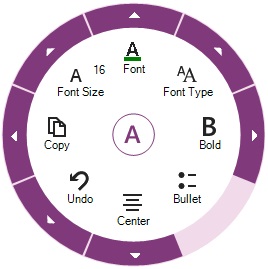
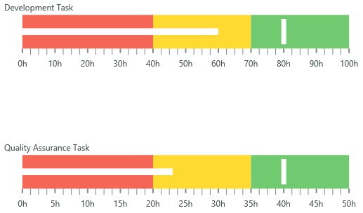
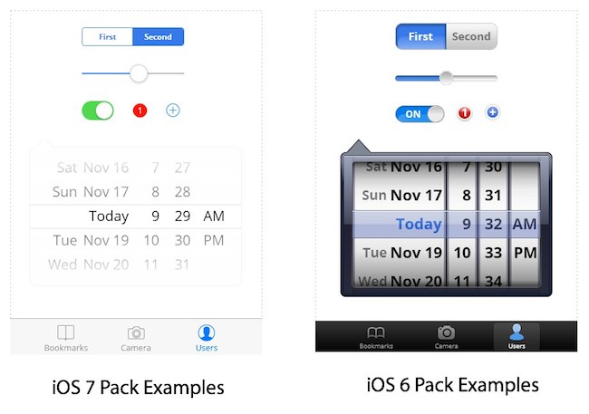
Fig 1. Comparing iOS 7 pack with iOS 6

    iOS 7 pack/style is mostly similar to iOS 6 in terms of functionality, but has a new visual design language. And while you could restyle the iOS 6 pack to get a similar look and feel, we realize this can be tedious. Moreover, some styles are difficult to achieve. You don't have to worry about getting the right iOS 7 look because we took care of it for you!

    How to use the iOS 7 pack after you update? Simple. Fire up your screen designer and choose iPhone or iPad viewport, and Indigo automatically selects the right toolbox for you!

    Auto Recover Files

    The thing we hate most is when our users lose design work because Indigo Studio quit suddenly, before you had a chance to save. Our apologies! Some of it is just the nature of software where wires do get crossed. Hopefully, no more!

    With this update, if for some reason Indigo quits, next time you restart the application, you will see the following auto-recover dialog:

    Fig 2. The new auto-recover dialog in Indigo Studio

    This feature allows you to review the recovered changes, and then you could either save or discard the changes. Most of you may never see this dialog, but if you are curious about the workflow, make some changes to your design, and force quit Indigo Studio :D.

    Naturally, we hope that you never have to see this dialog! If you do, please send us a note so that we can diagnose what happened.

    Exporting HTML Code Assets (BETA)

    We are also introducing a BETA feature which allows anyone viewing a prototype to export HTML code assets based on what's being shown in the browser.

    This feature should really appeal to our Infragistics ULTIMATE customers! Assume someone designed a screen using controls from the essentials toolbox, and they included all the usual suspects - Grid, Chart, Map, Dropdowns etc. They share the prototype with you. To get code assets, simple look for the code export option in the prototype toolbar, and just like that you can view the HTML code. 

    Fig 3. View HTML Code Assets

    But this goes a step farther if you are already using Ignite UI, our jQuery/HTML 5 controls. When you copy and paste this code in to your HTML editor, you will find that all the simulated controls in the prototype have been replaced with actual IGNITE UI controls! This can give you a running start. That is, you can add features to any of the controls to take it to the next level.

    We also shipped a new samples/demo for Ignite UI. If you are looking to add features to the GRID, for example, simply find the sample, and copy-paste the feature declarations. You can see more on how this done here:

    Watch video on Ignite UI/jQuery & HTML 5 controls

    To use this feature in your prototype, simply allow export of code assets when sharing a prototype. We kept this optional so that you have control over what the user can see or do. Sometimes exporting code assets is highly relevant, and at other times not so much.

    Please bear in mind that this is a BETA feature, and we are looking to improve this based on your feedback. Reach out to us at indigo AT infragistics.com with your thoughts so that we can explore ways to make it better, together.

    Fig 4. Enabling export of HTML code assets when sharing prototype

    Other Capabilities We Added

    • You can now decide whether to show annotations or highlight interactive elements when the user views the prototype 
    • Indigo Studio remembers the folder path which you used when sharing a prototype to a folder (e.g., Dropbox Public Folder)
    • When using icons, Indigo Studio will remember the last icon-group used. For example, if you used an icon from the "toolbar" category, the next time you launch the icon picker, the "toolbar" category is automatically selected.

    How to Get This update?

    Here's how to update the version of Indigo Studio installed on your machine:

    • If you have the option to automatically check for updates on startup checked, you should see a dialog box pop up when you launch Indigo. Simply click update, and Indigo Studio will do the rest. This is the easier approach.
    • If for some reason you chose not to automatically check for updates, go to MENU > HELP & ABOUT and use the "CHECK FOR UPDATES" option.

    Fig 5. Checking for updates in Indigo Studio

    Download Indigo Studio or Contact Us for Support

    Don't have Indigo Studio? Download a free 30-day trial which will let you try all of the prototyping goodness.

    Download Indigo Studio

    Looking to suggest improvements and new ideas for Indigo Studio?

    Submit a new idea

    For those who have contacted Indigo Studio Support team already know that we are committed to get you up and running. Thank you for all the complements you have been sharing about our support team and the product. If for some reason you are having trouble with Indigo Studio, check out our help topics, forums or contact support.

    Get Support

    Follow us on Twitter @indigodesigned

    What’s new in Infragistics WPF and Silverlight in 13.2

    Next: What’s New in Windows UI 13.2?
    Previous: Releasing Update 2 for Indigo Studio (v2)
    $
    0
    0

    Shhhh… Do you hear that?  That’s the sound of another mind blowing, face melting, feature packed, Chuck Norris* approved release of Infragistics WPF and Silverlight controls.  That’s right kiddies, this 13.2 release brings a number of new controls, new features, new themes, new styles, and much needed updates to an already industry leading WPF and Silverlight control suite.  Let’s stop wasting time and get to what’s new!

    XamRichTextEditor

    You’ve been asking, we’ve been listening, and now your wait is over.  I am excited to announce our brand new xamRichTextEditor control, which is a highly customizable rich text editing control that provides functionality modeled after the features and behavior of Microsoft Word.  So imagine taking Microsoft Word, removing all the crap you don’t care about or need, and then making a control out of it.  Well, that’s exactly what we did.  Even though this is a v1 release, it is packed with features.

    Formatting Options

    What formatting options do we have?  More like, what formatting options don’t we have!  The XamRichTextEditor has support for a number of text formatting options; such as font styles (bold, italic, underline, strikethrough), font name, font size, superscript and subscript, foreground and background colors, paragraph alignment (left, center, right, justify) and indention, as well as multi-level bulleted and numbered lists.

    xamRichTextEditor formatting options

    Not happy with the built in bullet and numbered lists options?  Why don’t you use your own?  You can easily create custom lists to meet your application requirements. You don’t need to settle for the default options.

    xamRichTextEditor custom lists

    Image Support

    What about image support?  Well, we got that too.  The xamRichTextEditor not only has support for inserting and displaying images, but you can even flip the image horizontally or vertically, crop it, set margins, resize it, and even rotate it.

    xamRichTextEditor image support

    Table Support

    You need tables?  Yeah, we got tables!  If you want, you can even have tables, inside of tables, insides of tables.  That’s a lot of tables.

    xamRichTextEditor table support

    MVVM Support

    What’s that you say?  What about MVVM support?  Don’t you worry, we have your MVVM needs covered.  You can easily data bind your rich text from a property in your ViewModel to the xamRichTextEditor by using one of the DocumentAdapters we have available.  Choose from RTF, plain text, and DOCX.  Don’t think you’re limited to just one DocumentAdapter per xamRichTextEditor control.  Feel free to data bind to multiple formats using all three DocumentAdapers on a single xamRichTextEditor instance.  Not only do we provide data binding to VewModels, but we also provide built-in support for over 34 commands that you can data bind to your buttons to apply many of the formatting options to the target xamRichTextEditor control’s content.

    xamRichTextEditor MVVMsupport

    And More…

    We even have a number of great editor customizations such as view splitting, zooming, capability to show hidden symbols, control over the caret color, control over the text update mode such as insert or overwrite, and more.  Need to export the content?  No problem!  The xamRichTextEditor supports importing and exporting to/from RTF, DOCX, and plain text formats. We also provide an extensible API that allows you to provide support for other custom formats.

    Alight Brian, but what about hyperlinks, undo and redo, multiple selection, tab stops, find and replace, clipboard support, and drop caps? Yes, yes, yes, yes, yes, yes, and YES!  It has all of those features and more.  As you can see, this control is packed with features.  Don’t even get me going on the xamRichTextEditor’s performance.  I challenge you to find a WPF and Silverlight rich text control with better performance!

    The xamRichTextEditor is provided in both WPF and Silverlight versions with an API that is common across both platforms, enabling you to incorporate all of these great rich text editing capabilities into your cross platform applications. 

    XamBulletGraph

    Our next brand new control to make its way into our WPF and Silverlight offering is the highly requested xamBulletGraph.  Linear by design, it provides a simple and concise view of a primary measure, or measures, compared against a scale and, optionally, some other measure.  The xamBulletGraph control provides you with the ability to create attractive data presentations, replacing meters and gauges that are used on dashboards, with simple, yet straightforward and clear bar charts. A bullet graph is one of the most effective and efficient ways to present progress towards goals, good/better/best ranges, or compare multiple measurements in as little horizontal or vertical space as possible.

    xamBulletGraph

    Need your bullet graph to display vertically?  No problem, the xamBulletGraph has configuration options to orient it either horizontal or vertical.  Need control over the visual elements of the xamBulletGraph?  We got you covered!  You have complete control over the performance bar, comparative marker, ranges, tick marks, scale, labels, border, background, titles, and more.  The xamBulletGraph has all the feature you would expect in a bullet graph control. 

    XamLinearGauge

    Now, you may be asking yourself, “don’t you already have a xamLinearGauge control”, and you are absolutely correct.  Let me introduce you to the brand new version of our xamLinearGauge.  This is a complete rewrite from the ground up.  It has all the bells and whistle of the old version, but takes advantages of all of our lessons learned while writing the old one.  We have improved the control API, usability, stability, and performance, as well as added new features and capabilities.

    xamLinearGauge

    Change various attributes of the needle, including the needle color, length, shape. Use one of the predefined shapes – rectangle, triangle, needle, and trapezoid or create one of your own.

    xamLinearGauge customized needle

    You have complete control over scale, including the start and end points, major and minor tick marks, labels, and color ranges.  You can change its’ orientation from horizontal to vertical, as well as take advantage customized tooltips.  With support for the Motion Framework, you can animate transitions between different configuration states and set the speed for those transitions.

    This new xamLinearGauge will ultimately replace our previously released version.  That means, from now on, you will want to use this new xamLinearGauges, and if you’re upgrading, you will want to start switching all the old linear gauges to use this new one.    The new xamLinearGauge API is not backwards compatible with the legacy linear gauge.

    XamRadialGauge

    Yup, that’s right.  We have written a brand new version of the xamRadialGauge control, which replaces the older version. 

    You control the Start and End positions of the scale, major and minor tick marks, labels, color ranges and sweep direction. You can create full 360 degree scales, or half circular gauges with 180 degree scales, 90 degrees, 45 degrees or any custom value you want.

    xamRadialGauge

    Feel free to customize various attributes of the needle, including the needle color, length, point, base, and cap to fit your application needs. The following needle shapes are built-in; None, Rectangle, Triangle, Needle, Trapezoid, Rectangle With Bulb, Triangle With Bulb, Needle With Bulb, and Trapezoid With Bulb.

    xamRadialGauge custom needle

    The xamRadialGauge control also has Motion Framework support built right into the control.  You can easily animate transitions between different configuration states. The control gradually animates as it redraws changes to the needle, needle position, scale range, color range and more. You can control the speed of the animations by setting the desired Transition Duration.

    xamRadialGauge animated transitions

    Same story here.  This new xamRadialGauge replaces the existing xamRadialGauge that was previously released.  The APIs are not compatible, so you should start using this new xamRadialGauge, and migrating your existing radial gauges over to this new version.

    XamDataChart Updates

    We heard you loud and clear!  We gave our industry leading xamDataChart control some much needed love as well.  The xamDataChart is a real work horse, capable of displaying millions of data points in real-time with refresh rates measured in just a few milliseconds, and we spent a lot of time implementing a little “fit, finish, and polish” to our xamDataChart to make it even more feature rich and visual stunning.

    Chart Title and Subtitle

    The title and subtitle feature of the xamDataChart control allows you to add information to the top section of the chart control. When adding a title and/or subtitle to the chart control, the content of the chart is automatically resized to allow for the title and/or subtitle information.

    xamDataChart chart titles and subtitles

    Axis Titles

    The axis title feature of the xamDataChart control allows you to add contextual information to the x-axis and y-axis of the xamDataChart control.  You can customize the axis title by specifying properties of the TitleSettings object such as the angle, font size and position.

    image

    Series Highlighting

    This feature allows you to highlight an entire series or individual items within the series.  For example, highlights the entire line in a series such as the LineSeries as it is all one shape; however, highlights can be applied to each individual column in a series such as ColumnSeries.  Individual markers can be highlighted in all supported series.

    xamDataChart series highlighting

    Drop Shadows

    The xamDataChart now supports drop shadows to enhance the visuals of individual series.  Developers can control various properties such as the shadow depth/offset/direction, color, and blur.

    xamDataChart drop shadows

    New Default Style

    We heard a lot of feedback regarding the xamDataChart’s default look and feel when dragging it from the Visual Studio toolbox onto the design surface, and we made sure to improve your experience.  You no longer have to spend hours setting properties, modify a control template, or creating new styles altogether.  We spent a lot of time creating a new default style to make the xamDataChart kick you in the eyeballs with visual awesomeness.  As of now, we are shipping it as a separate style that you can apply to your application.  In a future release, and after we gather some feedback on our changes, we will officially make it the new default style, and you will never again see those old blue and gray scale colors.  So if you like what we’ve done, you have to let us know!

    xamDataChart new default style

    And More…

    We added a lot of other great features and improvements such as startup animations, nicely styled default tooltips, performance improvements, and more.  There are so many xamDataChart features I could talk about, that a single blog post can’t do it justice.

    XamGeographicMap Updates

    We updated our high performance xamGeographicMap control to include a new High Density Geographic Scatter Series.  A High Density Geographic Scatter Series can be used to show millions of data points without sacrificing performance. The map plot area with more densely populated data points are represented by condensed color pixels, and loosely distributed data points are represented by pixels of another color.  Options are available to control the palette of colors used and to change the min/max heat properties of the series in order to adjust how heat colors are mapped.

    xamGeographicMap high density scatter series

    XamPieChart and XamDoughnutChart Updates

    We made a nice improvement to both our xamPieChart and our xamDoughnutChart which allows you to add curves to your labeling callout lines.  You can now add two types of curves to the straight lines used for the callout lines in the xamDoughnutChart and xamPieChart. You may choose whether to use a straight line or one of the curves, change the line style and control the spacing between the label and the end of the line.

    xamPieChart callout lines with curves

    New Metro Dark Theme

    Our popular Metro theme just got a lot better. The Metro theme, which is a clean, modern, and touch friendly theme inspired by Microsoft’s Design Style has just received a new Dark version. The Dark version helps to reduce eye string that can happen when staring at screens for many hours with lighter themes.  Honestly, it just looks cool!

    Metro Dark Theme

    Themes for Microsoft Controls

    The IG, Offfice 2010, and Metro themes now have support for over 19 standard Microsoft WPF and Silverlight controls.  Your application will no longer look like a Frankenstein of different styles.  Now, your application’s UI will seamlessly integrate with the full range of Infragistics WPF and Silverlight controls.

    IG Theme

    Microsoft controls theming support - IG Theme

    Metro Light and Dark Themes

    Microsoft controls theming support - Metro Light Theme

    Microsoft controls theming support - Metro Dark Theme

    Office 2010 Blue Theme

    Microsoft controls theming support - Office 2010 Blue Theme

    Radial Menu (CTP)

    Even though this release was already packed with a ton of great controls and features, we managed to squeeze in one more new control.  Inspired by the Microsoft OneNote radial menu, the xamRadialMenu provides a circular menu that orients the commands around the user, rather than requiring the user to negotiate a nested hierarchy of drop downs. Most commonly used as a context menu, the xamRadialMenu allows you to drill down into related sub-menu items with the ability to navigate back to the main level menu item. Although the xamRadialMenu is optimized for touch, it works just as well for mouse and keyboard interactions.

    Although this is being released as a CTP control, it is package with functionality.  It’s has configuration options for setting the number of wedges, rotation, size, and more.  It has a number of built in tools such as a radio button, color well, numeric items and gauges, as well as a list tool.  With support for recent items, tooltips, key tips, keyboard navigation, MVVM support, this control has everything you need to build your own touch based applications.

    xamRadialMenu - CTP

    Let’s Wrap This Baby Up!

    This release of Infragistics WPF and Silverlight 13.2 is packed full of new controls, new features, new themes, new styles, and much needed updates.  This is a massive release!  I couldn’t even cover every new feature.  There is just way too many of them.  I hope you are as excited about this release as I am.  We worked hard to bring you the best controls available, and we continue to make investments into the controls you need the most.

    As you have probably noticed, things are changing at Infragistics, and your voice is louder than ever.  If you have ideas about new features we should bring to our controls, important issues we need to fix, or even brand new controls you’d like us to introduce, please let us know by posting them on our Product Ideas website.  Follow and engage with us on Twitter via @infragistics. You can also follow and contact me directly on Twitter at @brianlagunas. Also make sure to connect with our various teams via our Community Forms where you can interact with Infragistics engineers and other customers.

    If you are not using our WPF or Silverlight controls yet, remember that a free evaluation download is only a click away.

    Lastly, when you do build something cool with our controls, please make sure to let us know.

    *Chuck Norris is not affiliated with Infragistics and did not officially approve this release.  This was simply a reference to how awesome this release is.

    What’s New in Windows UI 13.2?

    Next: Exciting Changes at Infragistics - 13.2 Release!
    Previous: What’s new in Infragistics WPF and Silverlight in 13.2
    $
    0
    0

    Roughly 7 months ago, we announced the release of a brand new product from Infragistics for Windows 8 development.  Now, it is time for another update to the Infragistics Windows UI control toolset with the release of 13.2.  In our first release of Windows UI 13.1 back in April, we had put so much awesomeness into a single release, that we had to leave some great features out of the controls and had to leave them as a CTP.  So, most of our 13.2 release is all about finishing what we started in 13.1.  This means giving our xamGrid, Persistence Framework, and Excel Framework some much needed love.  We are also throwing in a new control in the form of a CTP.  Enough of the intro stuff, let’s see what we have been working on.

    XamGrid

    We have spent a lot of time in 13.2 getting the xamGrid just right for Windows 8.  Actually, this is where we spent the majority of our time.  If you have been using the xamGrid since it’s initial release, then you already know that the xamGrid control is a hierarchical data grid control designed to handle large amounts of data. With numerous column features, editors, and capabilities, the xamGrid is the most feature rich and functional data grid available.  It provides support for a true hierarchical data source to the n-level, allowing you to display complex business data with master/detail data relationships and different column layouts at each level. With support for paging and deferred scrolling, the xamGrid handles large data sets with no problem. Besides support for hierarchical data, you can also create n-level groupings on your data. Grouping (GroupBy) in combination with our intuitive filtering capabilities, allows you to shape your data to fit your needs with no compromises.

    xamGrid hierarchy

    With the ability to define as many columns as you want, the xamGrid provides the most column options available in any grid. The xamGrid supports column moving, resizing, grouping (not to be confused with data grouping, aka GroupBy), column fixing (pinning), and even provides your end-users a column chooser all with the touch of a finger.

    xamGrid Colum Grouping

    The xamGrid comes with the largest selection of editors on the market. Built-in editors include a CheckBox column, ComboBox column, DateTime column, Hyperlink column, Image column, and a Text column. Need more than that? No problem, the xamGrid also provides you with Template and Unbound columns to fit any scenario.

    xamGrid Editors

    The xamGrid has been optimized for touch enabling even the most complex actions with the touch of a finger. New touch friendly selection grippers have been added to enable the selection of multiple cells with a simple drag operation. A new touch optimized column menu had been added, giving you access to common column operations such as sorting, group by, summaries, column pinning, access to the column chooser, and more, all with a simple tap gesture.

    xamGrid touch optimizations 

    xamGrid touch selection

    From data annotation support, to summaries, to clipboard support, to exporting to excel, and much more; the xamGrid is packed with features making it the most feature rich and functional data grid available for Windows 8 development.

    Persistence Framework

    With the Persistence Framework, you can persist control settings from any dependency object (including non-Infragistics controls) using Infragistics’ Control Persistence Framework to manage saving and loading the settings you want persisted to any external source. This framework makes it very easy for you to give your end-users the ability to save off their preferences and the layout of your application’s user interface down to the most detailed settings - such as which grid columns are fixes - and then re-load the same layout when they come back again.

    Persistence Framwork sample code

    Excel Framework

    Using the Infragistics Excel Framework allows you to work with spreadsheet data using familiar Microsoft Excel spreadsheet objects like Workbooks, Worksheets, Cells, Formulas and many more. The Excel Library makes it easy for you to represent the data of your application in an Excel spreadsheet as well as transfer data from Excel into your application.  The best part about the Excel Framework is that it is a simple class library that runs completely independent of Microsoft Excel.  That means you don’t need to have Excel installed on the client machine.

    Excel Framwork sample code

    The following is a list of the supported versions of Excel.

    • Microsoft Excel 97
    • Microsoft Excel 2000
    • Microsoft Excel 2002
    • Microsoft Excel 2003
    • Microsoft Excel 2007
    • Microsoft Excel 2010

    XamRadialMenu (CTP)

    Now, for the newest control to join the Windows UI control toolset.  The new xamRadialMenu!  Inspired by the Microsoft OneNote radial menu, the xamRadialMenu provides a circular menu that orients the commands around the user, rather than requiring the user to negotiate a nested hierarchy of drop downs. Most commonly used as a context menu, the xamRadialMenu allows you to drill down into related sub-menu items with the ability to navigate back to the main level menu item. Although the xamRadialMenu is optimized for touch, it works just as well for mouse and keyboard interactions.

    xamRadialMenu examplexamRadialMenu color wheel

    As you can probably tell from the screenshots, this thing is packed with features.  It does just about everything the Microsoft OneNote Radial Menu does, but better.  I’ll cover this control in more detail in a later post.

    That’s It

    If you are not using our Windows UI controls yet, remember that a free evaluation download is only a click away.

    If you have ideas about new features we should bring to our controls, important issues we need to fix, or even brand new controls you’d like us to introduce, please let us know by posting them on our Product Ideas website.  Follow and engage with us on Twitter via @infragistics. You can also follow and contact me directly on Twitter at @brianlagunas. Also make sure to connect with our various teams via our Community Forms where you can interact with Infragistics engineers and other customers.

    Lastly, when you do build something cool with our controls, please make sure to let us know.

    Exciting Changes at Infragistics - 13.2 Release!

    Next: Adding Data to the IGChartView at runtime (Xamarin.iOS / Objective C)
    Previous: What’s New in Windows UI 13.2?
    $
    0
    0

    Exciting Changes at Infragistics

    Wow, we’ve been busy over here. In 13.2 we made lots of changes: we transformed our brands, updated our products and their features, redesigned our website, and updated our pricing structure – all for the better! At Infragistics, we’re proud to be the company that helps you deliver stunning applications easily and we want everything we do to reflect that.

    New Branding and Products

    One thing we think a lot about is simplicity. There is elegance in simplicity. When we looked at our products, we realized that most of our customers were faced with unnecessary complexity. We had more than 20 different products available and we knew that most customers were making the decision to purchase our top two products.  It was time for us to simplify.


    So we turned Infragistics NetAdvantage for .NETversion13.1 into Infragistics Professional 13.2, and Infragistics NetAdvantage Ultimate version 13.1 into Infragistics Ultimate 13.2. We think you’ll agree that these less complicated names truly simplify things and make it much easier to find what you are looking for.

    New Features

    13.2 has a lot to offer. Most importantly, this new release of Infragistics Ultimate now includes our amazing design tool, Indigo Studio. It’s a complete solution for designing interactive prototypes that target mobile, desktop & web scenarios.  With Indigo Studio, designers and developers can focus on the user experience of the application before writing a single line of code. 


    For desktop, web and mobile development, we’ve updated our entire line of controls to bring you the “ultimate” experience from start to finish. We’ve added support for the latest Microsoft Office and Windows 8 inspired user interface, along with support for touch-enabled rich-client desktop & responsive web apps that help you develop for the iPad, iPhone, Android devices and the Surface.


    If you need to reach the broadest set of devices, our Ignite UI HTML5 / JQuery tools help you create a single application that will look native on any mobile device or desktop. And if you need no-compromise performance, only Infragistics has native Objective-C controls for building iOS apps with iOS 7 styles, native Java controls for Android apps and native Windows Phone controls. Finally, when you’re ready to test your applications, we’ve got you covered with automated UI testing tools for both Windows Forms & WPF.

    New Website

    In line with our promise to simplify, we’re doing everything we can to also streamline the experience of trying out our products. Many of our site’s less-visited pages have been shifted out to make it easier to find what you are looking for. But maybe the most exciting thing on our website is the introduction of our new Getting Started Videos on Infragistics’ YouTube channel. I encourage you to subscribe to this channel as we’ll be continually posting new videos – for all skill levels – to ensure you get the most out of your Infragistics controls. We think this will be very helpful to kick start your next project.

    New Pricing

    For the 13.2 release, we’ve modestly increased prices on new license purchases & renewals. But what about existing customers? Are we increasing renewal prices now? No. We have a little something called the Ultimate Gift and as you’ll see we want to make sure this transition is smooth. For example, if you’re a customer who used to have an ASP.NET subscription, congratulations - you just got a free upgrade to our Professional version!  This is our little way of saying thank you to our customers. For more information, check out the Ultimate Gift on our website.

    Summary

    As you can see, there’s a lot going on at Infragistics - and we’re just getting started! There is so much more we want to do to help you build stunning applications quickly. With new brands, new products, new features, new videos and more, we hope you are as excited as we are. We can’t wait to show you what’s IN development.

    Adding Data to the IGChartView at runtime (Xamarin.iOS / Objective C)

    Next: Infragistics Reporting Release Notes – November: 13.2 Volume Release
    Previous: Exciting Changes at Infragistics - 13.2 Release!
    $
    0
    0

    Intro

    Last week a customer asked in our forums how to add data at run time to the IGChartView.  After answering the question I figured I would convert the sample over to Xamarin.

    So attached is a zip file with both the Xamarin-iOS sample with the IGChartView and an Objective -C version written in XCode.

    The different series in the IGChartView all have datasource helper objects which take the array of data and process it for the various series to render.  In this example we are using a IGLineSeries, so the IGCategorySeriesDataSourceHelper will be used.  This data source helper is what we would use for area charts, bar charts, column charts, and line charts. 

    Basic Process


    The basic process for adding more data into the chart is to add the data to the underlying data array which is feeding the datasource helper and then tell chart that data at a particular index has been modified.

    <p >So in Xamarin iOS C#

    // On the Tick, make a new object in the bounds.
    MyDataObject newOb = this.createDataObject ();
    // Since we only want to show the last twenty data points, remove the first if we have hit the threshold
    if (_dataArray.Count >= 21) {
    // remove the data point and tell the chart that the point of data has been removed.
    _dataArray.RemoveAt (0);
    _chart.RemoveItem (0, _helper);
    }

    // now add in our new data point and tell the chart that a new point has been added.
    _dataArray.Add (newOb);
    _convertedData = _dataArray.ToArray ();
    _helper.Data = _convertedData;
    _chart.InsertItem (_convertedData.Length - 1, _helper);

    And in Objective C

    // Since we only want to show the last twenty data points, remove the first if we have hit the threshold
    if (_dataArray.count >= 21) {
    // remove the data point and tell the chart that the point of data has been removed.
    [_dataArray removeObjectAtIndex:0];
    [_chart removeItemAtIndex:0 withSource:_helper];
    }

    // adds a new data object to our underlying data collection
    [_dataArray addObject:[self createDataObject]];

    // tells the chart to put a new point into the view
    [_chart insertItemAtIndex:(_dataArray.count-1) withSource:_helper];

    So what is the above code doing. First it's checking that we are only showing 20 data points. I wanted to show a limited window of data. I could have let it add points indefinitely but that would only clutter the layout over time and make it very difficult to read. After it removes the expired point of data, it tells the chart that the data at that point has been removed. Then it adds a new point and tells the chart a new point has been added.

    So we can add and remove data easily and allow the UI to reflect those changes.

    Now this next part isn't in the sample, but we can also change data in place and have the UI reflect those changes as well.  

    So if we take the existing sample code and make a few modifications we will demonstrate how to update data in the chart rather then add / remove it.

    First we want to change the series being used from an IGLineSeries to and IGColumnSeries.

    Objective C
    IGColumnSeries* lineSeries = (IGColumnSeries*)[_chart addSeriesForType:[IGColumnSeries class] usingKey:@"series1" withDataSource:_helper firstAxisKey:@"xAxis" secondAxisKey:@"yAxis"];
    // adding a transitionDuration (how long an animation will run) onto the series so that when data switches it will animate the change. lineSeries.transitionDuration =0.5;

    Then in the tick we change the code to modify an existing member of our data array and then inform the chart of the change.

    int newValue = rand() % 10;
    int indexToChange = rand() % 10;
    MyDataObject* obj = [_dataArray objectAtIndex:indexToChange];
    obj.value = newValue;
    [_chart updateItemAtIndex:indexToChange withSource:_helper];

    So I hope you liked this little demonstration on how you can update data and have those changes reflect in the IGDataChart. Hopefully I will be able to get back to my book app in the near future.

    By Darrell Kress

    Infragistics Reporting Release Notes – November: 13.2 Volume Release

    Next: NucliOS - What's New in 2013.2
    Previous: Adding Data to the IGChartView at runtime (Xamarin.iOS / Objective C)
    $
    0
    0

    With every release of Infragistics Reporting comes a set of release notes that reflects the state of resolved bugs and new additions from the previous release. You’ll find the notes useful to help determine the resolution of existing issues from a past release and as a means of determining where to test your applications when upgrading from one version to the next.

    Release notes are available in PDF format and summarize the changes to this release along with a listing of each item. In order to download the release notes, use the following link:


    Note: There is an issue with the Infragistics Platform Installer that doesn’t allow installing Reporting's plugin for Visual Studio 2013. This issue will be fixed shortly. In the meantime, please follow these steps to successfully install the VS2013 plugin:

    1. Download and install Reporting from the Infragistics Ultimate 2013 Vol. 2 Platform Installer.

    2. Search for the "Setups" folder created by the Platform Installer’s installation.

    3. Run Reporting's installer (located in the Setup Folder) and choose Change.

    4. Select VS 2013 Plugin and install.


    NucliOS - What's New in 2013.2

    Next: Ember.js Basics - Project Structure
    Previous: Infragistics Reporting Release Notes – November: 13.2 Volume Release
    $
    0
    0

    Introduction

    The 2013 Volume 2 release of NucliOS is packed full of new controls and features to help you easily create stunning apps using Xcode or Xamarin.iOS. Without further ado, the following are the new controls and updates included with this new release.

    IGBulletGraphView (New Control)

    IGBulletGraphView (New Control)

    Deliver a simple and concise view of key performance indicators (KPI) to presents progress towards goals and good/better/best ranges in as little horizontal or vertical space as possible.

    FEATURES

    • Configurable Orientation
    • Ranges
    • Animated Transitions
    • Custom Scale Labels
    • Themes

    IGCalendarView (New Control)

    IGCalendarView (New Control)

    The IGCalendarView is the multitool of calendars. It's a 3 in 1 calendar allowing you to effortlessly navigate between year, month and day views. Connect it directly to your device's calendar or connect your custom appointments.

    FEATURES

    • Year View
    • Month View
    • Day View
    • Appointments
    • Calendar Localization
    • Animated Transitions
    • Themes

    IGChartView (Updated)

    IGChartView (Updated)

    Our high performance and feature rich IGChartView was updated for 2013 Volume 2 with the following features:

    • Custom Markers - Allowing you to insert a UIView in place of a marker on a data point.
    • Rounded Corners - You can configure rounded corners on the following series: IGBarSeries, IGColumnSeries, IGRadialColumnSeries, IGRadialPieSeries, IGRangeColumnSeries, IGStacked100BarSeries, IGStackedBarSeries, IGStacked100ColumnSeries, IGStackedColumnSeries and IGWaterfallSeries.
    • Single Axis Zoom - Allowing the IGChartView to restrict its zooming along either the vertical or horizontal axis.

    IGFunnelChartView (New Control)

    IGFunnelChartView (New Control)

    The IGFunnelChartView displays funnel slices with progressively increasing or decreasing values. The funnel chart view supports multiple slice selection, tooltips, tap and long press gestures.

    FEATURES

    • Legend
    • Slice Selection
    • Weighted Slices
    • Animated Transitions
    • Themes

    IGGridView (Updated)

    IGGridView (Updated)

    Our powerful and feature rich IGGridView was updated for 2013 Volume 2 with the following features:

    • Grid Data Entry - Allowing you to place a grid cell into a mode that makes it editable.
    • Swipe Row - Allows a user to swipe their finger on a row and have the row slide in a specific direction, exposing a UIView on the left or right side of the row. This feature was updated, allowing the user to drag rows or performing percentage dragging.

    IGLinearGaugeView (New Control)

    IGLinearGaugeView (New Control)

    Make your data visualizations and dashboards more engaging with a Linear Gauge that shows off KPIs with rich style and interactivity. The gauges are powerful, easy to use, and highly configurable to present dashboards.

    FEATURES

    • Configurable Orientation
    • Preset Needles
    • Ranges
    • Animated Transitions
    • Custom Scale Labels
    • Themes

    IGOverlayView (New Control)

    IGOverlayView (New Control)

    The overlay is a powerful and extremely flexible control for displaying any type of view that will overlay another view, with or without animation, when shown or dismissed. Adding views to overlay another view is a cinch, but if you require more than a quick and simple solution, the overlay was also designed to be extended upon. By deriving from the overlay class, you can tap into your creative psyche while using the overlay to help push your app to the next level.

    FEATURES

    • 12 Enter Animations
    • 12 Exit Animations
    • Custom Animation Support
    • Extensible

    IGProgressView (New Control)

    IGProgressView (New Control)

    The progress is a multifaceted progress control capable of rendering standard, radial, or even custom progress shapes. In addition, to the progress looking great out of the box, nearly every part of its UI can be styled to look great in your app. Properties are exposed to make it simple to adjust the color of the progress. Although, if you require finer tuning; layer properties are exposed to give you complete control over the progress appearance all the way down to the stroke used. The styling doesn't stop at only visual appearance, the properties for the animation duration and animating timing function allow for polishing the animation that occurs when the progress changes value.

    FEATURES

    • 5 Progress Types
    • Custom Progress Shapes
    • Configurable Start/End Angle
    • Animated Transitions

    IGRangeSelectorView (New Control)

    IGRangeSelectorView (New Control)

    While not a standalone control, the IGRangeSelectorView in conjuction with the IGChartView becomes a very powerful tool. Drop it in your application along with a chart, wire them up, and watch the magic begin, as the IGRangeSelectorView will add a simple slider based zoom functionality to your application.

    FEATURES

    • Synchronizes Interaction with the IGChartView
    • Configurable Orientation
    • Themes

    IGSparklineView (New Control)

    IGSparklineView (New Control)

    The IGSparklineView is a lightweight chart that is used within data sets, usually when displayed in a list or grid. Sparklines are non-interactive and support limited display options such as markers, trend lines and value ranges.

    FEATURES

    • 4 Sparkline Types
    • Markers
    • Trendlines
    • Adjustable Ranges
    • Animated Transitions
    • Themes

    IGTreemapView (New Control)

    IGTreemapView (New Control)

    The IGTreeMapView is designed to display a hierarchical data structure of treemap nodes, where each node is represented by a rectangle. Each treemap node can have any number of child nodes and the children are sorted by size, from largest to smallest.

    FEATURES

    • Slice and Dice Layout
    • Squarified Layout
    • Strip Layout
    • Color Mapper
    • CoreGraphics Rendering Mode
    • UIView Rendering Mode
    • Animated Transitions
    • Themes

    Download the Trial

    Try out NucliOS for free by downloading the fully featured trial.

    Ember.js Basics - Project Structure

    Next: Ember.js From the Ground Up Series
    Previous: NucliOS - What's New in 2013.2
    $
    0
    0

    One of the things that tripped me up when I first started using Ember.js was a lack of guidance in project structure. The early guides and samples placed all of the JavaScript into a few files and all of the templates were contained in script blocks inside of a single HTML file. To me, this seemed like a bit of a mess and it was very uncomfortable. Thankfully, as Ember has matured so have the tools around it. In this post, I’ll explain what the project “structure” looks like in a basic “out of the box” Ember.js application and then explore a few better approaches using build tools.

    This is post #2 in a series on Ember.js. You can find the other posts here.

    ember-basics-project-structure

    “Out of the box” structure

    I use the word “structure” loosely here as there is very little structure imposed by the framework in terms of filenames or folder structure in the application. Essentially, if named and ordered properly, all of your JavaScript code could go in one file and many early samples did just that. Even now, the Ember Starter Kit comes with a structure that looks like this:

    starter-kit-structure

    The guidance in TODO.txt states “Start writing your app in js/app.js.” and “Describe your application HTML in index.html.” This is fine for a small app, but it sure doesn’t scale well if we’re building ambitious web applications. In fact, you end up with an HTML file that looks like this:

    template-code

    All of these script blocks littered in the index.html file really started to bother me after a while and I had been wondering if there was another way. What I wanted to do was have each template exist in its own file and these would be referenced properly where needed by Ember. Thankfully, there’s a feature of Handlebars that allows for precompilation of templates and this is just what is needed to do what I wanted to do. It gets even better though. There are application workflows for Ember that make this process even easier. I’m going to briefly introduce the two options I have tried and show how they provide structure to the application building process. In future posts I will go into more detail on features offered by these tools.

    Ember App Kit

    Ember App Kit was created by Stefan Penner of the Ember.js team. It is billed as “A template for ambitious web applications” which, of course, fits quite well with the Ember tagline.

    The main features of the Ember App Kit are: Asset compilation (including Handlebars, LESS/SASS, CoffeeScript, and minified JS and CSS), ES6 Module support, testing with QUnit and Karma, and dependency management using Bower.

    The Ember App Kit is built around Grunt which is an amazing task runner for JS that was built with Node.js. I will describe the setup of many of the optional Grunt tasks in a future post. What we are mainly concerned at with Ember App Kit for now is the project structure inside of the app folder. Here’s what the top-level of the app folder looks like:

    ember-app-kit-structure

    Note that I have expanded the templates folder. Each template inside of this folder is taking the place of one of those stray script blocks we had in the original approach. This is a much more structured approach! The application structure is described in detail in the Ember App Kit Getting Started guide.

    Yeoman and the Ember generator

    Yeoman is described by it’s maintainers as “modern workflows for modern webapps”. It consists of three separate tools that work together to help jumpstart and develop applications that enable best practices. Much like Ember App Kit, Yeoman uses Grunt as the build tool. It also uses Bower for client dependency management. The extra added pieces for Yeoman are Yo which is a scaffolding tool and one of the many generators maintained by the community. Using the Yo command line tool one can scaffold out an entire application from a generator. In our case, the generator we’ll take a look at is generator-ember.

    When you run the Ember generator using Yo, you’ll get asked if you want to install Twitter Bootstrap for Sass. This is a nice touch since many developers are using Bootstrap and many Ember devs are using Sass. I’m much more of a Foundation fan so it would be nice to have a choice, but it’s easy enough to add later so no worries. Yeoman will scaffold out an Ember application and the Grunt tasks are pre-configured for Sass, minification, template precompilation, and LiveReload (which will automatically rebuild files and reload the browser any time you save a file). I’ll discuss the details of generator-ember in a future post.

    Again, the most important thing to look at for now is the application structure generator-ember offers. Just like with Ember App Kit, there is an app folder. Inside of this, the structure looks like:

    generator-ember-structure

    The app/scripts folder is where all of the JavaScript files for the app should go. There are folders for the major categories of files such as models, views, controllers, and routes. Also inside of app/ is a templates folder where you will store your Handlebars templates. Like Ember App Kit, all of these folders are configured to be watched and built by Grunt. Once again, this definitely adds much needed structure to an Ember application. The Ember generator also includes subgenerators for adding models, views, and controllers. You can read about these subgenerators on the generator-ember Github page. I’ll talk about them in more detail in a future post.

    Summary

    Ember.js does not impose a set structure for the application files in terms of folders and file names within a project. Thankfully, we have some great tools to help establish some best practices. Whether you choose Ember App Kit or generator-ember with Yeoman, I think it is easy to see how both of these approaches help facilitate easier project collaboration and maintenance. Try the different options before deciding on one to use for your project.

    Contact

    If you want to comment or reach out to me, the best place to do that is on Twitter @brentschooley. I can also be reached via email at bschooley@infragistics.com.

    Ember.js From the Ground Up Series

    Next: Infragistics ASP.NET Release Notes - November: 13.2 Volume Release
    Previous: Ember.js Basics - Project Structure
    $
    0
    0

    This is where I’ll be collecting my posts for my Ember.js tutorial series. Follow along and learn Ember.js from the ground up!

    ember-from-the-ground-up

    Posts:

    Contact

    If you want to comment or reach out to me, the best place to do that is on Twitter @brentschooley. I can also be reached via email at bschooley@infragistics.com.

    Infragistics ASP.NET Release Notes - November: 13.2 Volume Release

    Next: Infragistics Reporting Release Notes – November: 12.2, 13.1 Service Releases
    Previous: Ember.js From the Ground Up Series
    $
    0
    0

    With every release comes a set of release notes that reflects the state of resolved bugs and new additions from the previous release. You’ll find the notes useful to help determine the resolution of existing issues from a past release and as a means of determining where to test your applications when upgrading from one version to the next.

    Release notes are available in both PDF and Excel formats. The PDF summarizes the changes to this release along with a listing of each item. The Excel sheet includes each change item and makes it easy for you to sort, filter and otherwise manipulate the data to your liking.

    Download the Release Notes

    ASP.NET 2013 Volume 2

    Infragistics Reporting Release Notes – November: 12.2, 13.1 Service Releases

    Next: Infragistics WPF Release Notes – November: 13.2 Volume Release
    Previous: Infragistics ASP.NET Release Notes - November: 13.2 Volume Release
    $
    0
    0

    With every release of Infragistics Reporting comes a set of release notes that reflects the state of resolved bugs and new additions from the previous release. You’ll find the notes useful to help determine the resolution of existing issues from a past release and as a means of determining where to test your applications when upgrading from one version to the next.

    The Release Notes are available in PDF format and summarize the changes to this release along with a listing of each item. In order to download the release notes, use the following links:

    Reporting 2012 Volume 2

    Reporting 2013 Volume 1

    Infragistics WPF Release Notes – November: 13.2 Volume Release

    Next: Infragistics Silverlight Release Notes – November: 13.2 Volume Release
    Previous: Infragistics Reporting Release Notes – November: 12.2, 13.1 Service Releases
    $
    0
    0

    Release notes reflect the state of resolved bugs and new additions from the previous release. You will find these notes useful to help determine the resolution of existing issues from a past release and as a means of determining where to test your applications when upgrading from one version to the next.

    Release notes are available in both PDF and Excel formats. The PDF summarizes the changes to this release along with a listing of each item. The Excel sheet includes each change item and makes it easy for you to sort, filter and otherwise manipulate the data to your liking.

    Download the Release Notes

    Infragistics Silverlight Release Notes – November: 13.2 Volume Release

    Next: Creating Different iOS Progress Types Using IGProgressView (Xcode & Xamarin.iOS)
    Previous: Infragistics WPF Release Notes – November: 13.2 Volume Release
    $
    0
    0

    Release notes reflect the state of resolved bugs and new additions from the previous release. You wll find these notes useful to help determine the resolution of existing issues from a past release and as a means of determining where to test your applications when upgrading from one version to the next.

    Release notes are available in both PDF and Excel formats. The PDF summarizes the changes to this release along with a listing of each item. The Excel sheet includes each change item and makes it easy for you to sort, filter and otherwise manipulate the data to your liking.

    Download the Release Notes


    Creating Different iOS Progress Types Using IGProgressView (Xcode & Xamarin.iOS)

    Next: Ignite UI Release Notes - November: 13.2 Volume Release
    Previous: Infragistics Silverlight Release Notes – November: 13.2 Volume Release
    $
    0
    0

    Introduction

    The IGProgressView that comes with the NucliOS controls is an easy to use and extremely flexible control. It's unique design allows for many different progress visualizations, including custom shapes all in one control. This post will cover the many different visual possibilities of the IGProgressView to help you create stunning apps.

    Standard

    Standard

    The #1 annotation shown shows the default shape of standard progress type with it's progress property set to 63.

    // Objective-C
    IGProgressView *standard1 = [[IGProgressView alloc] initWithStyle:IGProgressViewStyleStandard];
    standard1.progress = 0.63;
    
    // C#
    IGProgressView standard1 = new IGProgressView (IGProgressViewStyle.IGProgressViewStyleStandard);
    standard1.Progress = 0.63f;

    The #2 annotation shown demonstrates setting the standardCornerRadius to 0 to achieve a square looking standard progress.

    // Objective-C
    IGProgressView *standard2 = [[IGProgressView alloc] initWithStyle:IGProgressViewStyleStandard];
    standard2.progress = 0.63;
    standard2.standardCornerRadius = 0;
    
    // C#
    IGProgressView standard2 = new IGProgressView (IGProgressViewStyle.IGProgressViewStyleStandard);
    standard2.Progress = 0.63f;
    standard2.StandardCornerRadius = 0;

    The #3 annotation shown demonstrates the default standard progress shape with the lineWidth set to 5.0 on the exposed progressShapeLayer. This creates a bigger stroke around the displayed progress.

    // Objective-C
    IGProgressView *standard3 = [[IGProgressView alloc] initWithStyle:IGProgressViewStyleStandard];
    standard3.progress = 0.63;
    standard3.progressShapeLayer.lineWidth = 5.0;
    
    // C#
    IGProgressView standard3 = new IGProgressView (IGProgressViewStyle.IGProgressViewStyleStandard);
    standard3.Progress = 0.63f;
    standard3.ProgressShapeLayer.LineWidth = 5.0f;

    Standard Indeterminate

    Standard Indeterminate

    The #1 annotation shown shows the default shape of standard indeterminate progress type.

    // Objective-C
    IGProgressView *standard1 = [[IGProgressView alloc] initWithStyle:IGProgressViewStyleStandardIndeterminate];
    
    // C#
    IGProgressView standard1 = new IGProgressView (IGProgressViewStyle.IGProgressViewStyleStandardIndeterminate);

    The #2 annotation shown demonstrates setting the standardCornerRadius to 0 to achieve a square looking standard indeterminate progress.

    // Objective-C
    IGProgressView *standard2 = [[IGProgressView alloc] initWithStyle:IGProgressViewStyleStandardIndeterminate];
    standard2.standardCornerRadius = 0;
    
    // C#
    IGProgressView standard2 = new IGProgressView (IGProgressViewStyle.IGProgressViewStyleStandardIndeterminate);
    standard2.StandardCornerRadius = 0;

    The #3 annotation shown demonstrates the default standard indeterminate progress shape with the lineWidth set to 5.0 on the exposed progressShapeLayer. This creates a bigger stroke around the displayed indeterminate progress.

    // Objective-C
    IGProgressView *standard3 = [[IGProgressView alloc] initWithStyle:IGProgressViewStyleStandardIndeterminate];
    standard3.progressShapeLayer.lineWidth = 5.0;
    
    // C#
    IGProgressView standard3 = new IGProgressView (IGProgressViewStyle.IGProgressViewStyleStandardIndeterminate);
    standard3.ProgressShapeLayer.LineWidth = 5.0f;

    Diving Deeper into the Standard Progress Type

    Diving Deeper into the Standard Progress Type

    The IGProgressView exposes the CAShapeLayers that make up the progress (progressShapeLayer) and the progress track (progressTrackShapeLayer). This allows for complete control over the styling and the finer details of what's rendered. In the following snippet, the progress progressTintColor has been change to red, and by using the strokeColor property found on the exposed progressShapeLayer property, we change the stroke around the progress to be a deeper shape of red.

    // Objective-C
    IGProgressView *standard1 = [[IGProgressView alloc] initWithStyle:IGProgressViewStyleStandard];
    standard1.progress = 0.63;
    standard1.progressTintColor = [UIColor redColor];
    standard1.standardCornerRadius = 5;
    standard1.progressShapeLayer.lineWidth = 3.0;
    standard1.progressShapeLayer.strokeColor = [UIColor colorWithRed:0.8 green:0 blue:0 alpha:1.0].CGColor;
    
    // C#
    IGProgressView standard1 = new IGProgressView (IGProgressViewStyle.IGProgressViewStyleStandard);
    standard1.Progress = 0.63f;
    standard1.ProgressTintColor = UIColor.Red;
    standard1.StandardCornerRadius = 5;
    standard1.ProgressShapeLayer.LineWidth = 3.0f;
    standard1.ProgressShapeLayer.StrokeColor = UIColor.FromRGB(0.8f, 0.0f, 0.0f).CGColor;

    Radial

    Radial

    The #1 annotation shown shows the default shape of radial progress type.

    // Objective-C
    IGProgressView *radial1 = [[IGProgressView alloc] initWithStyle:IGProgressViewStyleRadial];
    radial1.progress = 0.63;
    
    // C#
    IGProgressView radial1 = new IGProgressView (IGProgressViewStyle.IGProgressViewStyleRadial);
    radial1.Progress = 0.63f;

    The #2 annotation shown demonstrates setting the radialInsertScale property to 0.5 to shrink the size of the inset down to expose more of the progress shape and track under it.

    // Objective-C
    IGProgressView *radial2 = [[IGProgressView alloc] initWithStyle:IGProgressViewStyleRadial];
    radial2.progress = 0.63;
    radial2.radialInsertScale = 0.5;
    
    // C#
    IGProgressView radial2 = new IGProgressView (IGProgressViewStyle.IGProgressViewStyleRadial);
    radial2.Progress = 0.63f;
    radial2.RadialInsertScale = 0.5f;

    The #3 annotation shown demonstrates setting the radialInsertScale property to 0.0 to completely shrink the size of the inset down to nothing and expose the progress shape and track under it.

    // Objective-C
    IGProgressView *radial3 = [[IGProgressView alloc] initWithStyle:IGProgressViewStyleRadial];
    radial3.progress = 0.63;
    radial3.radialInsertScale = 0;
    
    // C#
    IGProgressView radial3 = new IGProgressView (IGProgressViewStyle.IGProgressViewStyleRadial);
    radial3.Progress = 0.63f;
    radial3.RadialInsertScale = 0.0f;

    Radial Indeterminate

    Radial Indeterminate

    The #1 annotation shown shows the default shape of radial indeterminate progress type.

    // Objective-C
    IGProgressView *radial1 = [[IGProgressView alloc] initWithStyle:IGProgressViewStyleRadialIndeterminate];
    
    // C#
    IGProgressView radial1 = new IGProgressView (IGProgressViewStyle.IGProgressViewStyleRadialIndeterminate);

    The #2 annotation shown demonstrates setting the radialInsertScale property to 0.5 to shrink the size of the inset down to expose more of the indeterminate progress shape and track under it.

    // Objective-C
    IGProgressView *radial2 = [[IGProgressView alloc] initWithStyle:IGProgressViewStyleRadialIndeterminate];
    radial2.radialInsertScale = 0.5;
    
    // C#
    IGProgressView radial2 = new IGProgressView (IGProgressViewStyle.IGProgressViewStyleRadialIndeterminate);
    radial2.RadialInsertScale = 0.5f;

    The #3 annotation shown demonstrates setting the radialInsertScale property to 0.0 to completely shrink the size of the inset down to nothing and expose the indeterminate progress shape and track under it.

    // Objective-C
    IGProgressView *radial3 = [[IGProgressView alloc] initWithStyle:IGProgressViewStyleRadialIndeterminate];
    radial3.radialInsertScale = 0;
    
    // C#
    IGProgressView radial3 = new IGProgressView (IGProgressViewStyle.IGProgressViewStyleRadialIndeterminate);
    radial3.RadialInsertScale = 0.0f;

    Diving Deeper into the Radial Progress Type

    Diving Deeper into the Radial Progress Type

    The IGProgressView exposes the CAShapeLayers that make up the progress (progressShapeLayer) and the progress track (progressTrackShapeLayer). This allows for complete control over the styling and the finer details of what's rendered. Additionally, the radial progress type has properties that allow you to set a radialStartAngle and radialEndAngle, as well as the radialInsertScale to control how much of the progress and track shape is exposed. In the following snippet, the radial progress is set with a radialStartAngle of 180 degrees and radialEndAngle of 0 degrees, and the radialInsertScale is set to 0.75.

    // Objective-C
    IGProgressView *radial1 = [[IGProgressView alloc] initWithStyle:IGProgressViewStyleRadial];
    radial1.progress = 0.63;
    radial1.radialInsertScale = 0.75;
    radial1.radialStartAngle = 180;
    radial1.radialEndAngle = 0;
    
    // C#
    IGProgressView radial1 = new IGProgressView (IGProgressViewStyle.IGProgressViewStyleRadialIndeterminate);
    radial1.Progress = 0.63f;
    radial1.RadialInsertScale = 0.75f;
    radial1.RadialStartAngle = 180.0f;
    radial1.RadialEndAngle = 0.0f;

    Custom

    Custom

    The IGProgressView supports using a CGPath to create a custom progress shape. Mac apps such as PaintCode make the creation of these paths easy and the possiblities endless. In the code snippet below, we use a custom path that draws out 5 stars, each would represent 20% of the total progress. The progress property is then be set to 80%, which fills 4 out of the 5 stars.

    // Objective-C
    IGProgressView *custom1 = [[IGProgressView alloc] initWithCustomShape:[self starsPath].CGPath];
    custom1.progress = 0.80;
    
    - (UIBezierPath *)starsPath
    {
        UIBezierPath *starsPath = [UIBezierPath bezierPath];
        [starsPath moveToPoint:CGPointMake(20.5, 6.5)];
        [starsPath addLineToPoint:CGPointMake(13.45, 16.79)];
        [starsPath addLineToPoint:CGPointMake(1.48, 20.32)];
        [starsPath addLineToPoint:CGPointMake(9.09, 30.21)];
        [starsPath addLineToPoint:CGPointMake(8.74, 42.68)];
        [starsPath addLineToPoint:CGPointMake(20.5, 38.5)];
        [starsPath addLineToPoint:CGPointMake(32.26, 42.68)];
        [starsPath addLineToPoint:CGPointMake(31.91, 30.21)];
        [starsPath addLineToPoint:CGPointMake(39.52, 20.32)];
        [starsPath addLineToPoint:CGPointMake(27.55, 16.79)];
        [starsPath addLineToPoint:CGPointMake(20.5, 6.5)];
        [starsPath closePath];
        [starsPath moveToPoint:CGPointMake(60.5, 6.5)];
        [starsPath addLineToPoint:CGPointMake(53.45, 16.79)];
        [starsPath addLineToPoint:CGPointMake(41.48, 20.32)];
        [starsPath addLineToPoint:CGPointMake(49.09, 30.21)];
        [starsPath addLineToPoint:CGPointMake(48.74, 42.68)];
        [starsPath addLineToPoint:CGPointMake(60.5, 38.5)];
        [starsPath addLineToPoint:CGPointMake(72.26, 42.68)];
        [starsPath addLineToPoint:CGPointMake(71.91, 30.21)];
        [starsPath addLineToPoint:CGPointMake(79.52, 20.32)];
        [starsPath addLineToPoint:CGPointMake(67.55, 16.79)];
        [starsPath addLineToPoint:CGPointMake(60.5, 6.5)];
        [starsPath closePath];
        [starsPath moveToPoint:CGPointMake(100.5, 6.5)];
        [starsPath addLineToPoint:CGPointMake(93.45, 16.79)];
        [starsPath addLineToPoint:CGPointMake(81.48, 20.32)];
        [starsPath addLineToPoint:CGPointMake(89.09, 30.21)];
        [starsPath addLineToPoint:CGPointMake(88.74, 42.68)];
        [starsPath addLineToPoint:CGPointMake(100.5, 38.5)];
        [starsPath addLineToPoint:CGPointMake(112.26, 42.68)];
        [starsPath addLineToPoint:CGPointMake(111.91, 30.21)];
        [starsPath addLineToPoint:CGPointMake(119.52, 20.32)];
        [starsPath addLineToPoint:CGPointMake(107.55, 16.79)];
        [starsPath addLineToPoint:CGPointMake(100.5, 6.5)];
        [starsPath closePath];
        [starsPath moveToPoint:CGPointMake(140.5, 6.5)];
        [starsPath addLineToPoint:CGPointMake(133.45, 16.79)];
        [starsPath addLineToPoint:CGPointMake(121.48, 20.32)];
        [starsPath addLineToPoint:CGPointMake(129.09, 30.21)];
        [starsPath addLineToPoint:CGPointMake(128.74, 42.68)];
        [starsPath addLineToPoint:CGPointMake(140.5, 38.5)];
        [starsPath addLineToPoint:CGPointMake(152.26, 42.68)];
        [starsPath addLineToPoint:CGPointMake(151.91, 30.21)];
        [starsPath addLineToPoint:CGPointMake(159.52, 20.32)];
        [starsPath addLineToPoint:CGPointMake(147.55, 16.79)];
        [starsPath addLineToPoint:CGPointMake(140.5, 6.5)];
        [starsPath closePath];
        [starsPath moveToPoint:CGPointMake(180.5, 6.5)];
        [starsPath addLineToPoint:CGPointMake(173.45, 16.79)];
        [starsPath addLineToPoint:CGPointMake(161.48, 20.32)];
        [starsPath addLineToPoint:CGPointMake(169.09, 30.21)];
        [starsPath addLineToPoint:CGPointMake(168.74, 42.68)];
        [starsPath addLineToPoint:CGPointMake(180.5, 38.5)];
        [starsPath addLineToPoint:CGPointMake(192.26, 42.68)];
        [starsPath addLineToPoint:CGPointMake(191.91, 30.21)];
        [starsPath addLineToPoint:CGPointMake(199.52, 20.32)];
        [starsPath addLineToPoint:CGPointMake(187.55, 16.79)];
        [starsPath addLineToPoint:CGPointMake(180.5, 6.5)];
        [starsPath closePath];
        return starsPath;
    }
    
    // C#
    IGProgressView custom1 = new IGProgressView (starsPath().CGPath);
    custom1.Progress = 0.80f;
    public UIBezierPath starsPath()
    {    UIBezierPath starsPath = new UIBezierPath ();    starsPath.MoveTo(new PointF(20.5f, 6.5f));    starsPath.AddLineTo(new PointF(13.45f, 16.79f));    starsPath.AddLineTo(new PointF(1.48f, 20.32f));    starsPath.AddLineTo(new PointF(9.09f, 30.21f));    starsPath.AddLineTo(new PointF(8.74f, 42.68f));    starsPath.AddLineTo(new PointF(20.5f, 38.5f));    starsPath.AddLineTo(new PointF(32.26f, 42.68f));    starsPath.AddLineTo(new PointF(31.91f, 30.21f));    starsPath.AddLineTo(new PointF(39.52f, 20.32f));    starsPath.AddLineTo(new PointF(27.55f, 16.79f));    starsPath.AddLineTo(new PointF(20.5f, 6.5f));    starsPath.ClosePath();    starsPath.MoveTo(new PointF(60.5f, 6.5f));    starsPath.AddLineTo(new PointF(53.45f, 16.79f));    starsPath.AddLineTo(new PointF(41.48f, 20.32f));    starsPath.AddLineTo(new PointF(49.09f, 30.21f));    starsPath.AddLineTo(new PointF(48.74f, 42.68f));    starsPath.AddLineTo(new PointF(60.5f, 38.5f));    starsPath.AddLineTo(new PointF(72.26f, 42.68f));    starsPath.AddLineTo(new PointF(71.91f, 30.21f));    starsPath.AddLineTo(new PointF(79.52f, 20.32f));    starsPath.AddLineTo(new PointF(67.55f, 16.79f));    starsPath.AddLineTo(new PointF(60.5f, 6.5f));    starsPath.ClosePath();    starsPath.MoveTo(new PointF(100.5f, 6.5f));    starsPath.AddLineTo(new PointF(93.45f, 16.79f));    starsPath.AddLineTo(new PointF(81.48f, 20.32f));    starsPath.AddLineTo(new PointF(89.09f, 30.21f));    starsPath.AddLineTo(new PointF(88.74f, 42.68f));    starsPath.AddLineTo(new PointF(100.5f, 38.5f));    starsPath.AddLineTo(new PointF(112.26f, 42.68f));    starsPath.AddLineTo(new PointF(111.91f, 30.21f));    starsPath.AddLineTo(new PointF(119.52f, 20.32f));    starsPath.AddLineTo(new PointF(107.55f, 16.79f));    starsPath.AddLineTo(new PointF(100.5f, 6.5f));    starsPath.ClosePath();    starsPath.MoveTo(new PointF(140.5f, 6.5f));    starsPath.AddLineTo(new PointF(133.45f, 16.79f));    starsPath.AddLineTo(new PointF(121.48f, 20.32f));    starsPath.AddLineTo(new PointF(129.09f, 30.21f));    starsPath.AddLineTo(new PointF(128.74f, 42.68f));    starsPath.AddLineTo(new PointF(140.5f, 38.5f));    starsPath.AddLineTo(new PointF(152.26f, 42.68f));    starsPath.AddLineTo(new PointF(151.91f, 30.21f));    starsPath.AddLineTo(new PointF(159.52f, 20.32f));    starsPath.AddLineTo(new PointF(147.55f, 16.79f));    starsPath.AddLineTo(new PointF(140.5f, 6.5f));    starsPath.ClosePath();    starsPath.MoveTo(new PointF(180.5f, 6.5f));    starsPath.AddLineTo(new PointF(173.45f, 16.79f));    starsPath.AddLineTo(new PointF(161.48f, 20.32f));    starsPath.AddLineTo(new PointF(169.09f, 30.21f));    starsPath.AddLineTo(new PointF(168.74f, 42.68f));    starsPath.AddLineTo(new PointF(180.5f, 38.5f));    starsPath.AddLineTo(new PointF(192.26f, 42.68f));    starsPath.AddLineTo(new PointF(191.91f, 30.21f));    starsPath.AddLineTo(new PointF(199.52f, 20.32f));    starsPath.AddLineTo(new PointF(187.55f, 16.79f));    starsPath.AddLineTo(new PointF(180.5f, 6.5f));    starsPath.ClosePath();}

    Further Reference

    Every styling point of the IGProgressView wasn't discussed in this post, but the IGProgress has a rich API that you'll find to be very easy to get up and running with. Below are links to the API reference page as well as the developer's guide.

    API Reference for IGProgressView - http://help.infragistics.com/iOS/2013.2/gridapi/Classes/IGProgressView.html
    Developer's Guide Documentation for IGProgressView - http://help.infragistics.com/iOS/2013.2/?page=IGProgressView.html

    By Torrey Betts

    Ignite UI Release Notes - November: 13.2 Volume Release

    Next: Is it time to open source Silverlight?
    Previous: Creating Different iOS Progress Types Using IGProgressView (Xcode & Xamarin.iOS)
    $
    0
    0

    With every release comes a set of release notes that reflects the state of resolved bugs and new additions from the previous release. You’ll find the notes useful to help determine the resolution of existing issues from a past release and as a means of determining where to test your applications when upgrading from one version to the next.

    Release notes are available in both PDF and Excel formats. The PDF summarizes the changes to this release along with a listing of each item. The Excel sheet includes each change item and makes it easy for you to sort, filter and otherwise manipulate the data to your liking.

    Download the Release Notes

    Ignite UI 2013 Volume 2

    Is it time to open source Silverlight?

    Next: objc.io - iOS Resource of the Day
    Previous: Ignite UI Release Notes - November: 13.2 Volume Release
    $
    0
    0

    Call to action: Vote on User Voice for Silverlight to be open sourced http://visualstudio.uservoice.com/forums/121579-visual-studio/suggestions/5042512-open-source-silverlight 


    Originally posted on my personal blog http://davidburela.wordpress.com/2013/11/22/is-it-time-to-open-source-silverlight/

    For all intents and purposes Microsoft now views Silverlight as “Done”. While it is no longer in active development it is still being “supported” through to 2021 (source).
    In today’s age of the “modern public web” with a variety of devices, Silverlight’s purpose no longer stands.

    However there is still a section of the .Net community that would like to see further development done on the Silverlight framework. It has a nice collection of portable technologies allows it a small niche in the desktop environment. A quick look at some common request lists brings up the following stats:

    Rather than letting Silverlight decay in a locked up source control in the Microsoft vaults, I call on them to instead release it into the hands of the community to see what they can build with it. Microsoft may no longer have a long term vision for it, but the community itself may find ways to extend it in ways Microsoft didn’t envision.
    Earlier this year Microsoft open sourced RIA Services on Outer Curve http://www.outercurve.org/Galleries/ASPNETOpenSourceGallery/OpenRIAServices, it would be great to see this extended to the entire Silverlight framework.

    We’ve seen what can happen with amazing technologies when they are released into the wild. e.g ID software released the Quake 1 source code to the community, it has since been extended greatly and ported to a variety of platforms. A version was even created for Silverlight http://www.innoveware.com/ql3/QuakeLight.html. Which makes sense as XNA running on Silverlight was a popular technology for students.

    I’ve used games as examples of ways to extend it as that is what hobbyists usually latch onto first. But there are equal reasons why people still using it on internal LoB applications would want to continue to extend the core framework, e.g:

    Silverlight still has a nice portable core of useful technologies, now is the time to start asking the question if it is time to Open Source it rather than let it mothball. There may be uses in the community for it now, in another 2-3 years its usefulness in the community would be lost. This may be a great point to release Silverlight to the community.
    Microsoft, let the community know if there is a way we can assist in making this happen.

    By David Burela

    objc.io - iOS Resource of the Day

    Next: Conquering the Last Stronghold: Automating the Results of Automation
    Previous: Is it time to open source Silverlight?
    $
    0
    0

    In the past, I have posted a lot of resources in a series for HTML5 developers. I hope these have been as helpful for others as they have been for me. That series got me thinking about doing a series for other developers as well, and I think I’ve finally decided on iOS as the focus. There are a lot of great resources out there for iOS, but I’m not convinced that everyone who is doing iOS development is aware of them. So with that in mind, let’s jump right into the first resource: objc.io

    objc.io

    objc.io - A periodical about best practices and advanced techniques in Objective-C

    objc.io started with its first issue in June 2013 and has continued as a monthly publication ever since. This online magazine style publication aims to provide high quality content centered around a single theme once a month. Each issue starts with an editorial article that sets up the theme for the issue. After the editorial there are roughly 4–8 articles based on the theme. The writing quality is superb and some of the best stuff you will find on the internet for iOS development. While the focus is on the Objective-C language, Xamarin developers should still read this as many of the best practices are applicable for C# iOS developers as well.

    One thing I really like is the ability to subscribe so that you always know when the latest issue is posted. You can do this in a variety of ways. For starters, you can subscribe to their mailing list. This will send you a short email when each issue is posted. If you are running OS X Mavericks, you can register for a push notification to be sent to your Mac when each issue is posted. If you prefer to read on your iPhone or iPad, objc.io is even available as a Newsstand app. This is a great option if you want to support the objc.io team as it carries a $4.99 monthly subscription. It really is a great format for reading this material. All of the other options are completely free though.

    Summary

    I highly recommend iOS developers of all types (obj-c and Xamarin, etc.) check objc.io out. Currently there are 6 issues and they are being added once a month. This periodical will definitely make you think about things you may not have considered before.

    Contact

    If you want to comment or reach out to me, the best place to do that is on Twitter @brentschooley. I can also be reached via email at bschooley@infragistics.com.

    Conquering the Last Stronghold: Automating the Results of Automation

    Next: Infragistics WPF Release Notes – November: 12.2, 13.1, 13.2 Service Releases
    Previous: objc.io - iOS Resource of the Day
    $
    0
    0
    Almost every software company nowadays is developing automation for the software it produces. We're building software and we're automating it in parallel. We're also employing a continuous integration process in order to have our automation running on code that is being submitted/checked into our source control while we're developing new code. It's all good, but at some point the automation starts failing. Tests fail because the tests could be inconsistent, because of infrastructure failure or simply because certain functionality in our software has a defect. What do we do then? We analyze why the tests failed and we try to correct the failures.

    The automation analysis is performed manually. A survey conducted among twenty two Quality Engineers (more details available at the presentation linked on the bottom of this post) showed that on average 20% of the total time they spend at work is dedicated to performing manual analysis. To put this in perspective: one day each week is entirely dedicated to manual analysis of results produced by the existing automation. One note that should be made here is that this survey is applicable to a mature software product. Products that are in early stages of their life-cycle do not require the same amount of time spent on automation analysis simply because they are still relatively small.


    We hypothesized at Infragistics that the software development process can be made self-sustainable by closing the continuous integration cycle.This can be achieved through automating the analysis process on the results coming from the existing automated software testing infrastructure. The purpose of doing this is to allocated the time of the Quality Engineers on more efficiently. If the 20% currently spent on manual analysis is spent on additional automation instead, then we would end up with 25% better automation coverage. As a result the only thing left for us to do is software development and automation coverage for the software development we're doing. In order to achieve this we need to analyze the process that Quality Engineers go through when analyzing automation results. Here's a simple workflow showing that process:

    This process has five states including a single entry point which we call "Failed Test", a single exit point called "Bug" and three intermediate steps each of which could lead to the exit point given that a certain condition is met. As you have already noticed this process can easily be turned into a basic state machine with five states. The rest of this post focuses primarily on the "Analyze Point of Failure and Identify the Responsible Party" state. We essentially want to create a consistent framework that automates bug submission given that we have failed tests.

    In order to automatically submit bugs for failed tests we need to determine how to provide the appropriate information from the failed tests to the bugs. There are essential bug fields you need to provide regardless of the bug tracking system you may be using. Such fields are the bug title, the steps to reproduce and the expected and actual behaviors. Those can be extracted directly from the failed assert.


    We still need a little more information in order to complete the bug submission. Such fields are the assigned to field, for example, and more additional metadata like area path and iteration. These we can extract from metadata associate with our tests that we otherwise use for other purposes or we don't utilize at all.


    These should not lead you to think that automated bug submission is restricted to MSTest only. Those are just examples, but the actual implementation that we're going to talk about later in this post is not at all related to MSTest. It's entirely custom in order to show that this is applicable to mostly any environment that we may be using. It's important to remember that:

    • Concepts presented here are general and are entirely platform and framework independent.
    • Implementation is specific to the platform and the testing framework that is being utilized.

    For the implementation I am going to show the following things are needed.

    1. Team Foundation Server (TFS) - manages the CI process
    2. QUnit - unit testing framework for JavaScript
    3. QUnit runner - automated runner for running and extracting the test results

    You can download a trial of TFS from Microsoft in order to try out the demo. To set it up use the default project collection.


    Then use either the TFS web access or visual studio to connect and setup a team project. The process for doing this is very well described in this article. Setup the project to use Scrum 2.2 template because the implementation of the bug submission framework uses this as a base implementation. If you like you can also setup e custom build template in order to execute the QUnit runner as part of the build. I would not show how to do that because this post is not about the CI process. A good article on how to do that can be found here.

    So we setup a simple reporting class that will handle the bug submission for us. The idea behind it is to connect to our project collection and to the specific project that we've created and then to create or modify work items.

    Code Snippet
    1. #region Private Members
    2.  
    3. privateTfsTeamProjectCollection _projectCollection;
    4. privateWorkItemStore _store;
    5. privateProject _teamProject;
    6.  
    7. #endregion
    8.  
    9. #region Constructors
    10.  
    11. ///<summary>
    12. /// Initializes a new instance of the <see cref="ReportingCore"/> class with default connection.
    13. ///</summary>
    14. public ReportingCore()
    15. {
    16.     _projectCollection = newTfsTeamProjectCollection(newUri("http://localhost:8080/tfs"));
    17.     _store = _projectCollection.GetService<WorkItemStore>();
    18.     _teamProject = _store.Projects["ISTA2013"];
    19.     TestRun = newList<GenericTestResult>();
    20. }
    21.  
    22. ///<summary>
    23. /// Initializes a new instance of the <see cref="ReportingCore"/> class.
    24. ///</summary>
    25. ///<param name="collectionUri">The TFS project collection URI.</param>
    26. ///<param name="projectName">Name of the TFS project.</param>
    27. public ReportingCore(Uri collectionUri, string projectName)
    28. {
    29.  
    30.     _projectCollection = newTfsTeamProjectCollection(collectionUri);
    31.     _store = _projectCollection.GetService<WorkItemStore>();
    32.     _teamProject = _store.Projects[projectName];
    33.     TestRun = newList<GenericTestResult>();
    34. }
    35.  
    36. #endregion

    Then we need to populate some collection of failed tests that we're going to analyze and submit bugs for.

    Code Snippet
    1. #region Properties
    2.  
    3. ///<summary>
    4. /// Gets or sets the list of failed tests from the test run.
    5. ///</summary>
    6. ///<value>
    7. /// The failed test run list.
    8. ///</value>
    9. publicList<GenericTestResult> TestRun { get; set; }
    10.  
    11. #endregion
    What is this GenericTestResult that we have there?

    Code Snippet
    1. ///<summary>
    2. /// Generic test result class. Used to populate failed test results for analysis.
    3. ///</summary>
    4. [Serializable]
    5. publicclassGenericTestResult
    6. {
    7.     #region Properties
    8.  
    9.     ///<summary>
    10.     /// Gets or sets the test expected result.
    11.     ///</summary>
    12.     ///<value>
    13.     /// The expected result.
    14.     ///</value>
    15.     publicstring ExpectedResult { get; set; }
    16.  
    17.     ///<summary>
    18.     /// Gets or sets the test actual result.
    19.     ///</summary>
    20.     ///<value>
    21.     /// The actual result.
    22.     ///</value>
    23.     publicstring ActualResult { get; set; }
    24.  
    25.     ///<summary>
    26.     /// Gets or sets the test title.
    27.     ///</summary>
    28.     ///<value>
    29.     /// The title.
    30.     ///</value>
    31.     publicstring Title { get; set; }
    32.  
    33.     ///<summary>
    34.     /// Gets or sets the test owner.
    35.     ///</summary>
    36.     ///<value>
    37.     /// The owner.
    38.     ///</value>
    39.     publicstring Owner { get; set; }
    40.  
    41.     ///<summary>
    42.     /// Gets or sets the test file.
    43.     ///</summary>
    44.     ///<value>
    45.     /// The file attachment.
    46.     ///</value>
    47.     publicstring FileAttachment { get; set; }
    48.  
    49.     ///<summary>
    50.     /// Gets or sets the test description.
    51.     ///</summary>
    52.     ///<value>
    53.     /// The description.
    54.     ///</value>
    55.     publicstring Description { get; set; }
    56.  
    57.     #endregion
    58. }

    Now we need to populate that list whenever we have a failed test in our test run.

    Code Snippet
    1. _analysis.TestRun.Add(newGenericTestResult()
    2. {
    3.     Title = testName + " " + message,
    4.     ActualResult = actual,
    5.     FileAttachment = testUrl,
    6.     ExpectedResult = expected,
    7.     Description = message,
    8.     Owner = testConf.Owner
    9. });

    Finally let's submit the result to our TFS.

    Code Snippet
    1. #region Public Methods
    2.  
    3. ///<summary>
    4. /// Logs a bug.
    5. ///</summary>
    6. publicvoid Submit()
    7. {
    8.     WorkItemType type = _teamProject.WorkItemTypes["Bug"];
    9.     foreach (GenericTestResult failedTest in TestRun)
    10.     {
    11.         failedTest.Title = failedTest.Title.Length < 256 ? failedTest.Title : failedTest.Title.Substring(0, 255);
    12.         WorkItemCollection bugs = _teamProject.Store.Query("SELECT [System.Id] FROM WorkItems WHERE [System.Title] = '" + failedTest.Title + "'");
    13.         if (bugs.Count > 0)
    14.         {
    15.             WorkItem bug = bugs[0];
    16.             this.HandleExistingBug(bug, failedTest);
    17.         }
    18.         else
    19.         {
    20.             WorkItem bug = newWorkItem(type);
    21.             this.HandleNewBug(bug, failedTest);
    22.         }
    23.     }
    24. }
    25.  
    26. ///<summary>
    27. /// Handles existing bug resubmission.
    28. ///</summary>
    29. ///<param name="bug">The bug.</param>
    30. ///<param name="failedTest">The failed test.</param>
    31. publicvirtualvoid HandleExistingBug(WorkItem bug, GenericTestResult failedTest)
    32. {
    33.     if (bug.State == "Done" || bug.State == "Removed")
    34.     {
    35.         bug.Open();
    36.         bug.State = "New";
    37.         bug[CoreField.AssignedTo] = failedTest.Owner;
    38.         bug["Repro Steps"] = failedTest.Description + "<br />Expected: " +
    39.             failedTest.ExpectedResult + "<br />Actual: " +
    40.             failedTest.ActualResult;
    41.         bug.AreaPath = failedTest.AreaPath;
    42.         bug.IterationPath = failedTest.IterationPath;
    43.         if (!string.IsNullOrEmpty(failedTest.FileAttachment))
    44.         {
    45.             bug.Attachments.Clear();
    46.             bug.Attachments.Add(newAttachment(failedTest.FileAttachment));
    47.         }
    48.         if (bug.IsValid())
    49.         {
    50.             bug.Save();
    51.         }
    52.         else
    53.         {
    54.             foreach (Field field in bug.Validate())
    55.             {
    56.                 Console.WriteLine(field.Name + " did not validated. Field value: " + field.Value);
    57.             }
    58.         }
    59.     }
    60. }
    61.  
    62. ///<summary>
    63. /// Handles new bug submission.
    64. ///</summary>
    65. ///<param name="bug">The bug.</param>
    66. ///<param name="failedTest">The failed test.</param>
    67. publicvirtualvoid HandleNewBug(WorkItem bug, GenericTestResult failedTest)
    68. {
    69.     bug.Title = failedTest.Title;
    70.     bug[CoreField.AssignedTo] = failedTest.Owner;
    71.     bug["Repro Steps"] = failedTest.Description + "<br />Expected: " +
    72.             failedTest.ExpectedResult + "<br />Actual: " +
    73.             failedTest.ActualResult;
    74.     bug.AreaPath = failedTest.AreaPath;
    75.     bug.IterationPath = failedTest.IterationPath;
    76.     if (!string.IsNullOrEmpty(failedTest.FileAttachment))
    77.     {
    78.         bug.Attachments.Add(newAttachment(failedTest.FileAttachment));
    79.     }
    80.     if (bug.IsValid())
    81.     {
    82.         bug.Save();
    83.     }
    84.     else
    85.     {
    86.         foreach (Field field in bug.Validate())
    87.         {
    88.             Console.WriteLine(field.Name + " did not validated. Field value: " + field.Value);
    89.         }
    90.     }
    91. }
    92.  
    93. #endregion

    There methods for handling the bug submission are made virtual in order for those methods be be overridden for different work item templates. We aren't assuming that the Scrum 2.2 template is the only thing out there. In fact we use a custom work item template and we have overridden those method in order to handle that template.

    We still need some code to test though. At Infragistics we test the Ignite UI product this way but for the purpose of this post I have created a very simple JavaScript"framework" called framework.js and a few QUnittests for it called test1.html. The framework.js looks like this.

    Code Snippet
    1. function Person(first, last, age) {
    2.     this.first = first;
    3.     this.last = last;
    4.     this.age = age;
    5.     this.getPropCount = function () {
    6.         var count = 0, prop;
    7.         for (prop inthis) {
    8.             count++;
    9.         }
    10.         return count;
    11.     }
    12.     this.compareFirstName = function (first) {
    13.         returnthis.first === first;
    14.     }
    15. }

    The test1.html tests for this "framework" look like this.

    Code Snippet
    1. <!DOCTYPEhtmlPUBLIC"-//W3C//DTD XHTML 1.0 Transitional//EN""http://www.w3.org/TR/xhtml1/DTD/xhtml1-transitional.dtd">
    2. <htmlxmlns="http://www.w3.org/1999/xhtml">
    3.  
    4. <head>
    5.     <metacharset="utf-8">
    6.     <title>QUnit Example</title>
    7.     <linkrel="stylesheet"href="QUnit/qunit-1.12.0.css"/>
    8.     <scripttype="text/javascript"src="QUnit/qunit-1.12.0.js"></script>
    9.     <scripttype="text/javascript"src="https://ajax.googleapis.com/ajax/libs/jquery/1.9.1/jquery.min.js"></script>
    10.     <scripttype="text/javascript"src="../Source/framework.js"></script>
    11.     <scripttype="text/javascript">
    12.         $(document).ready(function () {
    13.             test("Test Person API", function () {
    14.                 var person = new Person("Konstantin", "Dinev");
    15.                 equal(person.getPropCount(), 5, "The prop count returned from getPropCount has an incorrect value.");
    16.                 equal(person.compareFirstName("Konstantin"), true, "The first name comparison method of the Person object failed.");
    17.             });
    18.         });
    19.     </script>
    20. </head>
    21.  
    22. <body>
    23.     <divid="qunit"></div>
    24.     <divid="qunit-fixture"></div>
    25. </body>
    26.  
    27. </html>

    So if we run the test file now the results look like this.


    If we add code to the framework.js file that causes any of these tests to be failing we would get a bug submitted for that. Example would be to add an API method to the prototype of the Person class in framework.

    Code Snippet
    1. Person.prototype.getLastName = function () {
    2.     returnthis.last;
    3. }

    We now have one failing test and our TFS would reflect this by creating and submitting a bug.


    The additional meta information needed to create this work item is acquired through a configuration for the test runner. The configuration for this particular execution looks like this.

    Code Snippet
    1. <?xmlversion="1.0"encoding="utf-8" ?>
    2. <QUnitRunnerConfiguration>
    3.   <TestsRunnerConfiguration>
    4.     <TestSuites>
    5.       <TestSuite>
    6.         <Name>ISTA 2013 Test-1</Name>
    7.         <Owner>Konstantin Dinev</Owner>
    8.         <FileSystemFolder>E:\ISTA2013\Tests</FileSystemFolder>
    9.         <TestsFileName>test1.html</TestsFileName>
    10.         <MappedServerUrl>Tests</MappedServerUrl>
    11.         <SuiteCoverageFiles>
    12.           <File>framework.js</File>
    13.         </SuiteCoverageFiles>
    14.       </TestSuite>
    15.     </TestSuites>
    16.   </TestsRunnerConfiguration>
    17.   <TestsResultDispatcherConfiguration>
    18.     <MailServer>mail.test.com</MailServer>
    19.     <Sender>Automated Test Runner</Sender>
    20.     <Recipients>
    21.       <Email>email@test.com</Email>
    22.     </Recipients>
    23.     <Subject>ISTA 2013 Results</Subject>
    24.   </TestsResultDispatcherConfiguration>
    25. </QUnitRunnerConfiguration>

    So that was the example implementation. You will find the runner attached with instruction on how to use it. Further should also look at potential problems that we might experience when adding such automated bug submission framework on top of our testing framework. What could go wrong? Well quite a few things!

                Problem: There could be multiple bug submissions coming from the same issue. If a large number of tests could be running with the infrastructure and a single commit/changeset may cause a number of existing tests to fail. What would prevent an automated bug submission framework from submitting a bug for every failed test.
                Solution: The tests should be analyzed as a batch instead of performing analysis on a single test at a time. This allows for identification of such issues.


                Problem: The person receiving the submitted bug still needs to perform manual analysis.
                Solution: Meaningful error messages must be provided with the test. The error message when an assert fails is the thing that we extract most information from. If that message is generic or is missing then we are increasing the time needed for analyzing the existing bug before fixing it.Also analysis is part of the bug-fixing process even now. Regardless of what analysis the Quality Engineer performed, the person working on the bug still needs to analyze the issue. In this sense we're still saving time.


                Problem: Developers require detailed information about the bug. The person responsible for fixing a bug usually asks for additional things like a stack trace.
                Solution: The infrastructure can submit any information provided by the IDE. Anything that the developer asks for and we extract using the IDE can be extracted and provided with the bug.


                Problem: Inconsistent tests. There are a lot of existing tests but some of them are inconsistent. They randomly fail.
                Solution: Test consistency analysis. This is currently not implemented with the framework but we have a very clear idea of how this problem can be handled. The failing tests need to be repeated. If they are rerun enough many times (definition of enough many depends on the implementation and on the tests and the tested software) and they show deltas in some of executions then they are inconsistent. If all the runs show the same results then they are consistent. This is a large topic by itself so I won't go into further detail.

    As a conclusion we've examined the concepts for creating automated analysis of our automation executions and we've created a basic framework, proof of concept if you will, showing that these concepts are applicable. The expectation is for us to save at least some, if not all, of the time spent doing manual analysis of automation results. As I have already mentioned previously this framework is applicable and is being used already. Feel free to apply these concepts for the automation of your projects and hopefully it would prove useful. Feel free to send me any comments or questions!

    Link to PowerPoint presentation on the topic.


    Viewing all 2460 articles
    Browse latest View live