Quantcast
Channel: Infragistics Community
Viewing all 2460 articles
Browse latest View live

Infragistics WPF Release Notes – November: 12.2, 13.1, 13.2 Service Releases

$
0
0

Release notes reflect the state of resolved bugs and new additions from the previous release. You will find these notes useful to help determine the resolution of existing issues from a past release and as a means of determining where to test your applications when upgrading from one version to the next.

Release notes are available in both PDF and Excel formats. The PDF summarizes the changes to this release along with a listing of each item. The Excel sheet includes each change item and makes it easy for you to sort, filter and otherwise manipulate the data to your liking.

In order to download release notes, use the following links:

WPF 2012 Volume 2 Service Release

PDF - Infragistics WPF 2012 Volume 2 (Build 12.2.20122.2292)
Excel - Infragistics WPF 2012 Volume 2 (Build 12.2.20122.2292)

WPF 2013 Volume 1 Service Release

PDF - Infragistics WPF 2013 Volume 1 (Build 13.1.20131.2230)
Excel - Infragistics WPF 2013 Volume 1 (Build 13.1.20131.2230)

WPF 2013 Volume 2 Service Release

PDF - NetAdvantage for WPF LOB 2011 Volume 2 (Build 13.2.20132.2005)
Excel - NetAdvantage for WPF LOB 2011 Volume 2 (Build 13.2.20132.2005)


Infragistics Silverlight Release Notes – November: 12.2, 13.1, 13.2 Service Releases

$
0
0

Release notes reflect the state of resolved bugs and new additions from the previous release. You will find these notes useful to help determine the resolution of existing issues from a past release and as a means of determining where to test your applications when upgrading from one version to the next.

Release notes are available in both PDF and Excel formats. The PDF summarizes the changes to this release along with a listing of each item. The Excel sheet includes each change item and makes it easy for you to sort, filter and otherwise manipulate the data to your liking.

In order to download release notes, use the following links:

Silverlight 2012 Volume 2 Service Release

PDF - Infragistics Silverlight 2012 Volume 2 (Build 12.2.20122.2283)
Excel - Infragistics Silverlight 2012 Volume 2 (Build 12.2.20122.2283)

Silverlight 2013 Volume 1 Service Release

PDF - Infragistics Silverlight 2013 Volume 1 (Build 13.1.20131.2221)
Excel - Infragistics Silverlight 2013 Volume 1 (Build 13.1.20131.2221)

Silverlight 2013 Volume 2 Service Release

PDF - Infragistics Silverlight 2013 Volume 2 (Build 13.2.20132.2006)
Excel - Infragistics Silverlight 2013 Volume 2 (Build 13.2.20132.2006)

NSHipster - iOS Resource of the Day

$
0
0

Just about every platform and programming language has way more features than any one person can explore. That’s a real shame because a lot of these overlooked features are really cool. Thankfully for Objective-C and Cocoa/UIKit we have today’s wonderful iOS resource, NSHipster.

logo

NSHipster - A journal of the overlooked bits in Obj-C and Cocoa

NSHipster is the brainchild of Mattt Thompson (yes, that’s Mattt with 3 T’s…he’s the Mobile Lead and Heroku and the creator of the wonderful AFNetworking library) and is a weekly journal of some of the cooler but often overlooked aspects of Objective-C and Cocoa/UIKit. The oldest article listed is dated July 12, 2012 so there are plenty of articles to read here.

One of the more recent articles dealt with iOS7. With Apple touting 1500 new APIs there was a ton of new material in iOS7. Rather than hitting on the ones everyone else was talking about, NSHipster chose to focus on some of the more interesting bits that might go overlooked like CIDetectorSmile and CIDetectorEyeBlink, AVSpeechSynthesizer, and MKDistanceFormatter.

Other posts are centered around improving your productivity as a developer. If you’re an Xcode developer, you’ll definitely want to check out the posts about Xcode key bindings and gestures and Xcode snippets. The post about xctool is all about helping you control the build process for your applications.

If books are more your thing, you’ll definitely want to check out the first edition of NSHipster as a PDF. The book combines articles from the site as well as new material written just for the book. It’s available for $19.

NSHipster-Book-Banner

Summary

NSHipster is an amazing resource that looks into the uncharted bits and pieces of Objective-C and Cocoa/UIKit. Since many of the APIs and features discussed on the site are applicable to Xamarin developers, people doing iOS development using C# should definitely check this out as well. There are some great articles to read on NSHipster and I’d recommend reading them all!

Contact

If you want to comment or reach out to me, the best place to do that is on Twitter @brentschooley. I can also be reached via email at bschooley@infragistics.com.

Ignite UI Release Notes - November: 12.2, 13.1, 13.2 Service Releases

$
0
0

NetAdvantage® for jQuery is now named Ignite UI™. Please see this blog post for more details. With every release comes a set of release notes that reflects the state of resolved bugs and new additions from the previous release. You’ll find the notes useful to help determine the resolution of existing issues from a past release and as a means of determining where to test your applications when upgrading from one version to the next.

Release notes are available in both PDF and Excel formats. The PDF summarizes the changes to this release along with a listing of each item. The Excel sheet includes each change item and makes it easy for you to sort, filter and otherwise manipulate the data to your liking.

Download the Release Notes

Ignite UI 2012 Volume 2

Ignite UI 2013 Volume 1

Ignite UI 2013 Volume 2

Infragistics ASP.NET Release Notes - November: 12.2, 13.1, 13.2 Service Releases

$
0
0

With every release comes a set of release notes that reflects the state of resolved bugs and new additions from the previous release. You’ll find the notes useful to help determine the resolution of existing issues from a past release and as a means of determining where to test your applications when upgrading from one version to the next.

Release notes are available in both PDF and Excel formats. The PDF summarizes the changes to this release along with a listing of each item. The Excel sheet includes each change item and makes it easy for you to sort, filter and otherwise manipulate the data to your liking.

Download the Release Notes

ASP.NET 2012 Volume 2

ASP.NET 2013 Volume 1

ASP.NET 2013 Volume 2

You Don’t Need a Usability Lab

$
0
0

Sadly, a lot of usability testing doesn’t happen because people think it requires an expensive usability lab. The term “lab” itself implies some kind of high-tech science experiment. It sounds formal, expensive, time consuming, and out of reach. But you don’t need a lab, and usability testing is actually often better when it’s not conducted in a lab.

Usability Testing in a Lab

Sure, there are advantages to conducting usability testing in a lab, but there are also some significant disadvantages. Let’s take a look at these.

Advantages of Testing in a Usability Lab

  • Usability labs provide the best environment for people to observe and listen, either through one-way mirrors or through video cameras fed to large screens.
  • More people come to observe usability testing when it’s conducted in a lab. Testing becomes more of an “event”. The novelty of it, the comfort of the observation room, the free food, and the chance to get out of the office are all powerful temptations to get people to attend. It’s always helpful to get people from the project team involved in observing the testing firsthand.
  • When more people come to observe testing, you can have debriefing sessions and discussions at various points during the day.
  • Usability labs give you the most control over the testing equipment, the environment, and the situation. You can ensure that each participant’s experience is the same. That’s important when you’re doing a test that relies primarily on collecting quantitative metrics.
  • Labs allow you to have the most high-tech setup, with eyetracking, mobile usability testing equipment, multiple cameras, audio recording, etc.
  • Since the participants come to you, you don’t have to travel, and you can fit more sessions in each day.

Disadvantages of Testing in a Usability Lab

  • A usability lab is a highly artificial environment. Taking people out of their normal context and bringing them into a lab does not show you their natural behavior.
  • Usability labs with the one way mirror, the cameras, and the observers can be intimidating and make participants feel uncomfortable. This can affect their behavior. Knowing that the designers and project team are observing can lead to the effect of participants telling you what they think you want to hear.
  • It’s harder to get people to participate in a usability test when they have to come to a lab. It’s easier to get them to participate when you can go to them or test them remotely. The best participants are often the ones that don’t have time to come to a usability lab. Those who are able to come to a lab are sometimes less-than-desirable or, even worse, “professional” participants who supplement their income by participating in focus groups and usability tests.
  • Because people have to travel to the lab in person, your participants are limited to those in the immediate area.
  • Usability labs are expensive. Lab space and equipment cost a lot of money, making usability testing more expensive.

Alternatives to a Usability Lab

If you don’t test in a usability lab, what are the alternatives? You can test participants remotely or you can go to the participants in person. Let’s look at the advantages and disadvantages of each method.

Remote Usability Testing

When you can’t meet with the participants in person, you can test them remotely by connecting with the participant through a phone call and a web conferencing application (like WebEx or GoToMeeting). The participant shares his or her screen so you can see them navigate through the interface. Project team members can observe by joining the web conference and listening in to the conference call.

Advantages

  • It’s easier to get people to participate in a 60 minute, remote session than it is to get them to come into a lab. Many participants are reluctant to leave work or home, but it’s easy for them to take an hour to participate remotely. You are more likely to get the right type of participants you need instead of “professional” focus group participants.
  • You can reach participants anywhere in the world without having to travel.
  • You can pay remote participants less because the test takes up less of their time.
  • People participate on their own computer, in their own environment, so you may see more realistic behavior.
  • Participants usually feel much more comfortable in their own environment, without a facilitator looking over their shoulder, without visible observers, and without cameras pointing at them. Their behavior is usually more natural when the awkward elements of the lab are absent.
  • It’s often easier to facilitate the session when a participant isn’t in the room, because instead of focusing on maintaining eye contact and your interpersonal interaction with the participant, you can focus more on observing the screen and taking notes.
  • It’s easier to get participants to think aloud as they perform tasks, because it seems to make sense to them that they need to explain what they’re doing since you’re not in the same room with them.

Disadvantages

Because you aren’t with the participants in person, you miss their facial expressions and body language. You miss the scowls, squinting, leaning into the monitor, head shakes, eye rolls, and yawns – all of which give you important signs of what the participant is feeling. You have to rely more on what they do onscreen and what they say. Sometimes you can observe them through a webcam, but that can be difficult for some people to set up.

  • It’s more difficult to create a rapport with participants when you’re not in the same room with them.
  • Participants sometimes have technical difficulties connecting to the web conference. These delays take valuable time away from the testing session.
  • Although observers can connect to the web conference session and conference call, fewer people bother to observe remote sessions. Those that do tend to get distracted by email and other work. You miss out on the discussions that happen when everyone gathers in an observation room.

Going to the Participants

Another option is to go to the participants and do the testing where they would use the interface you’re testing. That’s often at their office or home.

Advantages

  • Visiting participants in their “natural” environment is by far the most realistic testing situation. You’re most likely to see how they would really use the interface you’re testing when they’re using their own equipment in their own location.
  • Participants feel most comfortable doing the testing in their own location.
  • Being with the participant in person is a little more personal than remote testing. You’re able to build a better rapport with the participant when you’re physically with them.
  • It’s much easier to get people to participate when they don’t even have to leave their location.
  • You don’t need to setup any special equipment, unless you want to record the session.
  • It costs much less with no lab or equipment expenses.
  • The testing is very easy and informal.

Disadvantages

  • You have less control over the situation when each participant uses their own equipment. So this is not the best form of testing when you’re gathering quantitative metrics and need each participant to experience the same conditions.
  • Since they are using their own equipment, it’s more difficult to record the session. There are ways to record the session, but the quality may not be as good and it may add complexity to the session.
  • You have to travel to the participants, which takes time and costs money. Unless the participants are all in the same area, travel time cuts down the number of sessions you can perform in a day.

Going to the Participants and Setting up a Temporary Lab

If all the participants are near each other, you can go to them, set up in one location and have them come to you. For example, if you’re testing employees at a company, you can set up in a conference room. Another example is going to a trade show or other event and setting up a “lab” in a booth or conference room.

Advantages

  • It’s easier to get people to participate when they are already in the area and your temporary “lab” is nearby.
  • You can informally recruit people and get them to participate at the last minute. If you have no-show participants, you can easily get someone else to take their place.
  • Because you’re in one location and don’t have to travel, you can fit more participants into each day.
  • You have more control over the situation because you can set up the equipment and cameras ahead of time.
  • It’s easier to record the situation with software you have installed on the computer and the cameras you can set up in the room.
  • It’s easier when you need to use special testing equipment, like an eyetracker.
  • Every participant uses the same equipment, resulting in more consistency.
  • Although the participants are coming into this temporary “lab,” the location is usually less formal and intimidating than a usability lab.
  • It’s less expensive than a usability lab.

Disadvantages

  • You don’t see people in their own environment, using their own technology.
  • A temporary lab isn’t as intimidating or as unnatural as a traditional usability lab, but it’s not as natural and comfortable for participants as being at their own desk.
  • You have to bring and setup a lot of equipment.

So what Should You Use?

Each of the techniques listed above are valid options. The best choice depends on the type of testing you’re doing, where your participants are, and how much money you have. There’s nothing wrong with testing in a usability lab. It’s the right choice for certain situations, but you shouldn’t think that a lab is necessary. The alternatives I’ve described are often more natural and produce better results. So if you don’t have (or can’t afford) a lab, don’t worry. It’s probably better anyway. Don’t let that stop you from testing.


Image of observation room courtesy of Rosenfeld Media on Flickr under Creative Commons license.

A practical guide to validation in Indigo Studio

$
0
0

Introduction

At times it is expected to showcase validation mechanism in prototyping. Since prototyping tools are solely meant to prototype, this sort of functionalities may not be available. However considering the totality it can be debated that validation is an integral part of any application and many would like to capture it. Be it a developer, tester or Business analyst; everybody understands data validation and certainly UX Expert are no exception.

Today many developer tools offer various ways and means to support validation. Microsoft .NET provides validation controls e.g. Required Field validator, Range validator etc. and certainly other tools may have similar sorts of offerings to make developers life easy.

The good news is that it is possible to demonstrate validation using Indigo Studio. Though it may seem little difficult to start with but eventually the approach will make more sense. The same concept can be applied not only for validation but also to any system transition through various states.

Before we start please go through Screens Overview & Key Concepts . If you are new to Indigo Studio please visit Indigo Studio Help.

 What is state?

Use State when you have minor variation in the screen and/or screen transition is happening from one state to another. In this way it becomes very easy to maintain different states and reusability increases. For a detailed guideline regarding states refer this link. (Click here)

Demo

For simplicity I have chosen a very simple flow where all you need is to enter your name to go to next screen by pressing Login button. If name field is blank than a label is shown above text box (in red color) instructing to enter text. As soon as some text is entered the label goes away and again reappears when text box is blank. You can simulate it by entering text and delete it using Backspace.

This prototype is available online. Click here.

As per the demonstration there are two screens (a) Login Page (b) Main Page. Similarly in prototype we will make use of only 2 screens using “States”.


Below is the actual screen shot of state transition for our application in Indigo Studio. Analyze the flow and refer the description provided against each state.


Q - How the button in state 1.1.1 / 1.2 does redirect you to next page? Whereas the same button in all other states doesn’t? They are highlighted above inside brown circles.

Ans - In this state a duplicate Login button of same size is placed over original Login button at the same position. This new button points to next screen. That said the original Login button is hidden underneath the new button.

Similarly when text field is cleared (empty) the duplicate new button is removed and the original button underneath comes to front.

Note: Original button (As in start page) doesn’t point to any page. It displays the red label on top of text field when clicked.


Epilogue

We have now reached the final part where the focus would be to optimize the states by eliminating redundancy. If a state is similar to the other state than refer it instead of maintaining duplicate state.

A state is starting point for following states in the sequence. Therefore you should refer to a state that exists in the beginning of the transition.

For example there are two states highlighted inside green rectangle but only the bottom green rectangle can point to top green rectangle not vice versa. The bottom green state is not the first item in the sequence, whereas the top one does. For brown color, the top one needs to refer to bottom.

1st Stage Refinement: Refinement of states inside brown rectangle


 2nd Stage Refinement: Refinement of states inside green rectangle


Comparison

Comparing our final draft screen (in Indigo Studio) with initial state diagram will yield following result.

Download

You can download the above sample here. I have kept 3 versions of Login page as described in this topic. Enjoy prototyping in Indigo Studio.

Introduction to Geographic High Density Scatter Series in Ignite UI Map control

$
0
0

The igMap control uses the Canvas HTML5 tag to draw actual maps and visualize data on them. Choosing between different background content delivered by a map imagery provider (like Bing® Maps, CloudMade, or OpenStreetMap) you can display custom data and show it to the end user. In this blog we will go over the new feature of the control – the Geographic High-Density Scatter Series and make a sample that will show the earthquake activity in the last few years.

Earthquakes

Main Idea and features

The Geographic High Density Scatter Series feature, which is included in the 13.2 release of Ignite UI, binds and shows scattered data points ranging from hundreds to millions points represented by color pixels and loading extremely fast. The scatter series are based on the Cartesian coordinate to display values of two variables for set of data. The two variables are represented by the latitude and longitude values.This feature is meant to deal with a great amount of data, that is why when there is a high density of points, they start to coalesce and color  in different tint. All of this is handled by the control’s many options which help you visualize your data in more accessible and more comprehensible way. For example you can use the heat maximum and heat minimum options to set the density value that maps respectively to the maximum and minimum heat color. In that way when you zoom in you will be able to see the separate pixels in the color you have chosen for the minimum heat, and when you zoom out you will see how the areas that are more saturated with points begin to change their color to the one you have set to the max heat option.

Code:

  1. heatMinimum: 0,
  2. heatMaximum: 5,
  3. heatMaximumColor: "red",
  4. heatMinimumColor: "yellow"

Image:

ZoomIn ZoomOut effect


By using the point extent option which enlarge the points’ size, you will achieve the effect of a heat map, but be aware that the point size affects the series performance – meaning that the higher the property value is the lower the performance will be.

  1. pointExtent:3


Image:

Heat Map

Another way to change the pixels is by setting the series object’s resolution a value bigger than 1, which is the default value. Using a low value means better resolution, but diminished performance.

If you want your data to load in less time and use less memory you can set the use brutal force property which renders all the data points every time, when true, rather than building its internal data structures. To render tooltips, you should first set the mouseOverEnabled property to true. That way the mouseOver event will be permitted.

You can find more information about the feature and it’s properties in the product's API  or in the documentation. And you can see live demo in the sample browser.

The Sample

To begin with we need a div tag for placing our map control. After that we initialize the control using the following lines:

  1. <divid="map"></div>


  1. $("#map").igMap({
  2.     width: "500px",
  3.     height: "500px"
  4. }

By using the backGroundContent property you can choose what kind of map to use. In this sample we will use a Bing map and we will give the imagerySet property, the AerialWithLabels value. That way we will have a physical map of different countries and cities of the world.

JS:

  1. $("#map").igMap({
  2.     width: "500px",
  3.     height: "500px",
  4.     backgroundContent: {
  5.         type: "bing",
  6.         key: "123456abcdef",
  7.         imagerySet: "AerialWithLabels "
  8.     }
  9. }

MVC:

  1. @(Html.Infragistics().Map(Model)
  2.     .ID("map")
  3.     .Width("500px")
  4.     .Height("500px")
  5.     .BackgroundContent(bgr => bgr.BingMaps("123456abcdef")
  6.                 .ImagerySet(ImagerySet.Aerial))
  7.     .Render()    
  8. )

If you want to be able to zoom in and zoom out the map, you should set the verticalZoomable and the horizontalZoomable to true. The last thing to add to our control configuration is the series. Well we want to display the earthquakes all over the world that is why we need appropriate data like that:

  1. var events =[
  2. { lat:"18.871" , lng:"146.2927" , dkm:"99.9" , mag:"5.7" , source:"NEIC" , date:"2011/06/26 09:19:48.2000"},
  3. { lat: "42.0", lng: "142.62", dkm: "44.2", mag: "5.6", source: "NEIC", date: "2011/06/24 17:39:25.0000" },
  4. . . .
  5. ];

The data we are using is the same as in the  Earthquake sample, which is taken from National Earthquake Information Center. Now in the series we take the data by setting the dataSource option to – events, and for the latitudeMemberPath and the longitudeMemberPath properties we use he respective items from the data. So our code will look like this:

JS:

  1. series: [{
  2.     type: "geographicHighDensityScatter",
  3.     name: "earthQuakes",
  4.     dataSource: events,
  5.     latitudeMemberPath: "lat",
  6.     longitudeMemberPath: "lng",
  7.     heatMinimum: 0,
  8.     heatMaximum: 5,
  9.     heatMaximumColor: "red",
  10.     heatMinimumColor: "orange",
  11. }]

MVC:

  1. .Series(series =>
  2. {
  3.     series.GeographicHighDensityScatter("earthQuakes")
  4.         .LatitudeMemberPath("Lat")
  5.         .LongitudeMemberPath("Lng")
  6.         .HeatMaximum(5)
  7.         .HeatMinimum(0);
  8. })

Image:

Geographic High Density Scatter Series


Conclusion

The Ignite UI  Geographic High Density Scatter Series feature of the igMap control, comes in handy when you need to display a large amount of data over the map. With its overflowing points you can easily show the most saturated places and thus help the end users make conclusions based on the presented data. For instance you can show all of the cities in US and the map will look like that:

Cities in US


You can find the sample ASP.NET MVC project demo.


Downliad Ignite UI

You can follow us on Twitter @Infragistics and stay in touch on Facebook, Google+ and LinkedIn!


jQuery Bulgaria 2013–Event Recap

$
0
0

On November 30 was held the first in Eastern Europe jQuery Conference . jQuery Bulgaria is the largest free community event in Bulgaria with 700+ participants


What is jQuery Bulgaria


  • The very first conference in Bulgaria dedicated to jQuery and related JS frameworks
  • Community event organized with the support of Infragistics, jQuery Sofia UG and many volunteers
  • jQuery Bulgaria is FREE – attendees are not charged !
  • Thanks to the sponsors who helped cover the expenses!
  • An one day event with sessions dedicated to all that is jQuery.
  • It is a chance for the local community to immerse in their favorite web technologies
  • The largest event for WEB developers in Bulgaria
  • The largest community event in Bulgaria
  • The larges free event in Bulgaria


Event history:

After a few successful “Saturday” format events across different platforms, the JavaScript event received major interest.

Infragistics confirmed its support for the event: Thanks to Jason Beres: VP of Product Management, Community and Evangelism @ Infragistics
Community leaders also confirmed their support: Community leaders also confirmed their support: Thanks to Boris Simandoff!

We chose Inter Expo Center as the best location for this event.

All our speakers are also volunteers – they decided to cover their own expenses to be possible to avoid charging community members


Infragistics participation in the event:

Infragistics was the main sponsor and organizer of the event.

There was 3 technical presentation from Infragistics Inc.:


Some statistic

  • 700+ attendees
  • First jQuery event in Bulgaria
  • The biggest event for WEB developers in Bulgaria
  • The biggest free event for developers in Bulgaria
  • Average event rating : 4.30 (scale 1 to 5)
  • Average sessions rating : 4:05 (scale 1 to 5)
  • 20 sessions in 4 tracks
  • Attendees from 7 countries (USA, Ukraine, Russia, Macedonia, Serbia , Nederland and Bulgaria)
  • Speakers from 5 countries (USA, Ukraine, Russia, Macedonia and Bulgaria )

Pictures from the event:

Some photos are available here– special thanks to Viktor Nonov

Photos from the official event photograph are available here:


More information about the event can be found at jQuery Bulgaria website (www.jquerybulgaria.com ) , Facebook page jQuery Bulgaria ( https://www.facebook.com/jquerybulgaria) and  on Twitter @jQueryBulgaria

Presentations from jQuery Bulgaria are available here:  [Query Bulgaria schedule]:


As always, you can follow us on Twitter @mihailmateev and @Infragistics and stay in touch onFacebook,Google+andLinkedIn!


Creating a navigation menu with Windows Forms and Infragistics Live Tile View control

$
0
0

We have all seen the Windows 8 and 8.1 start menu with its colorful tiles of different size and with different functionality. In the new 13.2 release of Windows Forms Infragistics presented a new control called Win Live Tile View, which allows you to create a navigation menu similar to the Windows one. This control gives you the opportunity to choose between more than fifty different tiles and thus create a beautiful, flexible and user friendly applications. The greatest thing about it is that you can navigate it in two ways by adding some back-end code or by using the visual designer which will generate the code-behind for you. Lets take a look at the functionality of the control and create a sample like those ones:

Navigation

Getting Started

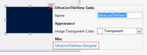
To begin with, I want to mention that in the documentation of the control you can find a full, step-by-step explanation of how to add Win Live Tile Vie using the designer and how to add it in the Code-behind. For the sample we are going to create we will use the Designer. Adding the control to our Windows Form Application is really easy. As you have already installed the Infragistics packages for Windows Forms you can find the whole list of controls in the toolbox. Find the UltraLiveTileView control in the toolbox and drop it onto the Form. When you do that you will see the so called smart tag.

smart tag

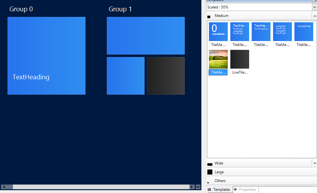
When you click on the UltraLiveTileView Designer tag, the designer will appear. Now that you have opened the designer you can choose from the templates different tiles and by dragging and dropping them you can create your groups of tiles.

designer

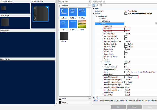
When you click on a particular tile you will see three options: delete, clone, edit. To customize your tile you can select the edit option and thus you will open an editor windows, where you can change the type of the tile, you can set an image or a background to the tile and you can change the heading or the text of the tile.

editor

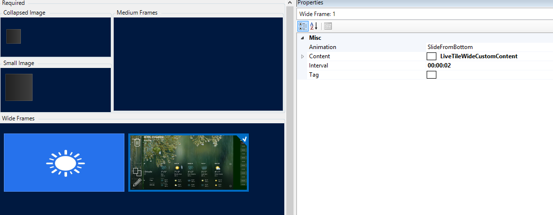
You can have as many tiles in a group as you want and they can be of a different size. You can also make live tiles with animation – meaning that they can change their appearance after few seconds. You can achieve this by following those steps:

1. Add a live tile.

2. Add more frames to the frame collection. That will result in animating the frames.

You can add more frames to the collections by going to the Default View option in the properties and then choosing the type of frame you are going to animate. In the user mode users can change the size of the tiles, so if you want the animation to occur only to the default size of the tile change only that collection, but if you want it to animate even when it is resized change all all of the collections. The animation option allows you to  determine the way it will act. The options are : Slide from top, slide from left, slide from right or from the bottom or fade. You can also set the interval after which the frames will change.

creating animation

Functionality

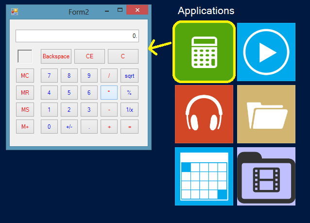
So we saw how to add tiles and group them, now lets take a look at the way they can act. For our sample we will make tiles that can open browser, tiles which will execute another forms and tiles that can open default programs.

All you have to do is handle the tile click event and perform an action based on the tile’s unique key. It can be anything available to you – like starting processes like browser from a link or a default program like windows explorer.:

  1. privatevoid ultraLiveTileView1_TileClick(object sender, Infragistics.Win.UltraWinLiveTileView.TileClickEventArgs e)
  2. {
  3.     if (e.Tile.Key == "chrom")
  4.     System.Diagnostics.Process.Start("http://google.com");
  5.     
  6.     if (e.Tile.Key == "explorer")
  7.     System.Diagnostics.Process.Start("explorer.exe");
  8. }

Or you can show other forms from like those one:

Example:

  1. if (e.Tile.Key == "calculator")
  2. {
  3.     Calculator calc = newCalculator();
  4.     calc.Show();
  5. }


calculator


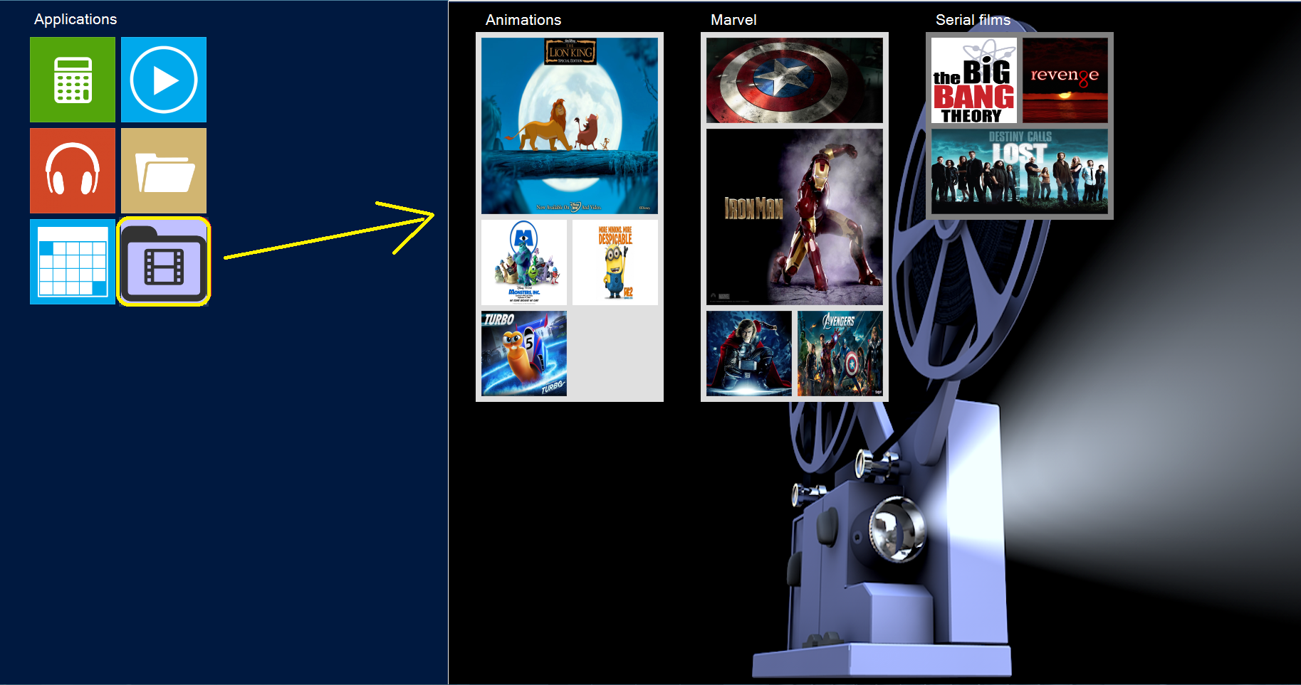
  1. if (e.Tile.Key == "movies")
  2. {
  3.     Movies movie = newMovies();
  4.     movie.Show();
  5. }


movies

In the user mode of the application the users can rearrange the tiles as they want . They can move them from one group to another, change the order of the groups or the order of the tiles. That is why it is good to allow you application to save the changes in the  layout, and then when you reopen it the new layout will load. You can do that by using the following functions: SaveAsXml and LoadFromXml. Create a form closing event and add the following lines:

  1. privatevoid Form1_FormClosing(object sender, FormClosingEventArgs e)
  2. {
  3.     this.ultraLiveTileView1.SaveAsXml("LiveTileConfig.xml");
  4. }

Then you can check for this file when the form is created and restore the tiles configuration.

  1. public Form1()
  2. {
  3.     InitializeComponent();
  4.     if (File.Exists("LiveTileConfig.xml"))
  5.     {
  6.        this.ultraLiveTileView1.LoadFromXml("LiveTileConfig.xml");
  7.     }
  8. }

Summary

Creating applications using the WinLiveTileView control for Windows Form is actually very easy and entertaining. This control can serve as a navigation ‘hub’ for an application and you can build a beautiful and functional one in no time using the designer and you can manipulate and customize the tiles anyway you like. In the movies sample as you can see we have changed the background of the form and the background of the groups, which makes it even more appealing. So unleash you imagination and create attractive and easy to access navigation menus.


You can check out all of the Infragistics Windows Forms controls and also download the sample project.

iOS - Unzip and Unrar in Objective-C

$
0
0
In a few of my own apps, i've needed the ability to unzip and unrar some files. Finding a good reliable library can be tough, so i'm going to recommend the ones that i've found and actually still use today. Unrar4iOS Note: this library just unarchives rar files, it will not actually create a rar file: Using this library is pretty simple, here's a snippet for unraring a file: Unrar4iOS* unrar = [[Unrar4iOS alloc] init]; if ([unrar unrarOpenFile:filePath]) { NSArray *fileNames = [unrar...(read more)

SQLSaturday #259 Kharkov Event Recap

$
0
0

Infragistics was a sponsor of SQLSaturday #259 Kharkov. Company provided licenses for the event raffle.

Infragistics also was presented at SQLSaturday Kharkov by me by me as a speaker.

The event was held on Saturday, December 7th at pr. Moskovsky, 199-b, Conference Hall «Sun City Premium», Kharkov, Ukraine

Administrators of the conference was  Denis Reznik – Kiev SQL user  group lead and former Kharkov SQL Server user group lead.

This is the third Infragistics event in Ukraina ( after SQLSaturday Kharkiv 2012 and SQLSaturdat Kiev this spring ). Infragistics Inc. was the only one component vendor with a speaker at the conference. Participants gave a good feedback about the company presentation.  There was also an interest in the  Infragistics solutions, related to Development Tools,  Data Visualization and Business Solutions. Infragistics presentation samples for Entity Framework  6  includes solutions with jQuery, WPF, Silverlight and Windows Forms, implemented with the company products like  Ignite UI. Hope in the near feature to have more closer contacts with professionals, community  members and companies from this region.


There were speakers from 5 countries: Poland, Turkey, Russia, Ukraine and Bulgaria


Sergey Olontsev in action:  


Some of the speakers:

Drawing the Infragistics swags for the SQLSaturday Kharkov raffle


Summary:

  • There was 20 presentations in 4 tracks.
  • Around 200 attendees
  • Speakers from 5 countries: Poland, Turkey, Russia, Ukraine and Bulgaria


Infragistics participation in the event:

Follow news from Infragistics for more information about new Infragistics events.

As always, you can follow us on Twitter @mihailmateev and @Infragistics and stay in touch on Facebook, Google+ andLinkedIn!

How to create interactive menu with Infragistics Radial Menu and Windows Forms

$
0
0

In the 13.2 release of Windows Forms, Infragistics offers attractive controls  which can help the end user to create interactive menus. In my previous blog we saw how to use Win Live Tile View control to create a menu similar to the Windows 8 one. In this blog we are going to create a radial menu,which will help us reach easily our favorite destinations and folders.

navigation menu

Radial Menu

The Win Radial Menu is similar to the Microsoft’s OneNote MX 2013 radial menu with the ability to customize its appearance and functionality. Designed for touch-first experience in mind, but also supports mouse and keyboard navigation. The control consists of slices that can have hierarchal structure – by selecting one you can open the children tools. The hierarchy level is unlimited.  You can add the menu by using the Designer or by using the Code-Behind. For the purpose of our sample we are going to use the Designer.

As you have installed the Infragistics packages for Windows Forms, you will find in the toolbox the full list of the controls. The one we need is the UltraRadialMenu. Drag and drop it in the form. Now that we have our control, we should use the smart tag to open the Designer.

designer

Move the mouse over the radial menu to enable the “New Tool” wedge for adding a new tool.  Your tool can be one of the following types: Button, Color, Numeric, List, Font name list, Numeric gauge or Color well. You can sign a name to that tool or import a custom image. Lets take a look at some of the tool types. In the example picture below you can see that we have created a menu for editing text. For the Font size tool we use the numeric type, so when you select it you will be able to choose the size from a numeric gauge:

Font size editor

For the Font tool we use the color type. So the result is:

font editor

The control maintain a lot of properties for customizing the tools, the menu and the center tool. You can change the appearance of the Outer Ring, the Inner Ring as well as the center button and Drill Down buttons. In the menu tab of the Designer you can alter the back color of all of the tools and their drill down buttons at once. But if you want to  remodel a particular slice you can do that from the active tool tab. Check out the Style Considerations topic in the online documentation for a step-by-step guide on how to stylize the control.

By default there are eight slices in the menu, but by changing the widgets count property you can have as many tools as you need. You can also manipulate the behavior of the tools, by changing the active tool settings. For example you can disable a tool by setting the enable option to false. That way you will see the tool but you wont be able to select it. All of the widget settings and options can be easily manipulated thanks to the Designer.

Active tool tab

For more information about the control’s options see the online documentation or take a look at the samples.

Navigation menu

As I mentioned in this blog we are going to create a navigation menu for a faster access to our favorite folders and destinations.  You can of course customize it as you like. In the main menu we will have tools that can open default programs like weather, maps, music player and other and we will open links like Google. To handle such functionality we need to perform an action based on the tools’ unique key like that:

  1. if (e.Tool.Key == "News")
  2.     System.Diagnostics.Process.Start("bingnews:");
  3.  
  4. if (e.Tool.Key == "Chrome")
  5.     System.Diagnostics.Process.Start("http://goolge.com");
  6.  
  7. if (e.Tool.Key == "Music")
  8.     System.Diagnostics.Process.Start("microsoftmusic:");

In the children tool menu of the explorer we have an easy access to the folders we use most frequently. If you want to open special folder like “My Music”, “My Videos” and etc. add the following lines:

  1. if (e.Tool.Key == "MusicFolder")
  2. {
  3.     Environment.SpecialFolder specialFolder = Environment.SpecialFolder.MyMusic;
  4.     string path = Environment.GetFolderPath(specialFolder);
  5.     System.Diagnostics.Process.Start(path);
  6. }


Special Folders

That is how in few easy steps you can build contemporary, appealing  and convenient to use widget. You can take a look at the INGear application sample on YouTube and download it by clicking the image below:

IN Gear app

Conclusion

As you can see by using this control you can easily create an interactive and functional menu. With its stylized  and compact appearance it becomes a handy and useful widget that can be part of every desktop application. With its full touch support this new UI pattern can optimized the user experience on a touch devices.


Download the Radial Menu sample.


Download


You can follow us on Twitter @Infragistics and stay in touch on Facebook, Google+ and LinkedIn!

Getting Started using NucliOS IGChartView with Xamarin.iOS

$
0
0

Once upon a time, I wrote a post called “Getting Started using NucliOS with Xamarin.iOS Part 1: IGChartView”. It was a decent post and many people have told me they found it helpful. Unfortunately, I hosted all of the images for the post on a server that no longer exists and now the post is littered with broken images and a project download link that no longer works. That’s not very helpful so hopefully this post will fill that void. This post will help you get started with the Xamarin bindings for Infragistics NucliOS IGChartView.

nuclios-xamarin<

Using IGChartView with Xamarin.iOS

IGChartView is a data visualization control that creates a graphical representation of the user’s data. It is designed to display high amounts of data and can handle constant data updates. It supports a variety of different series types including Area, Bar, Column, etc. For this Getting Started tutorial I’ll use the Area series. The finished application will look like this:

final

The data is populated using 100 random data points with values between 5.0 and 45.0. When the Refresh button is tapped, the data will be regenerated and the data points will smoothly animate to their new locations. Let’s get started!

Step 1: Creating the project

Start by creating a Single View iPhone Storyboard application by clicking on “Start new solution…” and configure the project as shown in the following screenshot:

project_creation

We will customize the storyboard file that is created to utilize a Navigation Controller instead of the basic controller that we are given.

Step 2: Customizing the storyboard

We could do this next step in code, but I wanted to briefly touch on the interface builder portion of the Xamarin.iOS workflow since I feel like it is a good fit for this kind of task and keeps your code a bit cleaner. Start by double-clicking the “MainStoryboard.storyboard” file. This will open the interface file in Xcode. Select the View Controller that is initially in the storyboard. If properly selected, it should look like this:

select_vc_to_delete

Press Delete to remove this view controller. After deleting the view controller, use the Library in the bottom right of Xcode to search for the Navigation Controller as shown here:

library_nav

Drag a Navigation Controller object onto the storyboard. The result should look like this:

dragged_out_navigation_controller

Next, delete the “Root View Controller” that was created with the Navigation Controller. We will replace this with our own View Controller. Use the Library to find the View Controller object and drag one onto the storyboard next to the Navigation Controller. The result should look like this:

viewcontroller_added_xcode

Now, hold down Control and drag from the Navigation Controller to the newly created View Controller. Your screen should look like this if you’re doing it right:

control_drag_connection

In the resulting popover, select “root view” under “Relationship Segue”.

root_view

Double-click on the empty middle portion of the Navigation Bar and type to change the title to “NucliOS Simple Chart”. Using the Library panel, search for “Bar Button Item” and drag one to the right-hand side of the Navigation Bar. The result should look like this:

navbar_setup

Next, select the View Controller and go to the “Identity inspector” and set the “Class” property to ChartViewController. Doing this will generate a C# class in Xamarin Studio when we switch back. If you’ve done it correctly (it should look like the image below), save the storyboard and switch over to Xamarin Studio to synchronize the changes we’ve made so far.

name_the_viewcontroller

Once synchronized, double-click the “MainStoryboard.storyboard” file again to head back to Xcode. Click on the Bar Button Item we added (it should currently say “Item”) and change the “Identifier” to “Refresh” to make the button look like a traditional refresh button. Now we need to add an outlet to the view controller which will allow us to access the refresh button from code back in our Xamarin.iOS project. Start by selecting the Assistant editor from the Editor picker at the top right of the IDE (it looks like this):

assistant_editor

This will put Xcode into a split screen mode where the left-hand side of the screen is the interface and the right-hand side is the code related to the interface, in this case the view controller. Make sure the “ChartViewController.h” file is loaded in the Assistant Editor. Hold down the Ctrl key on your keyboard and left-drag from the refresh button to the code file on the right and drop when the line is below the set of curly braces:

create_outlet_drag

Configure the resulting popover like this and click “Connect”:

outlet_popover

This will add an outlet to the Xcode project that will be automatically picked up by the Xamarin.iOS project when it is saved. Click the interface file on the left and save the file. Then click the code file on the right and save it. Switch back to Xamarin Studio and the changes will be picked up automatically.

We are ready to add our chart.

Step 3: Adding and configuring the IGChartView

The first thing we need to do is add a reference to the IGChartView.dll which is found in /Developer/Infragistics/NuCLiOS 2013 Volume 2/MonoTouch on your machine. To do this, right-click on References and chose “Edit references…”. Go to the .NET Assembly tab and navigate to the IGChartView.dll as shown here and add it by double-clicking it and then clicking “Ok”:

references

Now open the “ChartViewController.cs” file and add the using statement for Infragistics:

using Infragistics;
using MonoTouch.ObjCRuntime;

Add the following property declarations to the ChartViewController class:

public IGChartView Chart { get; set; }
public NSObject[] Data { get; set; }
public IGCategorySeriesDataSourceHelper Source { get; set; }
public int TotalItems { get; set; }
public Random NumberGenerator { get; set; }

The Data array will hold 100 random numbers between 5.0 and 45.0 and the Source object will make that data consumable by the IGChartView. In the constructor, initialize the variables and add & call the PopulateData function to get our data set up:

public ChartViewController (IntPtr handle) : base (handle)
{
    this.Data = new NSObject[100];
    this.NumberGenerator = new Random (1337);
    this.Source = new IGCategorySeriesDataSourceHelper ();
    this.PopulateData (100);
}

void PopulateData (int totalItems)
{
    double previousValue = -1;
    this.TotalItems = totalItems;
    this.Data.Initialize();
    for (int i = 0; i  40.0)
                value = 40.0;
        }
        previousValue = value;
        Data[i] = new NSNumber(value);
    }

    Source.Values = Data;
}

double RandomBetween(double small, double large)
{
    double difference = large - small;
    return this.NumberGenerator.NextDouble() * difference + small;
}

The PopulateData(int totalItems) method creates a set of randomized data that we will visualize using our chart. Each value is added to the Data array and once the Data array is full it is stored in the Source.Values property. Next, we will add code to the ViewDidLoad() method that is called when our view controller loads onto the screen. Underneath the call to base.ViewDidLoad(); add the following code:

// For iOS 7 we want to make sure we don't go under the Navigation Bar
this.EdgesForExtendedLayout = UIRectEdge.None;

// Set it up to fill...
this.Chart = new IGChartView (this.View.Bounds);
this.Chart.AutoresizingMask = UIViewAutoresizing.FlexibleHeight | UIViewAutoresizing.FlexibleWidth;

// Set the theme
this.Chart.Theme = IGChartDefaultThemes.IGTheme();

// Add the chart to the View Controller's View
this.View.AddSubview(this.Chart);

This code creates a new chart that fills the area underneath the Navigation Bar that will stretch in both the height and width such that it will work on all sizes of iPhones in all orientations. The chart theme is set to IGTheme. Next, add the following code which will set up the series that will be displayed in the chart:

var seriesType = new Class(typeof(IGAreaSeries));
var seriesName = "areaSeries";
var xAxisName = "xAxis";
var yAxisName = "yAxis";

IGAreaSeries areaSeries = 
    (IGAreaSeries)this.Chart.AddSeries(seriesType, seriesName, Source, xAxisName, yAxisName);

areaSeries.XAxis.LabelsVisible = false;
areaSeries.YAxis.Minimum = 0;
areaSeries.YAxis.Maximum = 45;
areaSeries.TransitionDuration = 1;

The first four lines set up the series type (area in this case), the name for the series, and the names for the x and y axes. The next line adds a new series to the chart that is configured using the variables we set up in the first four lines. Then, we configure the axis labels and minimums and maximums. The transition duration controls how long animations will last when switching between old and new values. These will be triggered using the refresh button. When tapped, the refresh button will generate a new set of data which the chart will switch to. Add the code for the refresh button right after the transition duration:

this.RefreshButton.Clicked += (object sender, EventArgs e) => {
    double previousValue = -1;
    for (int i = 0; i  40.0)
                value = 40.0;
        }
        previousValue = value;

        Data[i] = new NSNumber(value);
        Chart.ReplaceItem(i, Source);
    }
    Source.Values = Data;
};

This code hooks up the Clicked event for the RefreshButton which will replace each element in the Data array with a new random value and then updates the Source that the chart is displaying. The chart will then animate to the new values. At this point the application should be complete so build and run it!

Summary

You can download the solution here: NucliOS-Xamarin-SimpleChart.zip

I hope this code has helped you get up and running with the NucliOS IGChartView control in Xamarin Studio.

Contact

If you want to comment or reach out to me, the best place to do that is on Twitter @brentschooley. I can also be reached via email at bschooley@infragistics.com.

Getting Started using NucliOS IGGridView with Xamarin.iOS

$
0
0

Following up on the theme of getting these Xamarin posts cleaned up, I need to address the IGGridView post as well. Hopefully this will be a better help than that post! If you are a Xamarin.iOS developer that wants to add some flair to the data presentation in your app, we have you covered with the Xamarin.iOS bindings for NucliOS. This post focuses on using the IGGridView control to add a basic data grid to your application. As a bonus, I’ll also show you how to use the Xamarin.Mobile Contacts API to access the Address Book with this cross-platform API.

nuclgridxam

Using IGGridView with Xamarin.iOS

IGGridView is an iOS layout control that is very flexible and will allow you to create a wide variety of grid-based layouts. The most common use case for the control is as a standard data grid. This post will help you get started using the IGGridView in that context. The app that will be built loads the contacts in the iOS device’s address book and displays the first name, last name, and email address for each of them. The app looks like this:

final

The data is populated using 100 random data points with values between 5.0 and 45.0. When the Refresh button is tapped, the data will be regenerated and the data points will smoothly animate to their new locations. Let’s get started!

Step 1: Creating the project

Start by creating a Single View iPad application by clicking on “New…” under Solution and configure the project as shown in the following screenshot:

create_project

This will set up a project that uses a single view (i.e. no navigation) which is all we need for this simple sample. A ViewController with a XIB file will be created to represent the view. Unlike the first post in the series, we won’t need to customize the XIB file. Since we only need the IGGridView, we will add our user interface from code.

Step 2: Adding and configuring the IGGridView

The first thing we need to do is add a reference to the IG.dll which is found in /Developer/Infragistics/NucliOS 2013 Volume 2/MonoTouch on your machine. To do this, right-click on References and chose “Edit references…”. Go to the .NET Assembly tab and navigate to the IG.dll as shown here:

references

Now open up the NucliOSGridViewAddressBookViewController.cs file and add the following using statement:

using Infragistics;

Next, add fields for an IGGridView and a IGGridViewDataSourceHelper.

IGGridView _gridView;
IGGridViewDataSourceHelper _dsh;

The IGGridView is our data grid and the IGGridViewDataSourceHelper will help manage the data that is displayed within the grid. The data source helper is capable of auto-generating columns based on the properties on the objects contained in its Data property. Using an IGGridViewDataSourceHelper or one of its derivatives also shields you from having to write a lot of boilerplate code. Your time is too valuable for that so use the helpers when you can!

Add the following code to the ViewDidLoad method in the view controller to set the background color, create an autoresizing IGGridView, and add it to the view controller’s view:

this.View.BackgroundColor = UIColor.White;

_gridView = new IGGridView(this.View.Bounds, IGGridViewStyle.IGGridViewStyleDefault);
_gridView.AutoresizingMask = UIViewAutoresizing.All;    

this.View.Add(_gridView);

We will further customize the data grid once we have our data, but first we need to get that set up.

Step 3: Setting up the address book data

The data grid in the sample application will display the contents of the device’s address book. So, we need to get access to that data. The easiest (and most cross-platform) way to do this in a Xamarin.iOS project is by using the Xamarin.Mobile Contacts API. The Component Store within Xamarin Studio is the easiest way to get started with this. Right-click on the “Components” node under your project and click “Edit Components…” and then click the “Get More Components” button. Find the Xamarin.Mobile component which should look like this:

components

Add the component to your app. The “Getting Started” section for the component contains the code we need to use the API for what we need to do. Instead of adding the Contact objects from Xamarin.Mobile, we’ll create a lightweight wrapper object that contains only the properties we actually need to display. Add the following class after the closing brace of the view controller:

public class AddressBookItem : NSObject
{
    [Export("FirstName")]
    public String FirstName {get; set;}
    [Export("LastName")]
    public String LastName {get; set;}
    [Export("Email")]
    public String Email {get; set;}
    [Export("LastInitial")]
    public String LastInitial {get; set;}
}

Now that we have our wrapper object we can access the address book and build up our list of AddressBookItem objects. The following code sets up a list of contacts and then iterates over the address book to populate it.

Add the following code after the fields for the grid view and data source helper at the top of the class:

List   _contacts;

Add this code to the ViewDidLoad method:

_contacts = new List ();

var book = new AddressBook ();
var permission = await book.RequestPermission ();

if (!permission) {
    // In a shipping application, you'll want to do something to handle
    // the fact that your user did not give you permission to access the 
    // Address Book.
    Console.WriteLine ("Permission denied by user or manifest");
    return;
}

// Using Xamarin.Mobile, we can perform Linq operations over
// the Address Book entries.  Here we order by Contact.LastName
foreach (Contact contact in book.OrderBy (c => c.LastName)) {
    // Create an AddressBookItem (defined below) for each contact
    // to expose only what we need for the grid...
    AddressBookItem bookItem = new AddressBookItem();
    bookItem.FirstName = contact.FirstName;
    bookItem.LastName = contact.LastName;
    if(contact.Emails.Count () > 0)
        bookItem.Email = contact.Emails.FirstOrDefault().Address;
    else
        bookItem.Email = "";
    bookItem.LastInitial = contact.LastName.Substring(0, 1);
    _contacts.Add(bookItem);
}

SetupGrid();

The SetupGrid() method will take this data and set it up to be displayed in the data grid.

Step 4: Configure the data grid

Now that we have a list of contacts, we are ready to display them in our IGGridView. Although the data source helper we are using is capable of auto-generating the columns for us, we will create our column definitions manually. This is so that we can customize the header text that will appear in the header for each column. The SetupGrid() method will create column definitions and add them to the data source helper. The data will be grouped by the first initial of the last name which will automatically create sections for us. Add the following code to the view controller class:

void SetupGrid ()
{
    // We'll manually create the column definitions so that we can customize
    // the header text for each.  The string passed into the constructor is the
    // property name on the object to use for the column.
    IGGridViewColumnDefinition FirstNameColumn = new IGGridViewColumnDefinition("FirstName");
    FirstNameColumn.HeaderText = "First";
    IGGridViewColumnDefinition LastNameColumn = new IGGridViewColumnDefinition("LastName");
    LastNameColumn.HeaderText = "Last";
    IGGridViewColumnDefinition EmailColumn = new IGGridViewColumnDefinition("Email");
    EmailColumn.HeaderText = "Email";
    // We're using the basic IGGridViewDataSourceHelper
    // since our data will be displayed in a standard datagrid
    _dsh = new IGGridViewDataSourceHelper();
    // Since we are manually creating columns, turn off auto-generation
    _dsh.AutoGenerateColumns = false;
    _dsh.Data = _contacts.ToArray();
    // Add the ColumnDefinitions to the DataSource
    _dsh.ColumnDefinitions.Add(FirstNameColumn);
    _dsh.ColumnDefinitions.Add(LastNameColumn);
    _dsh.ColumnDefinitions.Add(EmailColumn);
    // We'll group on the first initial of the LastName
    _dsh.GroupingKey = "LastInitial";
    // Set the DataSource
    _gridView.DataSource = _dsh;
    // Turn off empty rows
    _gridView.EmptyRows = false;
    // Update the data!
    _gridView.UpdateData();
}

And that’s it. The application is ready to go. Run it and you should see your contacts in an IGGridView grouped into sections.

Summary

This post showed you how to set up a basic data grid to display contacts from the address book on the device. In future posts I’ll show you how to customize the grid and also interact with the contents.

You can download the solution here: NucliOSGridViewAddressBook.zip

Contact

If you want to comment or reach out to me, the best place to do that is on Twitter @brentschooley. I can also be reached via email at bschooley@infragistics.com.


Location-based Service: Tracking Business with SharePlus

$
0
0

"Even in a bad market, location, location, location is a way to still buy and sell property."
                                                                                                                   - Vanilla Ice 

Location is everything. Day by day location-based services and applications are becoming popular with consumers.

Introduction

Imagine you have clients spreading across different parts of cities or for that matter of fact resides anywhere. You are told to keep track of their whereabouts. It would be nice if somebody could create a report and share it with top management. Thankfully your mobile device is configured with SharePlus& ReportPlus (optional).

Once you go through this entire topic it becomes much simpler by using “Location Services” feature of SharePlus.

Before we start don’t forget to turn on the Location Services feature in your IOS device by following the instruction below.

Turning Location Services on or off

You can turn Location Services on or off at Settings > Privacy > Location Services. You can turn Location Services on either during the Setup Assistant process or later through the Location Services setting. You can turn it off if you don't want to use this feature or to conserve battery life.


Part 1: Getting Started

Start SharePlus and browse to the file location where you want to capture “location information”. Just tap and hold on it so that it pops up a dialog (Ref Figure 1). Tap Properties -> Edit Properties which takes you to next screen.


In the next screen press “location Services” icon (Ref Figure 2) available on bottom right corner of the screen followed by “Copy to Clipboard”. Now select the item which you want to copy. Cancel on top to go back to previous screen.


Once again tap and hold over your file (Ref Figure 3) but this time select “Document” tab. Before you start editing it is always advisable to “Check out” the document for proper versioning and comments.

Tap “Edit” so that it pops up the “Open In” dialog (Ref Figure 3) for editor selection. Select your desired editor for updating document with location information (Available in clipboard).

       [“When editing documents with QuickOffice through the “Open In” protocol, you have

        the “Save Back” feature available. This feature, developed in collaboration between

        QuickOffice and SharePlus, makes the User Interface (UI) simpler and also avoids leaving

        traces of your documents on the editor.”]


Update your spreadsheet with location coordinates (Ref Figure 4) and press “Close” button.

(Note - According to this illustration location coordinates are entered along with name & address of the customer.)


Now tap on “Save Back” and select “Open in SharePlus” (Ref Figure 5) from next dialog.


In the subsequent “Open In” dialog (Ref Figure 6) select “Update Item”.


Pressing “Save” button pops up a Check in confirmation dialog (Ref Figure 7) with two options to select from.

  • Ok – Keeps the edited version in Local Files and skips subsequent “check in” process.
  • Check In – Proceed to check in.


Final step would be to fill in the comments box and press “Done” (Ref Figure 8) which completes the process.


So far so good.


Part 2: Generate Report


Skip the next section if ReportPlus is not available in your device.

Once the updated spreadsheet is available in SharePlus (As per earlier steps), it becomes very easy to create dashboard using ReportPlus.

To recap what we require to plot in the dashboard refer the spreadsheet as below. It was prepared earlier in this topic.


We will render this information in a grid and use the location to plot in the map.

Just browse to the location where you want to add the ReportPlus dashboard and tap Add button (Ref Figure 9).


Select “Add ReportPlus Dashboard” menu item which pops up dashboard templates (Ref Figure 10).


Afterwards select the spreadsheet by navigating through SharePoint sites available on the left hand site. Simply drag & drop the spreadsheet over the blank dashboard which will provide the option to visualize grid, chart, graph, map etc.

(Note- Only SharePoint sites & Local Files are available in ReportPlus Data Source option when opened within SharePlus. ReportPlus standalone application can connect to almost all widely used data sources. Click here)

Watch this video to understand more about ReportPlus mapping functionality. (Click here)

Map setting will look similar to below (Ref Figure 11).


Finally your dashboard is ready, just save it.


Summary

Congratulation!! you have successfully prepared a report using location service. Any changes to the original spreadsheet will be automatically reflected in ReportPlus dashboard. Sharing this report is just one baby-step away.

Hacking for a Cause – Be a Part of Something Great!

$
0
0

With the holiday season upon us, it seems you can't leave your house without being faced with dozens of ways to "make a difference". Whether it's by adding a few dollars onto your shopping total for a worthy cause or tossing some spare change into a Salvation Army bucket, this time of year can inspire even the grinchiest of grinches to give back and feel good.

But sometimes, don't you wish there was more you could do? Maybe you want to get involved on a deeper level, and be a part of something bigger than a donation check. That's where Hackathons come in.

Hackathons (also known as code fests, hack days, or any other fun combination of similar words) bring programmers, designers, developers, and other tech-people together for a set period of time to collaborate on software projects. Their size and scope run the gamut from multi-day events focused on improving a company's existing programs (like Google's recent Glass-focused hackathon), to more grassroots-driven gatherings to benefit social good.

Code For A Cause

What's even better is that events like these can be organized by just about anyone with the desire and drive to be a part of something great! So this holiday season, why not make a new year's resolution to create your own hackathon around a cause that's important to you?

While it may sound like a daunting task, there are plenty of resources out there, like this great overview on dutiee.com, or the refreshingly candid breakdown on TechCrunch.  Budgeting, sponsorship, marketing, food, giveaways – everything you need to organize a successful event of your own!

Just imagine all the good that could come out of your hackathon: Enhanced tornado-tracking apps that help people get out of harm's way before it's too late; programs that connect high school students with volunteer opportunities in their communities; an app that can identify dangerous areas using crime statistics to improve pedestrian safety.

The fact is, when you bring a bunch of smart people together to rally around one task like hurricane relief or improving the local education systems, you can pretty much guarantee that great things are going to happen.

Infragistics' Junior Evangelist Damyan Petev has seen some great collaboration at these events. "Gathering with like-minded enthusiasts and working together to solve a problem is quite fun," he says. As a participant, "I get to do something I might not dedicate time to otherwise and I get to meet some great new people." And having participated as a judge at a few hackathons, Technical Evangelist Brent Schooley is especially impressed with the results of many of these events. "It really is amazing to see what people come up with in a short time frame," Brent says. "The time pressure and a fixed scope (such as using a particular service) really causes a team to focus and the results can be pretty interesting."  

So if you're looking for a way to give back this holiday season, by all means; give that extra dollar at the checkout, or toss your spare change into the red kettle outside the store if that's what moves you. But if you have the itch to be a part of something great, put your coding talents to use and consider organizing a hackathon of your own. When you give back in a big way, you just might find that the "season of giving" turns into a year-long thing. Happy coding!

Coding on Film

$
0
0

Let’s face it: movie producers just don’t make good coders.

If you’ve ever watched a movie that features technology – more specifically, anything that falls under the movie-terminology umbrella of “hacking” – chances are, you’ve laughed at how badly the filmmakers have botched up its portrayal. Sure, there are some exceptions where the technology enhances the story, follows some logic, and makes sense for the time period the film is set in (think The Matrix and War Games). But generally, movies that feature coding seem to follow the same principle: the more famous the leading actor or actress, the less money the producers had to spend on silly things like fact-checking.

The first movie that comes to mind is 1995’s Hackers. Now, this is a film that came out when the internet was new to the general public, and it was pretty exciting stuff for the big screen. A bunch of quirky, perfectly mid-90’s computer hackers (featuring Angelina Jolie!) take on an evil skateboard-riding genius who’s trying to destroy the world using a computer virus. And they’re only in high school!

But the filmmakers’ grasp on coding is really tenuous at best here. There’s no real code to speak of! By scrolling endless rows of random letters, numbers and other gibberish (mathematical equations?!) across the screen during the “hacking” scenes, all they’re really doing us showing us how easy it is to hack into TV stations, bring down the NY Stock Exchange, and save the world by flailing our hands around the keyboard. Or if you’re Jonny Lee Miller, by wearing sunglasses indoors while listening to The Prodigy on an endless loop.


Google Glass had a few more iterations to go before launch.

For a quick round-up of the best of the worst, check out Kyle Claypool’s post over at Stackify.com– if you’re in the mood for Matthew Lillard, blue lipstick, and some pretty epic rollerblading, I promise you won’t be disappointed.

Next, let’s examine Independence Day. How do we take down a race of angry aliens? By giving their mothership a “cold” with the blinding speed and unrivaled power of MacOS 7.6 of course!


To be fair, the original plan was to RickRoll the aliens and hope they just gave up on Earth.

This 1996 gem features Will Smith and Jeff Goldblum working together to save the earth from evil extraterrestrials. The very same extraterrestrials who just happened to have crash-landed at Area 51 years earlier and left behind a perfectly-preserved, now-functioning spaceship. Whose ships also miraculously run on the same platform as Jeff Goldblum’s PowerBook. What luck!

Wolf Gnards has a pretty awesome list of explanations for how the computer virus could have feasibly worked (my favorite being simply “Jeff Goldblum.”), but it is worth noting that the producers actually did try to address the flimsy reasoning with a deleted scene where Jeff Goldblum discovers that the Area 51 ship is “running off the same programming language”. But the fact that it’s a deleted scene goes to show you just how much they really cared about that pesky thing called logic.

Finally, let’s take a look at Superman III. This 1983 film may or may not have inspired a few months of terrifying nightmares (creepy robot-woman, anyone?) but the way the producers brought programming to the screen in this one is more likely to make you cry from laughter, not fear. Granted, this one came out years before either Independence Day or Hackers, but

OK, so here’s how it goes. After his unemployment checks run out, a down on his luck Gus Gorman (Richard Pryor) takes a computer class he finds advertised on the back of a matchbook and discovers that he has an uncanny talent for computer programming.


Evidently his success came as a shock to him too.

I won’t go into detail the way the crew at Den of Geek recently did, but suffice it to say that ol’ Gus’s first foray into coding – and the chain reaction of events that follow after it – are laughably misrepresented. Basically, Gus somehow goes from using BASIC to plot two bi-lateral coordinates (unthinkable in this movie’s reality) to thwarting the payroll security at his new employer’s company by simply entering the command “OVERIDE ALL SECURITY”. We’re guessing they charge by the letter at Webscoe – how else can you explain the missing “R” in override?

I’ll give the producers credit where it’s due – they did actually feature a little bit of actual code in the film when Gus is first taking his computer class. But after that, it looks like their programming consultant came down with the flu and the filmmakers were forced to wing it for the rest of the movie. Because soon, Gus is using similar simple commands to mess with the world’s oil tankers, cause the figures in a traffic signal to knock each other out, and search the Xeno galaxy for information about kryptonite. And to think, most of us use the internet to find funny pictures of cats. For shame.

So there you have it, my top 3 movies that feature some pretty bad representations of computer programming. But this is by no means an exhaustive list – I want to hear what you think! Leave a comment with your favorite “bad” movie and let’s see if we can work together to convince Hollywood to get it right next time!

Q&A with Dean Guida, Infragistics President & CEO

$
0
0

We sat down with Infragistics President and CEO, Dean Guida, to chat about the year in review, how Infragistics got its start, and where it's headed in the future. Read on!

Looking back, 2013 has been a really great year for Infragistics – How does that make you feel?

It feels great! It's great to be a part of this awesome team. And things just keep getting better. One million developers in our community and one million people using our enterprise mobility products – these two achievements alone would be enough to make it a great year, but on top of that, being recognized as the number one component vendor by the IDC makes it extra special.

One million community members. That's a lot of developers! What are the benefits of such a robust community?

First off, to be able to help that many people with our software is great. We love being able to help developers take their apps to the next level. We take enormous pride in our customer satisfaction – I think our most recent survey said that 94% of our customers would "delightfully recommend our product" – and that's huge.

Secondly – and most importantly – our community provides us with the chance to improve. We know that success stems from growth, and that's where our community comes in. We take it all into consideration and encourage everyone to participate. We want to hear it all: product feedback, industry trends, what's happening in software development around the world – they help us understand the needs of the market, and without them we could never be as successful or have such great products.

How has being named the number one component vendor impacted Infragistics?

It feels good for sure. We started out by building user interface controls for Windows 2.0. Now, I'm pretty sure a lot of people on our team now were even around then, let alone writing software! But since then, for the past 25 years, we've been building UI components. That's a long time! So it's very gratifying to be recognized by one of the largest analyst firms out there.

You've been at this development thing for a while - how did you get into this field? You've been doing this your whole life, essentially.

Yeah – believe it or not, I've been working since I was a kid! In high school, I worked at a TGI Friday's to save up money for a car. I did everything you could: cook, busboy, waiter, all of it. I had finally saved up $4,500, but instead of buying that car, I took that $4,500 and bought a computer. An IBM PC ii 360k drive, a real top of the line IBM PC! I'll never forget it. I fell in love with that device. I loved the sound of it, I loved writing code for it - I loved everything about it.

So as I started writing more software for it, I went on to school to study engineering. When I was in school, I was in the work study program getting paid $3 an hour, where I wrote the code for an $8 million payroll system for the University of Miami. My boss there told me it couldn't be done, but I told him it didn't matter if it couldn't be done, he was only paying me $3 an hour! But once I did that, I knew I was in love with technology. I graduated from school and became a freelance consultant, writing software on Wall Street and other large enterprises, and then I was able to turn that passion into Infragistics when I was only 23 years old.

Where did the idea of "Infragistics" come from?

Well the idea was already there. I had merged my company with my competitor at the end of October 2000, right in the middle of the big dot com era. So it was hard to find an available URL that wasn't being squatted on. But what it really comes down to is the two parts of the word: "infra" meaning infrastructure, and "gistics" meaning enabling. We are infrastructure enablers. If you view the user experience and interface as the infrastructure, it's our goal to enable that great user experience.

What do you think makes development so popular?

You know, building software is such a fun, intellectual and creative process. It's a process where you can dream up something, write the code for it, and see it happen instantly. That's very gratifying. It's an exciting process where you get to be an inventor, but you don't need a lot of capital or resources. All you need is the hardware to create it on, time, and creativity. It's very fluid and meaningful to be able to think of something, create it, test it, and there you have it.  I think that's why it's really flourishing, because it's so rewarding.

So what do you think is the next big thing in development?

Really, I think technology will become more invisible. People and their experiences are more connected than ever, so as they evolve together, the software that connects us to each other and our experiences and our work will continue to evolve and be more seamless.

The next big thing will be new ways to get people the information when and where they need it, and not having to work so hard to get it. It's part of everyone's lives now, but it's only going to be more important in the future.

So does that tie in to what's in store for Infragistics in 2014?

Definitely, I think we have a few really great things on the horizon – one being the ability to design great experiences with Indigo Studio. The ability to have an idea, meet with stakeholders, to take that conversation and those requirements and build out a real experience and testing it on a native device is huge. So we're working on improving the ability to produce code assets from that. You can do that now, but it's going to be even better.

In addition, Enterprise Mobility is another area we're working really hard in. We're already delivering solutions for people who have a lot of information and resources locked up in the enterprise, and need to securely push that data out to their devices – documents, social streams, analytics, everything. We're enabling the mobile workforce. Mobility is more than just going to a coffee shop, it's going from conference room to desk, meeting to board room. It's being able to access your data and work with it everywhere. That's going to become even more important as we move forward. It's an exciting time for Infragistics, I'm excited for what's in store!

To learn more about Infragistics, visit www.infragistics.com– and be sure to follow us on Twitter and Facebook for the latest news and updates!

CodeCamp Macedonia ‘13 – Event Recap

$
0
0

Infragistics was a gold  sponsor of CodeCamp Macedonia ‘13 . Company also  provided licenses and other swags for the event raffle. Infragistics also was presented at by Damyan Petev and  me ( as a speaker).

The event was help on Saturday, 14 of December 2013 in Skopje, Macedonia.

Conference was organized from  MkNET User Group supported by Infragistics and many other sponsors.


Some statistic

  • Around 700 attendees
  • Fifth CodeCamp in Macedonia 
  • The biggest IT event in Macedonia
  • The biggest free event for IT in Macedonia
  • 20 sessions in 4 tracks
  • Attendees from 4 countries (Macedonia, Serbia, Croatia  and Bulgaria  )
  • 18 speakers from 4 countries ( Macedonia, Serbia, Croatia  and Bulgaria )


Infragistics participation in the event:

The conference schedule is available here:


Pictures from Macedonian CodeCamp 2013:

Coffee break


Infragistics stand


Developers, developers, developers…


Damyan Petev in action: many people are interested in Infragistics products


CodeCamp raffle with swags from Infragistics


City trip with Daniel Joskovski after CodeCamp Macedonia ‘13


Follow news from Infragistics for more information about new Infragistics events.

As always, you can follow us on Twitter @mihailmateev and @Infragistics and stay in touch on Facebook, Google+andLinkedIn!

Viewing all 2460 articles
Browse latest View live