With every release comes a set of release notes that reflects the state of resolved bugs and new additions from the previous release. You’ll find these notes useful to help determine the resolution of existing issues from a past release and as a means of determining where to test your applications when upgrading from one version to the next.
Release notes are available in both PDF and Excel formats. The PDF summarizes the changes to this release along with a listing of each item. The Excel sheet includes each change item and makes it easy for you to sort, filter and otherwise manipulate the data to your liking.
In order to download release notes, use the following links:
WinForms 2013 Volume 2 Service Release (Build 13.2.20132.2010)
With the release of Windows 8, the era of touch devices is in full swing. Manufacturers are scrambling to create mobile devices that can run Microsoft Windows with the touch of a finger, without the need for a keyboard and mouse. Even Microsoft has released their very own Surface brand to satisfy this need to run Windows in a mobile world. This is all fine and dandy if you are building Windows Store applications that run on any version of Windows 8, and are built with touch as a first class citizen. Windows Store apps integrate perfectly with the device, such as automatically showing the Windows 8 touch keyboard when giving focus to an input element in the application. Windows Store apps are smart enough to know when I am not using a mouse and keyboard, and I give focus to a TextBox by touching it, it will show the touch keyboard to allow me to input data. On the other hand, if I am using a mouse and keyboard, and I give focus to the TextBox by clicking it with the mouse, the touch keyboard does not show, but rather I use the keyboard to enter my data. This is a nice feature built into the platform.
Although Microsoft has been shoving Windows Store apps down everyone’s throat, Windows Store apps are not a desktop solution, and in it’s current form, cannot replace certain desktop applications. This means, that if you are a desktop developer and want your WPF applications to work in this new mobile world, you need to make your WPF apps more touch accessible. Specifically, when dealing with running your WPF application on a Windows 8 Pro tablet, without the need for a mouse and keyboard.
Unfortunately, this is not as easy as we would like. As you have probably discovered, there is no API in WPF to access the Windows 8 touch keyboard. This means, that if a user loads your awesome WPF application onto their Surface Pro 2, and touches a input control, they have no way of entering data into that control. Well, they can, but it won’t be obvious to them. In order to enter any type of data into your WPF input controls, they would have to manually open the touch keyboard by tapping on the keyboard icon located in the taskbar.
Sure this works, but it is not the ideal experience. Wouldn’t it be nice to have your WPF application behave just like a Windows Store app, and automatically show the touch keyboard when an input control gains focus by touch? Well, you can, and I am going to show you how. Just so you know, it doesn’t require calling Process.Start(“C:\…\TabTip.exe”).
The first thing we have to do is disable inking in the WPF application. We do this because by default WPF touch support comes through the tablet platform’s real-time stylus input events (OnStylusDown, OnStylusUp, OnStylusMove). Instead, we need to use the multi-touch input as Win32 WM_TOUCH windows messages. This means we need to disable WPF listening to stylus input, and remove any tablet support added by the WPF Window. This code is freely available and documented in the MSDN topic “Disable the RealTimeStylus for WPF Applications”.
publicstaticvoid DisableWPFTabletSupport() { // Get a collection of the tablet devices for this window. TabletDeviceCollection devices = System.Windows.Input.Tablet.TabletDevices;
if (devices.Count > 0) { // Get the Type of InputManager. Type inputManagerType = typeof(System.Windows.Input.InputManager);
// Call the StylusLogic method on the InputManager.Current instance. object stylusLogic = inputManagerType.InvokeMember("StylusLogic", BindingFlags.GetProperty | BindingFlags.Instance | BindingFlags.NonPublic, null, InputManager.Current, null);
if (stylusLogic != null) { // Get the type of the stylusLogic returned from the call to StylusLogic. Type stylusLogicType = stylusLogic.GetType();
// Loop until there are no more devices to remove. while (devices.Count > 0) { // Remove the first tablet device in the devices collection. stylusLogicType.InvokeMember("OnTabletRemoved", BindingFlags.InvokeMethod | BindingFlags.Instance | BindingFlags.NonPublic, null, stylusLogic, newobject[] { (uint)0 }); } } } } }
The next thing we need to do is to get our WPF desktop application to opt-in to the focus tracking mechanism used in Windows Store applications. We do this by implementing the IInputPanelComfiguration interface. This will let our WPF app leverage the invoking and dismissing semantics of the touch keyboard and handwriting input panel. Unfortunately, this is not a managed interface, and there is no DLL you can reference to use it. There are two options for implementing this.
One, we can create an assembly from the IDL file located at c:\Program Files (x86)\Windows Kits\8.1\Include\um\inputpanelconfiguration.idl:
Start a command prompt
Use the MIDL compiler tool to build a Type Library TLB file (learn more about MIDL Compiler see here on MSDN)
Example: midl /tbld {filename}
Use the TLBIMP tool to convert the above generated Type Library (TLB file) into a DLL that .NET can use by running the following command (learn more about Tlbimp.exe here on MSDN)
This will create an unsigned DLL that you can now reference in your Visual Studio Solution.
Two, we can simply use a ComImport. This is my preferred approach.
[Guid("41C81592-514C-48BD-A22E-E6AF638521A6")] [InterfaceType(ComInterfaceType.InterfaceIsIUnknown)] publicinterfaceIInputPanelConfiguration { /// /// Enables a client process to opt-in to the focus tracking mechanism for Windows Store apps that controls the invoking and dismissing semantics of the touch keyboard. /// ///If this method succeeds, it returns S_OK. Otherwise, it returns an HRESULT error code. int EnableFocusTracking(); }
Now that we have taken care of the hard part, time to put the pieces together. We first turn off inking by calling InkInputHelp.DisabeWPFTabletSupport, and then we call IInputPanelConfiguration.EnableFocusTracking.
// Disables inking in the WPF application and enables us to track touch events to properly trigger the touch keyboard InkInputHelper.DisableWPFTabletSupport(); }
void MainWindow_Loaded(object sender, RoutedEventArgs e) { //Windows 8 API to enable touch keyboard to monitor for focus tracking in this WPF application InputPanelConfiguration cp = newInputPanelConfiguration(); IInputPanelConfiguration icp = cp asIInputPanelConfiguration; if (icp != null) icp.EnableFocusTracking(); } }
Now I can add a TextBox to my MainWindow.xaml, run the application, and watch the magic happen.
When I touch the TextBox to give it focus, the touch keyboard will show allowing me to use it to enter data into the control. If I click the TextBox with my mouse, the touch keyboard will not show, instead I have to use the keyboard to enter data into the control. As you can probably guess, this is not an official support solution by Microsoft, so you can expect some behavioral differences compared to Windows Store apps. For example, when you give touch focus to a control to show the touch keyboard, and then touch another area of your application, the keyboard may not hide as expected. Basically, some controls will dismiss the touch keyboard (for example a Button), while others won’t.
I have been working with my friend Dmitry Lyalin to solve this issue. He was vital to solving this, and he posted his own version of the solution to the Microsoft Developer Network. You will notice some differences in his implementation than mine, but the end result is the same. I would also like to note that Dmitry made a call to System.Windows.Automation.AutomationElement.FromHandle, but I do not see the need for the call, and do not notice any differences in behavior by not calling it. If I discover otherwise, I will update this post.
The Ignite UI radial gauge control is one of the many widgets for Data Visualization that you can find in the Infragistics package. This tool is capable of displaying a gauge containing a number of visual elements like scale with ticks,ranges, a needle and of course labels.
To create a basic radial control and visualize it in you project all you have to do is set width and height.
HTML:
<divid="gauge"class="gaugeContainer"></div>
JS:
$("#gauge").igRadialGauge({
width: "450px",
height: "450px"
});
MVC:
@(Html.Infragistics().RadialGauge()
.ID("radialgauge1")
.Width("150px")
.Height("150px")
)
So far so good,but before we continue with the various properties of the gauge, lets take a look at its structure. The radial gauge has a round shape, that is why we can use coordinate system to help us set the start and end angle of various visual elements of the control. The scale and all of the elements connected with the scale(tick marks, needle value, etc.) have clockwise orientation by default. Although a normal coordinate system has its 90 degrees at the top of the system, the control has it flipped. The example picture demonstrate how you should perceive the gauge.
Image may be NSFW. Clik here to view.
If you want for example to make a gauge that starts and ends at the same point – for example at the –90 degrees, you can set the start angle property to –90 or to 270 degrees and for the end angle set a value equal to the start angle value plus 360 degrees. For a scale that starts and ends at different points, you can just use the degrees from 0 to 360 to determine the range of the scale.
scaleStartAngle: "270",
scaleEndAngle: "630"
The scale sweep direction property can be used to change the scale orientation from clockwise to counterclockwise.
Features
As any other Ignite UI control the radial gauge supports plenty of features, which can make your application unique and easy to customize. While we are examining the control we are going to create a stopwatch like the one shown in the example image to demonstrate the different properties.
Image may be NSFW. Clik here to view.
Tick Marks
As we said the gauge is capable of displaying number of visual elements, such as scale with tick marks and labels, a needle and a number of ranges. The tick marks are the elements which display lines at a set interval. There are two types of ticks - major tick marks and the minor tick marks. You can specify the interval for the scale by assigning a value in which the major ticks will appear. For both the major and the minor ticks you can determine the start and the end position , measured from the center of the gauge by using respectively the tickStartExtent and thickEndExtent for the major ticks and minorTickStartExtent and minorTickExtentCount for the minor tick marks. Pay attention that the value of these properties should be between 0 and 1. You can also change the thickness and the brush of the tick marks by using the tickStrokeThickness and tickBrush for the major ticks and minorTickStrokeThickness and minorTickBrush for the minor tick marks. Choosing how many minor ticks to be displayed can be done with the minorTickCount option. For our stopwatch we need major tick mark at every 5 seconds and four minor ticks for more accurate time.
JS:
interval: 5,
minorTickCount: 4
MVC:
.Interval(5)
.MinorTickCount(4)
Labels
To determine the start and the end value of the gauge you should assign the required values to the minimumValue and maximumValue properties. The labels are vital part of the gauge. They display numeric values at a specified interval on the scale. In our sample we need labels at every major tick mark so we set the labelInterval property to 5 just like the interval for the major ticks. Because of that value for the label interval we are in a case where the first tick will have two labels (because we start and end in the same point). To prevent this we use the duplicateLabelOmissionStrategy property, which has several options – omitLast, omitFirst, omithNeither, omitBoth. Labels can be manipulated in one more way – by labelEXtent property. This option sets the position at which to put the labels as a value from 0 to 1, measured from the center of the gauge.
The needle can be remodeled in plenty of ways. You can choose the shape , the size, the brush as well as the position of the needle and the needle pivot. First of all you need to set the value property and that way you will specify where should the needle point. Using the needle shape option you can set one of the predefined shapes like : needle, triangle, trapezoid, rectangle and other. You can see the whole list in the API documentation. The needle start and end extent properties determine the position of the needle, measuring from the center of the gauge. The value can be between 1 and –1. There are two properties the needleStartWidthRatio and the needleEndWidthRatio that determine the width of the needle respectively at its point and at its base. Those properties take value between 0 and 1. Pay attention that the second one affects only needle of those shapes: rectangle, trapezoid, rectagleWithBulb and trapezoidEithBulb. For the sample we use the following lines:
You can see how to make the needle draggable in the sample browser.
Animation
The Radial Gauge control supports Motion Framework animations. The transitionDuration property makes it easy to animate the radial gauge and control its speed. This control animates almost every feature like scale range, color range, needle position and etc. In the Gauge Animation sample you can see how to animate between different configuration states of the control. In our sample we use this option to make the needle move smoothly.
MVC:
.TransitionDuration(1000)
Image may be NSFW. Clik here to view.
Background
By default the gauge has a circle shape, but we can change that using the backingShape option. The background shape can either be circular or fitted. A fitted shape creates a filled arc segment that encompasses the scale. We can customize the background by using the backingBrush, backing outline options as well as determining the inner and the outer extent of the gauge’s background. But the last two options will have effect only if the gauge has fitted shape. Making a stopwatch means that we need two gauges: the main one for the seconds and a little one for the minutes. To make it look as a real stopwatch the little one should be positioned in the main one. To accomplish that we need the background of the main gauge to be transparent. Making the background of the gauge transparent is useful if you want to create a complex background. You can do that by adding an image or CSS backing and place the gauge over it.
JS:
backingOutline: '#400000',
backingBrush: 'transparent'
MVC:
.BackingOutline("#400000")
.BackingBrush("transparent")
Scale
The scale is used to represent the values of the gauge visually. It defines a range of values in the control. All of the gauge’s elements are connected to the scale and are relevant to it. More information about the scale properties can be found in the documentation. For our sample we use the scale brush option to customize the gauge and the scaleStartAngle and scaleEndAngle that we mentioned earlier in the blog.
Conclusion
Basically, these are the essential properties needed for building a fully-functional gauge. You can see the samples in the sample browser and read the documentation for more detailed information about the Radial Gauge. The Ignite UI Radial Gauge can be used to create different visualizations like stopwatch, clock , compass, thermometer , mileage and etc.. It is an easy customizable and comprehensible widget that can enrich your web or mobile apps.
Coming soon a samples demonstrating how to create the following apps:
Image may be NSFW. Clik here to view.Image may be NSFW. Clik here to view.
Don’t get me wrong, it was a good gift, a very practical gift, I needed it, and I’ll definitely use it, but compared to the other things on my Amazon wish list, it wasn’t exactly a fun gift. Certainly not the kind of fun that the video game, Resident Evil 6, would have been.
Why did I put it on my wish list, then? Well, it was something that I needed, and I thought I might as well put it on there in case people needed more gift ideas for me. It wasn’t my top priority, but it was one of the last things I added to my wish list, and because Amazon orders your items by date added (as shown in figure 1), that’s what people first saw when they looked up my wish list. If it fits their budget, people are more likely to buy something near the top of your wish list. They’re much less likely to scroll down and notice the items lower down the page. And page two or three? Forget it! No one’s going to click through and see things from those pages, no matter how much you want them.
Figure 1 – Amazon’s wish list does not show your items in priority order.
And that’s where the Amazon wish list fails – it doesn’t allow people to easily rearrange their list to put the most important items at the top. For a company that practically invented the online wish list, you’d think they’d have it perfected by now.
It’s not like there are any other websites that allow users to create lists and easily change the order of the items. Oh wait, that’s right, there’s the Netflix Queue (as shown in figure 2), which gives you multiple ways of changing the order of items in your list. You can type in the exact numerical order you want, click a Top button to quickly move an item to the top of the list, or you can easily drag and drop the items to physically rearrange their order.
Figure 2– Netflix’s Queue provides several options to easily change the order of the items.
But what does Amazon provide? Drag and drop? A quick “Top” button? Okay then, at least they offer the ability to type in the numerical order that you want the items, right? No, not really. Instead they offer the ability to “Add comments, quantity, and priority” (as shown in figure 3). So you can select the priority (Lowest, Low, Medium, High, and Highest) and it appears below the item, although not very prominently displayed.
Figure 3– Amazon allows you to add a priority below the item.
Well, I suppose after prioritizing items, you can change the order of the list to show your items in priority order, right? Sure, you can sort the list by priority (as shown in figure 4), but it doesn’t save that sort order. Each time you or someone else comes to your list, it will be shown in Date Added order, with the most recently added items at the top. They have to notice the priorities that you put below each item, and they have to notice the ability to sort the list by priority.
Figure 4– The Amazon wish list can be temporarily sorted by priority, but that order doesn’t save.
So there’s no way to permanently reorder my list? Actually, there is a workaround (as shown in figure 5). To move an item to the top of your list, you can click on it and go to its product page. On that page, you click Add to Wish List, and since it’s already on your wish list, it will be moved to the top of the list. So with careful planning and many clicks, you can eventually reorder your wish list in the exact order that you want it to appear. Pretty simple, huh?
Figure 5– There is a workaround to change the order of items in your wish list.
You may think that people would be likely to have high priority items at the top of their list anyway, but the way the wish list works, people are more likely to have lower priority items at the top of the list. As a gift giving occasion approaches, people go to Amazon to update their wish list. The first items they add are the ones that they already know they want, which are probably the highest priority. As they browse, they may notice a few other items of interest and add those. The longer they browse and add items, the lower priority those items probably are. By the time they’re finished, the least desired items are at the top of the list, pushing the most wanted items down the list or even off the first page. Gift givers are most likely to buy something near the top of the list instead of scrolling down or going past the first page.
So, Amazon, can’t you change your wish list to work like the Neflix queue? Let us drag and drop the items into any order we want, and then show that order by default to anyone who looks at our list. After all, it is almost 2014. It can’t be that difficult to do.
With every release comes a set of release notes that reflects the state of resolved bugs and new additions from the previous release. You’ll find the notes useful to help determine the resolution of existing issues from a past release and as a means of determining where to test your applications when upgrading from one version to the next.
Release notes are available in both PDF and Excel formats. The PDF summarizes the changes to this release along with a listing of each item. The Excel sheet includes each change item and makes it easy for you to sort, filter and otherwise manipulate the data to your liking.
Image may be NSFW. Clik here to view.With Ignite UI we’ve mostly kept to its platform-agnostic nature, showing you how you can create something great, without touching too much detail of all the possible environments. However, some applications can be platforms in their own right, like web CMS. As content and teams grow, many end up using some form of CMS(and there’s always room for extending with some awesome jQuery widgets, right?). While WordPress dominates here and it’s pretty great, it’s not always the perfect fit for anyone, especially more .NET oriented web developers. The list of available picks for various platforms is rather long, but what stood out to me is that one CMS consistently either topped “.NET CMS” searches or was pretty high up there – Umbraco. What this tells me is that Umbraco has been gaining a lot of traction the last few years, or at least it got my attention. There’s a good reason for people to adopt it – it’s ASP.NET based, it’s open source, it’s got a lively community and as they put it “ ...Oh, and did we mention that it's free?”. Even the ASP.NET homepage is using it. Like, if that’s not good enough, there’s also the fact that Umbraco and the back-office, as they call it, are user-friendly and quite easy to start using by anyone.
Even though you can install Umbraco with pre-configured template sites(Starter kits) for various purposes, if you choose to do a Blank application, what you get is all the necessary infrastructure and an extremely clean foundation. Kind of like the “empty-really-blank-this-time” project template for ASP.NET MVC Image may be NSFW. Clik here to view. What’s so nice about bare-bones base? It can be built just the way you need it – no extra luggage to fight your way though. It will still integrate good old .NET controls, cache, let you use master pages or Razor or both and generally be the really nice platform that it is. But most importantly – MVC. Can I hear ASP.NET MVC Helpers?
Setup
I kind of wish this part could be super short, but it isn’t for now. If you haven’t got Umbraco or have no idea what that is – no worries, there are guides that have you covered. If you are using WebMatrix you can go ahead and hit New and then pick App Gallery. And it will be right up there
Image may be NSFW. Clik here to view.
All left to do is follow the rest of the steps and you will have Umbraco up in like 2min. There’s a convenient NuGet package that can just add Umbraco to your project in a click. In reality, Umbraco is a heavily customized ASP.NET Web Site and you can always download it, unzip and open in either WebMatrix or Visual Studio manually. At the time of writing the WebMatrix template is at v6 and NuGet is already updated to the new and pretty v7.
I’m assuming you already have Ignite UI, but here’s a neat trick we offer as of the latest release – igniteui.com (which is like a second, more geeky home of Ignite UI, where all the samples and codes are) also has a big “Download Now” button. Yes, you can download the full thing here, but there’s a bit extra – a custom build configurator. You can pick just the controls you need (like a chart for this blog) and get a combined and minified file with all the dependencies in. (for the doge fans)
Umbraco can have somewhat wonky setup – v6 kits often use both Razor rendering engine and ASP.NET WebPages. It’s a refreshing freedom to use anything you see fit, which is nicely in-tune with ASP.NET embracing similar multi-faced development side allowing us to simply tick off anything.
Resources
First things first, place the Ignite UI files in their respective CSS and Scripts folders. Now, I can’t really tell you how to add those to the content. I’ve seen a few ways and I’ve barely scratched the surface of Umbraco. And that’s kind of it, really – Umbraco doesn’t enforce anything on you. So be it though Client Dependency (which ships with Umbraco), the “umbraco.library.RegisterJavaScriptFile” method, some other third party packages like Combres that I’ve seen.
So Umbraco actually comes with jQuery anyways, so what’s left for you is to use it and also add jQuery UI and the Ignite UI. For my v6 demo I went with the library provided utility:
This sadly won’t combine resource like Client Dependency would, but I failed miserably to integrate the latter with MVC view and web forms template(might be me, might be the different engines, context, whatnot). However, if you have your own templates built with MVC or.. did I mention Umbraco 7 is out? It’s kits are full on MVC, so this works perfectly too:
Either way(or any other), just make sure those files are there, will ya? :)
What Infragistics MVC assembly should I use?
Not saying that you need to use one(you can just use the controls with client scripts only), but with MVC platform you’ll probably want to. Ignite UI helpers for ASP.NET MVC ship in multiple versions starting from MVC 2 to MVC 5 with the latest release, because it’s sort of a bummer you can’t have a single helper for everything. You will have to go check the MVC version you are using, since it’s a web site not even Visual Studio will give you properties with version. Good old explorer to the rescue:
Image may be NSFW. Clik here to view.
Helpers are built and will only work with their version of MVC available, so grab the Infragistics.Web.Mvc.dll for that version (for me both v6 and v7 were MVC4) and just copy it to the bin folder of the site (Visual Studio has add reference option too).
Where to develop?
Once more I can’t really tell you that, but I can give suggestions. I picked starter kits that have blogs/news, so I thought it’s only reasonable that there’s a page that allows content creators to see stats on those. With some kits’ default master pages templates the only reasonable entry point with Html helpers is a Macro. Those are under the developer section, and they are quite flexible as to what they can be developed with. as with everything in Umbraco – hit Create and pick a name. But it can also be somewhat confusing at first – for example there are two options using the Razor engine where you can find the Html helpers. Alas, Razor is used, but not always the one I expected. Script files are DynamicNodeContext that inherits from WebPages but as we already talked Html helper extensions are tied to System.Web.Mvc instead. That means you should go for the MVC Partial View, plus it’s the more recent and recommended way to develop macros anyways.
Image may be NSFW. Clik here to view.
The great part of macros is that you as developer can include them in templates for content, but you can also expose them to the editor, so content creators can reuse them. And you can setup properties to support that even further with users entering settings when adding your macro to content:
Image may be NSFW. Clik here to view.
Show me the code
Now that you have your Umbraco macro ready and with some published content you can add some Ignite UI visualization for that data. I have two demos with very similar code (links below), but one is on v6 Blog Starter and the other is on v7 with the Txt Starter Kit that has news instead, so the query for content items is different. I’ve added a property to blog/news items called “Views” where you would probably have some package to manage those.
In your MVC Partial View start with the all important:
@using Infragistics.Web.Mvc
And then after making sure the resources are covered, add in a chart to display the stats:
After that you can add the macro to some content page or render it in some template. The content query assumes this will be published on top level next to the News. If your templates are MVC based or you are using v7 where UmbracoTemplatePage inherits from System.Web.Mvc.WebViewPage, you can directly add this code without a macro too. I have second version with just that on the v7 demo. Regardless, the outcome should be a chart that shows the latest posts’ statistics:
Image may be NSFW. Clik here to view.
Resources
I think I’ve mentioned it already, but I’ll say it again – I’m only scratching the surface here with what’s possible – Umbraco CMS is good because it’s flexible and it just “supports”, but that also means there are many differences and also it can be easy to start, but it does have a steep learning curve if you want to go deep. Hopefully, the information above was useful and at the very least sparked some ideas what you can do next with our jQuery controls and their ASP.NET MVC wrappers. So, happy developing and happy holidays. Presents in forms of links are below :)
Check out Umbraco (they have nice getting started guides, videos, forums and the sorts)
Umbraco’s latest version 7 has moved code to GitHub
Download the v6 demo with Blog Starter Kit or the v7 demo with Txt Starter Kit. I’ve setup both demos to use SQL CE so it should be an unzip-and-run deal; the username is “IgniteUI” and the password is “umbraco” – open folder as site with WebMatrix or Visual Studio. Run and go to “/umbraco” for the back-office.
Image may be NSFW. Clik here to view.In the ”Getting started with jQuery Radial Gauge control” blog we examined the basic features of the Ignite UI Radial Gauge and we saw how to create a fully-functional gauge. In this blog we are going to take a look at some tips and tricks for using the gauge in more advanced scenarios and we are going to create a clock and a compass samples to demonstrate how to make multiple needles, multiple outlines and use gradients.
Multiple Needles
The radial gauge doesn’t yet support multiple needles, so to accomplish such effect for your application you should create few gauges and place them one over another. For example in the clock sample we need three needles- for the minutes, the seconds and the hours. This means we need to build three separate gauges.We don’t need all of the properties and functionalities to be repeated in every gauge, we should style only one of them and make the others transparent. The Labels can’t be transparent so to make them invisible in the transparent gauges we can use the formatLabel event. The result should be a control that looks like the one on the example image.
JS: (hours)
//hours
$("#hours").igRadialGauge({
width: "450px",
height: "450px",
minimumValue: "0",
maximumValue: "12",
scaleStartAngle: "270",
scaleEndAngle: "630",
scaleStartExtent: "1",
scaleEndExtent: "1",
scaleBrush: "transparent",
value: hours,
needleShape: "triangle",
needleEndWidthRatio: "1",
needleStartWidthRatio: "0.03",
needlePointFeatureWidthRatio: "0",
needlePivotWidthRatio: 0,
needleBrush: "black",
needleEndExtent: "0.35",
needlePivotShape: "circle",
interval: 1,
labelExtent: "0.70",
labelInterval: 1,
duplicateLabelOmissionStrategy: "omitFirst",
backingOutline: "black",
minorTickCount: 4
});
JS: (seconds and minutes have similar configuration)
//seconds
$("#seconds").igRadialGauge({
width: "450px",
height: "450px",
minimumValue: "0",
maximumValue: "60",
scaleStartAngle: "270",
scaleEndAngle: "630",
value: newSeconds,
needleShape: "rectangle",
needleEndWidthRatio: "0",
needleStartWidthRatio: "0.01",
needlePivotWidthRatio: 0,
needleBrush: "grey",
interval: 0,
scaleBrush: "transparent",
backingOutline: "transparent",
backingBrush: "transparent",
formatLabel: function (evt, ui) { ui.label = ""; }
});
Example image:
Image may be NSFW. Clik here to view.
To make the clock work of course we should change the value for the different needles at the appropriate time. This can be done easily, we just need to set initial values at the beginning and then change them respectively to the time.
Simple as that we now have a functional clock displaying the local time.
Gradients
Multiple needles are also useful for our second sample, but in addition to them we want to make the compass have three-dimensional appearance. To accomplish such effect we are going to use gradients as the brushes for different elements. Although you can see in the API documentation that only rangeBrush and rangeOutlines support CSS and gradients, actually all of the properties that are responsible for coloring the different elements of the gauge support them. If you are going to use rangeBrush and rangeOutlines you should first define a range. A range highlights a set of continuous values bound by a specified minimum and maximum value on a gauge scale. You can add multiple ranges to a scale, specifying different brushes, along with starting and ending values. The range has a counterclockwise orientation. Every property that can be used to color the different elements can a CSS string as well as JavaScript objects defining gradients.. The default gradient orientation is top to bottom, so the color at offset 0 will be positioned at the top of the figure and the color at offset 1 will be at the bottom. To change that direction , you should specify the start and the end points.Both the x- and y- axis coordinates for these points must be in the range 0÷1 where (0, 0) is the top-left corner of a figure’s bounds rectangle and (1, 1) is the bottom-right corner. In order to visualize it easily take a look at the following diagram. You can find more detailed information in the “Using Gradient Colors in Data Visualizations” topic of the documentation.
Image may be NSFW. Clik here to view.
As we mentioned these are not the only properties that support gradients. You can set gradients to the background, the needle, the scale, the outlines and even to the major and minor tick marks and every element has its own diagram like the one above. The diagram depends on the element orientation and is rotates along with it. For example when the needle is at 45 degrees the diagram will also be rotated by as much, you can visualize it like this:
Example Image:
Image may be NSFW. Clik here to view.
JS:
needleBrush: {
type: "linearGradient",
colorStops: [{
color: "#8F0000",
offset: 0
},
{
color: "#E06666",
offset: 0.4
}, {
color: "#8F0000",
offset: 1
}]
}
Apart from the needle in the sample we use gradients for the background and the outlines.
JS:
backingBrush: {
type: "linearGradient",
colorStops: [{
color: "#fff",
offset: 0
},
{
color: "#000",
offset: 1
}],
startPoint: { x: 0.5, y: 0 },
endPoint: { x: 0.5, y: 1 }
},
backingOutline: {
type: "linearGradient",
colorStops: [{
color: "#000",
offset: 0
},
{
color: "#fff",
offset: 1
}],
startPoint: { x: 0.5, y: 0 },
endPoint: { x: 0.5, y: 1 }
}
Example image:
Image may be NSFW. Clik here to view.
Finishing touches
The labelformat event comes in handy, because we need to replace the numeric labels with strings showing the direction.
The 3D effect of the outlines is accomplished by using the backing outline of both of the gauges. We set to the backingOutline property of the main gauge an array of brushes as we have shown earlier and we manipulate the outline of the second gauge by increasing its thickness and outer extent.
backingStrokeThickness: 6,
backingOuterExtent:0.84
When the design of the gauge is ready we should take care of its functionality. The contemporary mobile devices are capable of determining their orientation.In order to do that we will use the JavaScript DeviceOrientationEvent to handle orientation information. All you need to do to start receiving orientation changes is to listen to that event. We need to catch the changes when we rotate the device around the Z axis and for that reason we need the DeviceOrientationEvent.alpha value, which is represented in degrees with values ranging from 0 to 360 degrees. In the event handler function we need to set the value of one of the needle equal to the alpha value and the other needle should point the opposite direction – alpha+180 degrees.
if (window.DeviceOrientationEvent) {
window.addEventListener('deviceorientation', function (eventData) {
There are many ways to use the Ignite UI Radial Gauge control and create a handy and pretty applications. By placing one gauge over another you can have multiple elements like needles, labels, outlines and etc. . You can customize the control by using gradients for the different elements and that way you can have a unique gauge that will visualize your data.
At the beginning of the 2013 year, I announced the start of the Infragistics User Group Contest for 2013. The contest started in 2012 as a fun way to break the ice at the various user groups I would speak at. Due to the success of the contest, it quickly expanded to the rest of the evangelist team at Infragistics. Now, in 2013, we have had over three times the number of entries compared to 2012. Needless to say, this contest has become quite popular at Infragistics sponsored user groups all over the world.
Before we announce the winner, let’s review the rules, because these are important to know when determining a winner.
The Rules
The rules are simple. The user group that has the most eye catching, fun, exciting, smile producing, and laugh inducing picture will win. The picture must be taken the day/night of the presentation and the Infragistics presenter must either take the picture or be part of the picture. The picture can be taken at any location and is not restricted to the location of the presentation. The picture must be taken between Jan 1, 2013 and Dec 31, 2013. Only the Infragistics presenter can submit the photo.
The Contestants
Any user group, in any country, that an Infragistics employee presents at is eligible. If your group is lucky enough to have more than one Infragistics presenter during then 2013 year; sorry, but a user group can only be entered once for the 2013 contest. No other event presentations qualify for this contest.
The Prize
The winner of the Infragistics User Group Contest 2013 will win a $500 gift card for their user group.
Release notes reflect the state of resolved bugs and new additions from the previous release. You will find these notes useful to help determine the resolution of existing issues from a past release and as a means of determining where to test your applications when upgrading from one version to the next.
Release notes are available in both PDF and Excel formats. The PDF summarizes the changes to this release along with a listing of each item. The Excel sheet includes each change item and makes it easy for you to sort, filter and otherwise manipulate the data to your liking.
In order to download release notes, use the following links:
Infragistics Silverlight 2013 Volume 1 Service Release
Release notes reflect the state of resolved bugs and new additions from the previous release. You will find these notes useful to help determine the resolution of existing issues from a past release and as a means of determining where to test your applications when upgrading from one version to the next.
Release notes are available in both PDF and Excel formats. The PDF summarizes the changes to this release along with a listing of each item. The Excel sheet includes each change item and makes it easy for you to sort, filter and otherwise manipulate the data to your liking.
In order to download release notes, use the following links:
Image may be NSFW. Clik here to view.The great thing about being a UX or UI designer is there are always new challenges to face and new things to learn. The web, and specifically the wide variety of blogs available for consumption, offer a great way to learn new skills, keep up with the latest trends, or simply find inspiration. With that in mind here are 5 great blogs that all UX and UI designers need to know about:
Boxes and Arrows
The Boxes and Arrows site has been around for a long time now, certain in terms of the web. Since 2001 in fact. It features a wide range of well written and researched articles on the topics of graphic design, interaction design and information architecture. Articles are submitted by a range of contributors from across a number of industries. Check out the Boxes and Arrows site when you are looking for serious indepth articles that push forward the practice of UI and UX.
A List Apart
A List Apart is another old school site that has managed to keep relevant and interesting since it first got going in 1997 (initially as a mailing list). The site accepts submissions from writers in a range of professions, and as a result features a wide range of content exploring web design and content. A bit like ‘Boxes and Arrows’ in that it generally focuses on longer form in depth articles, this is a must for any UI or UX designer serious about their profession.
iA
Information Architects is the blog of the company of the same name. The company design and build various web products and services, and got a lot of attention when they launched ‘iA Writer’ for the Mac and iOS. The style of the blog tells you everything you need to know about their ethos (it is very sparse indeed) but it also includes a ton of useful material and design and user experience.
Little Big Details
We covered UI pattern websites in a previous post. Little Big Details isn’t quite one of those, but it does include a wealth of useful screenshots and snippets of user design goodness. What is especially nice about this site is the stripped back commentary, the team simple let the UI do the talking..
The Nielsen Norman Group
Whilst the principles expressed over the years by Jakob Nielsen and Don Norman don’t always meet with universal acclaim, most UX and UI designers would admit they have both had a huge influence on their field in the last 10-20 years. The Nielsen Norman Group blog features a ton of articles covering everything from tablet usability, to the use of the web by senior citizens.
After reading this blog, you will be able to integrate the Ignite UI igGrid control with history.js, a popular library for browser history manipulation and navigation. This will allow you to navigate through igGrid states and to directly access a certain state. With the following configuration, the igGrid control will be adapted to respond to the needs of the modern browsers’ history navigation. At the same time, using the rich event set of the Ignite UI controls, you will be able to use the same configuration and integration with the rest of the Ignite UI widgets. Firstly I will provide some background on the functionality the browsers provide for page navigations and possible issues you may experience.
HTML5 History and Navigation
Image may be NSFW. Clik here to view.
Building a web site, where a site entity or a site resource is identified with individual address in the address bar, is not something new, but with HTML5 and SPA applications on track, the methods for achieving this have changed. The HTML5 Session history and navigation functionality proposes new API and flexibility, and of course some new challenges that need to be addressed.
Instead of rendering a new page on each user navigation action, the websites today, are making asynchronous requests to load the desired content within the same page the user has already loaded – data transfer is smaller, performance is better and the overall user experience is more complete. In a Single Page Application (SPA), when the asynchronous request is made, everything happens “behind the scenes”, and most of the time the user will not even notice that a request to the server has been made. If we don’t manipulate the browser URL, then it also will stay the same, even after our users perform some navigation. For example if you open a page and after that you have several asynchronous requests for data initiated by user actions, then when the user presses the back button they will leave the page, because the browser has remembered only the state when the page has been loaded, and the previous browser state is the previous page. This means that the back and forward buttons are useless in our application and the only entrance to the page will be the home page. The solution for this is to use the HTML5 Session history and navigation functionality. Its API provides functionality that allows you to manually add entities (some object representation of a current state) to the browser history and in addition to change the page URL and title without the need of request to the server. This will allow the developer of a SPA or any asynchronous application to have navigation and identification of the application’s resources and states.
Following the HTML5 specifications, the usage of browser history API seems pretty straightforward:
window.history– the browser history object that holds all the functionality.
go(), back(), forward()– methods that allows to navigate through the browser history (available in the HTML4)
popstate– event that is fired, when navigation in the browser happens (when back or forward buttons are pressed)
pushState(), replaceState() – methods that allows you to add new or replace existing state in the browser history stack.
state– get current state
length– get length of the browser history stack
Before explaining the browser history workflow, I want to point out the pushState() method and its parameters, because it’s “the man” that do most of the work. The following pictures depicts what the results will be when the pushState() method is executed:
As you see the URL and the title of the page are new and the achieved result is the same as loading a new page, even though it’s only JavaScript executed on the client. Below is a more detailed description of the method parameters:
State object– a representation of the current state. In our case it’s an object with one property “page” – { page: 1 }. Here you can save all the parameters that will help you to describe and recognize the current state. Note that later, when the browser is back at that state of the history, you will be able to get it using history.state.
Title - the new page title that appears on the page tab.
URL– the suffix that is added to the URL, after the domain name. This URL is the identifier of the current state/page. In this tutorial we are using the old query approach, with the parameters encoded in the URL. This may not be the best approach, but is good for easily presenting and distinguishing the several states in the URL.
Let’s imagine that user loads the initial page of your SPA by typing in the address bar of the browser. A full request is made, the page is loaded and the page state information is added to the browser history stack – all that is performed by the browser. Then the user clicks an item on the page, asynchronous request is made and some new content is loaded. Now comes the place where you can use the pushState() method. You decide, what the appropriate representation that describes the currents state would be, you give the page new title and URL and you add it to the browser history stack. What you have as a result is a “fake new page load” – the page content, title and URL have changed, but the request itself is asynchronous – faster and lighter. Your new page state is identified in the web and added to the browser history. It can be saved to browser favorites and the URL link can be sent. In addition the page will be easily indexed by the search engines.
What can eat your time, in some of the cases, is to assemble a more complicated URL. If you want to encode a lot information in the URL, then you will need some more logic to create that. Note that pushState() method will work also if you don’t have URL as a parameter. In this case you will be able to navigate back and forward in the browser, but page will not be identified with its own URL, which means it cannot be directly accessed from the browser.
What happens when the back button is pressed? Then the browser returns the previous page URL and title, and fires the popstate event. What you need to do is to attach to that event and inside the handler to try to recover the previous page content. This can happen by using the information of the current state (taken from history.state property), that you previously saved with pushState() in the state object. Let’s put some overview and see if this is enough to start using the browser history navigation functionality.
Third-party Browser History Libraries and history.js
As I already said, navigating in a web page and identifying its resources is a straightforward task using HTML5. But what about the old browsers that don’t support HTML5? This appears to be a problem. Following the official Mozilla document: Chrome 18+, Firefox 4.0+, IE 10+, Opera 11.5+, Safari 6.0 are the browser that support history functionality. This means that we should search for some third-party library that will provide us with backward compatibility and will help us to create navigation in SPA even in the old browsers that don’t support HTML5 features.
What I can add as another alert is that inside the history object, we have access only to the current state – it is not possible to take the state at two or three steps behind. We will need this functionality if our application support more complex navigation. In addition to that we need to distinguish if the back or forward button is pressed. These concerns, along with the backward computability integration, are the most important that needs to be taken into account, when we decide to choose a third-party library. We decided to choose history.js for couple of reasons – it is available for both pure JavaScript and jQuery (this fits the Ignite UI needs) as well as other popular libraries like Dojo, ExtJS, MooTools; it’s API is almost the same as the native browser API for the history – the history object is replaced with History and there are several additional methods; following the commitment in GitHub, there are recent commits and it’s community managed. Here is a broader list of popular libraries:
history.js
HTML5 History API
jQuery BBQ
Sammy.JS
YUI 2 - integrated
Angular.js - integrated
I want to note that some of the libraries are especially made for navigation and routing – history.js, HTML5 History API, jQuery BBQ or Sammy.js. On other hand most of the SPA frameworks, like Angular.js, have their own navigation or routing and if you want to start your application from scratch then these are most probably the better choice for you. But if you have already implemented most of the page, then using history.js can be better choice. And if you are still asking yourself “Which framework should I choose?” – I can answer you – “It depends”. Maybe the right choice in 10 years will be only one – choose the native browser history API, but now it really depends on your needs. For example there is a problem with jQuery BBQ and jQuery 1.10, which I’m sure will be fixed, but if you’re using jQuery 1.10 in your application then BBQ is probably not the best choice for you. When you look at the commits in the GitHub for history.js and BBQ, you will see recent commits for the one and not so recent for the other. Another thing that I think is a history.js plus, is that the main idea behind it is that it “fakes” the HTML5 history navigation feature, while jQuery BBQ and Sammy.js use the hash technique and use the “hashchange” event. The history.js library is really closer to the native browser behavior, with the following differences:
History is the main object (history, with small “s”, is the native one).
statechange event fires instead of popstate.
statechange fires also when a new element is added using pushState() state. In native API, popstate is fired only when back or forward button is pressed.
new methods for accessing all the saved history states - savedStates.
instead of moving the reference back/forward in the stack, a new element is pushed on the stack every time the back or forward button is pressed.
Next I will show how to recover the state of the igGrid. I will show you how to add the current igGrid paging state to the browser history and then how to recover it when the back button is pressed. In addition we will look at the difference when the forward button is pressed. To achieve complete navigation experience we will parse a given URL and will “read” a current igGrid state and will load it.
Add igGrid State to Browser History
I will skip the igGrid initialization part. If you want to get familiar with that subject, you can take look at the sample that I am using as a reference - History.js integration. Our start point is the pageIndexChanged event, where we can get the information about the current page:
To change a page, the grid either performs an asynchronous request to get the data for the next page (remote paging) or takes the page data from the client (local paging). When the pager is interacted with the pageChaning event is fired, and when the page is changed – pageChanged is fired. We can choose either one of the events, and the only reason for choosing the one with “ed” suffix, is that it ensures that the operation has completed – the current state will be added to the browser history stack, only when it is fully finished. As you see from the code you already changed the title to “Page 2” and the URL to “?page=2”. In the sample and in this topic the parameters are encoded in the URL in a familiar manner – query string.
It’s becomes a bit more complicated when we have several igGrid features we want to push the state of to the history stack with several parameters. For example paging with multiple sorting requires multiple parameters for one state and multiple states for one feature. This is one of the ways to be implemented – we use ampersand as a feature separator, semi-colon as state separatory, and underscore as a parameter delimiter:
?page=2&sort=id_descedning;name_descending
Looking inside the grid events we see that, each event parameters represents some state of the feature. In some of the features, like paging, it’s one parameter – the current page. In features like sorting, there are parameters for the name of the column and for the sorting direction. For some features we may need three or more parameters. It seems that saving the parameters in an array is one good solution.
Recover igGrid State on Browser Navigation
Having the state in the history stack, now we should care to recover the state when the back button is pressed. What we do is to attach to the history.js “statechange” event and inside we recover the grid state by calling the appropriate API method of the current feature.
JavaScript
window.History.Adapter.bind(window, "statechange", function (e, args) {
state = window.History.getState().data;
$("#grid1").igGridPaging("pageIndex", value);
}
As you can see from the code, the paging feature exposes a method that allows us to change the page. It accepts the same parameters that were taken from the grid paging event. This shows some advantages of the igGrid design and for every feature we have such a design – event with arguments that represent the current state of the grid feature and corresponding API method that accepts the same parameters as the arguments. But is this enough to recover properly the igGrid state?
Let’s imagine that we change the grid page from 1 to 4. Then the state of 4 will be added to the browser history. Then we sort a grid column and sorting state object will be added to the browser history too. What we will happen if you press the back button? The previous state will return the grid to page 1. But in addition to that we should unsort the column that we previously sorted. The problem however is that we cannot concurrently access the current state and the preceding sorting one – all this information should be already embedded in the current paging state. This is achieved by adding the sort current state, before we add the page current state:
Because the columnSorting event happens before the columnSorted one, then when we take the current state, it will still be the paging one. In this way we will in addition add the sorting undo state to the paging state, and when we reach a stage when a back button is pressed and we recover the page state, we will have information about the sorting too. This will happen using the following code:
JavaScript
window.History.Adapter.bind(window, 'statechange', function (e, args) {
This is the way we handle more complex cases with multiple features integrated with each other. Of course this logic is needed, because we are trying to recover different states, when navigation happens, by using information from browser history stack. There is another option – when the back or forward button is pressed, to parse the URL and load the grid state from scratch. But this approach is not recommended and can create performance issues, due to the fact that we will call several grid methods which will likely re-render the igGrid several times.
Till now we talked only about the back button, but the same functionality is valid when the forward button is pressed. For security reasons, there is no way to distinguish the two in any browser. This means that the same logic will be done either on back or forward action. This may create some overhead, because when the forward button is pressed, even we have undoState we don’t need to recover it. This is the main difference from clicking the back button. So we should either leave it executed twice or search for alternative way. Such solution can be to check if this functionality is already implemented and step over it.
Loading igGrid State from URL Data
Of course we can add more details on the way the gird state is recovered, but these are the most important things that needs to be taken into account. One last thing that is left to be done is to try to load the grid state directly from the URL. Even though we cover this at the end, this is supposed to happen after the grid initialization. Imagine that you are receiving a URL that contains some encoded state, but at that stage you don’t have a state in the history stack. What you can do is to parse that URL, get the current state and using the grid API to recover that state. It is similar implementation to the one that is executed when the grid state is recovered in the statechage event, with the only difference that the state is taken from the URL instead of the browser history stack.
Summary
Let’s summarize the steps to implement browser history navigation with the igGrid control:
Include history.js script.
Configure the igGrid to meet the needs of your scenario.
Ensure to load the initial state of the grid, by preliminary parsing the URL.
Inside the –ing event handler save the current undo state, if this is necessary.
Inside the –ed event handler, push the state to the browser history stack – current state, page title, page URL.
Attach to the history.js statechange event and inside the handler, recover the grid state.
You can see all those steps implemented in the igGrid History.js integration sample. In this sample several grid features are enabled and you can see how it’s implemented – how the URL is formed, how undo and previous states are created, which grid methods are used for recovering the control state.
Have fun using the history.js framework and the Ignite UI toolbox.
Special thanks to Konstantin Dinev, who helped me with editing and constructing the blog.
The Ignite UI Grid control is jQuery based client-side grid that provides the ability to represent and manipulate data in tabular form. It supports many features like Paging, Column Resizing,Column Moving, Column Hiding, Sorting, Updating, Column Fixing and etc. Thanks to those features the end user can rearrange the table in a way suitable for their needs. The function we will take a look at in the current blog will be Column Fixing. It allows you to fix particular columns, so that they won’t get out of the user view while he is scrolling horizontally through the unfixed columns.
Getting started
To create a basic Grid with column fixing function you should set the width of the Grid. When you activate this feature, the fixed and unfixed columns will be marked with a pin icon at their right corner or if you are using more features of the grid, the feature chooser will appear and you will find the icon listed among the other functions.
Image may be NSFW. Clik here to view.
Column Fixing supports properties which help you configure the grid. For example you can choose where to position the fixed columns using the fixingDirection property. By default they are positioned on the left side of the grid. When you choose to use the column fixing feature the grid will be separated in two parts by a thick line. On the one side you will have the stationary fixed columns and on the other side you will have the non-fixed area, containing a scrollbar, which allows you to scroll vertically through the unfixed columns. The Fixed and unfixed columns are represented by two different table DOM elements. When you are configuring the column settings, you can make a column fixed by using the isFixed option and setting it to true. You can also disable a column from being fixed with the allowFixing property. You just have to assign it a “false” value. You can choose what is the width of the non-fixed column area and that way you will be able to fix columns until you reach the width required for the non-fixed area. This can happen if you use the minimalVisibleAreaWidth property.
column.For(x => x.workExperience).HeaderText("Years of previous Experience").Width("150px");
column.For(x => x.currentJobExperience).HeaderText("Experience at current position").Width("150px");
})
.Features(feature =>
{
feature.ColumnFixing().ColumnSettings(col =>
{
col.ColumnSetting().ColumnKey("Id");
}).ScrollDelta(100);
feature.Updating();
feature.Paging();
})
.DataBind()
.PrimaryKey("Id")
.Render()
)
Image:
Image may be NSFW. Clik here to view.
The fixNondataColumns option changes the selectors’ column behavior. By default it is set to true, which means that if you have row selectors they will be fixed while you are scrolling through the columns and if you assign it a false value it will move along with the other columns when scrolling.
Image may be NSFW. Clik here to view.
Another way to manipulate the row selectors is with the unfixDataSkippedColumns method. It place the row selectors after the thick line separating the fixed and non-fixed areas.
Image may be NSFW. Clik here to view.
You can find more information about the properties of the Column Fixing Feature in the API or the documentation.
What is supported
Currently the Column Fixing functionality support integration with most of the igGrid features like Filtering, Multi-column Headers, Paging, Updating, Sorting and other. But there are some exceptions:
Non-Supported features
Column Moving
Group By
Hiding
Responsive Web Design Mode
Virtualization
Unbound Columns
When you use the multi-column header feature , you can fix the whole group of headers together - you can’t pin individual columns from the inner-groups.
Image may be NSFW. Clik here to view.
More information about the supported and non-supported features can be found in the documentation.
Tips and Tricks
There are some specifications and particularities that you should take under consideration when you work with this feature of the Grid. As we said the main idea of this function is to allow the user to fix particular columns from the table so that they won’t move when he is scrolling vertically through the other columns. You can fix all of the columns apart from the last visible unfixed one - meaning that if you have ten columns, but the set width for the grid allows you to see only four of them at a time, you will be able to fix three and the remaining space will contain a scrollbar allowing you to scroll through the other unfixed columns. Pay attention that it is important to set a width value to the columns, otherwise they will be represented by percentage and the columns will crush in order to fit the width of the grid. By setting a width to the columns a scrollbar will be visualized and you will be able to view the column in a normal size and scroll vertically through them.
Image may be NSFW. Clik here to view.
The children of the Hierarchical Grid are normal Grids that is why they support Column Fixing, but of course all of the restrictions apply to them as well. If the children of the grid has children of their own, the column fixing feature can be set to the inner-most layout. The example image below demonstrates the usage of the function. You can check out the demo in jsFiddle, which represents the XML Binding sample with added column fixing feature and width for the columns.
Image:
Image may be NSFW. Clik here to view.
Another way of making one column fixed apart from user interaction or configuration is by using the API. You can use the fixColumn method which fixes columns by specified column identifier like column index or key. The opposite method is unfixColumn. It unfix columns by specified column identifier as column key or index. By using the isFixedColumn method you can see whether a particular column is fixed or not. You can find that property in the Grid’s options list in the API. The method takes as an argument the column’s key. For the implementation of our sample we will use the igCombo control and list the columns’ headers and in addition to the above mentioned methods we will call the columnByText method of the grid, which returns the column by its header text, to create a toggle button for fixing and unfixing columns.
When you have tabular data it is useful to be able to monitor the information in the different columns, but if the number of the columns is bigger this can become a difficult job. Here comes in handy the column fixing feature, which allows the user to fix particular columns and thus make them stationary while going through the other columns. This function makes it easy for the user to compare and trace the data.
The first Philly Code Camp was hosted 8 years ago, so if you’ve ever wondered how it all got started, check out this interview with the founders, Bill Wolfe and Andy Schwam. PhillyDotNet hosts 2 code camps per year, and Fall 2013 was their 18th code camp! Make sure you go to phillydotnet.org for more information on their next event or how you can get involved in the community.
With every release comes a set of release notes that reflects the state of resolved bugs and new additions from the previous release. You’ll find the notes useful to help determine the resolution of existing issues from a past release and as a means of determining where to test your applications when upgrading from one version to the next.
The marker display options include displayAsImage to designate the marker as non-interactive or as interactive when set to YES, showOriginalMarker that shows the original maker under the custom marker, and bringOriginalMarkerToFront which places the original marker in front of the custom marker.
13.2.146
IGPieChartView
Enhancement
Rotate pie slice to a specified angle programmatically.
Note: Two method were added the IGPieChartView to allow rotating the pie slice to an angle given the slice index or data point.
Exploded slice that extends past pie radius instead of separating from the pie.
Note: A new property was added to the IGPieChartView named explodedDisplayStyle. This property accepts the following enumerations.
IGPieSliceExplodedDisplayStyleExtendRadius - Exploded slices extend past the pie radius.
IGPieSliceExplodedDisplayStyleAwayFromCenter - Default display style, separates slices away from the pie when exploded.
Both enumerations use the explodedRadius property to determine the amount to extend or separate from the pie.
13.2.146
IGChartView
Bug Fix
Y-Axis Labels get clipped from rotation.
Note: The clipping is averted by repositioning the label and anchoring the end of the label when the angle is between 90 and 270 degrees. Clipping can still occur for the top and bottom labels at the top/bottom of the label panel. This is currently a limitation of the chart.
13.2.146
IGPieChartView
Bug Fix
Labels on the right are truncated.
Note: Fixed pie chart labels to display ellipsis when they collide with slices or go outside of the control's bounds.
13.1.262, 13.2.146
IGPieChartView
Bug Fix
ItemTapped method doesn't occur if there is only one slice.
Note: Fixed pie chart with a single slice that did not respond to tap and long press gestures.
13.1.262, 13.2.146
IGChartView
Bug Fix
Tooltip support for multi-columns in chart.
Note: Added findSeriesAtPoint:(CGPoint)point method to IGChartView. This will help determine which series to display the tooltip for, in case of multiple series in the chart.
13.1.262, 13.2.146
IGRangeSelectorView
Bug Fix
IGRangeSelector does not raise the IGChartView delegate methods for chartViewDidScroll / chartViewDidZoom.
Note: When using the IGRangeSelectorView the following IGChartViewDelegate methods were being suppressed:
Product changed so that these can be registered and used when using the IGRangeSelectorView.
13.2.146
IGChartView
Bug Fix
Very high transient memory usage when displaying IGChartView around CFStrings and CFArray.
Note: Added new property to the datasource helper, autoGenerateLabels.
The datasource helper will avoid creating labels for each data point when autoGenerateLabels is set to NO and there's no labelsPath or labels array provided. Labels can still be placed on the category axis via the chartView:labelForAxis:withItem: method.
13.1.262, 13.2.146
IGTreemapView
Bug Fix
IGTreemapView API documentation does not appear in the docset.
Note: The IGChart framework was updated to ensure that the API documentation for tree map is included in the API docset.
We recently had a question in the forums about using the IGGridView to show columns as rows and rows as columns which can be accomplished using a custom IGGridViewDataSourceHelper.
IGGridViewDataSourceHelper Customization
So let's hop right in. The default datasource helper renders what we could consider a common row / column grid. But we want the rows and columns to be flipped.
The first part of that process is overriding the informative information that the datasource helper is going to provide the IGGridViewControl.
// the number of columns in this case will be the number of rows for a normal grid (since we are flipping the two). -(NSInteger)numberOfColumnsInGridView:(IGGridView *)gridView { return [super gridView:gridView numberOfRowsInSection:0]; } // And similarly the number of rows in this case will be the number of columns in a normal grid -(NSInteger)gridView:(IGGridView *)gridView numberOfRowsInSection:(NSInteger)section { return [super numberOfColumnsInGridView:gridView]; } // Since we are flipping the columns and the rows when we want this method call to flip them for us -(IGCellPath *)normalizePath:(IGCellPath *)path { return [IGCellPath pathForRow:path.columnIndex inSection:path.sectionIndex inColumn:path.rowIndex]; } // And this reverses the change made in normalizePath. -(IGCellPath *)deNormalizePath:(IGCellPath *)path { return [IGCellPath pathForRow:path.columnIndex inSection:path.sectionIndex inColumn:path.rowIndex]; }
The first two methods : numberOfColumnsInGridView:(IGGridView *)gridView and numberOfRowsInSection:(NSInteger)section will tell the IGGridView how many columns and rows will appear. So we reverse the call slightly . For the number of rows we give the expected number of columns, for the number of columns we give the number of rows. The trickiest part in that code is the section number. Sections are groups of data, a group by type feature. Since this example isn't grouping, everything is going to be in section zero.
So the other two methods help map data between the underlying data array and how the cells and rows were displayed. In a normal rendering, a single data object is in its own row. Here we have to accommodate that a data object is now rendering up and down.
So now the datasource helper will tell the view it's row and column layout information. Pretty easy.
Next we will have the view add a "HeaderRow" and the column headers which will lay out our view area.
We want to give the view a column full of row headers. We want that to always be visible. So we can use a FixedColumn.
// We will use the fixed left column to hold the column headers now moved to be row headers. So mark a single column as fixed.
// When the fixed column cells are being rendered, we will want to take control of that process to show the row headers for the row. We will put the column header text into the cell.
Since there is only a single fixed column in this layout, we can hard set the data source helper to return a single fixed column. We then grab the Column.headerText for the column header that will be displayed and render that in our fixed column.
After that, we will render a custom column header cell. And that code is easy as well.
// We created a custom headerCell to show the image of the person whose data is being displayed. Override this method to get the data
// and finds the image associated with that data object.
hc.image = item.image;
return hc;
}
And that's it for the datasource helper. In the sample code we override another method or two, but those are cosmetic. We also define a custom header cell, but that is so we can show and image. We now have a datasource helper that will swap columns and rows. That is the important part.
So how do we use it? Well just like any datasource helper.
- (void)viewDidLoad
{
[superviewDidLoad];
// Do any additional setup after loading the view, typically from a nib.
We define some column definitions, add them to the DataSourceHelper so we can limit the columns we want, hook it up to some data, and give it to a igGridView to render.
Image may be NSFW. Clik here to view.
So I hope you enjoyed learning a bit about how to customize your datasource helper and how it can be used to make different UIs for your application.
Attached to this article is a sample showing this datasource helper in action in Objective-C.
Usability testing is observing how users interact with a technical system, a product or a service in order to learn how this system can be optimized for a better user experience. While usability tests should be run at various phases during a system’s lifecycle, they’re especially valuable in the early stages - before the design is complete and before we do any development. At this point there’s no prototype built in code on the actual target development platform, but that’s OK. Usability tests can be run with paper prototypes showing static screen states. I personally prefer something that is more interactive, like linked PowerPoint slides or Indigo Studio mockups. The goal of this kind of mockup is not to be fully functional and real, but to mimic, to some extent, what the envisioned product would be like. We put as much in the mockup as necessary to make the underlying design tangible for users and as little as possible in order to keep the time and costs low. What we want to discover through the testing are things like:
· Do end users understand what they’re looking at?
· Do they understand the labels we use?
· Do they understand how to find their way around in the product?
· Is it clear what to enter in specific text boxes?
· Does the UI support the tasks sufficiently?
· Is the level of user guidance appropriate?
The mockup is only built to support these types of issues. It’s not meant to be complete, either horizontally (range of features) or vertically (feature depth). It’s also not meant to investigate nuanced things like animations between screen states. It does not have to allow execution of complete work flows. Since the users are instructed to complete certain specific tasks only, it becomes the role of the moderator to steer test participants to those mockup areas we’re most interested in and away from areas that are incomplete.
Would it be great to test a 360 degree view of the whole product? Yes it would, but to accomplish that we’d pretty much have to build the real thing. User acceptance testing would cover that, but only very late in the development process. At this point, when we’re still in the early stages of this process, we need to focus on the most important things. And of course, it’s an option to run further usability tests later, that focus on other areas of interest and that allow more granular interactivity.
What we learn from testing is very valuable for the whole development process. For the first time we get feedback from the only group of persons that is actually qualified to rate the usability of the product under construction –the end users. The usability tests allow us to assess the validity of our concept: we understand what works well and we’re able to pinpoint areas where the usability should be improved. Thus, usability testing is not a waste of time and money. Quite the opposite: it helps save money because we identify issues early and fix them now rather than later, after development, when changes are much more costly. The table below provides some numbers substantiating this claim.
Remember: there are a lot of shapes and flavors of usability testing (formative vs. summative, remote vs. onsite, moderated vs. unmoderated, etc.), but the most important thing is to actually do it.


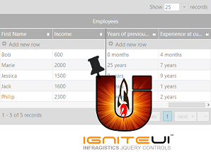