Quantcast
Channel: Infragistics Community
Viewing all 2460 articles
Browse latest View live

Common Questions About Indigo Studio License & Pricing

$
0
0

Do I need to buy a separate license for the Mac and Windows Version?

No. The license key you purchased will work both for both. You don't have to purchase a separate license for Windows if you bought the mac version, and vice versa.

I split my work across two computers. Can I install on both using my single-user license?

The Indigo Studio license is tied to the user, and not the computer. Install and use Indigo Studio on any computer "you" use. However, if we notice a large number of activations using the same license, we may contact you to verify this behavior.

What is a perpetual license and how is better than a regular license?

An Indigo Studio license enables you as a user to unlock and use all product features beyond the standard 30-day trial period. It is sold to you as a perpetual license. That means the product you buy is yours to keep and use FOREVER!

With the perpetual license, however, you get more! In addition to the product, the license qualifies you for any product updates we ship during that year (could even be a new major version of the product) and a year of free customer support. Updates may include new features, bug fixes or both.  

Let's use the following graphic to understand this licensing model better.

Explaining the perpetual license model

Say for instance, when you purchased the license key, the most current version of Indigo Studio was version 4 (Update 1). With the perpetual license model, you also get free updates all way till version 5 (update X).

Another way to say this is that you will get all updates for the last major version released during your active year of subscription. If you wish to get version 6 of the product, you will have to renew your subscription. Renewing will also extend customer support for an additional year. If you do not renew, the product is still yours, and you can keep using Version 5 (update X) forever. It does not stop working :).

In a nutshell, a perpetual license usually implies what you bought plus more! So don't worry. It's a good thing!

Please note that the version numbers I'm using in this graphic are only to help explain better the concept of our perpetual license. It does not signify the exact number of updates or our roadmap for the product.

Does my license include unlimited free sharing of prototypes on Infragistics Servers?

As stated in the software license agreement, prototypes will be available via its URL for a minimum of 12 months from the date of posting on Infragistics Servers. You can read our most up-to-date license agreement here. Prototype hosting is discussed in more detail under section III.A.

How long will I be able to receive product updates and what does that include?

We have tried to explain this under the question "What is a Perpetual License".

Are there any discounts available for for academic/educational use?

We are delighted that you wish to use Indigo Studio in the classroom! While we currently don't have formal academic pricing or an educational license, we can work out something with you. Every institution is a bit different in terms of how software is made available. Just get in touch with us and let us know what you plan to do with Indigo Studio. Send your inquiries to indigo@infragistics.com

Can I get a discount if I buy more than a certain number of licenses?

Do get in touch with our Sales team, and they will be able to answer questions related to bulk discounts. Contact Sales

How do I convert from a trial version to a full version of the product?

To convert, you will first need to purchase a license key from the product website http://www.infragistics.com/products/indigo-studio.

With key in hand, launch Indigo Studio, and look for the "Convert to Licensed Version" option in main menu. Paste in the key, and activate! If your trial has expired, you will see a way to enter the key on the product launch screen.

Entering your product Key

We encourage you to register this key with us so that you can retrieve/manage your key at any time.

Can I still download Indigo Lite, the free version?

That depends on whether you had downloaded version 1 in the past. Indigo Lite is available for re-download for those users upon request. Send us an email at Indigo@Infragistics.com.


Save Time and Build Higher Quality Products with Infragistics Test Automation

$
0
0

Testing takes time. But, with Infragistics Test Automation, it doesn’t have to!

As a developer, you create stunning applications every day. And if you’re already using HP’s Unified Functional Testing software (UFT) or IBM’s Rational Functional Tester (RFT) then you only need Infragistics Test Automation to complete your toolset.

With Test Automation, you can record your WPF or Windows Forms application’s user experience and play it back after you modify your app.

To make things even easier, we’ve created a set of how-to videos for you to follow along with, no matter what tool you use!

If you use IBM Rational Functional Tester, check out our getting started video here:

Or, to test Windows Forms applications using HP UFT, take a tour of some simple first steps here:

And if you’re testing WPF applications with HP UFT, see how easy it is to get started here:

Why Use Infragistics Test Automation?

  • Gain better coverage and a higher quality product through test automation.
  • Reduce your costs with an automated testing process that requires less manual testing.
  • Increase productivity by decreasing the time needed for testing your software.

Check out our website to learn more about how Infragistics Test Automation Tools can help you save time, reduce your testing costs, increase your productivity, and build higher-quality apps, faster.


Also be sure to subscribe to our YouTube channel to stay up-to-date with the latest how-to videos and more!

Exclusive Interview: Tim Huckaby

$
0
0

We recently had the opportunity to chat with InterKnowlogy founder, Tim Huckaby about NUI, interaction design, Grandma Huckaby, fly fishing and more. Read on to get inside the mind of “The Pioneer of the Smart Client Revolution”:

OK, so you have been at this for a while – how did you get into this field?

Well, I have some grey hair, so the digital native generation may not understand this, but it is relatively amusing. I went to Crespi Carmelite High School, an all-boys Catholic high school in Encino, CA and graduated in 1980. We didn’t have programming classes or computers; we had Latin and a mandatory full year of typing. And to avoid getting hit with Father Mike’s ruler for slacking, I learned to keep my elbows in and became a machine gun on the keyboard. When you can type faster than you can write, you have a distinct advantage in programming.

It wasn’t until I got to the University of San Diego that I was exposed to programming. At USD you fill out a profiling questionnaire to get your 1st semester freshman classes. Well, they gave me a PASCAL programming class and I fell in love with it. I fully remember something Dr. Dwight Bean taught me way back in September of 1980: “a program is never done; it can always be improved.” And that one statement is still so true today. I ended up taking every programming class that USD offered and talked my way into two programming electives.

I didn’t come from wealth. My parents were English teachers. I worked a lot. I paid my own way through college. You could do that back then. I saved to buy my first Apple II+. I pilfered every compiler I could get my hands on. Back then we didn’t have the internet. We had BBSs. Like many programmers I was fascinated by computer languages. I was fascinated by the software games I could hack into and change for my friend’s amusement.

My first job was at EDS back when Ross Perot still ran the company. By day I wrote COBOL and JCL to allocate resources to the COBOL. By night I worked on the $5,000 IBM XT that EDS had in the office with its 10MB hard drive! It was an awesome computer – way ahead of its time. The first real microcomputer with a hard drive; the first legit PC. That is when I found Turbo Pascal from Borland, an awesome compiler for the PC, and became a Turbo Pascal god [laughs].

Ultimately I found my way to Microsoft. In the late 90’s, I worked with some pretty famous product teams - and some bad ones, too! Did you know Windows NT had 65 million lines of code? I bombed the heap with some code me and my team wrote on the first real webserver from Microsoft (IIS 4.0). It was at Microsoft that l learned the difference between programming and building good software. I worked very hard. 12-14 hour days. My kids were babies and I commuted from San Diego to Seattle, only home for 32 hours each weekend for over a year. It was a huge sacrifice that my wife Kelly and I made, but it launched my career. It was shortly after my time at Microsoft that I stated InterKnowlogy.

Tim Huckaby

Is there any one programming tip or trick you use, regardless of the platform?

“You are not the user”. I say this all the time, especially now that I am so focused on NUI (natural user interface) and interaction design. It means us programmers and technologists don’t represent the user we are building software for. We are the technology elite. If you build software for yourself, the usability for a regular user is typically pretty bad. At InterKnowlogy we have what I call the “Grandma Huckaby test”. It means if Grandma Huckaby can walk up to software we build and become engaged and immediately effective in using it, we have done a good job.

If you could go back in time and rewrite any application out there, what would it be and why?

Well, like I quoted Dr. Bean earlier, “A program is never done.” But, if you truly mean “rewrite”, I can give you two perfect examples of software we were forced to build that we’d rewrite in a heartbeat if we had the chance. Both are InterKnowlogy customers and both applications were built for Fortune 50 companies. And they both basically had the same issue. Simply stated, the problem is this: creative agencies, no matter how big and famous, are just as in the dark as most technologists in terms of touch-enabled applications and the interaction design needed to create a truly engaging application.

So even though we built beautiful wireframes and comps and implemented the user interaction design needed for multi user large screen format touch enabled apps, the big agency came in and basically said, “We’ll take over the design”. And what came back was essentially the design for a web app that runs on an interactive table for multiple users where touch is the only input. We were forced to build it but the usability was awful. Although I cannot use these apps as demos I’m proud of in a typical keynote, I definitely use them in a lessons learned or guidance in NUI design keynote.

What would you consider to be the next big thing in programming?

Well, the next big thing in programming has got to be the bold promise of multi-platform. Unfortunately we had that same bold promise 20 years ago and it never came true. And now the problem is even worse than it was in the browser wars of the late 90’s. Of course the term “next big thing” is relative. Many developers would say the next big thing is Python or F# or HTML5 or the next programming language to be popular. I like to look at it in a more holistic way.

I’d love to live in a world where software architecture was part of the platform and not something you have to code or even think about every time you do a software project. I know that is going to freak out the pure software architects, but really, why do we continue having to deal with it? We should get software architecture for free and be able to focus on the business problems and the design of the application.

I will tell you one thing: the passion in engineers has not changed in 20 years. For some reason, programmers are religious about their tools and programming languages and platforms. If I took the InterKnowlogy engineering team out for beers and asked them what they would consider the next best thing in programming to be, they would be arguing within 5 minutes, shouting after 10 and deep in an all-out bar fight in 30 minutes… all because of programming languages.

You’ve met a lot of interesting people and done a lot of great interviews on Bytes by MSDN! If you were to resurrect that series, who would you want to interview and what would you want to talk about?

Well, as far as I’m concerned Bytes is not dead – I’d love to do it at Build this year! But one thing I always wanted to do on Bytes is have Bill Gates and Steve Ballmer at the same time. We tried. You have no idea how crazy these guys’ schedules are alone. Getting them in the same place outside a MSFT board meeting is almost impossible. But, what a great idea that would be, don’t you think? With Microsoft platform developer share waning and many still upset over the “Silverlight thing”, you could really fix some things and install some confidence with a 5 minute Bytes interview with those two. I haven’t talked to Bill Gates in years, but I can tell you that Steve Ballmer still gets the developers and the Microsoft app platform. And he’s a genuinely great guy. It would be awesome if he could do a Bytes segment at Build before he steps down as CEO.

How would you encourage someone to break out of their coding comfort zone?

I do it all the time. I did it yesterday. One of our very talented young engineers wanted to talk with me about his “career”. I started the conversation with something I have said a thousand times: “Smart engineers are a dime a dozen. Smart engineers that are leaders are rare and extremely valuable. Smart engineers who are leaders that can engage in conversation with a non-technical customer are invaluable.” I call them “walk and talk” engineers. Leads get paid more money; plain and simple. So what do you do to break out of you comfort zone? Study leadership. Study the roles of a developer lead. Tell your company you’d like to work towards leadership in your career path and see where it takes you!

Do you have any interesting hobbies?

Well, I don’t know if it’s interesting, but it is “different”. I’m a fly fisherman. It’s the only place where I can get true focus; it really is my passion. When I’m fly fishing I don’t think about family or work or stress of every day life; it’s just me in the wilderness and the river. And I get lost in it for hours. I have been hardcore, extreme catch and release fly fishing for over a decade. I didn’t grow up doing it, I fell in love with it mid-career. It’s also a pretty rare sport; not too popular. So, not many people know about it or what it entails. It’s very physical. I’ll often cover 20 miles in a day, and lose and gain 2000 feet in altitude. It’s constant action whether you are wading the river casting constantly or hiking or climbing to get to that perfect spot to enter the river. It’s usually in the middle of the wilderness and frequently dangerous. I’m so obsessed by it I even ties flies in my garage. Some of my creations, like the “Huck-Hopper” are even used by the fly fishing guides in Montana. I’m a lot safer now, but some of my earlier years I got into some pretty hairy situations: lost in the wilderness; hiking up a cliff to get out of the canyon in total darkness. My animal encounter stories are epic. I had bears break into my truck just a couple months ago and drink all my beer and eat all my food; not kidding!

To learn more about Tim – and his adventures in programming and in the wilderness – check out http://www.timhuckaby.com/ or visit http://www.interknowlogy.com/TimHuckaby/.

Getting Started Using NucliOS IGCalendarView with Xamarin.iOS

$
0
0

The 13.2 release of NucliOS introduced some new controls for iOS developers. In this post I’m going to focus on the IGCalendarView widget which combines the similar look and feel of the iOS7 calendar with the power and flexibility of Infragistics. This 3 in 1 calendar allows you to navigate between year, month, and day views as well as connect to the events stored on the device. I’ll show you how to use the IGCalendarView with Xamarin.iOS to display the events stored on your iPhone and also show you how to use EventKit to modify events.

nuclios-xamarin-3

Using IGCalendarView with Xamarin.iOS

IGCalendarView is a themeable calendar control that allows you to display both the calendar events on the device as well as custom calendar events you can create in code that do not need to be stored on the device. In this tutorial, we’ll create a single view iPhone application that displays the calendar events that are stored on the device and allow the user to edit them using EventKit. The final application will look like this:

final

Step 1: Creating the project

Start by creating a Single View iPhone application by clicking on “New…” under Solution and configure the project as shown in the following screenshot:

newproject

This will set up a project that uses a single view (i.e. no navigation) which is all we need for this simple sample. A ViewController with a XIB file will be created to represent the view. We won’t need actually customize the XIB file. Since we only need the IGCalendarView, we will add our user interface from code.

Step 2: Adding and configuring the IGCalendarView

The first thing we need to do is add a reference to the IG.dll which is found in /Developer/Infragistics/NucliOS 2013 Volume 2/MonoTouch on your machine. To do this, right-click on References and chose “Edit references…”. Go to the .NET Assembly tab and navigate to the IG.dll as shown here:

references

Now open up the IGCalendarViewXamarinViewController.cs file and add the following using statement:

using Infragistics;  

Add a field for the calendar view:

IGCalendarView _calendar;

Add the following code to the ViewDidLoad override in IGCalendarViewXamarinViewController.cs to initialize an IGCalendarView and add it to the view:

// Create the calendar
_calendar = new IGCalendarView();

// Set the Frame to be the size of the View
_calendar.Frame = this.View.Bounds;

// Set up auto-resizing for rotation purposes
_calendar.AutoresizingMask = UIViewAutoresizing.FlexibleWidth|UIViewAutoresizing.FlexibleHeight;

// Add the calendar to the view
this.View.Add (_calendar);

If you run the application at this point, you should see the following:

statusbar

You probably noticed that the status bar at the top of the screen is overlapping our calendar. This is because of a change in the way the status bar is treated in iOS7. Working around this issue in a way that integrates the status bar is outside of the scope of this tutorial so add the following code to the view controller to hide the status bar:

public override bool PrefersStatusBarHidden ()
{
    return true;
}

You’re free to consider alternative workarounds in your own application.

Step 3: Displaying the device’s calendar events

The calendar is functional as is, but it doesn’t contain any data. Let’s change that by loading up the events from the device. To do this we’ll need to use the EventKit APIs provided by Apple. Xamarin has a very good introduction to EventKit that’s worth reading. Start by adding the following using statements to the top of the view controller file:

using MonoTouch.EventKit;
using MonoTouch.EventKitUI;

We will need a list of NSObjects to manage the data sources for our IGCalendarView so add the following code above the constructor (you’ll need to resolve the reference for System.Collections.Generic as well):

List _dataSources;

Initialize the list in the constructor:

public IGCalendarTestViewController () : base ("IGCalendarTestViewController", null)
{
    _dataSources = new List ();
}

In order to access the calendar objects through EventKit we will need to create an EventStore object that we can access in our app. This object can be expensive to create and teardown so it is recommended that it be created as a long-lived object. This is the perfect scenario for a singleton pattern. Create a new class called App and modify the contents of App.cs to include the following:

using System;
using MonoTouch.EventKit;

namespace IGCalendarViewXamarin
{
    public class App
    {
        public static App Current {
            get { return current; }
        }
        private static App current;

        public EKEventStore EventStore {
            get { return eventStore; }
        }
        protected EKEventStore eventStore;

        static App ()
        {
            current = new App();
        }
        protected App () 
        {
            eventStore = new EKEventStore ( );
        }
    }
}

Now we will be able to access the EventStore at any time in our application by calling App.Current.EventStore.

Next, we need to request permission to access the user’s events. Add the following code just before the calendar view creation code:

var eventStore = App.Current.EventStore;
var accessGranted = await eventStore.RequestAccessAsync(EKEntityType.Event);

Now if we have access we can access the calendars in the event store. For each EKCalendar object we will create an IGCalendarEKDataSourceHelper and add it to our _dataSources array:

if (accessGranted) {
    EKCalendar[] cals = eventStore.GetCalendars (EKEntityType.Event);
    foreach (EKCalendar cal in cals) {
        IGCalendarEKDataSourceHelper ds = new IGCalendarEKDataSourceHelper (cal, App.Current.EventStore);
        _dataSources.Add (ds);
    }
}

Right after the line that sets the AutoresizingMask, add the following line to set the IGCalendarView’s AppointmentDataSources:

_calendar.AppointmentDataSources = _dataSources.ToArray();

Now if you run the code you should be able to see any events that are on the device or simulator. (If you are using the simulator you should launch the Calendar application and add some events to work with in your testing.)

Step 4: Editing an event

Displaying calendar events is great, but what’s even better is responding to taps on those events and allowing the user to edit them! Let’s enable that for our users. To respond to a tap on an event we need to implement a subclass of IGCalendarDelegate and override its AppointmentTapped method. We’ll also pass in an instance of our view controller so that we can present an EKEventEditViewController from within the delegate. To do all of this, add a class called MyCalendarDelegate that extends from IGCalendarViewDelegate. Add the following to the class:

UIViewController _viewController;

public MyCalendarDelegate (UIViewController viewController)
{
    _viewController = viewController;
}

Next, override the AppointmentTapped method and add the following code:

public override void AppointmentTapped (IGCalendarView calView, IGCalendarAppointment appt, IGCalendarAppointmentDataSource dataSource, RectangleF rect, NSDate date)
{
    var ds = dataSource as IGCalendarEKDataSourceHelper;
    var ekEvent = ds.ResolveEventFromAppointment(appt);

    var eventController = new EKEventEditViewController ();
    eventController.EventStore = App.Current.EventStore;
    eventController.Event = ekEvent;
    
    _viewController.PresentViewController (eventController, true, null);
}

This code accesses the EKEvent object for the appointment the user tapped and creates and presents an EKEventEditViewController to display the event. Only thing left to do is handle the event controller’s Completed event and save any edits that the user might have made. Add this code after the “eventController.Event = ekEvent;” line:

eventController.Completed += (sender, e) => {
    switch (e.Action) {
    case EKEventEditViewAction.Canceled:
        break;
    case EKEventEditViewAction.Deleted:
        break;
    case EKEventEditViewAction.Saved:
        NSError err;
        var ev = eventController.Event;

        App.Current.EventStore.SaveEvent (eventController.Event, EKSpan.ThisEvent, out err);

        appt.AllDay = ev.AllDay;
        appt.EndTime = ev.EndDate;
        appt.Location = ev.Location;
        appt.StartTime = ev.StartDate;
        appt.Title = ev.Title;
        break;
    }

    _viewController.UpdateCalendar();
    eventController.DismissViewController(true, null);
};

The key code here is in the case for EKEventEditViewAction.Saved. First we save the event to the EventStore. This updates it in the device calendar. Then we update the IGCalendarView appointment based on the edits to the event. This makes sure the view is in sync with the newly updated calendar appointment.

Back in the IGCalendarViewXamarinViewController’s ViewDidLoad method, set the calendar’s Delegate property:

calendar.Delegate = new MyCalendarDelegate(this);

We also need to add the UpdateCalendar() method to the view controller:

public void UpdateCalendar ()
{
    _calendar.Invalidate ();
}

This causes the calendar to redraw itself to reflect the changes the user made.

And that’s it. The application is ready to go. Run it and you should be able to tap on an event and edit it in the built-in event editor and see the changes reflected on the device.

Summary

This tutorial showed you how to add an IGCalendarView to your iOS application. I also showed you how to use an IGCalendarViewDelegate to handle editing events.

You can download the solution here: IGCalendarViewXamarin.zip

Contact

If you want to comment or reach out to me, the best place to do that is on Twitter @brentschooley. I can also be reached via email at bschooley@infragistics.com.

Infragistics' D3 is Hosting a World IA Day Event at HQ!

$
0
0

I just wanted to take a quick moment to spread the news about an awesome (and free!!) event that D3, the Consulting Services department of Infragistics, will be hosting here at our Cranbury, NJ HQ on February 15th!

World IA Day 2014

Saturday, February 15th, 2014 at the D3 / Infragistics headquarters in NJ.

Please join us and celebrate World IA Day 2014 with the Infragistics team and special guests on February 15, 2014. The annual event, which takes place in cities around the world “brings together the international community of academics, practitioners, technologists, and business leaders for a global conversation about ‘the architecture part’ of information architecture.” Infragistics is pleased to invite you to their ultra-sleek, central NJ-based headquarters for an official World IA Day event that will highlight the roles of UX, interaction design, and development in information architecture.

Remember, it's Free, so Register Now!


When:
February 15, 2014 from 12:00-5:00pm ET

Where: 
Infragistics World Headquarters
2 Commerce Way
Cranbury, NJ 08512


Centrally located off Exit 8A off the NJ State Turnpike (one hour south of NYC and one hour north of Philadelphia).

Space is limited, so Register Now to reserve your spot!


The agenda is still to be announced, but the speakers and content are sure to be top notch! In addition, Lunch, beer and wine will be served on-premises. It is requested that all attendees be at least 18 years old (21 to drink). 

How to get started with Windows UI Radial Menu for WinRT

$
0
0

Header image for xamRadialMenu

The Radial Menu is a circular menu that provides a fast navigation for users. This control is new in the 13.2 release of Windows UI and it is inspired by the Microsoft’s OneNote MX 2013 radial menu. This kinds of menus are very useful and  convenient for touch devices. Although the control is released as CTP it supports a wide range of features and has build in tools like numeric items and gauges, lists, color well and etc. . It’s design and functionalities are similar to those of the OneNote menu, so it is able to operates not only just like it but even it can be further customized based on your needs. In the 13.2 release of Infragistics this controls is build under more than one platforms. It is part of the Windows Forms package as well as WPF and Silverlight. You can read my post about Windows Forms radial menu to learn more about its functionalities.

Overview and features

The radial menu can be separated in three main parts – outer ring, inner area with items and center button. It supports unlimited levels of hierarchy. When you create an item with children  you will have an outer ring button automatically generated above that item. As we said there are few build in tools for this control and we will take a look at some of them. Creating a OneNote like menu means that it should have text edit tools like size, font type, list, font color and other. To start with we will need the Infragistics references. Once you have installed the Infragistics package you will find a list of its controls in the toolbox in Visual Studio. Drag the xamRadialMenu to the designers view an the needed references will be added automatically.

  1. xmlns:Menus="using:Infragistics.Controls.Menus"
  2.       xmlns:local="using:xamRadialMenu"
  1. <Menus:XamRadialMenu Height="300" Width="300"/>

Now that we have our radial menu we can add as many items in it as we need. Pay attention that there is a slight difference in this control compared to the one for Windows Forms. In Win Forms we always have a fixed number of items, while here we have the minWedgeCount property which allows you to specify the  minimum number of items for the entire menu.

If you want to create a numeric item you have to add RadialMenuNumericItem which will act as a button to the numeric gauge. Visually the slice will contain a custom image or header if any and an associated numeric value above them. The child item should be a RadialMenuNumericGauge which will allow to select a numeric value.

  1. <Menus:RadialMenuNumericItem>
  2.     <Menus:RadialMenuNumericItem.Icon>
  3.         <Image Source="Assets/font_size.png" Width="30" Height="30" />
  4.     </Menus:RadialMenuNumericItem.Icon>
  5.     <Menus:RadialMenuNumericGauge
  6.             Value="{Binding ElementName=textBox, Path=FontSize, Mode=TwoWay}"
  7.             Ticks="8 9 10 11 12 13 14 16 18 20 22 24 26 28 36 48 72" />
  8. </Menus:RadialMenuNumericItem>

Radial Menu's numeric item and numeric gauge

When it comes to colors the situation is similar. First you have to add a RadialMenuColorItem which will display custom image and header if any and an associated color. The child items should be RadialMenuColorWell. This item is specialized item that displays associated color in the item area and the outer ring. If you navigate to a child item of a color well item you will see a palette of hues of the selected color. To create the whole palette of colors you need to add a hierarchy of  color well children. The snippet below demonstrates how to do that for the yellow color.

  1. <Menus:RadialMenuColorItem Header="Color" >
  2.     <Menus:RadialMenuColorWell Color="#FFFF00">
  3.         <Menus:RadialMenuColorWell Color="#FFD55F"></Menus:RadialMenuColorWell>
  4.         <Menus:RadialMenuColorWell Color="#FFEB9C"></Menus:RadialMenuColorWell>
  5.         <Menus:RadialMenuColorWell Color="#FFFF00"></Menus:RadialMenuColorWell>
  6.         <Menus:RadialMenuColorWell Color="#AC4D25"></Menus:RadialMenuColorWell>
  7.         <Menus:RadialMenuColorWell Color="#D16227"></Menus:RadialMenuColorWell>
  8.         <Menus:RadialMenuColorWell Color="#EB7C23"></Menus:RadialMenuColorWell>
  9.         <Menus:RadialMenuColorWell Color="#F6901E"></Menus:RadialMenuColorWell>
  10.         <Menus:RadialMenuColorWell Color="#FFC000"></Menus:RadialMenuColorWell>
  11.     </Menus:RadialMenuColorWell>
  12. </Menus:RadialMenuColorItem>

Radial Menu's color well items

Another type of items is the RadialMenuList that represents a list of strings in an appropriate UI list box. We use it to make a fonts type selector.  

  1. <Menus:RadialMenuList Header="Font Type" Name="font">
  2.     <Menus:RadialMenuList.Items>
  3.         <x:String>Arial</x:String>
  4.         <x:String>Calibri</x:String>
  5.         <x:String>Consolas</x:String>
  6.         <x:String>Comic Sans MS</x:String>
  7.         <x:String>Courier New</x:String>
  8.         <x:String>Segoe UI</x:String>
  9.         <x:String>Tahoma</x:String>
  10.         <x:String>Times New Roman</x:String>
  11.         <x:String>Verdana</x:String>
  12.     </Menus:RadialMenuList.Items>
  13. </Menus:RadialMenuList>

Radial Menu list item - fonts

You can also have normal RadialMenuItem slices which wont have a build in functionality but can be customized according to your needs. The radial menu is build in such a way that you can style it as you like. You can change the center button icon, the brushes of the outer ring, the brushes of the inner item area. You can also add images and header text for the items. Another thing that you can control is the rotation of the main gauge. Using the RotationInDegrees property you can specify from which degree should it start to rotate.

This control is optimized for touch but it works as well with mouse and keyboard interaction. It even supports key tips. If you want to see what key tips are active for your menu and use them you should first press the Alt button of your keyboard. Then you will see all of the tips visualized and you can manipulate the menu by using them. By default if the center icon’s key tip is “0”. If you haven’t assigned a header to the items their key tips will be numbers, but if you have headers then the key tips will be the first letter of the header. You can always use the KeyTip property and make your own shortcuts. To dismiss the key tips and enter keyboard navigation mode you can press the escape key or a navigation key.

Radial Menu with key tips


Functionality

There is no doubt that the control’s design is attractive and desirable but we should make it functional to become a completed application. As we are making a menu that looks  and acts like the OneNote one, we need to add interaction between the selection of a particular item of the menu and the text that we are going to change. To do that we are going to use the header property of the control to distinguish the different items. Then we will take the selected text and apply a custom function to it. Using this pattern you can make all of the items interactive.

  1. if ((sender asRadialMenuItem).Header.ToString() == "Bold")
  2. {
  3.     ITextCharacterFormat format = this.textBox.Document.Selection.CharacterFormat;
  4.     format.Bold = FormatEffect.Toggle;
  5. }

xamRadialMenu interaction with text

Summary

The main idea behind the radial menu is to be simple and easy to work with. It should present small numbers of items and distribute them in a circular arrangement. It provides fast access to the inner – child items and it is perfect for a touch based applications.  Although it is designed to look and behave like OneNote’s radial menu, you can customize it and make your own creation.

Custom xamRadialMenu

A Win UI xamRadialMenu sample.


You can follow us on Twitter @Infragistics and stay in touch on Facebook, Google+ and LinkedIn!

Loading GeoJSON geometry into IgniteUI igMap

$
0
0

Introduction

I was asked recently if IgniteUI’s igMap supported the loading of GeoJSON data. The answer is that igMap supports loading geometry from a JavaScript object graph, and GeoJSON, when parsed or executed, also results in a JavaScript object graph, but the map expects the objects to be arranged in a subtly different way than you will receive them from GeoJSON.

The fact that the expectations are subtly different from what GeoJSON provides, though, does not present a difficult problem to surmount. In fact, it’s pretty simple to get things up and running. So, let’s do it!

TL;DR; version:

If you only want to know how to adapt some GeoJSON data for use with the symbol series please see the method flattenFeed below! Articles on how to adapt GeoJSON to fit polyline and shape series to follow.

Getting the Data

For this example, we will load earthquake data from the USGS, since they provide some convenient GeoJSON feeds for examining the locations of recent earthquakes.

The feed I decided to try was for all 4.5 magnitude and above earthquakes in the past month, which is located here: http://earthquake.usgs.gov/earthquakes/feed/v1.0/summary/4.5_month.geojsonp

We will use jQuery to make a jsonp AJAX call to retrieve this json data and parse it into a JavaScript object graph for our use. To do that we will make this call:

$.ajax({
        url: "http://earthquake.usgs.gov/earthquakes/feed/v1.0/summary/4.5_month.geojsonp",
        dataType: "jsonp",
        jsonpCallback: "eqfeed_callback",
        success: render
    });

Here we are performing the following:

  • Requesting that jQuery make an asynchronous call to retrieve the required GeoJSON feed from the USGS.
    • Note that the url ends with geojsonp, while most of the API doc on USGS will point you at geojson (with no p). The p at the end makes sure that USGS will respond with a result in jsonp format so that the appropriate callback method will be called when the json is loaded. For more details read up on jsonp.
  • Specifying to jQuery that we expect the response type to be jsonp.
  • Specifying what callback function jQuery will need to define in order that the jsonp request can notify us on load.
  • Specifying the callback function that we want called once the jsonp resource has been successfully downloaded and parsed for our use.

We will define this method later.

Creating the igMap

Next, lets create the igMap that will display the GeoJSON data once downloaded:

$("#map").igMap({
        width: "100%",
        height: "90%",
        horizontalZoomable: true,
        verticalZoomable: true,
        windowRectMinWidth: 0.001,
        overviewPlusDetailPaneVisibility: "visible"
    });

Here we are finding the DOM element with id “map” and initializing the igMap component within it with the following options:

  • The map will fill 100% of the width of the container.
  • The map will fill 90% of the height of the container.
  • The map can zoom in both directions.
  • The map currently does not have any series.
  • We are expressing the maximum zoom scale that the map can reach (Open Street Map imagery only goes so deep).
  • We are enabling the navigation pane in the corner of the map.

Note, we are not yet actually specifying any series content for the map. In this case, things are simpler if we wait until we have downloaded the required data, and then load some series content on demand.

Dynamically Adding a Series To igMap

Once the AJAX call has returned and we have our parsed GeoJSON data, we need to create a map series and bind it to that data. In this way we will make it possible to navigate through our data and interact with it. Above, we referred to a method called “render” as the success handler for the AJAX call. Let’s define that method now:

function render(res) {
        res = flattenFeed(res);

        $("#map").igMap("option", "series", [{
            type: "geographicSymbol",
            name: "earthquakes",
            title: "earthquakes",
            markerBrush: "red",
            markerOutline: "black",
            latitudeMemberPath: "latitude",
            longitudeMemberPath: "longitude",
            dataSource: res,
            showTooltip: true,
            tooltipTemplate: "<table><tr><td>Magnitude: </td><td>${item.properties.mag}</td></tr><tr><td>Place: </td><td>${item.properties.place}</td></tr><tr><td>Time: </td><td>${item.dateTimeString}</td></tr></table>"
        }]);
    }

In the above we:

  • Specified that the type of series that we want is the symbol series.
    • This series will place markers at the provided geographic coordinates.
    • We can style and customize these markers to convey other characteristics about the data.
    • We could also load polyline/polygon geometry from GeoJSON into some of the other available series types, but we’ll save that for next time.
  • Call a method that will rearrange certain aspects of the GeoJSON object graph to make it easier to load them into our desired series.
  • Provide a name and title to the series.
  • Set some colors to use for the earthquake markers.
  • Indicated which properties on our data items will contain the latitude and longitude information for the current series.
  • Assigned the data source we have flattened earlier in the method.
  • Assigned a tooltip that will display interesting information about the magnitude and location of the earthquake.

Given this, the only piece we are missing is how we have adapted the GeoJSON object graph to easily load it into the symbol series.

Adapting the GeoJSON Data

The symbol series in the map expects to be able to find two properties on each data item that represent the latitude and longitude position of each point. The GeoJSON format buries this information rather deep in the returned object graph, so one of the steps we will perform is to surface it to an easily discoverable place on each item.

Here is the definition of the flatten feed method:

function flattenFeed(res) {
        var curr;
        res = res.features;
        for (var i = 0; i < res.length; i++) {
            curr = res[i];
            if (curr.geometry && curr.geometry.type == "Point" && curr.geometry.coordinates) {
                curr.latitude = curr.geometry.coordinates[1];
                curr.longitude = curr.geometry.coordinates[0];
            }
            if (curr.properties && curr.properties.time) {
                curr.time = new Date(curr.properties.time);
                curr.dateString = curr.time.toLocaleDateString();
                curr.timeString = curr.time.toLocaleTimeString();
                curr.dateTimeString = curr.dateString + " " + curr.timeString;
            }
        }
        return res;
    }

In the above we:

  • Extract the features collection from the GeoJSON response. This is what holds the data we would like to bind to the series.
  • Check our assumptions to make sure we are being fed GeoJSON style point coordinates, and then copy them to be top level values on each data item.
  • Convert the integer time offsets associated with each earthquake to a readable string to refer to in our tooltips.
  • Return the resulting flattened collection.

Combining all of the above we have the following full code for the sample:

$(function () {
    var data = [];

    function flattenFeed(res) {
        var curr;
        res = res.features;
        console.log(res.length);
        for (var i = 0; i < res.length; i++) {
            curr = res[i];
            if (curr.geometry && curr.geometry.type == "Point" && curr.geometry.coordinates) {
                curr.latitude = curr.geometry.coordinates[1];
                curr.longitude = curr.geometry.coordinates[0];
            }
            if (curr.properties && curr.properties.time) {
                curr.time = new Date(curr.properties.time);
                curr.dateString = curr.time.toLocaleDateString();
                curr.timeString = curr.time.toLocaleTimeString();
                curr.dateTimeString = curr.dateString + " " + curr.timeString;
            }
        }
        data = res;
        return res;
    }

    function render(res) {
        res = flattenFeed(res);

        $("#map").igMap("option", "series", [{
            type: "geographicSymbol",
            name: "earthquakes",
            title: "earthquakes",
            markerBrush: "red",
            markerOutline: "black",
            latitudeMemberPath: "latitude",
            longitudeMemberPath: "longitude",
            dataSource: res,
            showTooltip: true,
            tooltipTemplate: "<table><tr><td>Magnitude: </td><td>${item.properties.mag}</td></tr><tr><td>Place: </td><td>${item.properties.place}</td></tr><tr><td>Time: </td><td>${item.dateTimeString}</td></tr></table>"
        }]);
    }

    $("#map").igMap({
        width: "100%",
        height: "90%",
        horizontalZoomable: true,
        verticalZoomable: true,
        series: [],
        windowRectMinWidth: 0.001,
        overviewPlusDetailPaneVisibility: "visible"
    });


    $.ajax({
        url: "http://earthquake.usgs.gov/earthquakes/feed/v1.0/summary/4.5_month.geojsonp",
        dataType: "jsonp",
        jsonpCallback: "eqfeed_callback",
        success: render
    });


});

Which produces this output:

You can visit the fiddle for this sample here.

Notice that if you hover over the markers, you will get more information about the earthquake in question:

Pretty neat, huh? This is up to date information from USGS that gets refreshed every 15 minutes. We could update our code to re-poll the service periodically and introduce additional points.

Tailoring Our Markers To the Data

Next, why don’t we improve the information slightly that we are conveying with our markers. Wouldn’t it be neat if we could increase the size based on the magnitude? The igMap actually includes a series that makes this very simple for you, but since it is currently in the preview quality band, instead, I will show you how to achieve this by providing a custom marker template for the symbol series.

First, lets track the minimum and maximum magnitude readings we are getting from the GeoJSON service. In this way, we will know how to decide on a size for the markers:

 var data = [], currMinMag, currMaxMag;

    function flattenFeed(res) {
        currMinMag = 100;
        currMaxMag = 0;
        var curr;
        res = res.features;
        console.log(res.length);
        for (var i = 0; i < res.length; i++) {
            curr = res[i];
            if (curr.geometry && curr.geometry.type == "Point" && curr.geometry.coordinates) {
                curr.latitude = curr.geometry.coordinates[1];
                curr.longitude = curr.geometry.coordinates[0];
            }
            if (curr.properties && curr.properties.time) {
                curr.time = new Date(curr.properties.time);
                curr.dateString = curr.time.toLocaleDateString();
                curr.timeString = curr.time.toLocaleTimeString();
                curr.dateTimeString = curr.dateString + " " + curr.timeString;
            }
            if (curr.properties && curr.properties.mag) {
                currMinMag = Math.min(currMinMag, curr.properties.mag);
                currMaxMag = Math.max(currMaxMag, curr.properties.mag);
            }
        }
        data = res;
        return res;
    }

This is a modified version of our flattenFeed function that will read out the magnitude value from each data item, and update the current seen max and min values. We’ll use these values in our custom marker template:

quakeTemplate = {
        measure: function (measureInfo) {
            var propMag = (measureInfo.data.item().properties.mag - currMinMag) / (currMaxMag - currMinMag),
            size = (14 + propMag * 30);
            measureInfo.width = size;
            measureInfo.height = size;
        },
        render: function (renderInfo) {
            var ctx = renderInfo.context,
                propMag = (renderInfo.data.item().properties.mag - currMinMag) / (currMaxMag - currMinMag),
                size = (14 + propMag * 30),
                halfSize = size / 2.0;

            if (renderInfo.isHitTestRender) {
                ctx.fillStyle = renderInfo.data.actualItemBrush().fill();
                ctx.beginPath();
                ctx.arc(renderInfo.xPosition, renderInfo.yPosition, halfSize, 0, 2.0 * Math.PI);
                ctx.closePath();
                ctx.fill();
                ctx.stroke();
            } else {
                ctx.globalAlpha = .3;
                ctx.fillStyle = "rbga(200,34,35,.35)";
                ctx.strokeStyle = "rgba(200,34,35,.89)";
                ctx.beginPath();
                ctx.arc(renderInfo.xPosition, renderInfo.yPosition, halfSize, 0, 2.0 * Math.PI);
                ctx.closePath();
                ctx.fill();
                ctx.stroke();
                ctx.globalAlpha = 1.0;

                ctx.fillStyle = "rgba(111,7,7,.84)";
                ctx.beginPath();
                ctx.arc(renderInfo.xPosition, renderInfo.yPosition, 3.5, 0, 2.0 * Math.PI);
                ctx.closePath();
                ctx.fill();
            }
        }
    };

If you don’t know much about the HTML5 canvas some of the above may seem arcane. Under the covers the map is doing most of its rendering in the canvas, and when you assign a custom marker template you are offering to intercede and render some content into the canvas for a marker based on the parameters that the map specifies to you. In the above we:

  • Respond to the map with a size our marker wants to be, when asked.
    • We calculate this based on where the magnitude of the current quake falls between the min and max value.
  • Respond to the map when our marker needs to be rendered by:
    • Determining the size we want for the marker as above (this could be pulled into a separate method).
    • Rendering a shape that represents the “hit area” of the marker so that the map knows when to display tooltips for the marker, if this is the hit test pass.
      • Note, a very particular color needs to be used when rendering the hit area.
    • Rendering two concentric circles with the outer radius size related to the magnitude.

The final piece is to assign that custom marker template to the series, so we change the series addition to look like this:

$("#map").igMap("option", "series", [{
            type: "geographicSymbol",
            name: "earthquakes",
            title: "earthquakes",
            markerBrush: "red",
            markerOutline: "black",
            markerTemplate: quakeTemplate,
            latitudeMemberPath: "latitude",
            longitudeMemberPath: "longitude",
            dataSource: res,
            showTooltip: true,
            tooltipTemplate: "<table><tr><td>Magnitude: </td><td>${item.properties.mag}</td></tr><tr><td>Place: </td><td>${item.properties.place}</td></tr><tr><td>Time: </td><td>${item.dateTimeString}</td></tr></table>"
        }]);

Put it all together and you get this:

Again, you can go here for the jsfiddle.

Lets Put In More Data!

Below is how we can display a much larger GeoJSON resource from USGS using the high density scatter series, which will use higher heat values to tell you where more quakes have been happening. You’ll see all we’ve really done it to change the series type and to switch to a much larger feed. Please note, that the GeoJSON file involved is actually quite large, so takes a while to download. You’ll see the status change from GeoJSON Downloading to Download Completed when the download has finished.

$(function () {
    var data = [], currMinMag = 0, currMaxMag = 10;

    function flattenFeed(res) {
        currMinMag = 10;
        currMaxMag = 0;
        var curr;
        res = res.features;
        console.log(res.length);
        for (var i = 0; i < res.length; i++) {
            curr = res[i];
            if (curr.geometry && curr.geometry.type == "Point" && curr.geometry.coordinates) {
                curr.latitude = curr.geometry.coordinates[1];
                curr.longitude = curr.geometry.coordinates[0];
            }
            if (curr.properties && curr.properties.time) {
                curr.time = new Date(curr.properties.time);
                curr.dateString = curr.time.toLocaleDateString();
                curr.timeString = curr.time.toLocaleTimeString();
                curr.dateTimeString = curr.dateString + " " + curr.timeString;
            }
            if (curr.properties && curr.properties.mag) {
                currMinMag = Math.min(currMinMag, curr.properties.mag);
                currMaxMag = Math.max(currMaxMag, curr.properties.mag);
            }
        }
        data = res;
        return res;
    }

    function render(res) {
        $("#downloading").text("Download Complete!");
        res = flattenFeed(res);

        $("#map").igMap("option", "series", [{
            type: "geographicHighDensityScatter",
            name: "earthquakes",
            title: "earthquakes",
            latitudeMemberPath: "latitude",
            longitudeMemberPath: "longitude",
            dataSource: res,
            mouseOverEnabled: true,
            showTooltip: true,
            pointExtent: 2,
            tooltipTemplate: "<table><tr><td>Magnitude: </td><td>${item.properties.mag}</td></tr><tr><td>Place: </td><td>${item.properties.place}</td></tr><tr><td>Time: </td><td>${item.dateTimeString}</td></tr></table>"
        }]);
    }

    $("#map").igMap({
        width: "100%",
        height: "90%",
        horizontalZoomable: true,
        verticalZoomable: true,
        series: [],
        windowRectMinWidth: 0.001,
        overviewPlusDetailPaneVisibility: "visible"
    });


    $.ajax({
        url: "http://earthquake.usgs.gov/earthquakes/feed/v1.0/summary/all_month.geojsonp",
        dataType: "jsonp",
        jsonpCallback: "eqfeed_callback",
        success: render
    });


});

Here’s the result:

And the associated fiddle.

Note, this series type can actually display MUCH more data. The above is roughly 7000 points, which is really on the low end of what you would be displaying with this series type. Unfortunately GeoJSON is pretty verbose, so a larger file would take even longer to download. Fortunately there are more compressed ways to get data to the map, but we’ll save that for another time!

-Graham

Infragistics Windows Forms - January 2014 Release Notes: 13.1, 13.2 Service Releases

$
0
0

With every release comes a set of release notes that reflects the state of resolved bugs and new additions from the previous release. You’ll find these notes useful to help determine the resolution of existing issues from a past release and as a means of determining where to test your applications when upgrading from one version to the next.

Release notes are available in both PDF and Excel formats. The PDF summarizes the changes to this release along with a listing of each item. The Excel sheet includes each change item and makes it easy for you to sort, filter and otherwise manipulate the data to your liking.

In order to download release notes, use the following links:

WinForms 2013 Volume 2 Service Release (Build 13.2.20132.2016)

PDF - Infragistics WinForms 2013 Volume 2
Excel - Infragistics WinForms 2013 Volume 2

WinForms 2013 Volume 1 Service Release (Build 13.1.20131.2100)

PDF - Infragistics WinForms 2013 Volume 1
Excel - Infragistics WinForms 2013 Volume 1


Infragistics User Group Contest 2014

$
0
0

It’s time to start the third annual Infragistics User Group Contest for 2014.  This contest started as a way to help break the ice and loosen up the attendees during my sessions at the user groups I would present at.  Once the groups learned they would be competing with other like-minded groups of people from around the country, the competition was on!  Now, this contest has grown beyond the user groups I present at, beyond the user groups in the US, and has now been expanded to ALL user groups in ALL countries, and ALL Infragistics sponsored user groups!  That’s right!  Any user group sponsored by Infragistics can submit their own photo into the contest.

Let’s cover the rules.

The Rules

The rules are simple.  The user group that has the most eye catching, fun, exciting, smile producing, feel good, or laugh inducing picture will win.  The picture must be taken the day/night of the presentation.  The picture must be taken between Jan 1, 2014 and Dec 31, 2014.  Only the user group leader can submit the photo. One entry per user group allowed.

The Contestants

Any user group, in any country, that is sponsored by Infragistics can participate in the contest.  Your user group can only be entered once for the 2014 contest.  No other event presentations qualify for this contest.

The Prize

MONEY!  The winner of the Infragistics User Group Contest 2014 will win a $500 gift card for their user group.

The Timeframe

The contest will run from Jan 1, 2014 to  December 31, 2014.  At the end of the year, we will choose the best photo to decide the winner.  The winner will be announce on the Infragistics blog.

How to Enter

To enter the Infragistics User Group Contest, send and email that contains the following information with the subject “User Group Contest 2014” to community@infragistics.com.  

  • the name of your user group
  • the date of the meeting
  • the name of the presenter
  • the user group website link
  • the image you want to submit

Submissions can only be made by the user group leader or co-leader.

If your user group is not currently sponsored by Infragistics, no problem.  Just send an email to community@infragistics.com and ask for your user group to be sponsored.  Need a speaker?  No problem.  You can request a speaker, and if we have one available, we will send them your way.  If you would like to request me to speak at your group personally, feel free to contact me.

As always, Feel free contact me on my blog, connect with me on Twitter (@brianlagunas), or leave a comment below for any questions or comments you may have.

SB VIZ: Creating a New Visualization and iOS App in under 3 Days using NUCLiOS

$
0
0
I'm going to walk you through how my colleague Tommy Rausch, our Chief Creative Officer, and I came up with a brand new visualization and created an iOS application to show case it in under 3 days! Before we get started, if you have an iPhone and/or an iPad, GO GET IT NOW!! (It's 100% Free) Now, if you want to follow along and use the amazing controls we used to make this app, you should grab them as well! It's also worth noting that while i'm going to talk about the code in objective...(read more)

Thinking Outside the Grid

$
0
0

For as long as I can remember, I have been fascinated by American Football. The speed, the strength, the dedication – I was engrossed by all of it, from my favorite players to the colorful team logos.To me, football was the perfect metaphor for the balance of life. When slowed down in an instant replay, the game can look like a ballet, but when played full speed it is has the force of a 5-car collision.

As I went through high school, sports played a major role in my life. I found solace on the field, where I was able to forget my everydaytroubles. On the playing field, everyone was equal, and passion and heart could break down the will of any opponent. And in class, I discovered a passion for design and technology too.

When it was time to consider what I would do for the rest of my life after graduation, I chose to follow the gift that I was graciously given and refine my raw talent in art school, while I continued to find beauty in sports. From there, it became my goal to combine my love of sports, my design skills, and my passion for technology in my professional career. And with hard work and determination, I’ve been very successful! Throughout the years, I’ve had the privilege of working closely with many legendary athletes and had countless experiences that have given me a deeper respect for the game, while honing my skills as an artist, designer, and developer.

As Chief Creative Officer at Infragistics, I am continously fascinated by the visualization of data. Just think about all the data we’re bombarded with each day: stocks, sales lists, statistics… It may sound  boring, but it doesn’t have to be. Most of us are referred to as right brained (creative) or left brained (analytical), but when we analyze data in a creative form through data visualization, it can actually be some of the most powerful information that our brains can interpret.

Data visualization & sports may not be two topics you’d think of together, but for me it was the next logical step. How could I best process all the statistics of these games? For years, I wondered if there was a better way to replay the game than as a grid filled with numbers and players names. Box scores are a great tool for fantasy sports that highlight a player’s individual stats, and by combining multiple grids in my mind I could possibly play the game over… but I could only take it so far.

So one Sunday afternoon, I decided to sketch out an idea on the top of a pizza box. How could I represent the game outside of the standard grid format?

My first instinct was to create a circle, and from that, the idea of a clock: the face of a clock represents 60 minutes,  which is the regulation playing time of a game.

A game is divided into four quarters, so I separated the circle into 4 quadrants and I now had the time of the game in place. The next step was to visualize the  movement of the ball.

If a football field is made up of 100 yards, I realized I could draw 10 rings emanating from the center of the circle, each one representing 10 yards.

With these 3 simple steps, I had everything in place to show a drive, as well as time of possession. With that, the chart was created!

That Monday, I shared my idea with a few of my coworkers and it was interesting to see their individual “A-ha!” moments. As soon as they were acclimated to the chart, it all made sense! Why hadn’t anyone thought of this before? they asked. That’s when I realized – all it took was some thinking outside the grid.

So now, I encourage you to think outside of the grid and visualize your data in a whole new way.

Check out www.sbviz.com

By Tommy Rausch 
Chief Creative Officer
Infragistics Inc.


Simple Scaffolding with the Ignite UI Yeoman Generator

$
0
0

If you haven’t heard of Yeoman, I gladly recommend you check it out. It’s a nifty little CLI-based scaffolding tool for modern Web apps.


Yeoman

One of the nifty things about it is that their generator (scaffolding) architecture is extensible, so anybody can add to it, and many have, such as the popular Angular generator. And now we have a simple one ready for you to use with Ignite UI.

Because Ignite UI is not an application framework (like Angular, Ember, Backbone, etc.), it didn’t seem to make a lot of sense for us to presume to set up a whole project for you. Instead, you can use whatever your preferred project generator is (such as the basic “webapp” one) to generate your app, and then you can use the Ignite UI generator to augment it. (Or you can use it on its own inside pretty much any project.)

So What Do You Get?

Well, for this initial release, I thought I’d keep it super simple but try to be somewhat helpful, so what you get is a single HTML page that has the Ignite UI boilerplate built in for you, plus a bonus of two nifty samples that illustrate using the Ignite UI Data Chart and the Ignite UI Grid based on some simple JSON data.

The code is well-commented, so you can see which parts you can and should safely gut/modify/replace with your own. As I said, I wanted to keep it simple for this initial release, and let the generator options organically grow from there.

So check it out. The instructions for using it are on the generator-igniteui GitHub repo. Once you have it installed, you can just type yo igniteui wherever you want to add a new page that uses Ignite UI.

If you have suggestions for what you’d like to see added as generator options/sub-generators (or have other issues), please report them on the repo.

Enjoy!

How to create a heatmap with jQuery Grid and jsRender

$
0
0
 

Ignite UI igGrid - heatmapThe Ignite UI Grid control is a jQuery-based grid that presents data in tabular form. I have already written about this control and it’s column fixing feature, but now we are going to consider it in a different light. The coolest thing about the grid is that it visualize the information you are  setting in a structured way and gives the end-user the ability to play with it and manipulate it. Imagine combining that data with a heat map - the users will be able to trace it even faster. Heat maps represent data as colors and those colors change respectively to the intensity of the data. In the current blog we will see how to build such grid by using jsRender templates.

Setting the basis

To build the grid you will need the required Ignite UI JavaScript and CSS files. As I said we are going to use jsRender template to define a structure and reuse it to generate HTML dynamically, that is why you will need a jsRender library referenced as well. We are going to use a table tag to host our grid.

  1. <tableid="grid"></table>

By default, the igGrid control uses the Infragistics template engine, so in order to use jsRender you need to configure it using the templatingEngine option and setting it to a  ”jsRender” value. 

I’ve mentioned few times already jsRender so lets take a step back and see what exactly is this. JsRender is a JavaScript library, which brings a new templating library to HTML5 development that has a codeless tag syntax and high performance, has no dependency on jQuery nor on the Document Object Model (DOM), supports creating custom functions and uses pure string-based rendering. You can read more about jsRender in MSDN 'Client Insight' articles on JsRender part one and part two or check out the documentation.

Back to our implementation of the grid we should create a custom row template if we want to use jsRender. To do that we need to follow few steps. First we have to configure the igGrid to use the jsRender templating engine, as we explained earlier, then we will have to define a helper function specific to the template.

  1. $.views.helpers(
  2.  {
  3.     //define function here
  4.  });

The third step is to create the jsRender template and finally we should define the rowTemplate option to use this template.

  1. <scriptid="template"type="text/x-jsrender">
  2.     <tr>@* You can use <td> tags and place your data here. *@
  3.                      <td>{{>ID}}</td>
  4.     </tr>
  5. </script>


  1. $("#grid").igGrid({
  2.     width: "600px",
  3.     height: "600px",
  4.     dataSource: busy,
  5.     rowTemplate: $("#template").html(),
  6.     columns: [
  7.         { headerText: "Id", key: "ID" },
  8.         { headerText: "Name", key: "Name" },
  9.         { headerText: "Mon", key: "Mon" },
  10.         { headerText: "Tue", key: "Tue" },
  11.         { headerText: "Wed", key: "Wed" },
  12.         { headerText: "Thu", key: "Thu" },
  13.         { headerText: "Fri", key: "Fri" }
  14.     ],
  15.     templatingEngine: "jsrender"
  16. });

Heatmap Grid

Creating a heatmap means we need to represent the values in the grid’s row not only by their numbers and labels but with colors as well. The data we are going to use represents how busy are the employees in one organization each day of the week and their business is represented by percentage – 0% means the employee has no work to do and 100% means he is occupied the whole day. Respectively to those percentage we want to paint the row cells in colors from green to red. We are going to make that in the jsRender helper function. What we need to do is define min and max values for the entire data. In a real case scenario you may have a remote data and you may not be able to calculate the minimum and maximum values on the client side, then you should take them as prepared values from the server side. For our sample as we already know the max and min values so we are going to use them as is to keep it simple. Then on every step we will call that helper giving him the current value of the cell and using that value we will generate an appropriate color for the cell.  

  1. $.views.helpers({
  2.     colorChange: function (val) {
  3.  
  4.         var perRed;
  5.         var perGreen;
  6.         var maxValue = 100;
  7.         var minValue = 0;
  8.  
  9.         var ratio = 1 / (maxValue - minValue);
  10.         var finalValue = (val - minValue) * ratio;
  11.  
  12.         if (finalValue == 0.5) {
  13.             perRed = 1;
  14.             perGreen = 1;
  15.         }
  16.         elseif (finalValue > 0.5) {
  17.             perRed = 1;
  18.             perGreen =( 1 - finalValue)*2;
  19.         }
  20.         else {
  21.             perGreen = 1;
  22.             perRed =  finalValue*2;
  23.         }
  24.  
  25.         var red = Math.round(255 * perRed);
  26.         var green = Math.round(255 * perGreen);
  27.  
  28.         var gString = green.toString(16);
  29.         var rString = red.toString(16);
  30.  
  31.         if (gString.length == 1) {
  32.             gString = '0' + gString;
  33.         }
  34.  
  35.         if (rString.length == 1) {
  36.             rString = rString + '0';
  37.         }
  38.  
  39.         var color = '#' + rString + gString + '00';
  40.  
  41.         return color;
  42.     }
  43. });

How do we call the function and when? Well this is a jsRender helper which means that we need it in our template. In the template we create <td> tags for all of the columns in our grid and set a background style to those tags, by calling the function.

  1. <scriptid="template"type="text/x-jsrender">
  2.     <tr>
  3.         <td>{{>ID}}</td>
  4.         <td>{{>Name}}</td>
  5.         <tdstyle='background: {{:~colorChange(Mon)}};'>
  6.             <b>{{>Mon}}%</b>
  7.         </td>
  8.         <tdstyle='background: {{:~colorChange(Tue)}};'>
  9.             <b>{{>Tue}}%</b>
  10.         </td>
  11.         <tdstyle='background: {{:~colorChange(Wed)}};'>
  12.             <b>{{>Wed}}%</b>
  13.         </td>
  14.         <tdstyle='background: {{:~colorChange(Thu)}};'>
  15.             <b>{{>Thu}}%</b>
  16.         </td>
  17.         <tdstyle='background: {{:~colorChange(Fri)}};'>
  18.             <b>{{>Fri}}%</b>
  19.         </td>
  20.     </tr>
  21. </script>

The example image demonstrates the final view of the grid.

Heatmap with igGrid and jsRender templates

You can see the jsRender Integration sample for more information about  how to use it in the grid’s row template.

Conclusion

Basically a heatmap visualize a table of numbers with corresponding colors.  This is a useful way for finding highs and lows or sometimes patterns. Although usually the numbers are substituted by colors, using the igGrid you can have them both for even better user experience. JsRender templates are a powerful way of creating and loading HTML tags dynamically and thanks to it’s helper functions we can manipulate those templates as we wish.

You can see a live demo on jsFiddle or download the An ASP.Net MVC Heatmap with Grid sample.


You can follow us on Twitter @Infragistics and stay in touch on Facebook, Google+ and LinkedIn!

Infragistics Friends Group Presentation: PhoneGap vs WinJS for Windows Store Apps - Event Recap

$
0
0

Infragistics Friends group (Bulgarian BI PASS Chapter) and jQuery Sofia with the help of Infragistics Inc.  organized a presentation on the following topic: PhoneGap vs WinJS for Windows Store Apps .

The event was held on Thursday, January 30th, 2014 at Infragistics Bulgaria Office, 110B, Simeonovsko Shosse Bul., Sofia, Bulgaria. The presentation was prepared by the Evangelism team in Sofia with a major lecturer Damyan Petev (Technical Evangelist @ Infragistics) with my involvement on PhoneGap / Cordova related content.

This lecture was a comparison of these two technologies that WEB developers can use to create Windows Store Apps. . Attendees learned about the different features of both technologies when creating Windows 8.x applications.

Participants understood that WinJS vs PhoneGap is a matter of API preference and code portability and both platforms are appropriate to build Windows Store applications. Presenters demonstrated specifics of the WinJS security model and possible solutions with jQuery 2.x Demos included examples with jQuery UI and Ignite UI

Damyan Petev – minutes before the presentation.


Some of our participants


Damyan Petev in action!


Some demos….


Dinner after the presentations


You can download presentation slides here:


As always, you can follow us on Twitter @mihailmateev and @Infragistics and stay in touch onFacebook,Google+andLinkedIn!

Unicorns in UX? Just say no!

$
0
0

The “Unicorn” concept (a rare individual who can do every UX job) has been talked up lately. I last heard an impassioned talk about this at UI18 in Boston. The idea goes something like this: There are so many enterprises that need UX services but there are just not enough people to do them. So what we need to do in the UX community is to avoid specialization and become a super generalist. If we become Unicorns then there will be more professionals available for the enterprises that need our services and there will be more opportunities for everyone. I just don’t get this logic and I think the conclusion hurts UX professionals, hurts the enterprises who employee UX professionals and more importantly hurts the people who use the enterprises’ products.

For many years I was a Unicorn. I did everything -- from usability testing to coding front-ends! Was I good? Well, good enough to keep my employer happy for many years. Was it good for the projects I worked on? Were the users best served by the websites and applications I helped build? The projects were better than the other projects not using any UX methods, but my projects could have been so much better. If the organization had a better understanding of what was truly needed and budgeted more UX time, all projects would have been completed faster and I know the final product would have been better. It was always a struggle convincing stakeholders to employ good UX practices, but once they were convinced they were always happy with the results.

I do hear that there doesn’t seem to be enough UX people, but is this really true? In my case it was not that there were not enough UX people in the market, it was the organizations unwillingness to hire the people and use UX methods. When I look at the ads posted for UX positions today, I see very unrealistic job descriptions. Descriptions written by people who don’t understand the field. They take every possible keyword and put them into one long wish list -- a description only a Unicorn can fill. Someone who can conduct research, create task flows, conduct usability tests, create wireframe, prototypes and  visual designs, write CSS, HTML, JavaScript, jQuery, and code .net and PHP! When organizations think that they can get all these skills from just one person, they don’t understand what UX is.

There are clearly not enough senior UX professionals who can fill all these positions, but if the job descriptions were slightly reworded and organizations opened up more opportunities to people with different skills, both the professionals and the organizations would benefit. Organizations will get the teams of people they need to create better products and UX professionals will be able to gain skills that can only be acquired by working in teams.

By hiring just one person, they must do everything, the quality and output of that individual is severely compromised. There is just not enough time to do research, talk to users or talk to other UX professionals. Almost at the same time as you are approached about a problem you are expected to create a prototype that solves that problem! There are limitations in how you approach problems and many times you must look for shortcuts to achieve suboptimal results. Organizations suffer because they get so-so results, other UX professionals suffer because organization are less likely to hire them (they got poor results in the past, why should they try again?) and of course users suffer because they are promised a positive user experience and they get a mediocre experience.

User Experience is not just a Visual Designer/Front End developer who has had some training in User Experience theory. User Experience is a team of User Researchers (people trained in Human Factors, Anthropology, Ethnography, Psychology and more) and Design (Graphic, Visual, Industrial and UI Design). Yes, I know that sounds like a lot of people, but I am not suggesting every project needs all these highly specialized positions. What I am suggesting is that the minimum team of people needed for a successful project is a User Experience Generalist and a Visual Design Generalist. These two areas require dedication to their craft and concentrated study to create the best user experience possible. I feel that as projects scale up, dedicated specialist are needed to deal with the volume and to increase the efficiency of the process.

Now, I am not a Unicorn. I work in an environment where UX professionals collaborate together on projects. There is always a dedicated UX Architect and Visual Designer on every project. After seeing what I used to do as a Unicorn and now what I can do as a dedicated UX Architect -- I would never go back. I have more time to concentrate on what I know best and the Visual Designer can concentrate on what they know best. After seeing what Visual Designers can do, I understand how important dedicated knowledge and skills are to every project.

Unicorns, it is an interesting idea but it shortchanges UX professionals, our clients and most importantly the people who use our products. 


Building a heatmap with XAML Grids

$
0
0

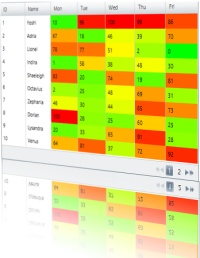
The grid is one of the most useful controls for visualizing structured data. It gives you the opportunity to display and style your data according to your needs. There are numerous features that can help you customize it and provide best possible user experience for your end-users while they are manipulating and extracting the information they need. If you display that information with a heatmap the users will be able to find patterns and track the data even faster. In this blog we will see how to build a heatmap with Infragistics WPF xamGrid and xamDataGrid.


Basics

If you have downloaded and installed the Infragistics package you will find a list of the controls from the 13.2 release of WPF in the toolbox. Drag the xamGrid or the xamDataGrid whatever you are going to use to the Designer View and you will see that the needed references will be added automatically. 

xamGrid:

xamGrid required references

xamDataGrid:

xamDataGrid required references

In the code behind we are going to create a sample data , that we are going to use for our heatmap. This data represents how busy are the employees in one organization each day of the week and their business is represented by percentage – 0% means the employee has no work to do and 100% means he is occupied the whole day. For the color calculations you will need the minimum and maximum values of your data one way or another, for this demo we'll expose them from the data collection but you can provide those any way you see fit.

  1. publicclassAppointment
  2. {
  3.     publicint ID { get; set; }
  4.     publicstring Name { get; set; }
  5.     publicint Mon { get; set; }
  6.     publicint Tue { get; set; }
  7.     publicint Wed { get; set; }
  8.     publicint Thu { get; set; }
  9.     publicint Fri { get; set; }
  10.  
  11. }
  12. publicclassDataCollection : List<Appointment>
  13. {
  14.     publicint Min { get; set; }
  15.     publicint Max { get; set; }
  16.     public DataCollection()
  17.     {
  18.         this.Add(newAppointment { ID = 1, Name = "Yoshi", Mon = 10, Tue = 96, Wed = 100, Thu = 99, Fri = 86 });
  19.         this.Add(newAppointment { ID = 2, Name = "Adria", Mon = 67, Tue = 18, Wed = 46, Thu = 39, Fri = 70 });
  20.         this.Add(newAppointment { ID = 3, Name = "Lionel", Mon = 78, Tue = 77, Wed = 51, Thu = 2, Fri = 0 });
  21.         this.Add(newAppointment { ID = 4, Name = "Indira", Mon = 1, Tue = 58, Wed = 38, Thu = 48, Fri = 30 });
  22.         this.Add(newAppointment { ID = 5, Name = "Shaeleigh", Mon = 83, Tue = 20, Wed = 74, Thu = 19, Fri = 81 });
  23.         this.Add(newAppointment { ID = 6, Name = "Octavius", Mon = 2, Tue = 25, Wed = 48, Thu = 69, Fri = 31 });
  24.         this.Add(newAppointment { ID = 7, Name = "Zephania", Mon = 46, Tue = 30, Wed = 44, Thu = 85, Fri = 73 });
  25.         this.Add(newAppointment { ID = 8, Name = "Dorian", Mon = 100, Tue = 28, Wed = 25, Thu = 60, Fri = 25 });
  26.         this.Add(newAppointment { ID = 9, Name = "Lysandra", Mon = 20, Tue = 33, Wed = 65, Thu = 91, Fri = 28 });
  27.         this.Add(newAppointment { ID = 10, Name = "Venus", Mon = 64, Tue = 81, Wed = 37, Thu = 72, Fri = 92 });
  28.         this.Add(newAppointment { ID = 11, Name = "Cairo", Mon = 82, Tue = 92, Wed = 40, Thu = 7, Fri = 46 });
  29.         this.Add(newAppointment { ID = 12, Name = "Iliana", Mon = 52, Tue = 78, Wed = 90, Thu = 16, Fri = 92 });
  30.         this.Add(newAppointment { ID = 13, Name = "Sarah", Mon = 33, Tue = 52, Wed = 27, Thu = 28, Fri = 59 });
  31.         this.Add(newAppointment { ID = 14, Name = "Valentine", Mon = 30, Tue = 26, Wed = 1, Thu = 52, Fri = 4 });
  32.         var list = this.Select(c => newList<int>() { c.Mon, c.Tue, c.Wed, c.Thu, c.Fri }).SelectMany(f => f);
  33.         Max = list.Max();
  34.         Min = list.Min();
  35.     }
  36. }

Now lets connect that information to the grid. As we dragged and dropped the xamGrid or the xamDataGrid respectively into the designer view we will see the control’s tag containing  the  grid itself. Now we can add some properties such as width, height and etc. How do we bind the data to the grid? Well it’s pretty easy.  We should add the  data collection that we have created as a resource and then in the control’s tag we need to use the data source option of the xamDataGrid and item Source option of the xamGrid and bind it to that static resource.

XAML:

  1. <Grid.Resources>
  2.     <local:DataCollection x:Key="source" />
  3. </Grid.Resources>

xamDataGrid:

  1. <igWPF:XamDataGrid Name="xamdataGrid" DataSource="{Binding Source={StaticResource source}}">

xamGrid:

  1. <ig:XamGrid Name="Grid" Width="500" Height="320" RowHover="None" ColumnWidth="*" ItemsSource="{Binding Source={StaticResource source}}" />

Defining the different columns in the xamGrid and xamDataGrid looks as follows:

xamGrid:

  1. <ig:XamGrid.Columns>
  2.     <ig:TextColumn Key="ID" />
  3.     <ig:TextColumn Key="Name" />
  4.     <ig:TextColumn Key="Mon" />
  5.     <ig:TextColumn Key="Tue" />
  6.     <ig:TextColumn Key="Wed" />
  7.     <ig:TextColumn Key="Thu" />
  8.     <ig:TextColumn Key="Fri" />
  9. </ig:XamGrid.Columns>

xamDataGrid:

  1. <igWPF:XamDataGrid.FieldLayouts>
  2.     <igWPF:FieldLayout>
  3.         <igWPF:Field Name="Name" Label="Name" />
  4.         <igWPF:Field Name="Mon" Label="Mon" />
  5.         <igWPF:Field Name="Tue" Label="Tue" />
  6.         <igWPF:Field Name="Wed" Label="Wed" />
  7.         <igWPF:Field Name="Thu" Label="Thu" />
  8.         <igWPF:Field Name="Fri" Label="Fri" />
  9.     </igWPF:FieldLayout>
  10. </igWPF:XamDataGrid.FieldLayouts>

xamGrid example image:

xamGrid with custom data

Now we have basic grids that display our data. The next step is to take the value from the numeric cells and based on that value to generate an appropriate color for every cell.

xamDataGrid with heatmap

Heatmaps visualize a table of numbers with corresponding colors. In our samples the values will be represented with both values and colors. Respectively to the data a green color meets the 0% and red meets 100%. In the xamDataGrid for every column that we want to add to the heatmap we will use the field settings and we will define a style which will take the current value of the cell and it will call a color converter function that will generate the relevant color.

Color Converter:

  1. publicobject Convert(object value, Type targetType, object parameter, System.Globalization.CultureInfo culture)
  2. {
  3.     var collection = parameter asDataCollection;
  4.     double max = collection.Max;
  5.     double min = collection.Min;
  6.  
  7.     int val = (Int32)(value);
  8.     double perRed = 0;
  9.     double perGreen = 0;
  10.     string color = "";
  11.     double ratio = 0;
  12.     
  13.     ratio = 1 / (max-min) ;
  14.     var finalValue = (val - min) * ratio;
  15.  
  16.     if (finalValue == 0.5)
  17.     {
  18.         perRed = 1;
  19.         perGreen = 1;
  20.     }
  21.     elseif (finalValue > 0.5)
  22.     {
  23.         perRed = 1;
  24.         perGreen = (1 - finalValue) * 2;
  25.     }
  26.     else
  27.     {
  28.         perGreen = 1;
  29.         perRed = finalValue * 2;
  30.     }
  31.  
  32.     var red = (int)Math.Round(255.0 * perRed);
  33.     var green = (int)Math.Round(255.0 * perGreen);
  34.     var gString = green.ToString("X");
  35.     var rString = red.ToString("X");
  36.  
  37.     if (gString.Length == 1)
  38.     {
  39.         gString = '0' + gString;
  40.     }
  41.  
  42.     if (rString.Length == 1)
  43.     {
  44.         rString = rString + '0';
  45.     }
  46.  
  47.     color = "#" + rString + gString + "00";
  48.  
  49.     return color;
  50. }

XAML:

  1. <igWPF:XamDataGrid.FieldLayouts>
  2.     <igWPF:FieldLayout>
  3.         <igWPF:Field Name="Name" Label="Name" />
  4.         <igWPF:Field Name="Mon" Label="Mon" >
  5.             <igWPF:Field.Settings>
  6.                 <igWPF:FieldSettings CellWidth="50" LabelWidth="50">
  7.                     <igWPF:FieldSettings.CellValuePresenterStyle>
  8.                         <Style TargetType="{x:Type igWPF:CellValuePresenter}">
  9.                             <Setter Property="Background" Value="{Binding Path=Cells[Mon].Value, Converter={StaticResource ColorConv}, ConverterParameter={StaticResource source}}" />
  10.                         </Style>
  11.                     </igWPF:FieldSettings.CellValuePresenterStyle>
  12.                 </igWPF:FieldSettings>
  13.             </igWPF:Field.Settings>
  14.         </igWPF:Field>
  15.         <igWPF:Field Name="Tue" Label="Tue" >
  16.             <igWPF:Field.Settings>
  17.                 <igWPF:FieldSettings CellWidth="50" LabelWidth="50">
  18.                     <igWPF:FieldSettings.CellValuePresenterStyle>
  19.                         <Style TargetType="{x:Type igWPF:CellValuePresenter}">
  20.                             <Setter Property="Background" Value="{Binding Path=Cells[Tue].Value, Converter={StaticResource ColorConv},ConverterParameter={StaticResource source}}" />
  21.                         </Style>
  22.                     </igWPF:FieldSettings.CellValuePresenterStyle>
  23.                 </igWPF:FieldSettings>
  24.             </igWPF:Field.Settings>
  25.         </igWPF:Field>
  26.         <igWPF:Field Name="Wed" Label="Wed">
  27.             <igWPF:Field.Settings>
  28.                 <igWPF:FieldSettings CellWidth="50" LabelWidth="50">
  29.                     <igWPF:FieldSettings.CellValuePresenterStyle>
  30.                         <Style TargetType="{x:Type igWPF:CellValuePresenter}">
  31.                             <Setter Property="Background" Value="{Binding Path=Cells[Wed].Value, Converter={StaticResource ColorConv},ConverterParameter={StaticResource source}}" />
  32.                         </Style>
  33.                     </igWPF:FieldSettings.CellValuePresenterStyle>
  34.                 </igWPF:FieldSettings>
  35.             </igWPF:Field.Settings>
  36.         </igWPF:Field>
  37.         <igWPF:Field Name="Thu" Label="Thu">
  38.             <igWPF:Field.Settings>
  39.                 <igWPF:FieldSettings CellWidth="50" LabelWidth="50">
  40.                     <igWPF:FieldSettings.CellValuePresenterStyle>
  41.                         <Style TargetType="{x:Type igWPF:CellValuePresenter}">
  42.                             <Setter Property="Background" Value="{Binding Path=Cells[Thu].Value, Converter={StaticResource ColorConv},ConverterParameter={StaticResource source}}" />
  43.                         </Style>
  44.                     </igWPF:FieldSettings.CellValuePresenterStyle>
  45.                 </igWPF:FieldSettings>
  46.             </igWPF:Field.Settings>
  47.         </igWPF:Field>
  48.         <igWPF:Field Name="Fri" Label="Fri">
  49.             <igWPF:Field.Settings>
  50.                 <igWPF:FieldSettings CellWidth="50" LabelWidth="50">
  51.                     <igWPF:FieldSettings.CellValuePresenterStyle>
  52.                         <Style TargetType="{x:Type igWPF:CellValuePresenter}">
  53.                             <Setter Property="Background" Value="{Binding Path=Cells[Fri].Value, Converter={StaticResource ColorConv},ConverterParameter={StaticResource source}}" />
  54.                         </Style>
  55.                     </igWPF:FieldSettings.CellValuePresenterStyle>
  56.                 </igWPF:FieldSettings>
  57.             </igWPF:Field.Settings>
  58.         </igWPF:Field>
  59.     </igWPF:FieldLayout>
  60. </igWPF:XamDataGrid.FieldLayouts>

To have the same color converter produce a color scale from blue to purple change the color variable at line 47 from the snippet and give it a maximum value for the blue(last) component:

  1. color = "#" + rString + gString + "ff";

Image:

xamDataGrid heatmap in colors from Blue to purple


xamGrid with Heatmap

We will use the same color converter as the one explained above, but we will show two ways of connecting it to that converter. One of the ways is setting a different style for every column. In this case we will send the current value of every column and receive back the relevant color. We will define the different styles in the static resources and then we will use the cellStyle property to bind the separate columns to those styles. It is good to disable the IsAlternateRowsEnabledateColumns property by assigning it a false value because otherwise it will override the coloring of the cells.

Resources:

  1. <Grid.Resources>
  2.     <local:DataCollection x:Key="source"/>
  3.     <local:ColorConverter x:Key="ColorConv"/>
  4.     <Style x:Key="MonStyle" TargetType="ig:CellControl">
  5.         <Setter Property="Background" Value="{Binding Path=Mon, Converter={StaticResource ColorConv}}"></Setter>
  6.     </Style>
  7.     <Style x:Key="TueStyle" TargetType="ig:CellControl">
  8.         <Setter Property="Background" Value="{Binding Path=Tue, Converter={StaticResource ColorConv}}"></Setter>
  9.     </Style>
  10.     <Style x:Key="WedStyle" TargetType="ig:CellControl">
  11.         <Setter Property="Background" Value="{Binding Path=Wed, Converter={StaticResource ColorConv}}"></Setter>
  12.     </Style>
  13.     <Style x:Key="ThuStyle" TargetType="ig:CellControl">
  14.         <Setter Property="Background" Value="{Binding Path=Thu, Converter={StaticResource ColorConv}}"></Setter>
  15.     </Style>
  16.     <Style x:Key="FriStyle" TargetType="ig:CellControl">
  17.         <Setter Property="Background" Value="{Binding Path=Fri, Converter={StaticResource ColorConv}}"></Setter>
  18.     </Style>
  19. </Grid.Resources>

Styling the columns:

  1. <ig:XamGrid.Columns>
  2.     <ig:TextColumn Key="ID" />
  3.     <ig:TextColumn Key="Name" />
  4.     <ig:TextColumn Key="Mon" CellStyle="{StaticResource ResourceKey=MonStyle}" />
  5.     <ig:TextColumn Key="Tue" CellStyle="{StaticResource ResourceKey=TueStyle}"/>
  6.     <ig:TextColumn Key="Wed" CellStyle="{StaticResource ResourceKey=WedStyle}"/>
  7.     <ig:TextColumn Key="Thu" CellStyle="{StaticResource ResourceKey=ThuStyle}"/>
  8.                      <ig:TextColumn Key="Fri" CellStyle="{StaticResource ResourceKey=FriStyle}"/>
  9. </ig:XamGrid.Columns>

The second way of achieving the same heatmap effect is by using the cellControlAttached event. In this case instead of of creating individual style for every column and connecting it to the color converter we will have only one style and in the event we will handle the coloring of the different cells.

XAML:

  1. <Style x:Key="Style" TargetType="ig:CellControl">
  2.     <Setter Property="Background" Value="{Binding RelativeSource={RelativeSource Self}, Converter={StaticResource ColorConv}}"></Setter>
  3. </Style>

Event:

  1. privatevoid Grid_CellControlAttached(object sender, Infragistics.Controls.Grids.CellControlAttachedEventArgs e)
  2. {
  3.     XamGrid grid = sender asXamGrid;
  4.     int columnIndex = grid.Columns.DataColumns.IndexOf(e.Cell.Column);
  5.     if (grid != null&& columnIndex > 1 )
  6.     {
  7.         e.Cell.Style = this.root.Resources["Style"] asStyle;
  8.     }            
  9. }

Image:

xamGrid heatmap - from green to red

If you follow those steps you can create your own heatmap grid in no time.

Summary

Using a heatmap is a useful way of finding patterns thought the data. It helps the end user to find faster highs and lows and track the information he needs. Although usually in heatmap the numbers are substituted by corresponding colors with the xamDataGrid and xamGrid we demonstrate how to keep them both and thus enrich the user experience.


Download the WPF xamDataGrid or the xamGrid heatmap samples.


Download free trial


You can follow us on Twitter @Infragistics and stay in touch on Facebook, Google+ and LinkedIn!

For The First Time - Azure Bootcamp Bulgaria with Infragistics

$
0
0


For the first time in Bulgaria Azure Bootcamp Bulgaria will be held on March 29, 2014 at Infragistics Bulgaria office: 110 B, Simeonovsko Shosse Bul., Office Floor II ans III , 1700 Sofia, Bulgaria.  The event is organized by the local Windows Azure society, Infragistics Friends (BI and. Net Geeks), Infragistics and Microsoft.   Infragistics and Microsoft did a lot to be done the first Windows Azure conference in this region. Azure Bootcamp Bulgaria has a great website created by Damian Petev, Technical Evangelist @ Infragistics – www.azure-camp.eu  There's also a Facebook event page you can join.


There are already 12 speakers from 4 countries (Estonia, Ukraine, Macedonia and Bulgaria), who have confirmed participation at the event.
Event organizers will try as a bonus to provide additional online streaming from Windows Azure boot camps in Poland and Japan.


This boot camp also will include a training for all attendees who have no experience or have less experience with the development of Windows Azure applications


This boot camp is also  part of the Global Azure Bootcamp .   Infragistics is a global sponso

In April of 2013 at the first Global Windows Azure Bootcamp there was more than 90 locations around the globe!

There are 113 locations registered in 45 countries and 105 cities. Of those, 86 have provided an event address and are pinned to the azure bootcamp map. You can see all the locations on the website of Global Azure Bootcamp.  Infragistics also is a global sponsor of the Azure Global Bootcamp for all locations where the event takes place.


Infragistics Bulgaria Office 


Location:

SQL Saturday 152 Bulgaria Location


What is Azure Bootcamp:

  • One day deep dive class to help thousands of people get
    up to speed on developing Cloud Computing Applications
    for Windows Azure!
  • Sessions and training should be delivered by influential and respected Windows Azure
    professionals


Our targets:

  • One-day event in Sofia, Bulgaria
  • Up to 250 attendees
  • Up to 15 sessions (lectures and training),
  • Up to 4 Tracks
  • Up to 15 speakers (local and foreign)
  • breaks, cocktail, press conference
  • At its heart this event is a local one day Windows Azure Community event.


The event is free! If you want to register you can grab the last ticketshere.


If you have any questions feel free to contact the Event Admins at mmateev@infragistics.com

Follow this event on Twitter with hashtag #WindowsazureBG, and get news on all our events with #gwab .

You can learn more about Azure Bootcamp Bulgaria if you follow us on Twitter @mihailmateev  and @Infragistics and stay in touch on Facebook, Google+, LinkedIn and Infragistics Friends User Group !

Warm Regards,
Team Azure Bootcamp Bulgaria

New How-To Video: WPF Test Automation

$
0
0

In our latest video, you'll learn how to implement a data driven testing scenario with Infragistics WPF Test Automation tools.

[youtube] width="560" height="315" src="http://www.youtube.com/embed/Q4JZ8R1FiJw" [/youtube]

Check it out and see how you can use HP's excel like Data Pane to iterate through multiple test cases while re-using the same base code.

New Video: Windows Forms Test Automation

$
0
0

In one of our newest videos, you'll learn how to implement a data driven testing scenario with Windows Forms Test Automation with HP Unified Functional Testing.

[youtube] width="560" height="315" src="http://www.youtube.com/embed/S_dqzs556vo" [/youtube]

See how easy it is when we use HP's excel like Data Pane to iterate through multiple test cases while re-using the same base code.

jQuery Bullet Graph Introduction

$
0
0

bullet graph header imageIn my previous blogs I’ve already mentioned that Infragistics’ Ignite UI package contains a lot of controls for Data Visualization. The one we are going to talk about in this blog is the bullet graph. This control is similar to the Linear Gauge but apart from the current value it also shows a target value which can serve as a point to reach or a measurement . It is usually used to compare two values one represented by a horizontal bar and another represented by a vertical line. You can display the chart separately or you can insert it in a Grid and thus create a graphical table for even better UX.


Features and Usage

The configuration of the bullet graph is easy. After adding the required Infragistics’ references as well as JavaScript and CSS files you have to create a HTML div tag to host your graph. The basic configuration of the igBulletGraph requires proving a width and a height values. If you haven’t added additional options to the configuration the control will display a scale ranging from 0 to 100 with major ticks and labels positioned  at an interval of 10. The bullet graph supports a lot of features which can help you customize it according to your needs. You can find a detailed information about the control and its features and how to configure its separate parts in the API documentation as we as the online help documentation.

To configure a custom scale you should set the minimumValue and maximumValue properties. Then you can add the performance bar which visualize the primary measure of the igBulletGraph. In order to do so set the value property. The comparative marker corresponds to the targetValue property. Those  are the four values that you should configure to have a fully functional bullet graph.

When it comes to styling the control you can customize almost every part of it starting from the labels and the tick marks and ending with the performance bar and target value. We are going to take a closer look at the ranges, cause they are a tool that can help you strengthen the feeling of comparison of values. Those comparative ranges are managed by the ranges property within which several individual ranges can be defined. Each range have its own starting and ending values as well as a brush. All of the brushes of the control support gradients. But if you want only the scale to be colored using the gradients you should use the ranges brush, if you use the backingBrush property you will color the whole control. Pay attention that if you don’t set specifically values for the brush and outline properties , the values are retrieved from the values of igBulletGraph’s rangeBrushes and rangeOutlines objects. They are defined in the default theme. You can also use CSS to style the different elements. For the ranges you can use the background-image property to set a gradient color. Another thing to watch about is : if you use the “ui-bulletgraph-range-palette-n” class you should set not only the background color but the border as well.

Each range can be configured individually by specifying its starting and ending value, the border thickness and color . The width and the position of the ranges are managed by the inner and outer start and end extent. You can add a tooltips to the ranges. By default the tooltip template of the ranges shows the start and the end values separated by hyphen.

MVC:

  1. @(Html.Infragistics().BulletGraph()
  2.     .Width("100%")
  3.     .Height("80px")  
  4.     .Ranges(range =>
  5.     {
  6.         range.Range("bad").StartValue(0).EndValue(25).Brush("#E6E6E6");
  7.         range.Range("acceptable").StartValue(25).EndValue(75).Brush("#B2B2B2");
  8.         range.Range("good").StartValue(75).EndValue(100).Brush("#808080");
  9.     })
  10.     .Value(60)
  11.     .TargetValue(40)
  12.     .ValueBrush("#000")
  13.     .TargetValueBrush("#CC0000")
  14.     .FontBrush("#660000")
  15.     .TickBrush("#660000")
  16.     .TargetValueOutline("#800000")
  17.     .MinorTickCount(0)
  18.     .ClientEvents(newDictionary<string, string>() { { "formatLabel", "function(evt, ui) { ui.label += '%' }" } })
  19.     .TransitionDuration(500)
  20.     .HtmlAttributes(newDictionary<string, object> { { "style", "margin-bottom:40px" } })
  21.     .Render())

igBulletGraph

jQuery:

  1. $("#bulletgraph").igBulletGraph({
  2.     width: '70px',
  3.     height: '400px',
  4.     minimumValue: -10,
  5.     maximumValue: 40,
  6.     targetValue: 26,
  7.     interval: 5,
  8.     value: 20,
  9.     orientation: "vertical",
  10.     labelInterval: 5,
  11.     minorTickCount: 0,
  12.     valueBrush: "#fff",
  13.     targetValueBrush: "#000",
  14.     targetValueOutline: "#000",
  15.     transitionDuration:1000,
  16.     ranges: [{
  17.         name: "temp",
  18.         startValue: -10,
  19.         endValue: 40,
  20.         brush: {
  21.             type: "linearGradient",
  22.             colorStops: [{
  23.                 color: "#33CCFF",
  24.                 offset: 1
  25.             },
  26.             {
  27.                 color: "#FFFF00",
  28.                 offset: 0.5
  29.             },
  30.             {
  31.                 color: "#FF3300",
  32.                 offset: 0
  33.             }]
  34.         }
  35.     }],
  36.     formatLabel: function (evt, ui) {
  37.         ui.label = ui.label + "C";
  38.     }
  39. });

igBulletGraph with gradient brush for the ranges

Animation Transitions

One of the main features of the bullet graph is the animated transitions. This control provides a build-in support for animations, which can be triggered by the transitionDuration property. By default this property is disabled, but you can enable it by assigning it a positive milliseconds value.   The milliseconds value determines the timeframe for sliding the control into view by smoothly visualizing all its visual elements through a slide effect. The animations appears when the control is loading as well as when the value of any of its property is changed.

In the sample below you can see how we change the value for the graph at every second and based on that value we change the background color of the control, so that it will correspond to it.

  1. transitionDuration: 1000

igBulletGraph animation

Check out the animated transitions sample to see transitions between different sets of settings in the igBulletGraph control.

For one of the samples, that you can find at the bottom of the blog we used the animation duration to show the wind speed change in mph for the different countries. You can see a live demo on jsFiddle.

igBulletGraph animation - wind speed

Graphical Table

As I said earlier the bullet graph comes in handy when we want to display comparison between two values. By building a grid and combining it with such graph you will provide to your end-users an easy to understand and use comprehensive information.  You can check out the grid integration sample to see how to use the igBulletGraph control in a grid.

To implement  such correlation between those controls, you should add a custom row template for the grid with a special div tag that will host the bullet charts.

  1. rowTemplate: "${id}${month}${sold}${produced}
    "

The next step is to add a rowsRendered event and configure the bullet graphs in it. The minimum and maximum values as well as the target value and the value itself we will take from the data that we are using for the grid.

  1. rowsRendered: function (evt, ui) {
  2.     $(".bulletgraph3").each(function (i) {
  3.         var item = data[i];
  4.         $(this).igBulletGraph({
  5.             height: "60px",
  6.             width: "450px",
  7.             backingBrush: 'transparent',
  8.             backingOutline: 'transparent',
  9.             minimumValue: item.min,
  10.             maximumValue: item.max,
  11.             targetValue: item.produced,
  12.             value: item.sold,
  13.             interval: 100,
  14.             minorTickCount: 1,
  15.             ranges: $.map(item.ranges, function (el, index) {
  16.                 return {
  17.                     name: item.month + index,
  18.                     startValue: el.start,
  19.                     endValue: el.end
  20.                 };
  21.             }),
  22.             transitionDuration: 1200,
  23.             scaleEndExtent: 0.9,
  24.            
  25.         });
  26.     });
  27. }


igBulletGraph in Grid

Summary

The bullet graph control is a handy widget when it comes to comparison of two values. With its numerous features it is easy to customize and  adapt to your personal needs. It can be used separately or you can combine it with a grid and thus create a stunning app providing the best possible  user experience.


See a live demo in jsFiddle or download the ASP.NET MVC sample.

download a free trial


You can follow us on Twitter @Infragistics and stay in touch on Facebook, Google+ and LinkedIn!

Viewing all 2460 articles
Browse latest View live