Quantcast
Channel: Infragistics Community
Viewing all 2460 articles
Browse latest View live

Infragistics Friends Group Presentation: Building your first Analysis Services solution - Event Recap and Follow-up

$
0
0

Infragistics Friends group, BI & .NET Geeks (Bulgarian PASS Chapter) with the help of Infragistics Inc.  organized a presentation on “Building your first Analysis Services solution” . From 14th of January 2013 our group is an official PASS Chapter in Bulgaria under the name BI &. NET Geeks and we try to provide more BI and data visualization related content.

The event was held on Tuesday, February 11 at Infragistics Bulgaria Office, 110B, Simeonovsko Shosse Bul., Sofia, Bulgaria.

This presentation was a practical session about SQL Server Analysis Services. Attendees learned how to build their first Analysis Services cube. This case is important for many BI systems and all kind of software that use multi-dimensional data. There were demonstrated the best practices how to build and use sol this cube in the easiest way.
Speaker will be Ivan Donev - SQL Server Solution Designer and DBA for Hewlett-Packard. He is also and SQL Server trainer,and holds certifications in several different SQL Server areas - development, business intelligence, database administration. He is also a certified trainer, active blogger and leader of www.mssqlinsider.com.


Let’s talk about the OLAP Cube


Ivan Donev and some of the participants in the Infragistics Bulgaria cafeteria.


Ivan  Donev is presenting   SSAS demo – how to build own cube


Pizza after the event


Some of attendees – Damyan Petev is excited by the content of the presentation


In connection with the topic of the presentation was great interest in Infragistics self service BI mobile client – ReportPlus.


The participants demonstrated great interest in the subject and we plan to have two more presentations related to SQL Server Analysis Services this year:

- Advanced  SASS (SQL Server  Analysis Services) tips & tricks

- Practical Olap Data for developers


As always, you can follow us on Twitter @mihailmateev and @Infragistics and stay in touch onFacebook,Google+andLinkedIn!


NucliOS Release Notes - November: 13.1.275, 13.2.155 Service Release

$
0
0

Introduction

With every release comes a set of release notes that reflects the state of resolved bugs and new additions from the previous release. You’ll find the notes useful to help determine the resolution of existing issues from a past release and as a means of determining where to test your applications when upgrading from one version to the next.

Release Notes: NucliOS 2013 Volume 1 Build 275 and NucliOS 2013 Volume 2 Build 155

ComponentProduct ImpactDescriptionService Release
IGChartViewBug Fix

Exception on tapping the stacked fragment after switching between stacked series.

Note: The findStackedFragmentSeriesAtPoint: method returns a proper index instead of crashing after switching between multiple stacked series.

13.2.155
IGChartViewBug Fix

Cannot add IGChartView to storyboard and Interface Builder.

Note: Added the missing handling of the initWithCoder: method.

13.1.275, 13.2.155
IGTreemapViewBug Fix

Leaf nodes don’t display multiline text.

Note: The IGTreemapView node label can now display multiple lines of text.

13.2.155
IGRangeSelectorViewBug Fix

Zooming with the IGRangeSelectorView zooms IGChartView exponentially.

Note: Fixed IGRangeSelectorView zooming, and added horizontalAutoMargin and verticalAutoMargin properties to the IGChartView.

13.2.155
IGChartViewBug Fix

Chart legend badges don't reflect the series dash array.

Note: Fixed stroke dash array in legend badges.

13.1.275, 13.2.155
IGBulletGraphView, IGGaugeView, IGLinearGaugeViewBug Fix

Setting of transitionDuration doesn’t animate transition when gradient brush is used.

Note: Fixed disappearing gradient brush during animation.

13.2.155

By Torrey Betts

XAML Bullet Graph : introduction and some tips

$
0
0

xamBulletGraph header image

The main idea behind a bullet graph is to present a progress against  a goal. It allows the end-users to visualize data in a simple concise view and thus create an attractive bar chart. The new xamBulletGraph control is a Infragistics XAML control which provides the users with the opportunity to customize every visual element of the bullet graph as well as add a title and subtitle and in that way express their data in the most appropriate way for their needs.


Introduction

The XAML bullet graph is separated in three main areas: Title area, Reserved area and Graph area. Those areas help enriching the user experience by providing more detailed information about the data, which we are presenting.

xamBulletGraph visual areas

The title area is the area in which you can display a title and a subtitle. This area is not set by default so you should define it explicitly. This area doesn’t overlap the scale. The text area for the title configures its width automatically according to the length of the title or the subtitle (whichever is longer). You can of course set the width specifically and style the titles using the titleStyle and subtitleStyle properties. In the documentation you can find a step-by-step information how to style the title and the subtitle.

  1. <ig:XamBulletGraph x:Name="xamBulletGraph1" ShowToolTip="True" Title="English level test" Subtitle="points" TitlesHorizontalRatio="0.3" />

The reserved area’s main purpose is to provide enough space for the numerous labels no matter of the orientation (horizontal or vertical).  This area spreads along the scale and automatically resizes when the orientation of the control is changed.  Actually when we say that this area should provide enough space for the numerous labels  it doesn’t mean that those labels should necessarily be position there. You can place the labels in the graph area if you like, but the spread and the location of the of the Reserved area itself – it remains where it is. This area is also important because its inner edge specifies the beginning of the graph area, and this edge serves as a a reference mark for the extent-related properties that position some visual elements.

The graph area contains the main body of the control with all of its visual elements like performance bar, target value, tick marks and ranges. This area begins from the edge of the control, if there is no title area or from the title area and ends at the edge of the control.

Configuration

As always you can find the xamBulletGraph in the toolbox under the “Infragistics 13.2 ” subcategory. Drag the control to the designer and you have the needed references added for you as well as the basic version of the control. The basic configuration consists of a scale from 0 to 100, if you want to customize it set a maximum and minimum value as well as a value and a target value. Adding comparative ranges to the graph reinforces the sense of comparing values until reaching any goal.

  1. <ig:XamBulletGraph Width="400" Height="80" Value="50" Interval="10" MinimumValue="0" MaximumValue="120" TargetValue="60" ValueBrush="White" TargetValueBrush="#FFFDFBFB" >
  2.     <ig:XamBulletGraph.Ranges>
  3.         <ig:XamLinearGraphRange StartValue="0" EndValue="45"/>
  4.         <ig:XamLinearGraphRange StartValue="45" EndValue="70"/>
  5.         <ig:XamLinearGraphRange StartValue="70" EndValue="95"/>
  6.         <ig:XamLinearGraphRange StartValue="95" EndValue="120"/>
  7.     </ig:XamBulletGraph.Ranges>
  8. </ig:XamBulletGraph>

Image:

basic xamBulletGraph with ranges

You can use gradients for the ranges’ brush to achieve a 3D effect.

To show more information about the separate ranges and what do they express you can use tooltips. The bullet graph actually supports tooltips for the performance bar, comparative marker and comparative ranges. Those tooltips can be configured individually and can be customized by manipulating their visibility, delay and value. The value can be a template, string or a UI element. In the documentation you can find how to set and change the tooltips of the different visual elements. For the purpose of the blog we created a tooltips for the ranges.

  1.       <ig:XamBulletGraph Width="400" Height="80" ShowToolTip="True" MinimumValue="0" MaximumValue="120" Value="40" TargetValue="60" ValueBrush="WhiteSmoke" TargetValueBrush="#FFFBF9F9" Interval="10">
  2.           <ig:XamBulletGraph.Ranges>
  3.                 <ig:XamLinearGraphRange StartValue="0" EndValue="45" Caption="Beginner"/>
  4.               <ig:XamLinearGraphRange StartValue="45" EndValue="70" Caption="Intermediate" />
  5.               <ig:XamLinearGraphRange StartValue="70" EndValue="95" Caption="Advanced"/>
  6.               <ig:XamLinearGraphRange StartValue="95" EndValue="120" Caption="Expert"/>
  7.           </ig:XamBulletGraph.Ranges>
  8.           <ig:XamBulletGraph.RangeToolTip>
  9.                 <Border CornerRadius="0, 20, 0, 20" Padding="10,5" Background="#BFC5C5C5" >
  10.                   <TextBlock FontWeight="Bold" FontSize="12">
  11.                       <Run Text="{Binding Path=Item.Caption}"/>
  12.                   </TextBlock>
  13.               </Border>
  14.           </ig:XamBulletGraph.RangeToolTip>
  15.       </ig:XamBulletGraph>

xamBulletGraph with tooltips for the ranges

Combining the bullet graph with a grid is a handy way to express the data in an easy to understand and work with information. In the WPF samples at our page you can see the Grid integration sample which demonstrates how to use the the xamBulletGraph control in a grid. To create such interaction you should use unbound column for the xamBulletGraph.

  1.       <ig:XamGrid Grid.Row="1"
  2.                   ItemsSource="{Binding}"
  3.                   DataContext="{Binding Mode=OneWay}"
  4.                   ColumnWidth="Auto"
  5.                   AutoGenerateColumns="False" Height="230" >
  6.           <ig:XamGrid.EditingSettings>
  7.               <ig:EditingSettings AllowEditing="Cell" />
  8.           </ig:XamGrid.EditingSettings>
  9.           <ig:XamGrid.Columns>
  10.               <ig:TextColumn Key="Month" HeaderText="{Binding Month}"/>
  11.               <ig:TextColumn Key="Sold" HeaderText="{Binding Path=Sold}"/>
  12.               <ig:TextColumn Key="Produced" HeaderText="{Binding Path=Produced}"/>
  13.               <ig:UnboundColumn Key="XamBulletGraph" HeaderText="{Binding Path=ConsumptionGraph}">
  14.                   <ig:UnboundColumn.ItemTemplate>
  15.                       <DataTemplate>
  16.                           <ig:XamBulletGraph MinHeight="50"
  17.                                              MinWidth="250"
  18.                                              Margin="0,5"
  19.                                              ValueBrush="White"
  20.                                              VerticalAlignment="Center"
  21.                                              MinimumValue="{Binding RowData.Min}"
  22.                                              MaximumValue="{Binding RowData.Max}"
  23.                                              TargetValue="{Binding RowData.Produced}"
  24.                                              Value="{Binding RowData.Sold}"
  25.                                              LabelInterval="100" >
  26.                               <ig:XamBulletGraph.Ranges>
  27.                                   <ig:XamLinearGraphRange StartValue="{Binding RowData.Min}"
  28.                                                           EndValue="{Binding RowData.Ranges[0]}" />
  29.                                   <ig:XamLinearGraphRange StartValue="{Binding RowData.Ranges[0]}"
  30.                                                           EndValue="{Binding RowData.Ranges[1]}" />
  31.                                   <ig:XamLinearGraphRange StartValue="{Binding RowData.Ranges[1]}"
  32.                                                             EndValue="{Binding RowData.Max}" />
  33.                               </ig:XamBulletGraph.Ranges>
  34.                           </ig:XamBulletGraph>
  35.                       </DataTemplate>
  36.                   </ig:UnboundColumn.ItemTemplate>
  37.               </ig:UnboundColumn>
  38.           </ig:XamGrid.Columns>
  39.       </ig:XamGrid

Image:

xamGrid integration with xamBulletGraph

Multiple target values

The bullet graph by its own supports only one performance bar and one comparative marker. If you want to have multiple target values or to create a progress bar you have to configure several bullet graph controls and position them one over the other. We make the labels and the ranges of the second graph transparent , but if you want your control to have tooltips you should define them on the upper-most bullet graph.

xamBulletGraph with multiple target values


Conclusion

The bullet graph control is a handy widget when it comes to comparison of two values. With its numerous features it is easy to customize and  adapt to your personal needs. It can be used separately or you can combine it with a grid and thus create a stunning app providing the best possible  user experience.


Download the XAML Bullet Graph sample.


You can follow us on Twitter @Infragistics and stay in touch on Facebook, Google+ and LinkedIn!

ConveyUX: A New Contender in UX Conferences

$
0
0

I recently attended a unique user experience conference, ConveyUX, from February 5th– 7th in Seattle. I was pleasantly surprised by the size, organization, and quality of content.

The idea of a privately-organized conference was new to me. So I wasn’t sure what to expect. I’ve only been to conferences organized by professional associations, such as the UXPA conference (organized by the User Experience Professional’s Association) and CHI (organized by the Association for Computing Machinery). But I found that it was very well-organized and executed, with a wide variety of excellent and thought-provoking speakers.

Networking

A big part of any conference are the networking opportunities, and ConveyUX provided several opportunities to encourage networking between the attendees. In addition to a welcome reception at a nearby brewpub, lunch sessions had tables devoted to specific discussion topics, and there was a session of speed-networking to meet a lot of people in a short time period.

At this second ConveyUX conference, attendance had grown rapidly from about 100+ people last year to about 350 attendees this year from 11 countries and 28 U.S. states. Occupations ranged across the UX spectrum with designers, researchers, content strategists, information architects, and even a few developers and project managers.

Sessions

ConveyUX had a varied program with about 35 sessions over the three days. Pacing was good with a mix of shorter 30 – 40 minute sessions, longer 60 minute sessions, and several 90 minute, interactive workshops, which provided the ability for attendees to work together in small-group exercises.

Each day kicked off with one large session for all attendees and then split into three different choices. With such good content, it was often difficult to choose between sessions. At conferences, I often seem to suffer from a “grass is greener” regret, in which halfway through a session I get the feeling that I should have attended another session instead. I only felt that a few times during this conference, as most of the sessions I attended were good.

Designing Beyond the Screen

The conference kicked off with a great keynote presentation from Don Norman about UX Design in the Real World. A low-key, but fascinating, living-legend in the UX world, Norman discussed what became a common thread throughout the conference – that user experience is more than just what happens on the screen, it’s about every interaction we have in the real world, with products, devices, appliances, services, and more. He lamented the state of current design trends that don’t label or provide affordances for controls, giving examples such as the iPhone’s iOS 7 design and a personal, humorous example of his challenge that morning to figure out how to work his hotel shower.

Samantha Starmer, in her presentation - The Future of Experience Design is Omnichannel, also stressed the need to design for all channels in which customers experience a product or service. With her personal example of her chaotic experience of flying her cats across the country and the failures of the airline, she showed the need for UX designers to move beyond simply designing for the screen and instead designing a holistic customer experience, seamless across channels and devices.

Emotion and Engagement

As UX has matured from focusing solely on usability, designing compelling experiences has become a major focus, which was reflected in several sessions on designing for emotion and engagement. In two sessions, Kelly Goto, from Gotomedia, detailed her “Why-Finding” technique to quickly get an understanding of research participants’ emotional connections to products and services. Although these connections are mostly unconscious, she demonstrated the types of questions you can use to get people to reveal these needs and desires.

With her sessions, “Designing for Engagement” and “How to Get People to Do Stuff,” Susan Weinschenk gave practical, and often humorous, advice on how to design engaging and persuasive interfaces. I felt that she was particularly good at explaining principles from behavioral psychology research on vision, perception, memory, and cognition in a way the audience could easily understand and apply directly to their work.

A few improvements

Although most sessions were very good, I did attend a few that left me bored or with the feeling that I should have attended something else. Session titles and descriptions weren’t always informative about what to expect or the level of expertise they were aimed at. Unlike other conferences, the schedule didn’t specify whether sessions were for beginners or advanced professions, so I ended up attending a few sessions that didn’t provide me with anything new.

Although the conference started with a great keynote speaker, Don Norman, it didn’t have a traditional, big-name or inspiring closing speaker. Instead, the conference asked attendees to submit their predictions for the future of user experience in five years. In the closing session, the audience voted on whether they agreed with the predictions and how bold they were. This was a fun, interactive session, but it would also have been nice to have a closing speaker to sum things up, give a new perspective, or to provide some inspiration.

Despite these few problems, it was a great conference overall - great speakers, interesting content, and extremely well run. The organizers at Blink deserve a lot of credit. I look forward to seeing how the conference continues to develop and grow in the future.

Infragistics Windows Forms - February 2014 Release Notes: 13.1, 13.2 Service Releases

$
0
0

With every release comes a set of release notes that reflects the state of resolved bugs and new additions from the previous release. You’ll find these notes useful to help determine the resolution of existing issues from a past release and as a means of determining where to test your applications when upgrading from one version to the next.

Release notes are available in both PDF and Excel formats. The PDF summarizes the changes to this release along with a listing of each item. The Excel sheet includes each change item and makes it easy for you to sort, filter and otherwise manipulate the data to your liking.

In order to download release notes, use the following links:

WinForms 2013 Volume 2 Service Release (Build 13.2.20132.2023)

PDF - Infragistics WinForms 2013 Volume 2
Excel - Infragistics WinForms 2013 Volume 2

WinForms 2013 Volume 1 Service Release (Build 13.1.20131.2105)

PDF - Infragistics WinForms 2013 Volume 1
Excel - Infragistics WinForms 2013 Volume 1


How to build a jQuery Tornado chart using the data chart control

$
0
0
 

tornado chart header imageThe Ignite UI Data Chart is a chart control that uses the Canvas tag in HTML5  to plot different kinds of chart into web applications and pages. The control has numerous series which can be combined and this way you can create even more series such as a tornado chart. The tornado chart is a special type of bar chart, which present values in a horizontal rather than vertical orientation. Those values are usually sorted from the largest bar at the top to the smallest one at the bottom. The final appearance of the chart is in a tornado shape and hence it is called. Tornado charts are useful for comparing relative variables or for sensitive analysis.  The current blog is based on Graham Murray' s ideas and help for the sample.


Step one

As always the first step to configure the widget is to add the required references as well as the JS and CSS files. If you are creating a JavaScript project you will need two div tags – one for the control and one for the legend. After you are done doing that you can start configuring the data chart.  For the purpose of our sample we are going to use movies data from Freebase.

Freebase CC-BYSource: Freebase, licensed under CC-BY. We are going to compare the number of comedy and drama movies that came out in theaters for the years: 2000 to 2010.

JS:

  1. <scriptsrc="../../Scripts/jquery-ui-1.8.20.min.js"></script>
  2. <scriptsrc="../../Scripts/infragistics.core.js"></script>
  3. <scriptsrc="../../Scripts/infragistics.dv.js"></script>


  1. <divid="chart"></div>
  2. <divid="legend"></div>

Data:

  1. var data = [
  2.     { 'Year': 2010, 'Comedy': 449, 'Drama': 780},
  3.     { 'Year': 2009, 'Comedy': 682, 'Drama': 1143 },
  4.     { 'Year': 2008, 'Comedy': 729, 'Drama': 1034 },
  5.     { 'Year': 2007, 'Comedy': 660, 'Drama': 982 },
  6.     { 'Year': 2006, 'Comedy': 765, 'Drama': 1117 },
  7.     { 'Year': 2005, 'Comedy': 686, 'Drama': 1042 },
  8.     { 'Year': 2004, 'Comedy': 639, 'Drama': 998 },
  9.     { 'Year': 2003,  'Comedy': 593,  'Drama': 864},
  10.     { 'Year': 2002,  'Comedy': 543,  'Drama': 850},
  11.     { 'Year': 2001, 'Comedy': 467, 'Drama': 732 },
  12.     { 'Year': 2000,  'Comedy': 417, 'Drama': 653, }
  13. ];

MVC:

  1. @using Infragistics.Web.Mvc
  2. @model IQueryable<TornadoChart.Models.Movies>

Model:

  1. publicclassMovies
  2. {
  3.     publicint Year { get; set; }
  4.     publicint Drama { get; set; }
  5.     publicint Comedy { get; set; }
  6. }

HomeController:

  1. publicActionResult MVC()
  2. {
  3.     var data = newList<Movies>()
  4.     {
  5.         newMovies{Year=2010,Comedy=449,Drama=780},
  6.         newMovies{Year=2009,Comedy=682,Drama=1143},
  7.         newMovies{Year=2008,Comedy=729,Drama=1034},
  8.         newMovies{Year=2007,Comedy=660,Drama=982},
  9.         newMovies{Year=2006,Comedy=765,Drama=1117},
  10.         newMovies{Year=2005,Comedy=686,Drama=1042},
  11.         newMovies{Year=2004,Comedy=639,Drama=998},
  12.         newMovies{Year=2003,Comedy=593,Drama=864},
  13.         newMovies{Year=2002,Comedy=543,Drama=850},
  14.         newMovies{Year=2001,Comedy=467,Drama=732},
  15.         newMovies{Year=2000,Comedy=417,Drama=653},
  16.  
  17.     };
  18.     return View(data.AsQueryable());
  19. }

Step two

We have everything needed to proceed with the configuration of the widget.  Let’s start with configuring the basic – we need to set height, width and dataSource which we are going to connect with the data array we defined.  Then we need to configure the chart axis options. The axis type determines if this is the category X-axis or a numeric (value) Y-axis, and the axes names are used in data series configuration to refer to which axis to map a particular data series. We will define two Y-axes and one X-axis. The X-axis main role in the case is to determine the referenceValue (the starting point for our bars).By default this value is 0. We have two Y-values: one for each bar. Although you can place as many bars as you need at one Y-axis they will be positioned one above the other. For the tornado chart we will need the opposite  bars to be displayed at the same visual line (to align the series) that is why we need two Y-values. Using the labelVisibility property we can collapse the labels of one of the Y-axes.

The crossing axis property can be used for changing where the X-Axis crosses the Y-Axis. You can set one of the Y-axis to cross the X-axis, and assign to the stroke and strokeThickness properties some values. This way when the tornado chart is ready the bars will be separated visually by a line (the Y-axis).

The last thing to do is configure the series. They are mapped to the corresponding Y-axes because the values in the two data series exist in different value ranges and we want to display them in a different way. We choose the bar type for the series because we want the bars to be displayed horizontally.  We can customize the bars by changing their brush or outline. The valueMemberPath connects the series to the data property we want it to display. If we want a legend we should assigned it with the legend option which points to the div element we created earlier.

JS:

  1. $("#chart").igDataChart({
  2.     dataSource: data,
  3.     width: "500px",
  4.     heigh: "250px",
  5.     title: "Movies",
  6.     subtitle: "Number of comedies and drama movies for the years: 2000-2010",
  7.     axes: [{
  8.         name: "yAxis",
  9.         type: "categoryY",
  10.         label: "Year",
  11.         crossingAxis: "xAxis",
  12.         stroke: "black",
  13.         strokeThickness: 2,
  14.         isInverted: true,
  15.         gap: 10,
  16.         interval: 1
  17.     }, {
  18.         name: "yAxis2",
  19.         type: "categoryY",
  20.         label: "Year",
  21.         isInverted: true,
  22.         labelVisibility: "collapsed",
  23.         gap: 10
  24.     }, {
  25.         name: "xAxis",
  26.         type: "numericX",
  27.         labelExtent: 30,
  28.         formatLabel: function (val) {
  29.             return Math.abs(val);
  30.         }
  31.     }], series: [{
  32.         name: "Comedy",
  33.         type: "bar",
  34.         xAxis: "xAxis",
  35.         yAxis: "yAxis",
  36.         valueMemberPath: "Comedy",
  37.         title: "Comedy",
  38.         brush: "#666699",
  39.         outline: "#666699"
  40.  
  41.     }, {
  42.         name: "Drama",
  43.         type: "bar",
  44.         xAxis: "xAxis",
  45.         yAxis: "yAxis2",
  46.         valueMemberPath: "Drama",
  47.         title: "Drama",
  48.         brush: "#336699",
  49.         outline: "#336699",
  50.  
  51.     }],
  52.     legend: {
  53.         element: "legend"
  54.     }
  55. });

MVC:

  1. @(Html.Infragistics().DataChart(Model)
  2.     .ID("chart")
  3.     .Height("400")
  4.     .Width("500")    
  5.     .Title("Movies")
  6.     .Subtitle("Number of comedies and drama movies for the years: 2000-2010")    
  7.     .Axes(a =>
  8.     {
  9.         a.CategoryY("yAxis")
  10.             .Label(item => item.Year)
  11.             .IsInverted(true)           
  12.             .Gap(10)
  13.             .Interval(1);
  14.         a.CategoryY("yAxis2")
  15.             .Label(item => item.Year)
  16.             .IsInverted(true)
  17.             .LabelVisibility(Visibility.Collapsed)
  18.             .Stroke("#000")
  19.             .Gap(10);
  20.         a.NumericX("xAxis")
  21.             .CrossingAxis("categodyY")
  22.             .ReferenceValue(0)
  23.             .LabelExtent(60)            
  24.             .FormatLabel("function(val){return Math.abs(val);}");
  25.     })
  26.     .Series(s => {
  27.         s.Bar("Drama")
  28.             .XAxis("xAxis")
  29.             .YAxis("yAxis2")
  30.             .ValueMemberPath("Drama")
  31.             .Title("Drama")
  32.             .ShowTooltip(true)
  33.             .TooltipTemplate("tooltipTemplateDrama")
  34.             .IsTransitionInEnabled(false);
  35.         s.Bar("Comedy")
  36.             .XAxis("xAxis")
  37.             .YAxis("yAxis")
  38.             .ValueMemberPath("Comedy")
  39.             .Title("Comedy")
  40.             .ShowTooltip(true)
  41.             .TooltipTemplate("tooltipTemplateComedy")            
  42.             .IsTransitionInEnabled(false)
  43.             .Brush("#666699")
  44.             .Outline("#666699");
  45.     
  46.     })
  47.     .Legend(legend => legend.ID("legend"))
  48.     .DataBind()
  49.     .Render())

Step Three

Building a tornado chart out of the data chart is not that hard. We want the different bars of the chart to be displayed in opposite directions and for that reason we call the convert function which transform one of the data properties’ values into negative integers.  After the call of the converting function we will have negative values in the data and for that reason the labels will have negative values as well which doesn’t fit the data we are presenting. That is why we convert the labels using the formatLabel property and we will display the numbers’ absolute value. As we said to achieve a tornado appearance for the chart we need the series to be aligned that is why we use two Y-axes.

  1. function convert() {
  2.     var i;
  3.     for (i = 0; i < data.length; i++) {
  4.         if (data[i].Drama) {
  5.             data[i].Drama = data[i].Drama * -1;
  6.         }
  7.     }
  8. }

  1. formatLabel: function (val) {
  2.     return Math.abs(val);
  3. }

This was the last step for the creation of the the tornado chart.

Tornado chart using igDataChart

If you want to add tooltips to your control you just have to add the showTooltip property and set it to true. That way you will see the default template.You can create a custom template using the tooltipTemplate property. In our case we will see the negative values that correspond to the drama bars that is why we will have to handle this with the tooltipShown event.

Tooltip templates:

  1. <scriptid="tooltipTemplateDrama"type="text/x-jquery-tmpl">
  2.   <span>${item.Drama}</span>
  3. </script>
  4. <scriptid="tooltipTemplateComedy"type="text/x-jquery-tmpl">
  5.   <span>${item.Comedy}</span>
  6. </script>

JS:

  1. series: [{
  2.             name: "Comedy",
  3.             type: "bar",
  4.             xAxis: "xAxis",
  5.             yAxis: "yAxis",
  6.             valueMemberPath: "Comedy",
  7.             title: "Comedy",
  8.             showTooltip: true,
  9.             isHighlightingEnabled: true,
  10.             tooltipTemplate: "tooltipTemplateComedy",
  11.             brush: "#666699",
  12.             outline: "#666699"
  13.  
  14.         }, {
  15.             name: "Drama",
  16.             type: "bar",
  17.             xAxis: "xAxis",
  18.             yAxis: "yAxis2",
  19.             valueMemberPath: "Drama",
  20.             showTooltip: true,
  21.             isHighlightingEnabled: true,
  22.             tooltipTemplate: "tooltipTemplateDrama",
  23.             title: "Drama",
  24.             brush: "#336699",
  25.             outline: "#336699",
  26.  
  27.         }],

Event:

  1. tooltipShown: function (evt, ui) {
  2.     if (ui.tempId == "Drama") {
  3.         ui.element.text(parseInt(ui.element.text()) * -1)
  4.     }
  5. },

Image:

jQuery Tornado Chart - tooltips

To conclude

In few simple steps you can easily create a tornado chart using the Ignite UI data chart , displaying comparative values. This chart provides an easy to understand presentation of the data and an attractive addition to any web application or site.


Check out the live demo on jsFiddle or download the MVC sample


You can follow us on Twitter @Infragistics and stay in touch on Facebook, Google+ and LinkedIn!

Ignite UI Release Notes - February 2014: 13.1, 13.2 Service Releases

$
0
0

With every release comes a set of release notes that reflects the state of resolved bugs and new additions from the previous release. You’ll find the notes useful to help determine the resolution of existing issues from a past release and as a means of determining where to test your applications when upgrading from one version to the next.

Release notes are available in both PDF and Excel formats. The PDF summarizes the changes to this release along with a listing of each item. The Excel sheet includes each change item and makes it easy for you to sort, filter and otherwise manipulate the data to your liking.

Download the Release Notes

Ignite UI 2013 Volume 1

Ignite UI 2013 Volume 2

Infragistics ASP.NET Release Notes - February: 13.1, 13.2 Service Releases

$
0
0

With every release comes a set of release notes that reflects the state of resolved bugs and new additions from the previous release. You’ll find the notes useful to help determine the resolution of existing issues from a past release and as a means of determining where to test your applications when upgrading from one version to the next.

Release notes are available in both PDF and Excel formats. The PDF summarizes the changes to this release along with a listing of each item. The Excel sheet includes each change item and makes it easy for you to sort, filter and otherwise manipulate the data to your liking.

Download the Release Notes

ASP.NET 2013 Volume 1

ASP.NET 2013 Volume 2


Creating a vCard QR Barcode generator with jQuery igQRCodeBarcode control

$
0
0

header image for QR barcode

The igQRCodeBarcode control is an HTML5, canvas control for Data Visualization. It presents different kind of information like URLs, personal contacts and etc. by rendering a Quick Response (QR) Code. The control supports several options for optimizing the size, readability and the position of the generated code. In the current blog we are going to see how to create a vCard QRBarcode for electronic business cards. vCard is a file format standard for electronic business cards. Those cars can contain various information like name, address, phone numbers and emails as well as logos, photos and URLs. In order to create a vCard you should follow some specifications which we are going to look at further in the blog.

Initial steps

The minimum requirements needed to configure the igQRCodeBarcode are setting its dimensions – width and height and set a value for the data option. The value for the data should be a string containing the information we wand to encode in the QR code. We will discuss how to create a vCard data later in the blog. The main features of the control can be grouped in three main categories: 1. Look and feel – the functions from this category can be used to customize the barcode by changing the bars; color as well as its background. The second category is the QR-code specific – using the features in this category you can set the error correction level, the size version, encoding mode and other. The third category unites functions that are responsible for configuring the control’s size, stretch and fill. Let’s take a look at some of those functions.

We want to add a lot of information in the code that is why we are going to use the barsFillMode property and it is important to set it to ensureEqualSize value to ensure that it will be easily readable by the QR readers. The default value for the property is fillSpace,  meaning that the code image will fill the whole space available for the igQRCodeBarcode.

Another property that we are going to use is the errorCorrectionLevel . The error correction is a build-in functionality which restores encoded data which has been damaged or dirty. The data recovery level is at the 15% of damaged symbols by default meaning that the errorCorrectionLevel is set to medium. We will set it to low which is equal to 7% of damages symbols that can be restored. Pay attention that the higher the correction level is, the higher the storage capacity will be required from the user’s device for scanning the QR code.

The last property I want to mention is the sizeVersion. This feature specifies the the size version of the QR code barcode matrix. The size version refers to the number of the black and white modules that make up the matrix. The control supports size versions from version 1 to version 40. The first version corresponds to 21x21 size module matrix and the version 40 corresponds to 177x177 modules. If you don’t set any version, the control automatically will use the smallest version that fits the data.

You can fine detailed information about the igQRCodeBarcode control in the documentation or the API.

  1. $("#barcode").igQRCodeBarcode({
  2.     height: "200px",
  3.     width: "200px",
  4.     barsFillMode: "ensureEqualSize",
  5.     errorCorrectionLevel: "low",
  6.     data: "BEGIN:VCARD\r\nVERSION:2.1\r\nN:Somebody\r\nFN:Somebody\r\nORG:Organization's name\r\nTITLE:Job title\r\nTEL;TYPE=cell:555555555\r\nEMAIL;PREF;INTERNET:example@example.com\r\nEND:VCARD"
  7. });

igQRCodeBarcode image with sample data

To create an electronic business card we will need a form where the users will be able to fill in their information. We are going to use the igTextEditors for that purpose. The igTextEditor control provides a lot of features for styling the input and giving it a unique view.

HTML:

  1. <formid="businessCardInfo">
  2.     <fieldsetid="field">
  3.         <legend>Personal Information</legend>
  4.         <divclass="popoverTooltip">
  5.             <label>Prefix: </label>
  6.             <br>
  7.             <inputid="textEditor"type="text"name="prefix"title="Mrs, Miss, Dr ..."><br>
  8.  
  9.             <label><spanclass="req">* </span>First Name: </label>
  10.             <br>
  11.             <inputid="textEditor1"type="text"name="firstName"title="first name"required><br>
  12.  
  13.             <label>Middle Name: </label>
  14.             <br>
  15.             <inputid="textEditor2"type="text"name="middleName"title="middle name"><br>
  16.  
  17.             <label><spanclass="req">* </span>Last Name: </label>
  18.             <br>
  19.             <inputid="textEditor3"type="text"name="secondName"title="last name"required><br>
  20.  
  21.             <label><spanclass="req">* </span>E-mail: </label>
  22.             <br>
  23.             <inputclass="output"id="textEditor4"type="text"name="email"title="example@example.com"><br>
  24.  
  25.             <label>Phone(Home): </label>
  26.             <br>
  27.             <inputclass="output"id="textEditor5"type="text"name="usrtel"title="555-555-555"><br>
  28.  
  29.             <label>Mobile: </label>
  30.             <br>
  31.             <inputclass="output"id="textEditor6"type="text"name="mobile"title="555-555-555"><br>
  32.             
  33.             <label>Twetter: </label>
  34.             <br>
  35.             <inputclass="output"id="textEditor18"type="text"name="twi"title="twitter"><br>
  36.         </div>
  37.     </fieldset>
  38.     <fieldsetid="field2">
  39.         <legend>Office Information</legend>
  40.         <divclass="popoverTooltip">
  41.             <label><spanclass="req">* </span>Organization:</label><br>
  42.             <inputclass="output"id="textEditor7"type="text"name="companyName"title="Company name"><br>
  43.  
  44.             <label><spanclass="req">* </span>Job Title :</label><br>
  45.             <inputclass="output"id="textEditor8"type="text"name="position"title="Job title like: CEO, Software Engineer,..."><br>
  46.  
  47.             <label>Business E-mail: </label>
  48.             <br>
  49.             <inputclass="output"id="textEditor9"type="text"name="email"title="example@example.com"><br>
  50.  
  51.             <label>Business Phone: </label>
  52.             <br>
  53.             <inputclass="output"id="textEditor10"type="text"name="usrtel"title="555-555-555"><br>
  54.  
  55.             <label>Fax: </label>
  56.             <br>
  57.             <inputclass="output"id="textEditor17"type="text"name="usrtel"title="555-555-555"><br>
  58.  
  59.             <label>Website: </label>
  60.             <br>
  61.                 <inputclass="output"id="textEditor11"type="text"name="homepage"title="www.example.com"><br>
  62.         </div>
  63.     </fieldset>
  64.         <fieldsetid="field3">
  65.         <legend>Office Address</legend>
  66.         <divclass="popoverTooltip">
  67.             <label>Street: </label>
  68.             <br>
  69.             <inputid="textEditor13"type="text"name="street"title="bul. Simeonovsko Shose 110B"><br>
  70.  
  71.             <label>City: </label>
  72.             <br>
  73.             <inputid="textEditor14"type="text"name="city"title="Sofia, New York, London,... "><br>
  74.             
  75.             <label>State/Province: </label>
  76.             <br>
  77.             <inputid="textEditor15"type="text"name="state"><br>
  78.             
  79.             <label>Country: </label>
  80.             <br>
  81.             <inputid="textEditor12"type="text"name="country"title="UK, USA, Bulgaria, ..."><br>
  82.  
  83.             <label>Zip/Postal Code: </label>
  84.             <br>
  85.             <inputid="textEditor16"type="text"name="zipcode">
  86.         </div>
  87.     </fieldset>
  88.     <br>
  89.       <buttonid="generateBC"value="GenerateBarcode">Generate Barcode</button>
  90. </form>

JS:

  1. $('#textEditor').igTextEditor({
  2.     width: 220
  3. });
  4.  
  5. $('#textEditor1').igTextEditor({
  6.     width: 220
  7. });
  8. $('#textEditor2').igTextEditor({
  9.     width: 220
  10. });
  11. . . .

Image:

igTextEditor inputs for the QR barcode generator

vCard Specifications

The most important thing about the igQRCodeBarcode is the data. To create a vCard we should follow some specifications. A vCard is a collection of one or more properties and a property is a uniquely named value. We should attach our values to those properties if we want our information to be encoded correctly. We are going to look at some of the properties and how to attach our data to them.  Every vCard begin with “BEGIN:VCARD” and is followed by the version “VERSION:2.1”  and ends with “END:VCARD”. Other properties can be defined in any order you like. The whole list of properties can be found in Wikipedia.

We are going to look at some of the properties just to give you a hint how to use them.The “N” value corresponds to the name property which specifies the person, place or thing associated with the vCard. The Formatted name property specifies the way the name is going to be displayed. The unique name for this property is “FN”. Those two properties has fields for the names of the person, thing or place associated with the card as well as fields for suffix and prefix if needed. We take the values from the input using the igTextEditor methods and then concatenate those values to create a valid string.

  1. var prefix = $("#textEditor").igTextEditor("text");
  2. var firstName = $("#textEditor1").igTextEditor("text");
  3. var middleName = $("#textEditor2").igTextEditor("text");
  4. var secondName = $("#textEditor3").igTextEditor("text");
  5.  
  6. if (prefix != "" || prefix != null) {
  7.     if (middleName != "" || middleName != null) {
  8.         barcodeN = "N:" + secondName + ";" + middleName + ";" + firstName + ";" + prefix + "\r\n";
  9.         barcodeFN = "FN" + prefix + firstName + " " + middleName + " " + secondName + "\r\n";
  10.     }
  11.     else {
  12.         barcodeN = "N:" + secondName + ";" + firstName + ";" + prefix + "\r\n";
  13.         barcodeFN = "FN" + prefix + firstName + " " + secondName + "\r\n";
  14.     }
  15. }
  16. else {
  17.     if (middleName != "" || middleName != null) {
  18.         barcodeN = "N:" + secondName + ";" + middleName + ";" + firstName + "\r\n";
  19.         barcodeFN = "FN" + firstName + " " + middleName + " " + secondName + "\r\n";
  20.     }
  21.     else {
  22.         barcodeN = "N:" + secondName + ";" + firstName + "\r\n";
  23.         barcodeFN = "FN" + firstName + " " + secondName + "\r\n";
  24.     }
  25. }

For the inputs which contain separate values corresponding to separate vCard properties we overwrite the value method. In those text editors we add an appropriate template. For example for the mobile phone input we will need a template of the  following kind:"TEL;CELL;VOICE:{0}\r\n" there the {0} symbol will be replaced by the input text.

  1. var originalValue = $.ui.igTextEditor.prototype.value;
  2. $.widget("ui.igTextEditor", $.extend({}, $.ui.igTextEditor.prototype, {
  3.     value: function () {
  4.         if ((val = originalValue.apply(this, arguments))) {
  5.             returnthis.options.outputTemplate.replace("{0}", val);
  6.         }
  7.         return val;
  8.     }
  9. }));


  1. $('#textEditor4').igTextEditor({
  2.         width: 220,
  3.         outputTemplate: "EMAIL;INTERNET:{0}\r\n"
  4.     });
  5.     $('#textEditor5').igTextEditor({
  6.         width: 220,
  7.         outputTemplate: "TEL;HOME;VOICE:{0}\r\n"
  8.     });
  9.     $('#textEditor6').igTextEditor({
  10.         width: 220,
  11.         outputTemplate: "TEL;CELL;VOICE:{0}\r\n"
  12.     });
  13.     $('#textEditor7').igTextEditor({
  14.         width: 220,
  15.         outputTemplate: "ORG:{0}\r\n"
  16.     });
  17.     $('#textEditor8').igTextEditor({
  18.         width: 220,
  19.         outputTemplate: "TITLE:{0}\r\n"
  20.     });
  21.     $('#textEditor9').igTextEditor({
  22.         width: 220,
  23.         outputTemplate: "EMAIL;PREF;INTERNET:{0}\r\n"
  24.     });
  25.     $('#textEditor10').igTextEditor({
  26.         width: 220,
  27.         outputTemplate: "TEL;WORK;VOICE:{0}\r\n"
  28.     });
  29.     $('#textEditor11').igTextEditor({
  30.         width: 220,
  31.         outputTemplate: "URL:{0}\r\n"
  32.     });


vCard QR barcode generator

Summary

Creating an electronic business card as a barcode is a modern and handy way to add new contacts to your phone or just receive information about somebody. The vCards contain various information starting from personal data as name, phone and email and continuing with information about business such as office address, job title, office name and business phone and emails. Adding all that information in a QR code makes its readability harder, but the igQRCodeBarcode supports several options for optimizing the size, readability and the position of the generated code.

See a live demo of the QRCodeBarcode generator on jsFiddle or download the sample.


You can follow us on Twitter @Infragistics and stay in touch on Facebook, Google+ and LinkedIn!

Infragistics WPF Release Notes – February: 13.1, 13.2 Service Releases

$
0
0

Release notes reflect the state of resolved bugs and new additions from the previous release. You will find these notes useful to help determine the resolution of existing issues from a past release and as a means of determining where to test your applications when upgrading from one version to the next.

Release notes are available in both PDF and Excel formats. The PDF summarizes the changes to this release along with a listing of each item. The Excel sheet includes each change item and makes it easy for you to sort, filter and otherwise manipulate the data to your liking.

In order to download release notes, use the following links:

Infragistics WPF 2013 Volume 1 Service Release

PDF - Infragistics WPF 2013 Volume 1 (Build 13.1.20131.2300)
Excel - Infragistics WPF 2013 Volume 1 (Build 13.1.20131.2300)

Infragistics WPF 2013 Volume 2 Service Release

PDF - Infragistics WPF 2013 Volume 2 (Build 13.2.20132.2096)
Excel - Infragistics WPF 2013 Volume 2 (Build 13.2.20132.2096)

Infragistics Silverlight Release Notes – February: 13.1, 13.2 Service Releases

$
0
0

Release notes reflect the state of resolved bugs and new additions from the previous release. You will find these notes useful to help determine the resolution of existing issues from a past release and as a means of determining where to test your applications when upgrading from one version to the next.

Release notes are available in both PDF and Excel formats. The PDF summarizes the changes to this release along with a listing of each item. The Excel sheet includes each change item and makes it easy for you to sort, filter and otherwise manipulate the data to your liking.

In order to download release notes, use the following links:

Infragistics Silverlight 2013 Volume 1 Service Release

PDF - Infragistics Silverlight 2013 Volume 1 (Build 13.1.20131.2278)
Excel - Infragistics Silverlight 2013 Volume 1 (Build 13.1.20131.2278)

Infragistics Silverlight 2013 Volume 2 Service Release

PDF - Infragistics Silverlight 2013 Volume 2 (Build 13.2.20132.2094)
Excel - Infragistics Silverlight 2013 Volume 2 (Build 13.2.20132.2094)

Top Cheat Sheets for Developers

$
0
0

Remembering all of the command types for different development programs can be a monumental task, even for seasoned devs. Luckily, there are some cheat sheets available to help users if they can't remember certain functions in a pinch.

HTML
As any dev knows, HTML is a popular language used to create web pages and content for Internet browsers. To help devs that need a quick reference, PSACake.com has a
helpful cheat sheet for developers using HTML. The guide includes commands for various tasks, such as body attributes and tags for headers and text. The PSACake cheat sheet also offers devs a list of how to create HTML links, graphics, tables, frames and forms.

JavaScript
JavaScript is a common computer programming language used for a variety of tasks, including gaming and desktop applications. Developers looking for JavaScript cheat sheets should definitely consider one created by AddedBytes. The guide was designed to
highlight the functions of the programming language and references for common expressions, XMLHttpRequest objects, JavaScript in HTML and Event Handlers. Each section of the cheat sheet also includes a brief description of the accompanying guide.

SQL Server
SQL Server is a relational database management system created by Microsoft. Developers searching for an effective cheat sheet for this solution should view the SQL Server TSQL CheatSheet from Pete Freitag. The report highlights
how developers can add or rename columns, add foreign keys, rename tables, create indexes and set default values for columns, among other important tasks.

Windows Commands
The Windows operating system is a staple throughout the corporate landscape, making it a logical platform for developers to focus on. An SS64.com cheat sheet provides devs with many
mission-critical commands for Windows. The report arranges commands alphabetically, making it easy for users to quickly find exactly what they are looking for without performing tedious searches.

CSS
Cascading Style Sheets (CSS) are used to describe the formatting of documents that include markup language. A Pete Freitag cheat sheet offers devs
commands for many tasks related to CSS, including padding, margins and colors for text and backgrounds. The report also details commands for text, including upper- and lower-case letters, italics, underlines and capitalization.

Developers may not always remember particular commands and how they relate to every programming language, but there are plenty of useful cheat sheets available to make life easier and potentially help devs recall what they may have once learned but have now forgotten.

Creating a custom column for the IGGridView (ObjectiveC)

$
0
0

Introduction

Like most developers, I don't just write for my employer, but I write for myself and projects that I want to do.   When I can, I like to use the product I am working on to enhance my projects.  It allows me to take advantage of the work I am doing and it dog foods my efforts. I am constantly amazed on how many product enhancements my product teams find by just using our own things.   

This article on custom columns is based one of these labor of love projects (Dun duun- Law & Order bars clanging).

TL;DR - Making a custom column for the IGGridView is easy, check out the sample (Objective - C).  Xamarin-IOS sample in a few days.

Creating a custom column

The IGGridView is designed to show all types of data.  Out of the box we show normal text data, we have a column to display images, we even have a column that can show the object that is being bound to.  We understood however that developers are going to want to visualize their data in other ways too, so we tried to make the process of making a custom column for your data as painless as possible.

Inheriting the IGGridViewColumnDefinition

The first custom column in this example doesn't need a custom cell to display the data, we are just going to customize how the data gets formatted going into the default text cell.  

If we take a look at the CurrentRecordColumnDefinition.m we can see that the is only one method being overridden.   -(IGGridViewCell*)gridView: createCell: usingDataSource: is called as the grid view goes to draw each cell.  In this case the column definition isn't using a custom cell type so it's doing the work that needs to be done, and then modifies the default cell's textLabel appropriately to show the data.   This is probably the simplest custom column that could be set up as it is just changing the text being assigned.  This would be appropriate for specialized format type columns.

// in this case we want to format the data going into the underlying textLabel and assign it to the textLabel.attributedText.
-(IGGridViewCell *)gridView:(IGGridView *)gridView createCell:(IGCellPath *)path usingDataSource:(IGGridViewDataSourceHelper *)dataSource
{
// first we see if we can grab a cell from the recycler
  IGGridViewCell* cell = (IGGridViewCell*)[gridView dequeueReusableCellWithIdentifier:@"CurrentRecordCell"];
  if (!cell)
  {
    // nope, make a new one
    cell = [[IGGridViewCell alloc]initWithReuseIdentifier:@"CurrentRecordCell"];
  }
// get the data object that is going to be associated with the row, and send it to a method to generate the text we want to display.
TeamSeasonData* data = [dataSource resolveDataObjectForRow:path];
// set the textLabel.attributedText. Since we aren't making a custom cell we are using default IGGridVeiwCell object and just modifying what is being shown.

cell.textLabel.attributedText = [self generateText: data];
return cell;
}

Custom Column Definition with Custom Cell

The IGGridView also allows the custom columns to show custom cells. With this we are able to show almost anything in a cell. So for this example we added a IGSparkLineView to the cell.

Similar to the first case we will define a custom column definition and override  -(IGGridViewCell*)gridView: createCell: usingDataSource:.  In this case the code is extremely similar to the previous code.   The difference is going to that since we aren't using the default cell, we need to tell the custom cell to set itself up.

// tell the cell to set itself up with the data object
[cell setupCell:[dataSource resolveDataObjectForRow:path]];

The custom cell will inherit from IGGridViewCell. As an IGGridViewCell is just a UIView we will be able to set up the layout just like any other UIView.  So during the init phase we create a sparkline and set it to the cell.  During the setup method call we make a datasource helper and bind it to the sparkline.


-(id)initWithReuseIdentifier:(NSString *)identifier
{
self = [super initWithReuseIdentifier:identifier];
if (self)
{
self.sparkGraph = [[IGSparklineView alloc]init];
self.sparkGraph.displayType = IGSparklineDisplayTypeWinLoss;
self.sparkGraph.lineThickness = 2.0;
[self addSubview:self.sparkGraph];
}
return self;
}

-(void)setupSize:(CGSize)size
{
int padding = 5;
self.sparkGraph.frame = CGRectMake(0, padding, size.width, size.height-(padding*2));
}

-(void)setupCell:(TeamSeasonData *)data
{
_helper = [[IGSparklineViewDataSourceHelper alloc]initWithValues:data.recordData];
self.sparkGraph.dataSource = _helper;
}

With that little bit of code, we have created two custom columns to enhance how we display data in the IGGridView.  

So if you are looking to make a custom column please download the sample and review it.  It requires the NucliOS frameworks, so you may need to download the trial versions which can be downloaded from the NucliOS product page.

If you have any questions, please visit the NucliOS Forums and ask away.

Sample of custom column for NucliOS IGGridView (Objective-C)

By Darrell Kress

Releasing Update 3 for Indigo Studio (v2)

$
0
0

Sorry. I got busy with designing the next iteration of Indigo Studio, hence the delay in posting this. Without further ado, let's get on with what's new in Update 3.

OK. I admit that sounds fancy, but this can be a huge time-saver. So what problem does it solve?

When we are in the flow of prototyping, one may not know up front what to call or name the screens in Indigo Studio. Since the goal is quickly build a prototype that can be evaluated, our primary interest is in having a working prototype as soon as possible that we can put in front of users.

The problem happens when you decide to make the prototype more maintainable and comprehensible. Re-naming screens may be a natural first step. Since we are tinkering with a finished prototype with navigation links and all, in prior versions of Indigo Studio renaming would cause the navigation to break :(. For example, if you had a NAVIGATE TO interaction defined from Screen A to Screen B, renaming screen B to something else resulted in broken prototypes. We are all too familiar with broken links on websites at some point. Similar problem. But just like you, we too believe that any advice about naming screens appropriately before linking them or to not edit screen names after linking is just plain silly.

Healing interactions automatically After renaming

Our solution? Actually there is nothing you need to do; just go ahead and rename the screens till you are satisfied. Indigo Studio will do the heavy lifting of automatically fixing/healing the interactions within the project. Simple and, I admit, anti-climactic. It's something we always wanted in the product, and we are mighty glad to release this feature.

Note: For this to work correctly, you need to rename the screens from inside Indigo Studio application, and not from the file folder structure in your finder (mac) or file explorer (windows).

Unique URLs for Screens and Screen States

We have tried our best to make it dead-simple to share prototypes with anyone. All you need to do is click on the share prototype option, which publishes the prototypes on Infragistic's secure servers. In response, you receive a simple URL which can be sent around to viewers.

Till this update, when you interact with the prototype in the browser, the URL information never changed; you could be on screen 1 of 5 or on a particular screen state deep in a user flow. With update 3, these URLs are unique. So when you are interacting with the prototype the URL changes along with the views!

Unique URL image

This enables you to do couple of things easily:

  • Copy the URL for a specific screen or state, and send it to viewers. This way you can start the prototype experience deep in the user-flow without having to always start from home
    • For example, you may be having a conversation like "Hey Jane, I was referring to the situation when the user adds a new item to the cart. Here's the link." 
    • Or when preparing usability tasks, you can link specific tasks listed in the participant's instruction sheet to specific portions of the prototype
  • Since the URLs are unique, you can now use your browsers "back" button to rewind or retrace the user flow. This can be quite helpful when testing prototypes. Assuming your user went down a particular path and you as the moderator wants to bring them back to a certain point.

Easily Look up Viewport Dimensions for Generic Phone/Tablet

The concept of viewports as it applies to devices (i.e., iPhones and similar) often times feels more cumbersome than it needs to be. If you understand this concept well enough, feel free to skip to the next paragraph. Since prototypes created in Indigo Studio are pure HTML, what matters most is the viewport declared by the browser. A nested surprise is that the viewport dimensions are different from the device's native resolution. For example, the viewport dimensions for a retina iPhone 5 is in fact 320x568px. Don't believe me? Visit what's my viewport size on your iOS device.

If you are creating your designs in Indigo Studio using the UI elements provided, you never have to worry about blurry prototypes. Everything is going to look razor sharp when you load up your prototypes. For iOS, simply pick the iOS device in the platform picker, and get going. Even the icons provided with Indigo Studio are vector/SVG and scale perfectly!

Specifying iOS Device

In this update we made it easier to design for some of the other popular devices (e.g., Nexus devices, and Samsung Galaxy S4). We made the connection between the viewport size and devices more explicit in the picker. And since we can never exhaustively list all the devices ever made, we also included a way for you to look up the viewport sizes-- thanks to http://viewportsizes.com

Looking up viewport size for generic devices

The only caveat is if you are using bitmap images (e.g., PNG or JPEG). If you are, you need to match the true resolution of the device you are targeting. And then when you add this image to the design canvas in Indigo Studio, simply resize using the adorners. Don't worry. These will render perfectly on your device because we are only changing the visible size and not the true resolution.

Specify watermark or hint text for Input fields

This has been requested by quite a few of you. We just ran out of time in earlier updates to ship this. It's small, but a time saver. You can now set the help text in the properties panel of the UI element. Very similar to how you specify tooltip info.

Specifying Hint Text for Input Fields

And now... off to Indigo Studio (Update 4)

About Indigo Studio for Interaction Prototyping

Don't have Indigo Studio? Download a free 30-day trial which will let you try all of the prototyping goodness.

Download Indigo Studio

Looking to suggest improvements and new ideas for Indigo Studio?

Submit a new idea

If for some reason you are having trouble with Indigo Studio, check out our help topics, forums or contact support.

Get Support

Follow us on Twitter @indigodesigned

Releasing Update 4 for Indigo Studio

$
0
0

For the impatient reader, we just shipped an all-new prototype viewing experience :)! Here are some of the features in this update:

Enhanced Prototype Viewer

We actually were planning on adding a small UI element to hide the toolbar completely, when viewing prototypes in the browser. We already had this capability when viewing on devices (tap with two fingers to toggle). But we were also keeping an eye on ideas coming in through our ideas system. Quite a few of you are demoing or sharing prototypes on desktop browsers, and the prototype toolbar overlapped your designs. So we went ahead and added the feature to completely hide the toolbar.

Collapsing the toolbar when viewing prototypes

Since we were tweaking the prototype toolbar, figured we'd add some more awesome sauce to this experience. And lo behold, you can now do the following too:

  • Expand the toolbar to reveal a list of screens shared in the prototype
  • Search for screens

 Table of contents showing screens that were shared

  • Click on Show states to see the interactions explorer for each screen.

 Showing States

With these enhancements, you can jump around in your prototype any way you wish. This will be helpful if you want to just view a particular screen or state onwards. You don't have to rely solely on interacting with the prototype to get there. Users, of course, should use the prototype ;). Isn't that the point?

(Helpful) Changes to Sharing Prototypes

Now that we have menu showing a list of screens shared, we did away with some of the restrictions we originally had in place. That is, when sharing screens you have selected, depending on what's defined as the starting point or home for the prototype, we notified you which of the screens will not be shared.

We originally implemented it in this way because there was no way for someone viewing the prototype to reach that screen. That restriction, my friends, is gone! Freely share any number of screens even if there are no navigation links between them. Let us know what you think.

Another small tweak we made was when you shared a screen from the screen tab's context menu. A lot of you who have embraced the state model in Indigo Studio have realized that for a lot situations states are more helpful than creating and maintaining disconnected screens. As a result, sometimes your entire prototype has a few screens and lot of states. And once you are done with making changes on your screen, you right click on the screen tab and hit share prototype.

Context Menu for Screentab

Now when you adopt this workflow, we provide a handy little option to automatically include the linked screens. Whichever screen you triggered the share from becomes the home screen. You can of course change this.

Include linked screen option

Other Improvements in this Update

  • Performance Tweak to Project Home/Gallery View- Sped up the load times for projects and when switching between open screen tabs and the project home.
  • Quick Formatting Shortcuts - Use the common command shortcuts used to bold, underline or italicize text.
  • Improvements to Touch Gestures- We revisited some of the code related to touch gestures in devices to make it more responsive. On a related note, when you add a prototype to the home screen (add to home screen), the screen stays planted just like a full screen app on devices. And this implies less interference with swipe interactions you may have in your prototype.
  • ... and how can we forget bug fixes. Thanks for reporting these and for your understanding. Y'all rock!

Hope you are just as excited as us about all the new features we shipped. It's only going to get better!

How to Get This update?

Here's how to update the version of Indigo Studio installed on your machine:

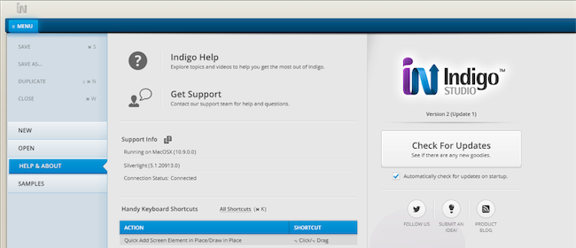
  • If you have the option to automatically check for updates on startup checked, you should see a dialog box pop up when you launch Indigo. Simply click update, and Indigo Studio will do the rest. This is the easier approach.
  • If for some reason you chose not to automatically check for updates, go to MENU > HELP & ABOUT and use the "CHECK FOR UPDATES" option.

Checking for updates in Indigo Studio

About Indigo Studio for Interaction Prototyping

Don't have Indigo Studio? Download a free 30-day trial which will let you try all of the prototyping goodness.

Download Indigo Studio

Looking to suggest improvements and new ideas for Indigo Studio?

Submit a new idea

If for some reason you are having trouble with Indigo Studio, check out our help topics, forums or contact support.

Get Support

Follow us on Twitter @indigodesigned


SQLSaturday #278 Budapest Event Recap

$
0
0

Infragistics was a sponsor of SQLSaturday #278 Budapest. Company provided licenses for the event raffle.

Infragistics also was presented at SQLSaturday Budapest me by me as a speaker.

The event was held on Saturday, March 1st at Lurdy Konferencia- és Rendezvényközpont, Könyves Kálmán körút 12-14., Budapest, 1097, Hungary

Administrator of the conference was  Zoltán Horváth  Lead of the Hungarian User Group of Microsoft SQL Server.

This is the first Infragistics event in Hungary ( SQLSaturday Budapest was one of the biggest events for Microsoft Data Platform and BI in Europe ). Infragistics Inc. was the only one component vendor with a speaker at the conference. Participants gave a good feedback about the company presentation.  There was also an interest in the  Infragistics solutions, related to Development Tools,  Data Visualization and Business Solutions. Infragistics presentation samples for Entity Framework  6  includes solutions with jQuery, WPF, Silverlight and Windows Forms, implemented with the company products like  Ignite UI. Hope in the near feature to have more closer contacts with professionals, community  members and companies from this region.


SQLSaturday Budapest registration


Sessions


  The speakers room


Conference closing ceremony with raffles


Summary:

  • There was 23 presentations in 4 tracks.
  • Around 600 registrations
  • Speakers from 11 countries: Australia Poland,  UK, USA, Germany, Ireland, Austria, Slovenia,  Sweden, Hungary and Bulgaria


Infragistics participation in the event:

Follow news from Infragistics for more information about new Infragistics events.

As always, you can follow us on Twitter @mihailmateev and @Infragistics and stay in touch on Facebook, Google+ andLinkedIn!

Binding Complex Objects to an igGrid Column Template

$
0
0

Demo:Running code sample and GitHub repository

When working with the Ignite UIigGrid you have the option to harness the column template feature in order to take control of how data is presented in a column inside the grid. While you can use the column template to make some relatively simple modifications to the data (e.g., add labels, etc.) you can also use it to take full control over the layout of a rendered column. The following screenshot shows how to use the grid with a single column to render data with a custom layout.

Here data for the grid is laid out using Bootstrap layout classes in order to arrange the data in the grid in more complex fashion than traditional rows and columns.

Building the Column Template

The column templates for the igGrid are flexible enough that you can use them in a few different ways. In this example the grid is setup with a single column and the layout is fairly involved, therefore in a way you can think of this setup as being analogous to using a row template.

In the documentation many of the examples demonstrate how to use the column template with a very simple string embedded in JavaScript. While this works well to demonstrate the concepts, when building more robust applications you’ll often want to define the template in the page’s markup and then inject the HTML into the grid when the template is required.

Here is the template used to render data in the grid. It’s a bit involved so I’ll review some of the more interesting segments after you’ve had a chance to survey the entire template.

<script id="sessions-template" type="text/template"><div class="row pad-top-md pad-bottom-md pad-right-md"><div class="col-xs-4 col-sm-2 text-center bio-links"><a href="/speakers/${speakerId}/${speakerFirstName}-${speakerLastName}"><div><img src="${speakerImageSource}" class="img-thumbnail" /></div><h4>${speakerFirstName} ${speakerLastName}</h4></a><a href="http://twitter.com/${speakerTwitter}" target="_blank" class="text-sm">@${speakerTwitter}</a></div>                <div class="col-xs-8 col-sm-10"><div class="row"><a href="/sessions/${id}/${titleEncoded}"><div class="col-sm-9"><h3 class="session-title">${title}</h3>
                        ${description}</div></a><div class="col-sm-2"><span class="h3">${level}</span><div>${roomName}</div><div>${day}</div><div>${timeShortString}</div><div class="pad-top-md"><a href="#" data-role="attend" data-id="${id}" title="Attend Session"><i class="fa fa-user"></i></a></div></div></div><div class="row text-sm pad-top-md"><div class="col-sm-4 text-left"><strong>Track:</strong> <a href="/track/${trackName}"  class="btn btn-default btn-sm">${trackName}</a></div><div class="col-sm-4 text-right"><strong>Tags:</strong>
                    {{each ${tagsList}}}<a href='/tags/$data' class='btn btn-default btn-sm'>$data</a>
                    {{/each}}</div></div></div></div></script>

You’ll notice that the template consists of a basic Bootstrap layout markup with tokens surrounded by ${} sprinkled throughout the template. Each token corresponds to a member name in the JavaScript object that is bound to the grid.

Looping in a Template

The binding object includes a string array named tagsList which includes the list of tags that are associated to the given session. The template requires looped elements to follow a few rules in order for the data to render correctly.

First, take a closer look at the loop syntax in the template:

<divclass="col-sm-4 text-right"><strong>Tags:</strong>
    {{each ${tagsList}}}<ahref='/tags/$data'class='btn btn-default btn-sm'>$data</a>
    {{/each}}</div>

As you review this code you’ll notice that:

  1. Loop blocks are surrounded with the opening statement of {{each ${MEMBER_NAME}}} and closing statement of {{/each}} where MEMBER_NAME is the member of the JavaScript object that is being bound to the template, which in this case is tagsList.

  2. You must not use double quotes inside a loop block. Double quotes will cause a syntax error as the template is compiled. Instead of using double quotes you can safely use the single quote character (') in your template and they are transformed into double quotes after the template is compiled and rendered.

  3. In order to gain access to the data item in each iteration you use the $data syntax. Also note that here you do not surround the token name with curly braces.

Now that the template is setup you can look at ways to provide the template’s markup to the grid.

Grid Setup

The grid is created with a few settings that are required in order to render the custom template. First, take a look at the grid’s code in this example:

$('#grid').igGrid({dataSource:data,autoGenerateColumns:false,localSchemaTransform:false,columns:[{width:'100%',template:templateMarkup}],width:'100%'});

In this example the data is provided in-line via the data variable, but you could just as easily have had it available from any number of asynchronous requests.

The first settings to change are to turn off column auto generation and local schema transformation. As automatic column generation is disabled the columns are set up explicitly through the columns array.

In the columns array a single column is defined and set at 100% width and the template is provided to the column. In the code you see that the column’s template is being set to templateMarkup. The templateMarkup variable is getting its value from a previous jQuery call to extract the HTML from the template on the page:

vartemplateMarkup=$('#sessions-template').html();

Make sure to check out the running sample.

Summary

The igGrid column templates allow you a great amount of flexibility in customizing columns in simple ways like adding some basic formatting all the way to taking full control over how data is rendered in the grid.

As you work with column templates it’s often recommended to maintain your template in markup instead of strings in JavaScript and make sure to follow a few basic rules when creating loop blocks in your templates.

New IGPieChartView features introduced in the February SR

$
0
0

With our latest service release we introduced a few new features to the IGPieChartView which I figured I would give a little demonstration of.

Exploding Slices - Extended Radius

The IGPieChartView released with exploding slices, which would pop the slice away from the center radius of the chart.  

IGPieChartView Default Exploding Slices

With the lastest SR, we introduced a second mode that was requested by a customer.  In this mode the slice will not pull away from the center, but instead increase it's outer radius to highlight itself.


// New feature # 1 : Slice explosion, extended radius.
// When doing a slice explosion, the default is to move the slice out from the center of the pie chart.
// Instead we can have the chart extend the radius of the "exploded" slice.
_pie.allowSliceExplosion = YES; 
_pie.explodedDisplayStyle = IGPieSliceExplodedDisplayStyleExtendRadius;

IGPieChartView Exploding slices new

Rotating Pie Chart

The second feature added were a pair of methods that allow you to programmatically spin the pie chart to have a slice start at a certain angle.  

Sample project showing this in action

pieChartView rotateSliceWithDataPoint: toAngle: duration: alignment:
pieChartView rotateSliceWithIndex: toAngle: duration: alignment:

So that's it for this installment. As I mentioned briefly earlier, these features were requested by a customer.  If you have a request for a feature in our frameworks, please let us know and we will see what can be done. 

Questions about a feature?  Hit us on the NucliOS Forums.

By Darrell Kress

Multiple enabled and disabled checkbox states for the ASP.NET AJAX Data Grid

$
0
0

ASP.NET AJAX Data Grid with enabled and disabled checkbox statesIs it checked or not quite? Multi-state checkboxes are in the menu today. Which, of course, begs the question “Doesn’t the WebDataGrid already support checkbox columns out-of-the box?”. Why yes, it does support a tri-state CheckBox Field, but there are cases where you might need a little bit more flexibility. As we have been reminded on our Product Ideas feedback platform, having more checkbox states with enabled and disabled variations is something the users themselves can benefit directly. This is partly because the Grid’s editing  behavior treats checkboxes fields in bulk (as in the entire column) and perhaps even because there’s no visual cue the checkboxes in the column are not editable. So if you want more than the standard tri-state checkboxes that can be setup for each row – read on. Based on the feedback we received, the team has prepared a solution and I added my own spin as well and I want to share those with you.
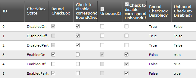
Setup

There are a few things assumed here – you want to show a data grid with checkbox column bound or unbound, but you also want to use the Editing behavior and to control if each row’s checkbox is editable based on a condition or your other data columns. This way from three states, in combination with enabled and disabled, we go to six and that’s something you might need to store in more than one column. Depending on your data and case that extra column can be used as a flag weather or not the checkbox should be active or the entire state. Implementation of something like this can be very different, so a bit of adapting might be required but I’ll try to point out the basics that are reusable and mark optional features in the demo code.

Basics

The idea behind adding a disabled state is quite clever – replace the checkbox image with respective inactive image and perform runtime check for those images to prevent editing. This way you get control over the visual indication, but also on the image details you can use for detection. So you need 3 images, along with a settings object for the client-side with paths and values for them and mapping between checkbox and their hidden state cells.

Client events to handle:

  • Initialize– go through checkboxes that have extra state and apply enabled/disabled look
  • Handle Editing’s CellValueChanging to prevent disabled editing. Also keep in mind the event is fired when using the API so if you want to still be able to change values programmatically client-side you might need to use the “_set_value_internal” method instead.
  • If you are using unbound checkboxes with a header box, you should also handle the HeaderCheckBoxClicked to set proper state and perhaps value.

You can use either bound fields from your  current data, add new ones to do that if not available, use unbound fields with the sole purpose of holding flags or even enable and disable checkboxes based on logic executed on the client.

External flag approach

This uses the standard checkbox functionality along with applying editable states based on a flag – that can either be another data column, predetermined by server logic and carried over as (un)bound field or completely based on client side logic. The implementation is really up to you, I will use another bool column as part of the data – and since I have two checkbox columns the last two fields carry disabled flags for them:

  1. <ig:WebDataGridID="WebDataGrid1"runat="server"Height="350px"Width="100%"AutoGenerateColumns="False"DataKeyFields="ID"StyleSetName="IG">
  2.     <Columns>
  3.         <ig:BoundDataFieldDataFieldName="ID"Key="ID">
  4.             <HeaderText="ID"/>
  5.         </ig:BoundDataField>
  6.         <ig:BoundDataFieldDataFieldName="CheckBoxState"Key="CheckBoxState">
  7.             <HeaderText="CheckBox State"/>
  8.         </ig:BoundDataField>                
  9.         <ig:BoundCheckBoxFieldDataFieldName="BoundCheckBox"Key="BoundCheckBox"DataType="System.Boolean">
  10.             <HeaderText="Bound CheckBox"/>
  11.         </ig:BoundCheckBoxField>
  12.         <ig:BoundCheckBoxFieldKey="DisableBoundCheckBox">
  13.             <HeaderText="Check to disable corresponding BoundCheckBox"/>
  14.         </ig:BoundCheckBoxField>                
  15.         <ig:UnboundCheckBoxFieldKey="UnboundCheckBox"HeaderCheckBoxMode="TriState">
  16.             <HeaderText="UnboundCheckBox"/>
  17.         </ig:UnboundCheckBoxField>   
  18.         <ig:UnboundCheckBoxFieldKey="DisableUnboundCheckBox"HeaderCheckBoxMode="TriState">
  19.             <HeaderText="Check to disable corresponding UnboundCheckBox"/>
  20.         </ig:UnboundCheckBoxField>
  21.         <%-- Hidden columns to store the states for the CheckBoxFields --%>   
  22.         <ig:BoundDataFieldKey="BoundCheckBoxDisabled"Hidden="true"DataType="System.Boolean">
  23.             <HeaderText="Bound CheckBox Disabled?"/>
  24.         </ig:BoundDataField>
  25.         <ig:BoundDataFieldKey="UnboundCheckBoxDisabled"Hidden="true"DataType="System.Boolean">
  26.             <HeaderText="Unbound CheckBox Disabled?"/>
  27.         </ig:BoundDataField>                      
  28.     </Columns>
  29.     <ClientEventsInitialize="WebDataGrid_Grid_Initialize"HeaderCheckBoxClicked="WebDataGrid_Grid_HeaderCheckboxClicked"/>
  30.     <Behaviors>
  31.         <ig:EditingCore>
  32.             <EditingClientEventsCellValueChanging="WebDataGrid_Editing_CellValueChanging"CellValueChanged="WebDataGrid_Editing_CellValueChanged"/>
  33.             <Behaviors>
  34.                 <ig:CellEditing>
  35.                         <ColumnSettings>
  36.                             <ig:EditingColumnSettingColumnKey="ID"ReadOnly="True"/>
  37.                         </ColumnSettings>
  38.                         <EditModeActionsMouseClick="Single"EnableOnKeyPress="true"/>
  39.                 </ig:CellEditing>
  40.             </Behaviors>
  41.         </ig:EditingCore>
  42.     </Behaviors>
  43. </ig:WebDataGrid>

Initial state based on the values of those is established and the disabled checkbox images replace the defaults where needed:

  1. var styleName = "<%=this.WebDataGrid1.StyleSetName %>" || "Default";
  2. var clientSettings = {
  3.     "true": { src: "images/" + styleName + "/ig_checkbox_disabled_on.gif", value: true, chkState: 1 },
  4.     "false": {src: "images/" + styleName + "/ig_checkbox_disabled_off.gif", value: false, chkState: 0 },
  5.     "null": { src: "images/" + styleName + "/ig_checkbox_disabled_partial.gif", value: null, chkState: 2 },
  6.     "columns": {2: 6, 4: 7}           
  7. };
  8.  
  9. function WebDataGrid_Grid_Initialize(sender, eventArgs) {
  10.     // Set initial enabled / disabled state for all checkboxes            
  11.     try {
  12.         var rows = sender.get_rows();
  13.         var rowCount = rows.get_length();
  14.         for (var i = 0; i < rowCount; i++) {
  15.             var row = rows.get_row(i);
  16.             for (columnIndex in clientSettings["columns"]){
  17.                 // Set the correct enabled/disabled states:
  18.                 var checkBoxCell = row.get_cell(columnIndex);
  19.                 var hiddenStateCell = row.get_cell(clientSettings["columns"][columnIndex]);
  20.                 var isDisabled = hiddenStateCell.get_value();
  21.                 SetCheckState(checkBoxCell, isDisabled, hiddenStateCell);
  22.             }
  23.         }
  24.     }
  25.     catch (ex) { }
  26. }
  27.  
  28. function SetCheckState(cell, isDisabled, checkStateCell) {
  29.     // Set Enabled or disabled state to a cell (adjust image and title/alt) and store in secondary cell.
  30.     try {
  31.         if (isDisabled === isCellDisabled(cell)) return;
  32.         var checkBoxElem = cell.get_element().getElementsByTagName("img").item(0); //get checkbox image
  33.         var chkStates = clientSettings[String(cell.get_value())]; //get state info
  34.         if (!chkStates) return;
  35.                 
  36.         if (isDisabled === true) {
  37.             // Set the disabled values of src and title for the checkbox
  38.             checkBoxElem.src = chkStates.src;
  39.             checkBoxElem.title = "Disabled " + checkBoxElem.title;
  40.             checkBoxElem.alt = "Disabled " + checkBoxElem.alt;
  41.         }
  42.         else {
  43.             // re-set value to restore state
  44.             checkBoxElem.src = "";
  45.             //use _internal to force setting the same value
  46.             cell._set_value_internal(chkStates.value, chkStates.chkState);
  47.         }
  48.         checkStateCell.set_value(isDisabled); // Store the new checkbox state value in the corresponding hidden checkbox
  49.     }
  50.     catch (ex) { }
  51. }
  52.  
  53. function isCellDisabled(cell) {
  54.     var checkBoxElem = cell.get_element().getElementsByTagName("img").item(0);
  55.     return checkBoxElem && checkBoxElem.src.toLowerCase().indexOf("disabled") >= 0;
  56. }

Prevent edits on disabled checkboxes and for unbound fields preserve the state when the header box is used:

  1. function WebDataGrid_Editing_CellValueChanging(sender, eventArgs) {
  2.     // Prevent edit actions on disabled checkboxes
  3.     try {
  4.         var currCell = eventArgs.get_cell();
  5.         if (isCellDisabled(currCell))
  6.             eventArgs.set_cancel(true); // cancel event to prevent value change
  7.     }
  8.     catch (ex) { }
  9. }
  10.  
  11. function WebDataGrid_Grid_HeaderCheckboxClicked(sender, eventArgs) {
  12.     var columnIndex = eventArgs.get_column().get_index();
  13.     var rows = sender.get_rows();
  14.     var rowCount = rows.get_length();
  15.  
  16.     // When the header of the "UnboundCheckBox" column is clicked,
  17.     // set the check states for all while maintaining enabled/disabled states
  18.     if (clientSettings["columns"][columnIndex]) {
  19.         for (var i = 0; i < rowCount; i++) {
  20.             var row = rows.get_row(i);
  21.             var unboundCheckBoxCell = row.get_cell(columnIndex);
  22.             var hiddenUnboundCheckBoxCell = unboundCheckBoxCell.get_row().get_cell(clientSettings["columns"][columnIndex]);
  23.             var unboundCheckBoxCellVal = hiddenUnboundCheckBoxCell.get_value();
  24.             SetCheckState(unboundCheckBoxCell, unboundCheckBoxCellVal, hiddenUnboundCheckBoxCell);
  25.         }
  26.     }
  27. }

Of course, keeping state for unbound fields is just as optional as the header box itself – it’s a matter of what you might need. At this point you can use the SetCheckState function to toggle state and you can provide the user with various ways of doing that if needed (see demo code handling value changes of neighboring standard checkbox fields).

Enabled and disabled checkbox states based on 'flag' secondary column (last two) that would be hidden from the user.

P.S. If you want better readability for column pairs in the client settings you can store keys instead and use the “get_cellByColumnKey” method where I went for indexes - because you know both on the server, and the key method will use it to find the index anyways.

All-in-one approach

This is the one if you need to keep everything in a single data cell. The all-in-one approach goes for a single data column holding the full state on the checkbox as a string just like you see it on the screenshots – “EnabledOn”, “EnabledOff” and so on. So you are once again in need of two columns, one checkbox and one hidden that carries the actual state. Cue similar set of event handlers to provide client side looks and behavior and you have a solution just as functional.

The grid markup, with variations for required bound and unbound fields, is essentially the same and so is the ‘disabling’ of checkboxes by checking their image source and canceling editing and initialize event handling. The main difference comes from the fact that setting state deals with and saves the full string values:

  1. // Sets the enabled/disabled state on the bound/unbound checkbox in the given cell
  2. function SetCheckState(cell, chkState, checkStateCell) {
  3.     try {
  4.         var checkState = chkState? chkState.replace("Enabled", "Disabled"): "";
  5.         var checkBoxElem = cell.get_element().getElementsByTagName("img").item(0);
  6.         var chkStates = checkStates[checkState];
  7.         if (!chkStates) return;
  8.  
  9.         // Get the default values of src and title for checkbox in its enabled state
  10.         var enabledSrc = null, enabledTitle = null;
  11.         if (chkState && chkState.indexOf("Enabled") >= 0) {
  12.             enabledSrc = "ig_res/Default/" + chkStates.src.replace("disabled_", "");
  13.             enabledTitle = chkState.replace("Enabled", "").replace("On", "Checked").replace("Off", "Unchecked");
  14.         }
  15.  
  16.         cell.set_value(chkStates.value, chkStates.chkState);
  17.         checkBoxElem.src = enabledSrc? enabledSrc : chkStates.src;
  18.         checkBoxElem.title = enabledTitle ? enabledTitle : chkStates.title;
  19.         checkBoxElem.alt = enabledTitle ? enabledTitle : chkStates.alt;
  20.         checkStateCell.set_value(chkState); // Store the new checkbox state value in the corresponding hidden checkbox
  21.     }
  22.     catch (ex) { }
  23. }

Enabled and disabled checkbox states based on a hidden column holding string values and logic applying those to the checkboxes

Bonus round

Of course, when I mention that you need two columns for this approach again, I mean that it won’t always be effective to bind a checkbox column to string values like “DisabledOn”. That doesn’t mean you can’t do it, though. Using the IBooleanConverter interface you can bind checkbox field (this naturally excludes unbound options) and it actually eases up the client code required as well because you won’t need the extra hidden column.

  1. publicclassCheckboxConverter : IBooleanConverter
  2. {
  3.  
  4.     publicobject DefaultFalseValue
  5.     {
  6.         get { return"EnabledOff"; }
  7.     }
  8.  
  9.     publicobject DefaultTrueValue
  10.     {
  11.         get { return"EnabledOn"; }
  12.     }
  13.  
  14.     publicbool IsFalse(object value)
  15.     {
  16.         return value.ToString().Contains("Off");
  17.     }
  18.  
  19.     publicbool IsTrue(object value)
  20.     {
  21.         return value.ToString().Contains("On");
  22.     }
  23. }

A bonus of the converter handling is that when editable checkboxes will set the default true/false values when the user interacts with them and use the rules to match checked or unchecked and when nothing matches ( read: “EnabledPartial”) it will actually set the checkbox to partial state as well. How convenient!

Options, options, options

I guess that is exactly what this blog can give you – 3 ways to achieve the Multiple enabled and disabled state checkbox functionality.  Whether you want two Boolean columns that give a combined state or a single column approach with either hidden and presentation column pair or binding fields through a converter – all versions produce similar behavior with different amount of effort and limitations. It’s up to you to decide which one is a better fit for your requirements and reuse as much of the demo code as possible!

Speaking of code, here are the demo ASP.NET sites:

Open as Web Site from Visual Studio or WebMatrix and you will need Infragistics ASP.NET installed (might need reference version adjustments) which you can grab from here:

Infragistics for ASP.NET banner

I’d love to hear your thoughts, so leave a comment down below or ping me @DamyanPetev.

And as always, you can follow us on Twitter @Infragistics and stay in touch on Facebook, Google+ and LinkedIn!

Who is Jeff Atwood?

$
0
0

Software developers like Jeff Atwood have had a major influence on the greater development community over the years. For those just starting their careers, or for those with years of experience, both groups can benefit from reading some of Atwood's content on his blog, Coding Horror.

According to Atwood, his computer software developer journey began in the 1980s with the TI-99/4a microcomputer by Texas Instruments, where he learned the trade by using multiple versions of Microsoft BASIC. In the 1990s, he moved to Visual Basic 3.0 and Windows 3.1 systems, as well as writing Pascal code for Delphi.

In 2004, Atwood launched Coding Horror, which is a website devoted to keeping track of developments taking place throughout the software development field. Atwood explained that he creates public blogs after researching topics he finds intriguing. He also noted that he believes readers should not hesitate to email or comment about his work, because he believes that blogging is a two-way street between writers and audiences.

In 2005, Atwood moved to California after landing his dream job at Vertigo Software. In 2008, alongside Joel Spolsky, he created Stack Overflow, which later became known as the Stack Exchange, where various Q&A sites are featured. Atwood and Spolsky's ambitions have paid some tremendous dividends, as the Stack Exchange rose through the ranks and is now one of the top 150 largest websites on the Internet today.

Atwood appears to not be satisfied with limiting himself to any particular area. In 2012, he left the Stack Exchange to spend more time with his family, but this endeavor would be short-lived. Unable to keep himself out of the developer sphere, he created the Civilized Discourse Construction Kit and the Discourse open-source discussion platform in 2013, all with the hopes of advancing Internet-based conversations.

The inventing of the CODE keyboard
Atwood's impact on the developer world is not limited solely to improving web discussions. Ars Technica's Casey Johnston explained that Atwood's new CODE keyboard has changed the game for mechanical keyboards, which are extremely loud when users are typing. At its core, the CODE keyboard has two major attractive benefits compared to rubber dome switches.

"First, they activate before they are pressed all the way down (you can feel a tactile bump at this actuation point). Your finger doesn't have to 'bottom out' the key in its well in order to get the key press to register," Johnston explained.

The other advantage, according to Johnston, is that the CODE keyboard is less vulnerable to aging compared to rubber dome switches, which have a lifespan of roughly 5 million presses, less than the 10 to 20 million of mechanical ones.

Johnston concluded that not every computer user will rush to purchase the CODE keyboard, but for active typists, like the folks in the development world, it is a great option.

Software developers and others interested in learning more about Atwood's impressive journey, innovations and the most recent developments taking place throughout their fields should visit CodingHorror.com

Viewing all 2460 articles
Browse latest View live